Case 25624
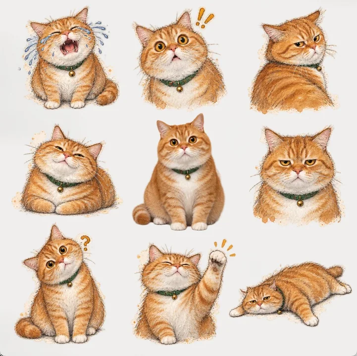
九宫格透明人物表情包贴纸页
Prompt
Please strictly refer to the original image of the character I uploaded to create a **1:1 square transparent sticker sheet**.

【Screen Structure】
- The entire image consists of **9 independent stickers**;
- Arranged in a **3×3 grid**;
- Keep **wide and completely transparent gaps** between the nine stickers;
- The background of the entire sticker sheet must be transparent;
- Do not generate additional backgrounds, do not make it into a single continuous illustration, and do not let the stickers overlap.

【Subject Consistency】
- All nine stickers must be the **same character**;
- Strictly preserve the identity characteristics, face shape, facial features, hairstyle, hair color, skin color, key clothing features, and overall temperament of the character in the original image;
- Slight optimizations can be made, such as improving clarity, optimizing edges, and fine-tuning textures;
- Do not change the character's identity, do not swap faces, and do not make different stickers look like different people.

【Center Sticker Requirements】
- The **middle 5th cell** is fixed as a cutout version of the character from the original image;
- The center sticker should maintain realism, with only slight refinement;
- Do not apply stylization to the center sticker;
- The center sticker should form a "real vs. stylized" contrast with the surrounding eight stickers.

【Surrounding Eight Stickers Requirements】
- The surrounding eight stickers are all based on the extension of the same character;
- Uniformly converted into the following style:
Extract the most recognizable subjects, outlines, gestures, and narrative relationships from the photos, and reconstruct them into observational pen and wash manuscripts. Do not fully trace the photos; only keep the visual clues most worth recording, maintaining the subject's identity, proportions, directions, and scene meanings with minimal information, so that the original object can be recognized at a glance, while retaining traces of observation, deletion, and stopping the pen.

The composition emphasizes a musical rhythm within a minimalist page: treat the most important outline or movement of the subject as a visual motif, organizing the image through repetition, variation, pauses, accents, and sudden white space. The subject does not need to be complete, nor does it need to be centered; it can be offset, cropped, suspended, or naturally extended in a certain direction; one or two powerful free lines carry the visual accent, while other lines quickly fade away, letting large areas of blank space act like rests in music. Avoid even distribution and full filling, making the image present a sense of improvisation within a restrained order and completeness within the unfinished.

Lines use slender, loose, uneven hand-drawn pen outlines, allowing for broken contours, searching lines, repeated corrections, sudden weight, slight deviations, and unfinished edges. Some areas can feature freer, more decisive long lines or fast brushstrokes, forming a rhythmic contrast with quiet fine lines, but key proportions, directions, and gestures must be accurate. Light colors are only used in a few necessary positions, extracting 2–4 most recognizable colors from the original image for light, transparent local dotting, allowing for bleeding, water marks, graininess, and uneven coverage, with environmental colors disappearing quickly.

The background paper color is not fixed; intelligently match an extremely light, clean, almost white composite background based on the original image's overall color temperature, light, and mood, which can be slightly warm, slightly cool, or have a very light hue, but always serves the original image and does not form a distinct colored background.

Text is freely generated based on the photo itself, without preset fixed titles, numbers, locations, years, or fixed languages. A small amount of truly meaningful words, phrases, short sentences, or symbols can be refined from the subject, movement, environment, emotion, sound, sense of time, memory, or accidental details. The text also follows the rhythm of the image, entering the white space like a slight accent, pause, or echo, naturally arranged along outlines, lines of sight, movement directions, or unfinished edges; it is better to be few, offset, light, and clever than to form a menu-style information area.

The overall look is like a carefully edited private observation manual: minimalist pages, bold white space, keen composition, free but not scattered lines, local improvisation but overall highly restrained. Let the image have an artistic sense of "a visual motif being observed, repeated, varied, and then stopped at the most appropriate position." Avoid full watercolor landscapes, even compositions, filled backgrounds, excessive detailing, decorative strokes, thick black outlines, vector lines, cartoons, 3D rendering, menu-style layouts, and a commercial poster template feel.

【Meme Adaptation Requirements | Priority higher than the above poster layout description】
- In the above style content, "current layer area" refers to the current single sticker area among the surrounding eight; do not connect the eight stylized stickers into one continuous image.
- The paper, base color, color gamut, rectangles, white space, environment, or partial background involved in the original style must fully retain their color, material, lighting, and texture logic, but can only serve as a partial substrate, material piece, color block, negative shape, or compositional element surrounding the character within the current layer area; they must not fill the single cell, let alone the entire sticker sheet. The area outside the character and partial substrate must be transparent, and the wide gaps between the nine cells must be completely transparent.
- The character must be the sole protagonist, fully visible, and have clear edges within each current layer area. Stylization, generalization, reduction, or exaggeration can only be applied to non-identity details, material language, brushstrokes, color, and auxiliary environments; do not reduce or abstract away face shape, facial features, hairstyle, hair color, skin color, key clothing features, and overall temperament.
- The number of characters is fixed; do not add a second character, do not duplicate characters, and do not split the same character into multiple parts. It is allowed to change the expressions, poses, gestures, and reactions of the eight stickers according to template requirements; otherwise, the character's perspective, body structure, left-right direction, relative position, and spatial relationship with key props in the original image must be continuous and reasonable, and must not be arbitrarily reconstructed due to style conversion.
- Titles, numbers, or annotations involved in the original style are only allowed as a very small amount of clearly readable phrases or micro-markings within the current layer area when truly necessary; they must not cross cells, occupy transparent gaps, or generate large blocks of meaningless text.
- The surrounding eight stickers must respectively present **different expressions, poses, gestures, or reactions**;
- Emphasize a sense of meme, reaction, drama, and exaggeration;
- The eight stickers must be distinctly different, avoiding only slight expression changes;
- Positions are not fixed and are freely allocated by the model, but must be visually balanced.

【Overall Effect】
- The middle one is the realistic cutout version of the original image;
- The surrounding eight are stylized meme stickers of the same character;
- All stickers should have the feel of independent PNG stickers, with clear edges and complete subjects;
- The overall look is like a pre-formatted nine-grid transparent meme sticker sheet.

请严格参考我上传的人物原图,制作一张 **1:1 正方形透明贴纸页**。

【画面结构】
- 整张画面由 **9 个独立贴纸** 组成;
- 按 **3×3 网格** 排列;
- 九个贴纸之间保留 **较宽且完全透明的间隔**;
- 整张贴纸页背景必须透明;
- 不要生成额外背景,不要做成整张连续插画,不要让贴纸相互重叠。

【主体一致性】
- 九个贴纸都必须是 **同一个人物**;
- 严格保留原图人物的身份特征、脸型、五官、发型、发色、肤色、服装关键特征和整体气质;
- 可以做轻微优化,如提高清晰度、优化边缘、微调质感;
- 不要改变人物身份,不要换脸,不要让不同贴纸像不同的人。

【中心贴纸要求】
- **中间第5格** 固定为原图人物的抠像版;
- 中间贴纸保留真实感,仅做轻微精修;
- 不要对中间贴纸做风格化处理;
- 中间贴纸要与周围八张形成“真实 vs 风格化”的对比。

【周围八张要求】
- 周围八张都基于同一个人物延展;
- 统一转换为以下风格:
从照片中提取最具识别性的主体、轮廓、姿态与叙事关系,重构为观察式钢笔淡彩手稿。不要完整描摹照片,只保留最值得记录的视觉线索,以最少信息维持主体身份、比例、方向和场景含义,让人一眼认出原物,同时保留观察、删减与停笔的痕迹。

构图强调极简页面中的音乐性节奏:把主体最重要的轮廓或动作视为一个视觉动机,通过重复、变奏、停顿、重音和突然留白组织画面。主体不必完整,也不必居中,可偏置、裁切、悬置或向某一方向自然延伸;一两处较有力量的自由线条承担视觉重音,其余线条迅速减弱,让大片空白像音乐中的休止。避免平均分布和完整填充,使画面呈现一种克制秩序中的即兴、未完成中的完整感。

线条使用纤细、松动、不均匀的钢笔手绘线稿,允许断续轮廓、寻找线、重复修正、突然加重、轻微偏差和未完成边缘。局部可以出现更自由、更果断的长线或快速笔触,与安静细线形成节奏反差,但关键比例、方向和姿态必须准确。淡彩只用于少数必要位置,从原图提取2–4种最具辨识度的颜色进行轻薄、透明的局部点染,允许越线、水痕、颗粒和不均匀覆盖,环境颜色迅速消失。

背景纸色不固定,根据原图综合色温、光线与情绪智能匹配一个极度浅、干净、几乎接近白色的综合色底,可以微暖、微冷或带极轻色相,但始终服务于原图,不形成明显彩色背景。

文字自由根据照片本身生成,不预设固定标题、编号、地点、年份或固定语种。可从主体、动作、环境、情绪、声音、时间感、记忆或偶然细节中提炼少量真正有意义的字、词、短句或符号。文字也遵循画面的节奏,可像一个轻微重音、停顿或回声一样进入留白,沿轮廓、视线、运动方向或未完成边缘自然排列;宁可少、偏、轻、巧,也不要形成菜单式信息区。

整体像一本被精心编辑过的私人观察手册:页面极简、留白大胆、构图敏锐,线条自由却不散乱,局部即兴而整体高度克制。 让画面具有“一个视觉动机被观察、重复、变奏,然后在最恰当的位置停下”的艺术感。避免完整水彩风景、平均构图、填满背景、过度精描、装饰性笔触、粗黑轮廓、矢量线、卡通、三维渲染、菜单式排版和商业海报模板感。

【表情包适配要求|优先级高于上述海报版式描述】
- 上述风格内容中的“当前层区域”,均指周围八张中的当前单枚贴纸区域;不得把八张风格贴纸连接成一幅连续画面。
- 原风格涉及的纸面、底色、色域、矩形、留白、环境或局部背景必须完整保留其色彩、材质、光影和质感逻辑,但只能作为当前层区域内围绕人物的局部衬底、材质片、色块、负形或构图元素;不得铺满单格,更不得铺满整张贴纸页。人物及局部衬底之外必须透明,九格之间的宽间隔必须完全透明。
- 人物在每个当前层区域内必须是唯一主角、完整可见、边缘清楚。风格化、概括、删减或夸张只能作用于非身份性细节、材质语言、笔触、色彩与辅助环境;不得删减或抽象掉脸型、五官、发型、发色、肤色、服装关键特征和整体气质。
- 人物数量固定,不新增第二人物,不复制人物,不把同一人物拆成多个局部。允许按照模板要求改变八张贴纸的表情、姿势、手势和反应;除此以外,人物视角、身体结构、左右方向、相对位置及与原图关键道具的空间关系必须连续、合理,不得因风格转换而擅自重构。
- 原风格涉及的标题、编号或注释只允许在确有必要时作为当前层区域内极少量、清晰可读的短语或微型标记;不得跨格、占用透明间隔或生成大段无意义文字。
- 周围八张必须分别呈现 **不同的表情、姿势、手势或反应**;
- 强调 meme 感、反应感、戏剧化、夸张感;
- 八张之间必须明显不同,避免只有轻微表情变化;
- 位置不固定,由模型自由分配,但必须视觉均衡。

【整体效果】
- 中间一张是真实原图抠像版;
- 周围八张是同一人物的风格化 meme 贴纸;
- 所有贴纸都应是独立 PNG 贴纸感,边缘清晰、主体完整;
- 整体像一张已经排好版的九宫格透明表情包贴纸页。
More prompts
Case 26921
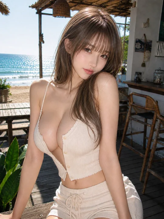
海滨咖啡馆木质露台上的年轻女性夏日人像
Theme: Sunshine at a seaside cafe Main Subject: In the center of the frame, on a simple wooden cafe terrace facing the sea, a young woman leans her upper body close to the camera with both hands supported on a wooden bench in the foregroun
Case 22668
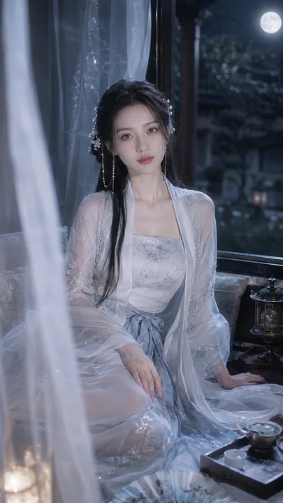
电影感月夜国风汉服人像摄影
Photorealistic cinematic guofeng portrait, Japanese photobook aesthetic, Ricoh GR III HDF photography, vertical 9:16 composition, medium-full portrait, eye-level or slightly high-angle shot. A beautiful adult Chinese woman in her mid-20s wi
Case 8