Case 24609
智能自适应艺术排版视觉语言提示词
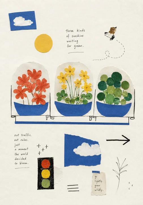
Prompt
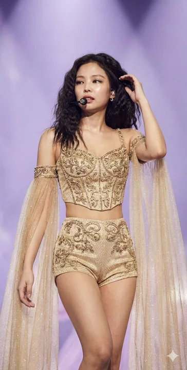
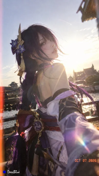
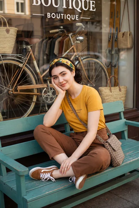
For the lower half, use the uploaded reference image as the basis for a new visual language and presentation logic. The reconstruction should feel highly intelligent, adaptive, and conceptually strong rather than following a fixed template. Interpret the original photograph first, then spontaneously generate a small set of simplified visual symbols, abstract shapes, poetic fragments, and graphic relationships that are genuinely connected to its subject, mood, action, or hidden meaning.

The layout should feel intuitive, improvised, and almost casually assembled, yet remain visually sophisticated and perfectly responsive to the theme. Avoid rigid grids or overly calculated symmetry. Allow elements to float, shift, overlap, separate, or form unexpected relationships across generous negative space, as if they were fragments of visual thought placed naturally on a page. Each photograph should generate its own unique composition rather than repeating the same arrangement.

Use a tactile, handmade editorial language inspired by the reference image: simple cut-paper-like shapes, softly imperfect silhouettes, hand-drawn marks, loose geometric forms, subtle grain, paper texture, lightly printed or stamped surfaces, naïve symbolic imagery, and occasional handwritten text. Forms may be extremely simple—even childlike at first glance—but their selection and placement should reveal an intelligent interpretation of the photograph.

Instead of literally reconstructing the photographed scene, translate its essential meaning into a small visual vocabulary. A person, object, gesture, landscape, architectural detail, weather condition, or spatial relationship may become an unexpected symbol, metaphor, diagram, or poetic association. Different visual fragments may communicate different layers of the same idea, creating a loose visual conversation rather than a single literal illustration.

Typography should also feel spontaneous and context-sensitive. Use only a few meaningful words, short phrases, poetic observations, or conceptual notes generated specifically from the image. Text may appear handwritten, lightly typeset, tilted, offset, or placed in seemingly accidental locations, but its position should always strengthen the visual rhythm and thematic meaning. It should feel like a private annotation, fleeting thought, visual diary entry, or poetic observation rather than conventional poster information.

The final result should combine the freedom of an artist’s sketchbook, the intelligence of editorial art direction, the intimacy of a visual diary, and the restraint of an independent art publication. It should feel playful, poetic, slightly naïve, tactile, and spontaneous, while still being highly intentional, refined, and conceptually precise.

对于下半部分,使用上传的参考图像作为新视觉语言和表现逻辑的基础。重建应该感觉高度智能、具有自适应性且概念性强,而不是遵循固定模板。首先解读原始照片,然后自发地生成一小组简化的视觉符号、抽象形状、诗意碎片和图形关系,这些元素应与照片的主题、情感、动作或隐含意义真正相连。

布局应感觉直观、即兴且几乎是随性组装的,但仍保持视觉上的精致,并与主题完美契合。避免僵硬的网格或过度计算的对称。允许元素在广阔的负空间中漂浮、移动、重叠、分离或形成意想不到的关系,仿佛它们是自然放置在页面上的视觉思维碎片。每张照片都应生成其独特的构图,而不是重复相同的排列。

使用受参考图像启发的触感、手工社论语言:简单的剪纸状形状、柔和的不完美轮廓、手绘标记、松散的几何形式、微细的颗粒感、纸张纹理、轻微印刷或盖印的表面、天真的符号意象以及偶尔出现的手写文字。形式可能非常简单——初看之下甚至是稚气的——但它们的选择和布局应揭示出对照片的智能解读。

不要字面上重建拍摄的场景,而是将其本质含义转化为一小组视觉词汇。人、物体、手势、景观、建筑细节、天气状况或空间关系可能变成意想不到的符号、隐喻、图表或诗意联想。不同的视觉碎片可能传达同一想法的不同层面,创造一种松散的视觉对话,而不是单一的字面插图。

排版也应感觉自发且对上下文敏感。仅使用从图像中专门生成的几个有意义的单词、短语、诗意观察或概念笔记。文字可能以手写、轻微排版、倾斜、偏移或出现在看似偶然的位置,但其位置应始终加强视觉节奏和主题意义。它应该感觉像私人注释、转瞬即逝的想法、视觉日记条目或诗意观察,而不是常规的海报信息。

最终结果应结合艺术家素描本的自由、社论艺术指导的智能、视觉日记的亲密以及独立艺术出版物的克制。它应该感觉有趣、充满诗意、略显天真、具有触感且自发,同时仍然保持高度的意图性、精致感和概念上的精确。