Case 9918
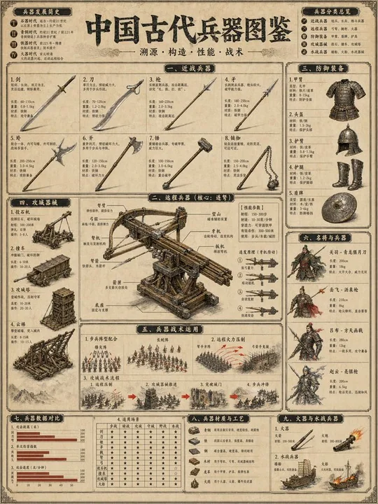
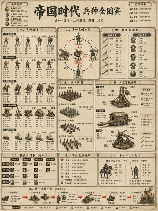
中国古代兵器図鑑百科図版
信息图兵器谱古风志蓝图纸军事图
Prompt
驚くほど複雑で洗練された技術情報図の傑作、テーマは[SUBJECT / 例: 古代中国の海戦]で、以下の第一原理の視覚パラメータに基づいて厳密に設計されています。

[キャンバスと色の独裁]
ベースキャンバス (L0): 老化した軍用羊皮紙のテクスチャ、温かみのある #E8DCC4、微妙な風化汚れと歴史地図の繊維テクスチャ。
システムカラー (L1, ~60%): 伝統的な濃い炭黒インク #2B2B2B、構造的な技術ライン、兵士のシルエット、機械の接合部に使用。
コンテンツ階層カラー (L2, ~30%): 風化した銅色、黒いラッカー赤、鉄灰色 #555555、異なる部隊や素材を区別するために使用。
アクセントカラー (L3, ~5-10%): 高可視性の朱色 #E62B1E、戦術矢印、火/爆発、将軍の旗にのみ使用される。

[空間重力とトポロジー]
構図: [選択: 主従衛星配置 / 45度等軸測全景]。情報重力は論理的な戦術順序に沿って流れます。
境界: 専門的な編集レイアウト、クリーンなマージン;負空間は「戦術的呼吸空間」として、異なる戦闘フェーズを分離するために使用。
モジュールトポロジー: [N] 個の異なる情報モジュール、異なるスケール(例: 個々の武器の詳細とマクロな陣形)を描写。

[次元とグラフィック物理学]
スタイル: 伝統的な中国工筆(精緻な線画)と現代的な軍事戦術図(例: Osprey Publishingスタイル)の融合。
線の言語: 0.8ptの鋭い技術アウトライン / 0.3ptの薄い背景グリッドライン / 2ptの太い枠線で主タイトルの印を囲む。
表面効果: 実際的な素材レンダリング — ボラスタの木目、鱗甲の金属輝き、地形の微妙なインクウォッシュシェーディング。

[タイポグラフィー生態系 — 自動調整密度]
タイポグラフィー密度: 地図優先(65%視覚 / 35%テキスト)。
T1マクロヘッダー: 主タイトル「[テーマ中国語名]」に巨大で極太の伝統的な宋体文字を使用。必ず純粋な中国漢字で、インクプレスのテクスチャを持つ。
T2モジュールヘッダー: 楷体のフォントで、黒い矩形の「軍階」バッジ内に配置し、異なる戦術領域をラベル化。
T3本文テキスト: 武器仕様や戦術役割に使用する、クリーンで中太の黒体(無装飾体)。すべての文字は鋭くなければならない。
T4注釈: 超クリアな技術ラインが直接的にコンポーネント(例えば、引き金機構、羽根、装甲接合部)に指す微細なテキスト。

[ナラティブフロー]
ナラティブモード: [選択: 流程順序型 / 核心放射型]。
視覚エントリーポイント: 最も重要な戦術ユニット(例: 指揮車両または主要な攻城兵器)。
パスメカニズム: 数字の順序(1, 2, 3…)または太字の朱色の矢印で、戦闘のロジックに沿って視聴者を導く。

[イコングラフィとメタファー]
イコンスタイル: 軍団(歩兵、騎兵、射手)のための非常に詳細な歴史的ピクトグラム。
コアメタファー: 軍事秩序は精密な時計の歯車メカニズム。
一貫性: すべてのシンボルは[時代/王朝, 例: 唐王朝]の軍事美学に従う。

[モジュール構造 — 推奨ブロック]
[MOD 1: 中心ピース] — 主な[兵器/陣形]、内部構造を示す爆発ビューの詳細。
[MOD 2: 戦術地図] — 上からの概略図、部隊の移動と射撃ラインを示す。
[MOD 3: 兵士の装備] — 攻撃と防御装備のアップクローズの並列比較。
[MOD 4: 補給/統計] — 射程、重量、部隊密度を示す小さなアイコンベースのチャート。

[最終実行ロック]
単一の、超詳細な教育用プレートとしてレンダリング。すべての視覚システムは、専門的な博物館アーカイブの美学に一貫して従う必要があります。1ピクセルずつも複雑な軍事歴史を明確に示す目的に役立つ必要があります。
解像度目標: 最大の情報密度、印刷用百科全書品質。

テーマ: 中国古代兵器図鑑 3:4 4k文字が読みやすい
他のプロンプト

Case 14869
シャワールームにいるエメラルドグリーンのビキニ姿で濡れ髪の美女
{ "subject": { "description": "日焼けした肌と、濡れたウェーブのかかったブルネットからブロンドへのオンブレヘアの30代半ばの女性が、シャワーの中に立っている。", "apparel": { "top": "エメラルドグリーンの三角ビキニトップ、マットな生地、紐結び仕様で、胸元にぴったりフィットしている。", "bottom": "おそろいのエメラルドグリーンのビキニボトム、ローライズで腰にかかっている。" }, "anatomical_featu
写实比基尼性感湿身淋浴
Case 23
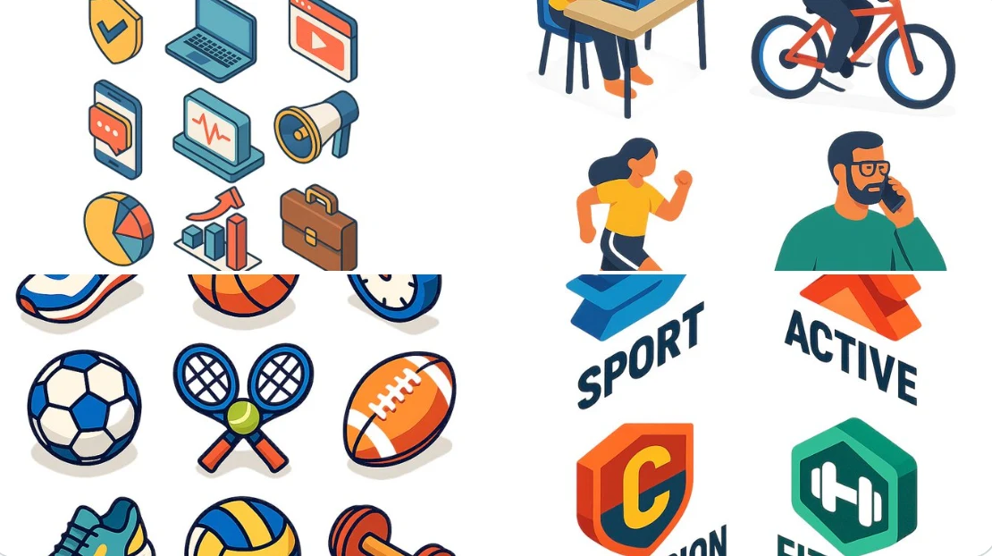
平面デザインのエッジスタイル
フラットなイソメトリックなデジタルイラストレーション、[対象を記述:例:現代的なワークスペース、市街地のブロック、アプリアイコンのグループ、スポーツショップ]、クリーンなラインと幾何学的な形状、明るいパステルカラー、3Dの深みを持つ簡略化された透視図、シャドウは最小限、白背景または柔らかなグラデーション。スタイルは現代的なベクターインフォグラフィックに似ており、UI、アプリデザイン、ウェブビジュアルに最適です。
illustrationminimalist