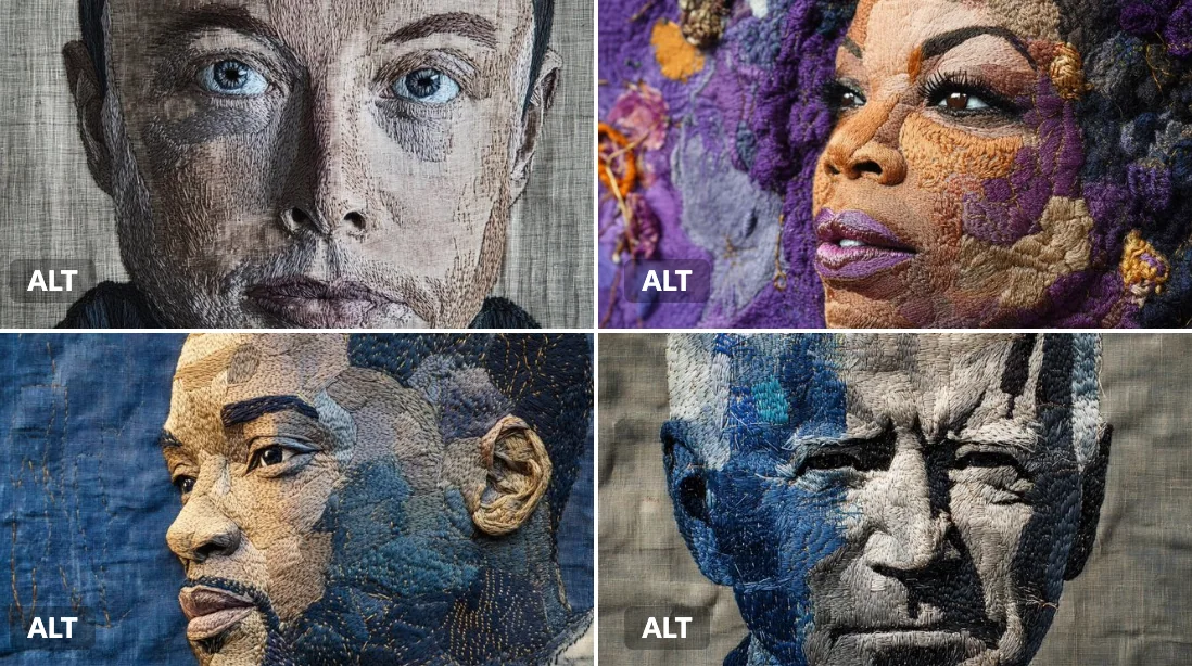
Case 26098
Промпт для постера с интеграцией архитектурной перспективы и типографики
Prompt
НАЗВАНИЕ: [ПАДЕНИЕ / ПРОХОД / ИЗГИБ / ПОДЪЁМ-СПУСК / собственный текст]
НАЗВАНИЕ ПРОЕКТА: [бренд / выставка / кампания]
АРХИТЕКТУРНОЕ ПРОСТРАНСТВО: [атриум / проход / изогнутая рампа / вертикальный каньон / другое]
ТИП ДВИЖЕНИЯ: [падение / отдаление / изгиб / подъём / противоположные направления]
ОБЪЕКТ: [маленькая человеческая фигура / скейтбордист / отсутствует]
ОСНОВНОЙ ЦВЕТ: [один или два ярких акцентных цвета]
ДОПОЛНИТЕЛЬНЫЙ ТЕКСТ: [место / дата / короткий слоган]
ФОРМАТ: вертикальный постер 9:16

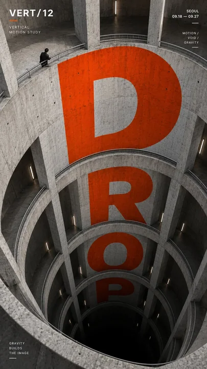
Создайте постер с высокоэффективной перспективной типографикой, в котором сверхкрупный шрифт физически интегрирован в архитектуру и использует структуру пространства для создания движения, глубины и направленности.

Сначала создайте архитектурную и перспективную систему, затем заставьте типографику строго следовать её поверхностям, кривым, проёмам, изменениям высоты и направлениям схода в перспективу.

Главное слово должно доминировать в композиции, оставаясь при этом читаемым. Позвольте формам букв естественно изменяться в соответствии с выбранным пространственным механизмом:

Для вертикальных пространств заставляйте шрифт расширяться, сжиматься или падать через разные уровни.

Для проходов и повторяющихся проёмов позволяйте буквам появляться, исчезать за структурными элементами и вновь проступать глубже в сцене.

Для изогнутых траекторий изгибайте и вращайте типографику вдоль изменяющегося направления архитектуры.

Для противоположных направлений используйте два потока типографики, движущихся навстречу друг другу в одной и той же пространственной системе.

Типографика должна выглядеть так, будто она нанесена, напечатана или встроена в реальные архитектурные поверхности, с точной перспективой, масштабом, перекрытием и контактом с поверхностью. Избегайте простого наложения плоского текста на изображение.

Используйте сдержанную архитектурную палитру с одним или двумя яркими акцентными цветами на фоне бетона, чёрного, белого или нейтральных материалов. Держите формы букв смелыми, геометричными и визуально доминирующими.

Если в кадре присутствует человек, сохраняйте его относительно маленьким и используйте как якорь масштаба. Его движение или позиция должны подчёркивать направление типографики, а не конкурировать с ней.

Добавьте лишь небольшое количество редакционной информации, такой как название проекта, место, дата и одна короткая тематическая строка.

Общий стиль: перспективная типографика, архитектурный постер, пространственный графический дизайн, редакционная композиция, сильная глубина, чёткая иерархия и смелое визуальное воздействие.