Case 25756
Affiche artistique de haute qualité : restructuration, photographie réaliste, minimalisme, aquarelle à la main, collage
Prompt
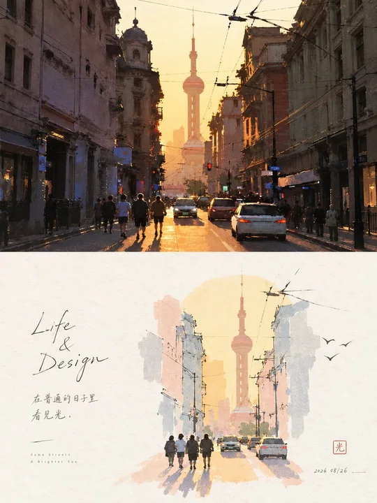
Veuillez transformer chaque photo que je téléverse en une affiche de design haut de gamme indépendante, sans collage de plusieurs photos, en sortant chaque photo séparément. Utilisez une composition verticale globale de 3:4, avec les deux zones supérieure et inférieure strictement dans un rapport de hauteur de 1:1, chacune occupant 50 % de l'écran.

La partie supérieure conserve la photo d'origine, en maintenant l'identité, la structure, la posture, la texture réelle, la lumière et les ombres naturelles, ainsi que l'atmosphère colorée d'origine, avec seulement un léger étalonnage des couleurs haut de gamme. Pour s'adapter au cadre, l'arrière-plan environnemental peut être naturellement étendu, mais le sujet ne doit pas être étiré, déformé ou modifié.

La partie inférieure ne doit pas être redessinée à partir de la photo ; au lieu de cela, déterminez d'abord un thème central, un ancrage visuel et une relation émotionnelle véritablement dignes d'être conservés à partir de l'image d'origine, et supprimez audacieusement le reste des informations. Même si la composition de la photo d'origine est ordinaire, encombrée ou ressemble à un raté, redessinez l'échelle, la position, le recadrage, la direction et les relations entre les éléments du sujet pour reconstruire le matériau d'origine en une scène artistique indépendante. Conservez uniquement les contours, les tendances, les postures et les points de mémoire visuelle les plus représentatifs de l'objet d'origine, afin que les gens puissent ressentir le lien avec la photo du dessus d'un coup d'œil, mais que la partie inférieure possède une meilleure composition et une expression artistique que l'image d'origine.

Le style artistique adopte le dessin à la main en fines lignes + aplat aquarelle léger + texture de papier + léger collage. Le sujet est identifié par quelques contours simples, avec très peu de lignes nécessaires laissées à l'intérieur ; les couleurs sont résumées par de grandes masses de couleur légères, fines et calmes, sans peindre de détails réalistes. Une très légère masse de couleur de base thématique peut être ajoutée pour soutenir le sujet, et le sujet est autorisé à traverser, croiser ou couper les bords de la masse de couleur, formant une relation de collage éditorial naturelle.

La composition met l'accent sur les petits tampons + de grandes zones de blanc intentionnel. Le sujet peut être excentré, aligné sur le bord, suspendu, partiellement recadré ou changer de position par rapport à la photo d'origine, sans rechercher une présentation complète. La zone de blanc est nettement plus grande que la zone peinte et participe à la composition comme un véritable graphique, formant des formes positives et négatives, des distances, des directions, des rassemblements et des dispersions, et un équilibre asymétrique avec le sujet. Mieux vaut supprimer l'environnement que de remplir la mise en page ; laissez le blanc être responsable de l'air, de l'espace, des pauses et des émotions.

La palette de couleurs extrait 2 à 4 couleurs les plus vitales et reconnaissables de la photo du dessus et les reformule en un système pastel de haute luminosité, clair et doux, comme le vert menthe, le vert jeune feuille, le rose brume, le violet clair, le jaune crème, le bleu doux, l'abricot, etc., variant naturellement selon l'image d'origine. L'arrière-plan reste une couleur de papier extrêmement claire, proche du blanc ; le sujet et la masse de couleur de base doivent être clairement visibles, ni gris, ni sale, ni flou.

Seuls un très petit nombre d'éléments symboliques dérivés de l'émotion ou du thème de l'image d'origine sont autorisés autour, exprimés en un ou deux coups de pinceau, sans copier des objets réels, ni décorer pour remplir l'espace. Le texte est également minimal, sans restriction de langue, un petit nombre de mots et de phrases peuvent être librement générés à partir du sujet, de l'action, de l'émotion, de la mémoire ou de la métaphore, entrant dans le blanc avec une police fine, naturelle et légèrement manuscrite, constituant la mise en page avec le sujet.

L'accent global n'est pas de « peindre la photo », mais de « rediriger la scène après avoir raffiné l'âme de l'image d'origine » : peu d'éléments, thème fort, petit sujet, grand blanc, lignes légères, masses de couleur légères, reconstruction intelligente. Évitez le redessinage objet par objet, les arrière-plans complets, l'accumulation de détails, les sujets trop grands, les écrans remplis, la description réaliste, les vecteurs lisses et les mises en page modulaires.
Autres prompts
Case 18774
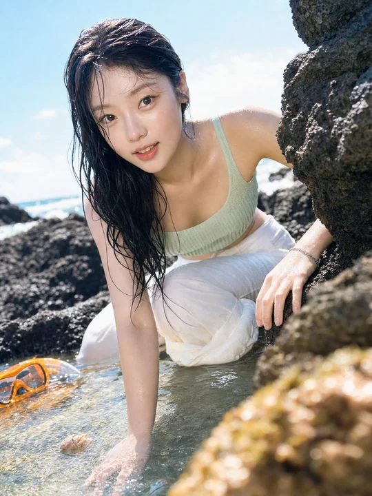
Portrait coréen, style CCD, avec une boisson gazeuse à l’orange sur une île tropicale
Format 3:4, single independent vertical image, no collages, no grids, no text. CCD digital compact camera photography, orange soda island portrait, bright cyan blue and orange color system, slightly blown highlights, realistic travel snapsh
Case 20
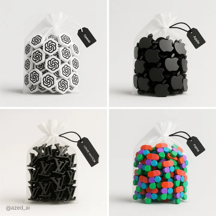
Objet dans un sac en plastique transparent
Une photographie à haute résolution d'un sac en plastique transparent avec une corde, placé sur un fond gris clair. À l'intérieur du sac se trouvent plusieurs petites figures 3D de [sujet] disposées soigneusement. Le sac est attaché avec un
photography