Case 24914
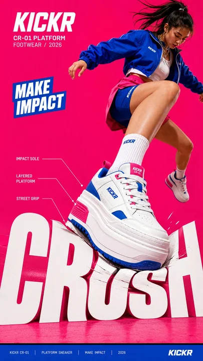
大胆社论海报超大字体动态交互
Prompt
Create a bold editorial campaign poster where oversized typography reacts to a physical force created by the subject or product.

Brand: [BRAND NAME]
Product / Campaign: [PRODUCT OR CAMPAIGN]
Main Word: [SHORT WORD]
Subject: [PERSON / PRODUCT / BOTH]
Action: [STEP / JUMP / PULL / SKATE / ETC.]
Force: [PRESS / PUSH / WRAP / SLIDE / OTHER]
Force Direction: [DOWN / UP / ROTATE / DIAGONAL / OTHER]
Main Color: [COLOR]
Accent Color: [COLOR]
Aspect Ratio: [9:16]

Use realistic commercial photography, oversized typography, high-contrast colors, and contemporary editorial design.

Make the main word extremely large, filling roughly 50–75% of the frame. The typography should visibly respond to the chosen force instead of remaining static.

For example:

 PRESS: compress, bend, or shift the letters at the point of impact.
 PUSH: stretch the typography along an upward or forward direction.
 WRAP: let large letterforms pass behind and in front of the subject to create an enclosing motion.
 SLIDE: offset and shift the letters along one strong directional axis.

The deformation must follow the subject’s actual movement and force direction. Keep the typography graphic and readable — avoid turning it into soft 3D, liquid, or cartoon lettering.

Create clear foreground–subject–background interaction so the person or product feels physically connected to the type.

Use one dominant high-impact color with black, white, and a contrasting accent color. Add only a few meaningful campaign details such as the brand name, product name, slogan, specifications, labels, or small editorial text.

Keep people and products realistic, with believable proportions, materials, lighting, shadows, and dynamic movement.

The final image should feel like a finished campaign key visual where force, subject, typography, and composition all move together.

创建一个大胆的社论竞选海报,其中超大字体对由主体或产品产生的物理力量做出反应。

品牌:[品牌名称]
产品 / 竞选:[产品或竞选]
关键词:[短词]
主体:[人 / 产品 / 两者皆有]
动作:[跨步 / 跳跃 / 拉动 / 滑行 / 等]
力量:[按压 / 推 / 包裹 / 滑动 / 其他]
力量方向:[下 / 上 / 旋转 / 对角线 / 其他]
主色调:[颜色]
强调色:[颜色]
长宽比:[9:16]

使用真实的商业摄影、超大字体、高对比度颜色和现代社论设计。

让关键词非常大,占据画面的大约 50–75%。字体应该明显地响应所选的力量,而不是保持静态。

例如:

按压:在冲击点压缩、弯曲或移动字母。
推:沿向上或向前的方向拉伸字体。
包裹:让大型字母形状穿过主体的后方和前方,创造一种包围感。
滑动:沿一个强烈的方向轴偏移和移动字母。

变形必须遵循主体的实际运动和力量方向。保持字体的图形感和可读性 — 避免将其变成软 3D、液体或卡通字体。

创建清晰的前景–主体–背景互动,让人物或产品在物理上与字体相连。

使用一种极具冲击力的主导色,搭配黑色、白色和一种对比鲜明的强调色。仅添加少量有意义的竞选细节,如品牌名称、产品名称、标语、规格、标签或小型社论文本。

保持人物和产品的真实性,具有可信的比例、材料、光效、阴影和动态运动。

最终图像应该感觉像是一个完成的竞选关键视觉图,力量、主体、字体和构图全部融为一体。
他のプロンプト
Case 1
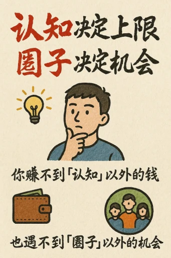
手描風のインフォグラフィックカード
縦9:16の手描きスタイルのインフォグラフィックカードを作成してください。テーマは明確で、背景には紙質感のある米色または米白色を使用し、全体的に素朴で親しみやすい手描きの美しさを表現してください。カードの上部には、赤と黒の対比が鮮やかな大号の毛筆草書フォントでタイトルを配置し、視覚的な焦点を引きつけます。すべてのテキストは中国語の草書を使用し、全体のレイアウトは2〜4つの明確なセクションに分けられ、各セクションには簡潔で洗練された中国語の短いフレーズで要点を表現します。フォン
illustrationtypographyportraitpaper-craftinfographic
Case 20190
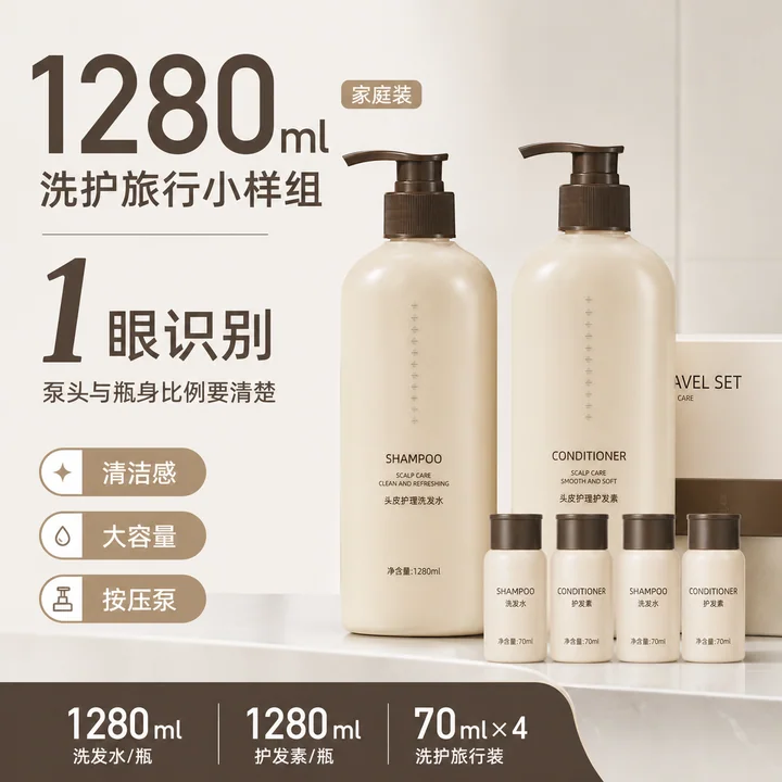
中高客单洗护套装天猫大容量主图设计
大容量奶咖色高客单按压泵数字流