Case 24914
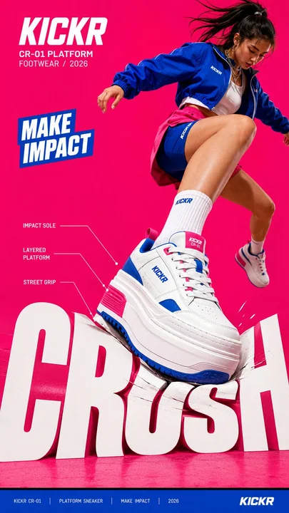
大胆社论海报超大字体动态交互
Prompt
Create a bold editorial campaign poster where oversized typography reacts to a physical force created by the subject or product.

Brand: [BRAND NAME]
Product / Campaign: [PRODUCT OR CAMPAIGN]
Main Word: [SHORT WORD]
Subject: [PERSON / PRODUCT / BOTH]
Action: [STEP / JUMP / PULL / SKATE / ETC.]
Force: [PRESS / PUSH / WRAP / SLIDE / OTHER]
Force Direction: [DOWN / UP / ROTATE / DIAGONAL / OTHER]
Main Color: [COLOR]
Accent Color: [COLOR]
Aspect Ratio: [9:16]

Use realistic commercial photography, oversized typography, high-contrast colors, and contemporary editorial design.

Make the main word extremely large, filling roughly 50–75% of the frame. The typography should visibly respond to the chosen force instead of remaining static.

For example:

 PRESS: compress, bend, or shift the letters at the point of impact.
 PUSH: stretch the typography along an upward or forward direction.
 WRAP: let large letterforms pass behind and in front of the subject to create an enclosing motion.
 SLIDE: offset and shift the letters along one strong directional axis.

The deformation must follow the subject’s actual movement and force direction. Keep the typography graphic and readable — avoid turning it into soft 3D, liquid, or cartoon lettering.

Create clear foreground–subject–background interaction so the person or product feels physically connected to the type.

Use one dominant high-impact color with black, white, and a contrasting accent color. Add only a few meaningful campaign details such as the brand name, product name, slogan, specifications, labels, or small editorial text.

Keep people and products realistic, with believable proportions, materials, lighting, shadows, and dynamic movement.

The final image should feel like a finished campaign key visual where force, subject, typography, and composition all move together.

创建一个大胆的社论竞选海报,其中超大字体对由主体或产品产生的物理力量做出反应。

品牌:[品牌名称]
产品 / 竞选:[产品或竞选]
关键词:[短词]
主体:[人 / 产品 / 两者皆有]
动作:[跨步 / 跳跃 / 拉动 / 滑行 / 等]
力量:[按压 / 推 / 包裹 / 滑动 / 其他]
力量方向:[下 / 上 / 旋转 / 对角线 / 其他]
主色调:[颜色]
强调色:[颜色]
长宽比:[9:16]

使用真实的商业摄影、超大字体、高对比度颜色和现代社论设计。

让关键词非常大,占据画面的大约 50–75%。字体应该明显地响应所选的力量,而不是保持静态。

例如:

按压:在冲击点压缩、弯曲或移动字母。
推:沿向上或向前的方向拉伸字体。
包裹:让大型字母形状穿过主体的后方和前方,创造一种包围感。
滑动:沿一个强烈的方向轴偏移和移动字母。

变形必须遵循主体的实际运动和力量方向。保持字体的图形感和可读性 — 避免将其变成软 3D、液体或卡通字体。

创建清晰的前景–主体–背景互动,让人物或产品在物理上与字体相连。

使用一种极具冲击力的主导色,搭配黑色、白色和一种对比鲜明的强调色。仅添加少量有意义的竞选细节,如品牌名称、产品名称、标语、规格、标签或小型社论文本。

保持人物和产品的真实性,具有可信的比例、材料、光效、阴影和动态运动。

最终图像应该感觉像是一个完成的竞选关键视觉图,力量、主体、字体和构图全部融为一体。
更多提示词
Case 27671
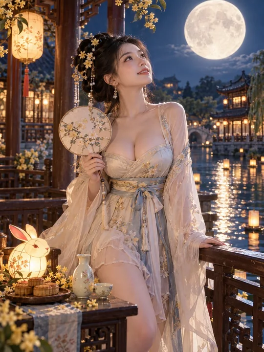
中秋月下古风汉服绝美东亚少女
A stunning 23-year-old East Asian beauty, with a well-proportioned and plump figure, breasts are noticeably and naturally full, visually about F-cup, with a natural sense of weight and soft rounded contours, the difference between chest and
Case 13761
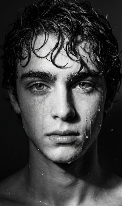
暴雨中质感强烈的黑白戏剧性人像
创作一张戏剧性的黑白特写肖像,营造出忧郁、电影般的氛围。使用高对比度照明,通过深邃的阴影和明亮的高光勾勒出面部轮廓。让拍摄对象看起来湿漉漉的,仿佛刚被雨淋过,脸颊、额头和下颌线上有不规则的水珠和水痕。头发应显得潮湿并略微结块,几缕发丝自然地垂落在脸上。背景保持黑暗和极简,以突出被照亮的面部特征和水珠。整体效果应强烈、富有情感和摄影感——一幅带有真实雨水纹理和戏剧性色调深度的原始、富有表现力的肖像。图像生成
电影感情绪黑白高对比淋雨