Case 26451
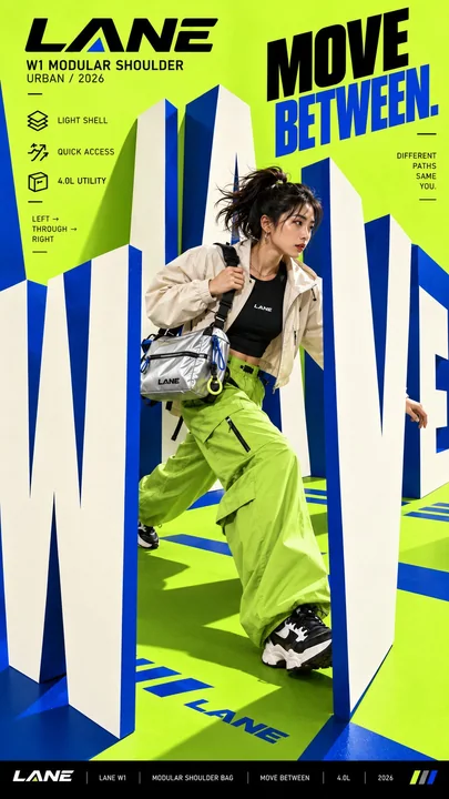
巨型文字物理互动创意海报设计
Prompt
Create a bold editorial campaign poster where oversized typography becomes a physical space the subject can move through and interact with.

Brand: [BRAND NAME]
Product / Campaign: [PRODUCT OR CAMPAIGN]
Main Word: [SHORT WORD]
Subject: [PERSON / PRODUCT / BOTH]
Spatial Action: [VAULT / WEAVE / EDGE / SPIN / OTHER]
Movement: [DESCRIBE THE SUBJECT’S ACTION]
Main Color: [COLOR]
Accent Color: [COLOR]
Aspect Ratio: [9:16]

Use realistic commercial photography, oversized typography, strong perspective, high-contrast colors, and contemporary editorial design.

Make the main word extremely large and transform its letterforms into a believable spatial structure. The subject must physically interact with the typography instead of simply standing in front of it.

Use the selected spatial action as the main visual logic:

 VAULT: turn the letters into obstacles the subject can physically vault over.
 WEAVE: arrange the letters at alternating depths so the subject moves between them.
 EDGE: use narrow letter edges or surfaces as a path the subject carefully moves along.
 SPIN: arrange the typography into a circular or curved track the subject moves around.

Create clear foreground, midground, and background relationships. Let some parts of the typography pass in front of the subject while other letters recede behind them.

Keep the typography clearly readable. Use shallow, controlled depth rather than heavy 3D sculpture. Letter surfaces should be clean, matte, evenly colored, and sharply defined, with no distressed, chipped, dirty, or weathered texture.

All graphic lines, motion paths, callout lines, and curves should be continuous, smooth, and clearly rendered.

Keep the person highly realistic with natural body proportions, believable movement, real skin texture, natural highlights, and detailed hair. Avoid waxy skin, excessive shine, CGI appearance, distorted limbs, oversized hands or feet, and extreme wide-angle deformation.

Use one dominant high-impact color with black, white, and one contrasting accent color. Add only a few meaningful campaign details such as the brand name, product name, slogan, and 2–3 short feature callouts.

The final image should feel like a finished commercial campaign key visual where the typography itself becomes the environment and the subject’s movement explains the word.

创建一张大胆的编辑级活动海报,其中超大排版成为主体可以移动并与之互动的物理空间。

品牌:[品牌名称]
产品/活动:[产品或活动]
主要词汇:[短词]
主体:[人物 / 产品 / 两者]
空间动作:[撑跳 / 穿梭 / 边缘 / 旋转 / 其他]
动作:[描述主体的动作]
主色:[颜色]
强调色:[颜色]
纵横比:[9:16]

使用真实的商业摄影、超大的排版、强烈的透视、高对比度的颜色以及当代的编辑级设计。

使主要词汇变得极大,并将其字母形状转化为可信的空间结构。主体必须与排版进行身体上的互动,而不仅仅是站在它面前。

使用所选的空间动作作为主要的视觉逻辑:

撑跳 (VAULT):将字母变成主体可以身体撑跳过去的障碍物。
穿梭 (WEAVE):将字母排列在交替的深度,使主体在它们之间移动。
边缘 (EDGE):使用狭窄的字母边缘或表面作为主体小心移动的路径。
旋转 (SPIN):将排版排列成主体绕其移动的圆形或曲线轨道。

创建清晰的前景、中景和背景关系。让排版的某些部分经过主体前方,而其他字母则退到他们身后。

保持排版清晰易读。使用浅层且受控的深度,而不是沉重的3D雕塑。字母表面应该是干净、哑光、颜色均匀且轮廓分明的,没有磨损、碎裂、脏污或风化的纹理。

所有图形线条、运动路径、标注线和曲线都应该是连续、平滑且渲染清晰的。

保持人物高度写实,具有自然的身体比例、可信的动作、真实的皮肤纹理、自然的亮部和细节丰富的头发。避免蜡质皮肤、过度的光泽、CGI感、畸形的四肢、过大的手或脚以及极端的广角畸变。

使用一种极具冲击力的主导色,搭配黑色、白色和一种对比鲜明的强调色。仅添加少量有意义的宣传活动细节,如品牌名称、产品名称、口号和2-3个简短的功能标注。

最终图像应该感觉像是一个完成的商业活动关键视觉图,其中排版本身成为了环境,主体的动作解释了单词的含义。
Другие промпты
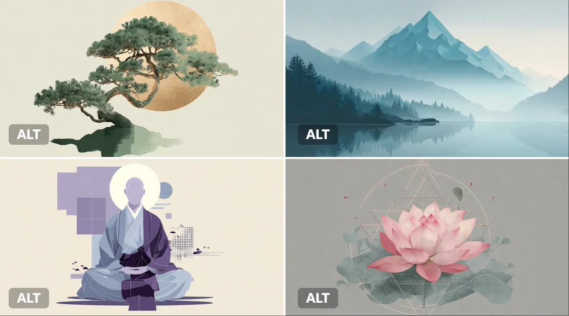
Case 166
Геометрический чан
[ТЕМА], изображённая в стиле геометрического дзен-спокойствия, где важны простота и баланс. Используйте чёткие линии, основные формы и спокойную цветовую палитру из [COLOR1] и [COLOR2], чтобы вызвать ощущение мира и гармонии.
illustration
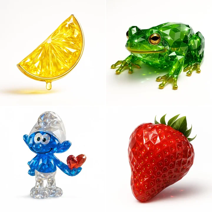
Case 159
Рендеринг драгоценных камней
Создайте это изображение, используя параметры JSON, предоставленные. { "name": "Gemstone Render", "object": { "type": "auto", "detected_color": "auto", "form": "realistic, natural form preserved", "material": "crystal or
naturephotography