Case 26393
巨型文字引力控制商业海报
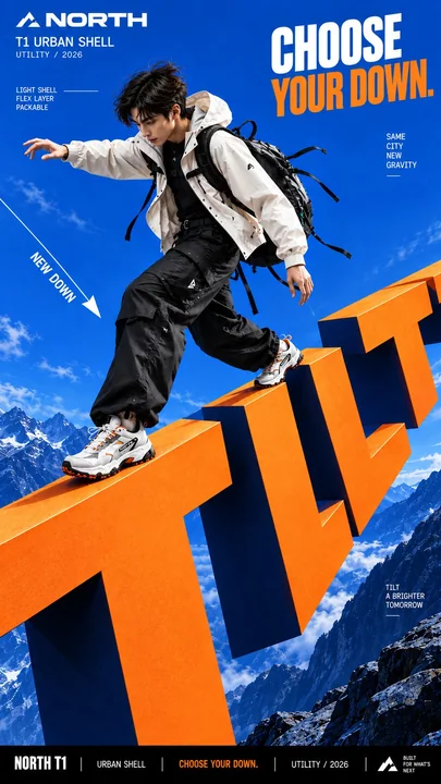
Prompt
Create a bold commercial campaign poster where oversized typography controls gravity and directly affects how the subject moves.

Brand: [BRAND NAME]
Product / Campaign: [PRODUCT OR CAMPAIGN]
Main Word: [SHORT WORD]
Subject: [PERSON / PRODUCT / BOTH]
Gravity Effect: [TILT / DROP / FLOAT / PULL / OTHER]
Movement: [DESCRIBE THE ACTION]
Main Color: [COLOR]
Accent Color: [COLOR]
Aspect Ratio: [9:16]

Use realistic commercial photography, oversized typography, strong perspective, vivid high-contrast colors, and contemporary editorial design.

Make the typography extremely large and let it create a clear gravity effect:

 TILT: rotate the direction of gravity while the normal poster layout stays upright.
 DROP: pull the subject and typography downward, with stronger vertical displacement toward the bottom.
 FLOAT: remove the ground and let the subject, clothing, hair, and typography naturally suspend at different depths.
 PULL: create an opposing force that pulls clothing, hair, straps, or products toward the typography while the subject moves against it.

The body pose, hair, clothing, accessories, shadows, and products must all follow the same gravity logic so the effect feels physically believable.

Create clear foreground, subject, and background layers, with parts of the typography moving in front of and behind the subject.

Keep the main letters crisp, readable, and clean. Use smooth matte surfaces, even color, sharp edges, and controlled depth. Avoid distressed, chipped, dirty, concrete-like, or noisy textures.

All motion paths, gravity lines, curves, and callout lines should be continuous, smooth, and clearly rendered.

Keep people highly realistic with natural anatomy, believable proportions, real skin texture, controlled highlights, and detailed hair. Avoid waxy skin, oily reflections, CGI appearance, distorted limbs, and exaggerated wide-angle proportions.

Use one dominant high-impact color with black, white, and one strong accent color. Add only a few meaningful campaign details such as the brand, product name, slogan, and 2–3 concise feature callouts.

The final image should feel like a finished campaign key visual where typography, gravity, and human movement behave as one physical system.

创建一个大胆的商业活动海报,其中超大号的排版控制着重力,并直接影响主体的移动方式。

品牌:[品牌名称]
产品 / 活动:[产品或活动名称]
主要词汇:[短词]
主体:[人物 / 产品 / 两者结合]
重力效果:[倾斜 / 下落 / 漂浮 / 拉扯 / 其他]
动作:[描述动作]
主色调:[颜色]
强调色:[颜色]
纵横比:[9:16]

使用真实的商业摄影、超大号排版、强烈的透视、鲜艳的高对比度颜色以及当代编辑设计风格。

让排版变得极其巨大,并让其产生明确的重力效果:

 倾斜:旋转重力方向,而普通海报布局保持垂直。
 下落:将主体和排版向下移动,越靠近底部垂直位移越强。
 漂浮:移除地面,让主体、服装、头发和排版自然地悬浮在不同的深度。
 拉扯:产生一种相反的力量,将服装、头发、肩带或产品拉向排版,而主体则逆向移动。

身体姿势、头发、服装、配饰、阴影和产品必须全部遵循相同的重力逻辑,使效果在物理上具有真实感。

创建清晰的前景、主体和背景层,部分排版在主体前后穿插移动。

保持主要字母清晰、易读且整洁。使用平滑的哑光表面、均匀的色彩、锐利的边缘和受控的深度。避免磨损、碎裂、脏污、类混凝土或多噪点的纹理。

所有的运动路径、重力线、曲线和引线都应该是连续、平滑且渲染清晰的。

保持人物高度逼真,具有自然的解剖结构、可信的比例、真实的皮肤纹理、受控的高光和细腻的头发。避免蜡质皮肤、油腻反光、CGI外观、扭曲的肢体和夸张的广角比例。

使用一种极具冲击力的主色调,搭配黑色、白色和一种强烈的强调色。仅添加少量有意义的活动细节,如品牌、产品名称、口号以及 2–3 个简明的功能说明。

最终图像应该感觉像是一个完成的活动主视觉,其中排版、重力和人体运动表现为一个统一的物理系统。
Другие промпты
Case 24812
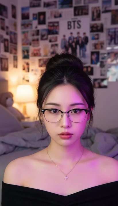
紫色氛围卧室中的黑银框镜东亚少女
A close-up portrait of a young East Asian woman with fair, smooth skin and soft natural makeup, looking directly at the camera with a calm, slightly pouty neutral expression. She has dark brown/black hair styled in a messy half-up half-down
Case 24809
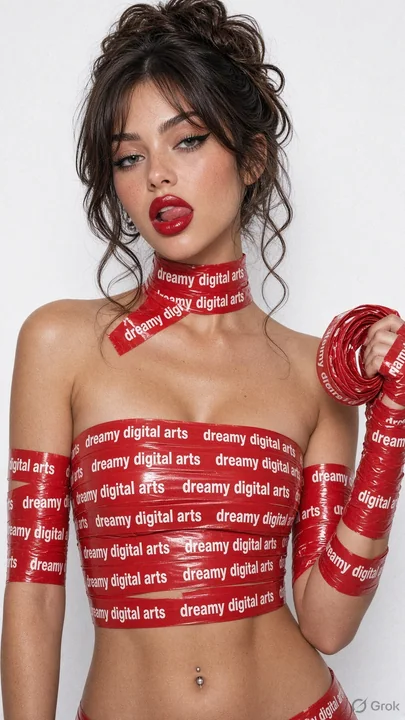
红色警示胶带缠绕的写实少女肖像
{ "subject": "The woman in the attached reference image (DO NOT TOUCH FACE).", "prompt": "Portrait of this girl, DO NOT TOUCH FACE, do not change her appearance, facial features, or hair color even by 1%. Studio photo, slightly cold filter,
Case 26425