Case 24928
影像衍生品牌包装视觉识别海报
Prompt
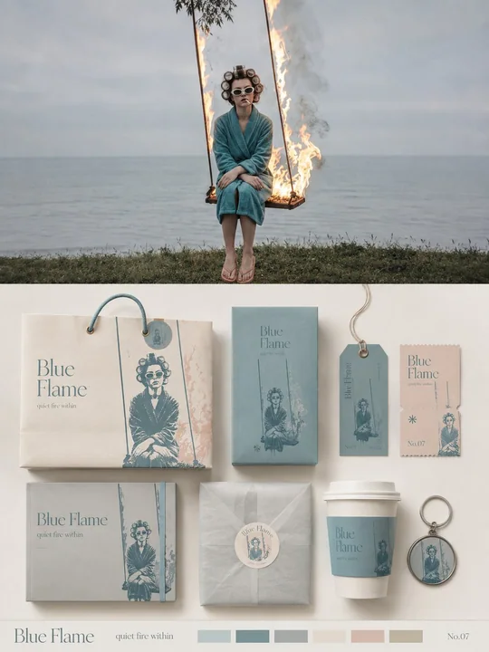
Please turn each photo I upload into an independent high-end design poster, no multi-photo stitching, each photo output individually. The overall composition uses a 3:4 vertical layout, with the upper and lower areas strictly 1:1 in height, each occupying 50% of the frame. The upper half preserves the original photo, maintaining the subject identity, structure, posture, realistic texture, natural lighting, and original color atmosphere, with only slight high-end photographic color grading to give it the texture of art magazines, independent publications, and exhibition photography. To adapt to the frame, the sky, ground, or environmental background can be naturally extended, but the subject must not be stretched, distorted, or changed. The lower half extracts the most recognizable subject, outline, posture, and narrative relationship from the photo, transforming it into a complete brand packaging and material visual system. Do not simply copy the photo; instead, refine the subject's characteristics into reusable core graphics, illustration symbols, patterns, color blocks, or identification elements, and then apply them to packaging carriers of different sizes and purposes, making all materials instantly belong to the same visual family. Automatically select the most suitable 5–8 carriers based on the original image's theme, such as paper bags, packaging boxes, gift sets, labels, tags, tickets, cards, stickers, sleeves, cup packaging, key pendants, wrapping paper, or other related materials, without forcing the use of fixed categories. Use 1–2 main packages as the visual focus, with the remaining materials forming modular combinations based on size, horizontal/vertical ratios, and function; use a clear grid, edge alignment, scale contrast, spacing rhythm, and large areas of white space to organize the frame, like a professional brand design studio's packaging identity presentation board, rather than product displays or messy mockup collages. The color palette remains soft, transparent, and slightly desaturated in high-end tones, mainly light pink-blue, mist blue, sky blue, and airy cool-toned blue, paired with ivory white, cream white, light beige, soft gray-green, and architectural neutral colors, using only a small amount of dusty rose or muted blush as visual accents. Different packaging can change the color area and combination method, but must maintain the same color system to form a rich yet unified sense of series. The material emphasizes realistic and exquisite paper and packaging craftsmanship, showing matte paper, fine-grained paper, thick cardstock, translucent paper, embossing, die-cutting, folding, stickers, partial printing, and slight layering relationships; lighting is soft and natural, only used to express paper thickness, creases, and material differences, avoiding plastic feel, strong reflections, exaggerated 3D, and cheap product rendering. Text is also designed uniformly as part of the entire packaging system. Extract a short English main title from the subject's name, theme, mood, function, or symbolic meaning of the original image, and extend a very small amount of sub-titles, short sentences, numbers, category names, or micro-descriptions. Text can change naturally according to different carriers: vertically arranged on tags, extending along packaging edges, surrounding circular labels, crossing box surfaces, hidden between graphics, or becoming part of the packaging closure structure, so that fonts, graphics, and materials together form a complete brand language, rather than repeating the same title on every item. The overall presentation is a high-end brand packaging system / visual identity proposal board: rich but not crowded, lively but orderly, showing both the complete series and the design logic between graphics, text, materials, and different carriers. Whether the original image is a person, animal, plant, architecture, object, food, vehicle, or natural landscape, a unique packaging language should be established from the original image itself, avoiding fixed product combinations, repetitive templates, e-commerce display feel, and ordinary brand mockup templates.

请将我上传的每一张照片分别制作成一张独立的高级设计海报,不多图拼接,每张照片单独输出。整体采用3:4竖版构图,上下两个区域高度严格1:1,各占画面50%。

上半部分保留原始照片,保持主体身份、结构、姿态、真实质感、自然光影和原有色彩氛围,仅进行轻微高级摄影调色,使其具有艺术杂志、独立出版物与展览摄影质感。为适配画幅,可自然扩展天空、地面或环境背景,但不得拉伸、扭曲或改变主体。

下半部分提取照片中最具识别性的主体、轮廓、姿态与叙事关系,将其转化为一套完整的品牌包装与物料视觉系统。不要简单复制照片,而是把主体特征提炼成可重复使用的核心图形、插画符号、纹样、色块或识别元素,再分别应用到不同尺寸和用途的包装载体中,使所有物料一眼属于同一个视觉家族。

根据原图主题自动选择最合适的 5–8 种载体,例如纸袋、包装盒、套盒、标签、吊牌、票券、卡片、贴纸、封套、杯具包装、钥匙挂件、包装纸或其他相关物料,不强行使用固定品类。以 1–2 个主包装作为视觉重心,其余物料按大小、横竖比例和功能形成模块化组合;使用清晰网格、边缘对齐、尺度反差、间距节奏和大面积留白组织画面,像专业品牌设计工作室的 packaging identity presentation board,而不是商品陈列或杂乱 mockup 拼贴。

配色保持柔和、通透、略微去饱和的高级色系,以浅粉蓝、雾蓝、天空蓝、空气感冷调蓝为主,搭配象牙白、奶油白、浅米色、柔和灰绿和建筑中性色,仅用少量 dusty rose 或 muted blush 作为视觉跳点。不同包装可以改变颜色面积和组合方式,但必须保持同一套色彩系统,形成丰富而统一的系列感。

材质强调真实而精致的纸张与包装工艺,可表现哑光纸、细纹纸、厚卡、半透明纸、压纹、模切、折叠、贴纸、局部印刷与轻微层叠关系;光线柔和自然,只用于表现纸张厚度、折痕和材质差异,避免塑料感、强反光、夸张3D和廉价商品渲染。

文字也作为整个包装系统的一部分统一设计。从原图的主体名称、主题、情绪、功能或象征意义中提炼一个简短英文主标题,并延展出极少量副标题、短句、编号、品类名称或微型说明。文字可以根据不同载体自然变化:竖排于吊牌、沿包装边缘延伸、环绕圆形标签、跨越盒面、隐藏在图形之间或成为包装封口结构的一部分,使字体、图形和材质共同形成完整品牌语言,而不是每件物料重复贴上同一个标题。

整体呈现为一张高级品牌包装系统 / 视觉识别提案板:丰富但不拥挤,活泼但有秩序,既展示完整系列,也能看到图形、文字、材质与不同载体之间的设计逻辑。无论原图是人物、动物、植物、建筑、器物、食物、交通工具或自然景观,都应从原图本身建立独特的包装语言,避免固定产品组合、重复模板、电商展示感和普通品牌 mockup 套版。
مطالب أخرى
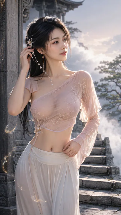
Case 16146
盛唐幻梦:云阶之上的粉罗仙子花灵女修
写实仙气唯美唐风修仙
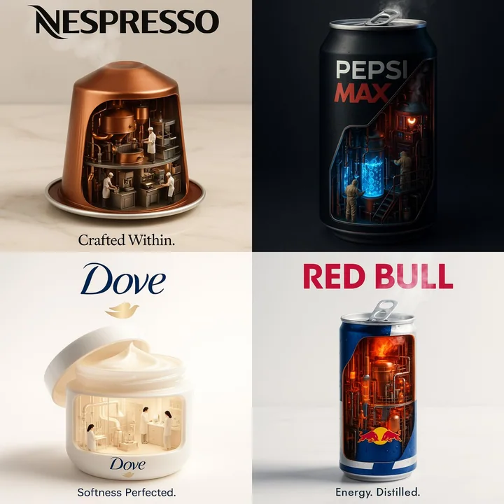
Case 206
إعلانات العلامة التجارية الداخلية الصناعية
أنشئ إعلانًا فائق الواقع، وخيالي بمقاس 1:1 لـ [اسم العلامة التجارية]. حوّل الجزء الداخلي من المنتج إلى مصنع أو مختبر صغير. أظهر التفاصيل الداخلية للنظام: الأنابيب، العمال، السوائل المتوهجة، البخار، والآلات — كلها تعمل لتعكس الغرض الأساسي لل
minimalistphotographyproduct品牌Logo