Case 17707
明亮洁净舞台剧场感图文海报设计
Prompt
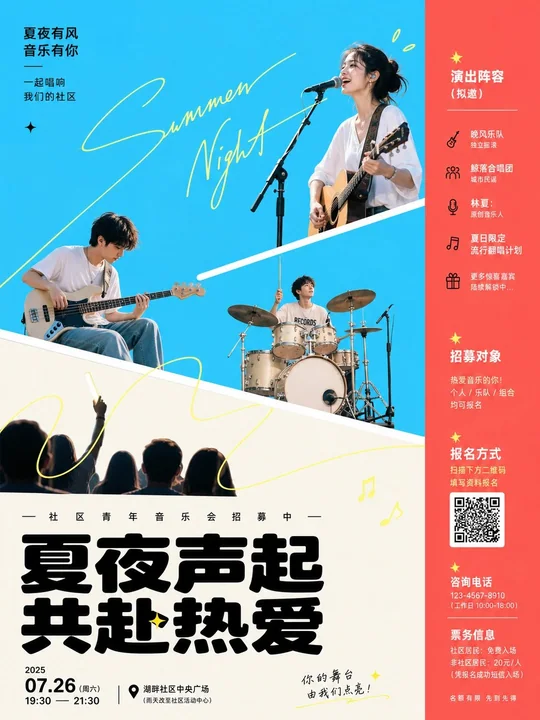
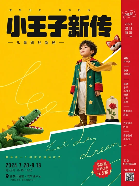
Centered around any subject, adopt a bright and clean theatrical graphic poster treatment: the visual establishes immediate impact with large areas of high-brightness solid color planes; the primary color derived from the subject serves as the main open background, while auxiliary colors use deeper or warmer saturated tones pressed to one side as narrow vertical bars or bottom weight blocks; light bright colors serve as the foreground platform, and deep near-black is used for the core title and a small amount of key information; hues change with the subject, but maintain an emotional tone of high brightness, cleanliness, minimal gradients, minimal textures, and strong color block adjacency, avoiding low-saturation gray mist and complex materials. Use two to three thick white diagonal boundaries to cut the frame into displaced platforms; the boundaries act like a stage proscenium supporting the subject; the characters, products, symbols, or key visuals within the theme are processed as hard-edged photographic cutouts or clear image silhouettes, resting on different heights and different color blocks: a larger lateral element presses down on the lower light-colored block, a central core element sits near the diagonal line, and a small emotional element protrudes from the upper color block; they are not on the same horizon but are strung into a reading path from the bottom left to the top right by the diagonal lines and line of sight. Superimpose a set of ultra-fine handwritten lines in light lemon or a high-brightness neighbor color of the theme; the strokes are relaxed, long loops, passing through objects and blank spaces, partially obscured by the main subject, like an unfinished casual signature rather than a decorative pattern; the lines must cross the background, diagonal lines, and title area to create a light sense of intimacy and spatial continuity. Set a large black local text title at the bottom; the typeface is heavy, low-center-of-gravity, with rounded corners and square folds coexisting, with tight letter spacing but clear internal white space; place a line of small-sized explanatory text with dispersed letter spacing above the title, arrange information such as date and location in the bottom left, and a narrow column of names and tiny ticketing information in the right color bar; all text maintains clear poster printing edges. The overall look is like a digital collage plus a flat theater set, with clean edges, no aging, no paper texture; figures or subject images have a slight photographic compression feel and hard cut edges, making the flatness of the color blocks and the static expression of the real subject form a quiet, slightly staged-distanced contrast.

围绕任意主题对象,采用明亮洁净的演出式图文海报处理:画面以大面积高明度纯色平场建立第一眼冲击,主题派生的主色承担主要开放背景,辅助色以更深或更暖的饱和色压在一侧形成窄竖栏或底部承重块,浅亮色作为前景台面,深近黑用于核心标题和少量关键信息;色相随主题变化,但保持高亮、干净、少渐变、少纹理、强色块邻接的情绪,避免低饱和灰雾和复杂材质。用两到三条粗白色斜向边界把画面切成错位平台,边界像舞台台口一样承托主题对象,主题中的人物、产品、符号或关键视觉被处理成硬边摄影切贴或清晰图像剪影,分别停在不同高度和不同色块上:一个较大的侧向元素压住下方浅色块,一个正面核心元素居中坐在斜线附近,一个小型情绪元素从上方色块探出,彼此不完全同地平线,却由斜线和视线方向串成从左下到右上的阅读路径。叠加一组浅柠檬或主题高明度近邻色的超细手写线条,笔画松弛、长回环、穿过对象与空白,局部被主体遮挡,像未完成的随笔签名而非装饰花纹;线条必须跨越背景、斜线和标题区,制造轻快的亲密感和空间连续性。底部设置大号黑色本地文字标题,字形厚重、低重心、圆角与方折并存,字距紧密但留出清晰内白;标题上方放一行小号分散字距的说明文字,左下排日期地点等信息,右侧色栏排窄列名单与细小票务信息,所有文字保持清楚的海报印刷边缘。整体像数字拼贴加平面剧场布景,边缘干净、无做旧、无纸纹,人物或主题图像带轻微摄影压缩感和硬切边,使色块的平面性与真实主体的静止表情形成安静、略带舞台距离的对照。
更多提示词
Case 15
树屋
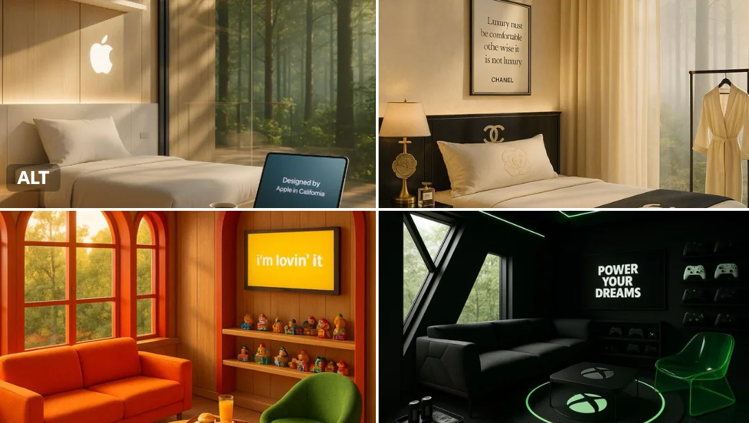
[品牌名称]打造的豪华树屋度假胜地迎来宁静的清晨——金色的阳光透过以品牌标志性色彩装饰的窗户洒入室内。舒适的休息区摆放着充满趣味和主题感的家具,以及一款灵感源自[品牌标志或产品]的圆形地毯。咖啡桌上印有品牌的浮雕标识,墙面屏幕上循环播放着标语:“[品牌口号]”。精心陈列的一系列经典物品唤起怀旧之情。柔和的环境灯光以品牌色调散发出温暖光芒,窗边摆放着盛放特色点心的托盘。这里温馨、充满想象力,并且毫无疑问地彰显着[品牌名称]。
natureproductbranding
Case 1
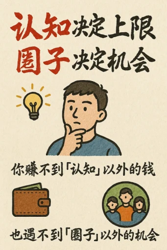
手绘风格的信息图表卡片
创作一张手绘风格的信息图卡片,比例为9:16竖版。卡片主题鲜明,背景为带有纸质肌理的米色或米白色,整体设计体现质朴、亲切的手绘美感。 卡片上方以红黑相间、对比鲜明的大号毛笔草书字体突出标题,吸引视觉焦点。文字内容均采用中文草书,整体布局分为2至4个清晰的小节,每节以简短、精炼的中文短语表达核心要点。字体保持草书流畅的韵律感,既清晰可读又富有艺术气息。 卡片中点缀简单、有趣的手绘插画或图标,例如人物或象征符号,以增强视觉吸引力,引发读者思考与共鸣。 整体布局注意视觉平衡,预留足
illustrationtypographyportraitpaper-craftinfographic