Case 21146
明亮简约包装感甜甜圈产品海报
Prompt
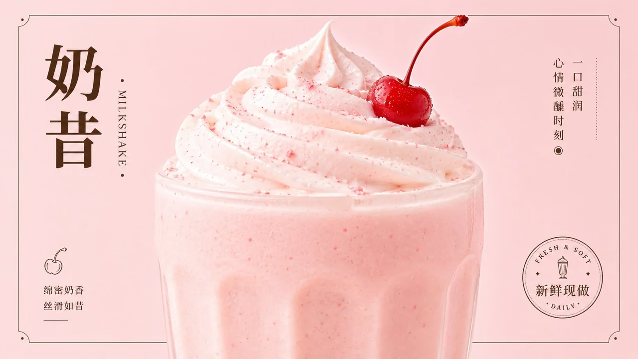
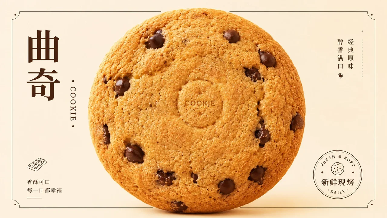
Generate a visual system centered around any subject that is bright, restrained, and has a sense of packaged advertising: the subject content is first distilled into a giant, soft, and approachable central main form, placed close to the center of the frame and clearly overlapping a thin-line frame behind it, drawing the eye into an internal cavity or core white space through radial organization; the cavity maintains the same color scheme or similar brightness as the background, forming a clear figure-ground relationship and Gestalt closure, allowing the viewer to first read a complete, full symbol with a pause before reading the specific subject. The background uses a high-key warm bright color or clean light color derived from the subject's semantics as a large-area single color field; the subject's color is slightly thicker than the background, with subtle grain and soft edges; the light is diffused high-key light, and shadows only lightly press out layers at contact points, keeping the whole clean, transparent, and free of gray or dirty tones. The frame uses dark thin lines, a small amount of vertical or horizontal short copy, and a small circular seal-like information point to establish a traditional packaging order; the main title can use high-contrast Songti or an equivalent stable display font, with a certain glyph or mark echoing the circular structure, but the text must be subordinate to the central main form. Retain the relationship of "giant subject form obstructing the frame, sparse surrounding information enclosure, and bright color field lifting the product mood," avoiding turning elements into scattered collages, thick retro styles, or low-saturation dark posters. This theme: Donut product poster. Aspect ratio 16:9. Note that the above is the content of the first image. Follow the same logic to expand to other color systems and images of other products for this store. A total of 10 products.

围绕任意主题对象生成一种明亮、克制、带包装广告感的视觉系统:主题内容先被提炼成一个巨大、柔软、可亲近的中心主形体,贴近画面中心并明显压过后方细线框架,借由径向组织把视线吸入内部空洞或核心留白;空洞与背景保持同色系或近似明度,形成清晰的图地关系和格式塔闭合,让观者先读到一个完整、饱满、带停顿的符号,再读取具体主题。背景使用主题语义推导出的高调暖亮色或清洁浅色作大面积单一色场,主体颜色比背景略厚、略有细腻颗粒和柔和边缘,光线为漫射高调光,阴影只在接触处轻轻压出层次,整体保持干净、透明、无灰脏感。画面用深色细框、少量竖排或横排短文案、一个小圆章式信息点建立传统包装秩序,主标题可采用高反差宋体或等效的稳重展示字,某个字形或标记与圆形结构呼应,但文字必须从属于中心主形体。保留“巨大主题形体遮挡框架、周围信息稀疏围合、亮色场托起产品情绪”的关系,避免把元素做成散乱拼贴、厚重复古或低饱和灰暗海报。

本次主题: 甜甜圈 产品海报
比例 16:9

___

注意如上是第一张图片的内容

你同样的逻辑,拓展其他色系,这个店铺其他产品的图片。
一共10个产品
更多提示词
Case 28067
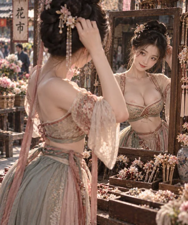
半臂宫衣花市挑簪细腰美态
Half-sleeved palace dress; clear shoulder lines; fabric naturally supported by the body shape; large area of skin exposed on the chest, slender waist is evident; clear waist-to-hip ratio; picking hairpins at a flower market; bowing head to

Case 23868
手机闪光灯质感复古美学女性肖像
Ultra-realistic close-up beauty portrait of a stunning young woman, captured with an iPhone / digital camera aesthetic using direct on-camera flash in a dark indoor setting. Glamorous candid beauty shot with soft lens glow, subtle flash blo
Case 14412