Case 27768
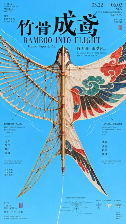
中轴夹景动势文化海报设计
Prompt
[Subject]: ____
[Chinese Title]: ____
[English Title]: ____
[Central Hard Axis]: ____
[Left and Right Visual Power]: ____ / ____
[Repeating or Radiating Elements]: ____
[Movement Mode]: Radiating / Diagonal / Repetitive Rhythm / Ripple / Tension / Other____
[Primary Color Tone]: ____
[Secondary Colors]: ____
[Research Node]: ____
[Aspect Ratio]: 9:16

Generate a "Center Axis Framing" cultural poster with strong momentum and a mature Editorial Design temperament.

First, establish a clear, stable central hard axis, which can be a ship hull, bamboo spine, arrow, vessel structure, or other longitudinal main body; then let the repeating elements, arcs, diagonal lines, or ripples on the left and right sides together press the visual power toward the center.

The left and right elements are not just decorations, but must truly participate in the sense of direction and rhythm. Use oar arrays, skeletons, bow bodies, sound waves, wings, rods, etc., to form a continuous visual sequence, creating momentum through repetition, radiation, inclination, and scale changes.

The image must have a very clear first visual big shape: the central hard axis + the directional structures on both sides. The visual weight on the left and right should remain balanced, but do not make it a mechanical mirror image; allow for changes in angles, scales, materials, and rhythms.

Typography is redesigned according to the direction of the main body, it can span structures, stay close to the hard axis, align along the big shape, or be partially offset; do not fixedly use four-character vertical arrangement, giant single character centered, or the same title template.

A very small structural research module can be added, such as action stages, forces, ripples, skeletons, or path diagrams, with the area controlled at 5%–7%, adding a "sense of design research," but do not make it into a PPT or instructional diagram.

Control colors to 3–5 main colors, using clear large color gamuts and strong main body contrast.

The first eye sees the big shape and momentum, the second eye sees the central axis and title, and the third eye discovers how the elements on both sides together create direction and tension.

Avoid: mechanical symmetry, complete duplication of repeating elements, the main subject being too small, confused directions, multiple visual centers, complex technical parameters, PPT info boxes, random decorative lines, excessive aging, mottled noise, and a low-completion AI poster feel.

【主题】:____
【中文标题】:____
【英文标题】:____
【中央硬轴】:____
【左右视觉力量】:____ / ____
【重复或放射元素】:____
【运动方式】:放射 / 斜向 / 重复节奏 / 波纹 / 张力 / 其他____
【主色调】:____
【辅助色】:____
【研究节点】:____
【画面比例】:9:16

生成一张具有强动势和成熟 Editorial Design 气质的「中轴夹景」文化海报。

先建立一条明确、稳定的中央硬轴,可以是船身、竹脊、箭矢、器物结构或其他纵向主体;再让左右两侧的重复元素、弧线、斜线或波纹共同把视觉力量压向中央。

左右元素不只是装饰,而要真正参与方向感和节奏。可以使用桨阵、骨架、弓身、声波、羽翼、杆件等形成连续视觉序列,通过重复、放射、倾斜和尺度变化制造动势。

画面要有一个非常清楚的第一视觉大形:中央硬轴 + 两侧方向性结构。左右视觉重量保持平衡,但不要机械镜像,允许角度、尺度、材质和节奏存在变化。

Typography 根据主体方向重新设计,可以横跨结构、贴近硬轴、沿大形排布或局部错位,不要固定使用四字纵排、巨大单字居中或同一种标题模板。

可加入一个很小的结构研究模块,例如动作阶段、受力、波纹、骨架或路径示意,面积控制在 5%–7%,增加“设计研究感”,但不要做成 PPT 或教学图。

色彩控制在 3–5 个主要颜色,使用明确的大色域和强主体反差。

第一眼看到大形和动势,第二眼看到中轴和标题,第三眼发现两侧元素如何共同制造方向与张力。

避免:机械对称、重复元素完全复制、主体过小、方向混乱、多个视觉中心、复杂技术参数、PPT 信息框、随机装饰线、过度做旧、斑驳噪点和低完成度 AI 海报感。
Другие промпты
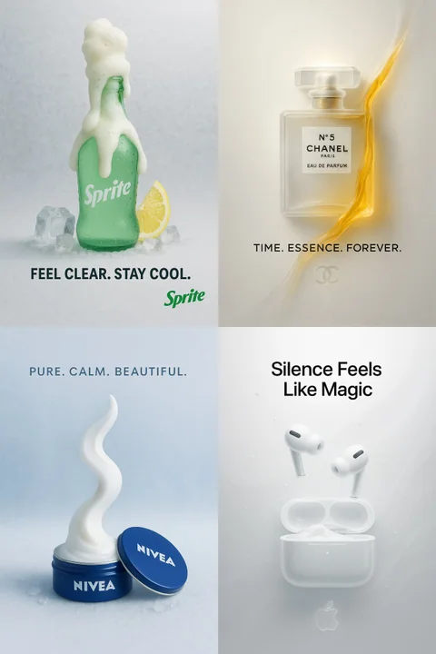
Case 21
Продукт превращается в бумажное стекло
[Продукт от Бренда] в сюрреалистичной минималистичной рекламе из бумаги и стекла. Продукт находится в центре, изготовлен из полупрозрачного матового стекло-бумаги, размещён на чистом белом или слегка окрашенном фоне. Мягкий кинематографичес
minimalistproductpaper-craftposterbranding
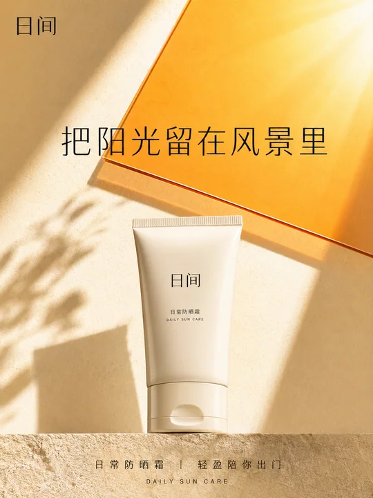
Case 18940
几何光影交错的高端美妆防晒海报
极简风格商业海报几何光影美妆摄影