Case 13318
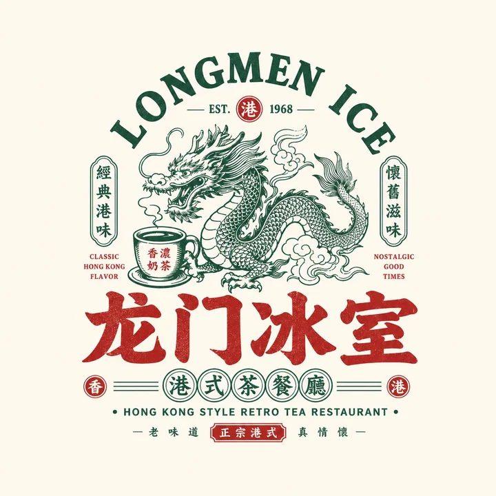
National trend retro restaurant badge logo design prompt words
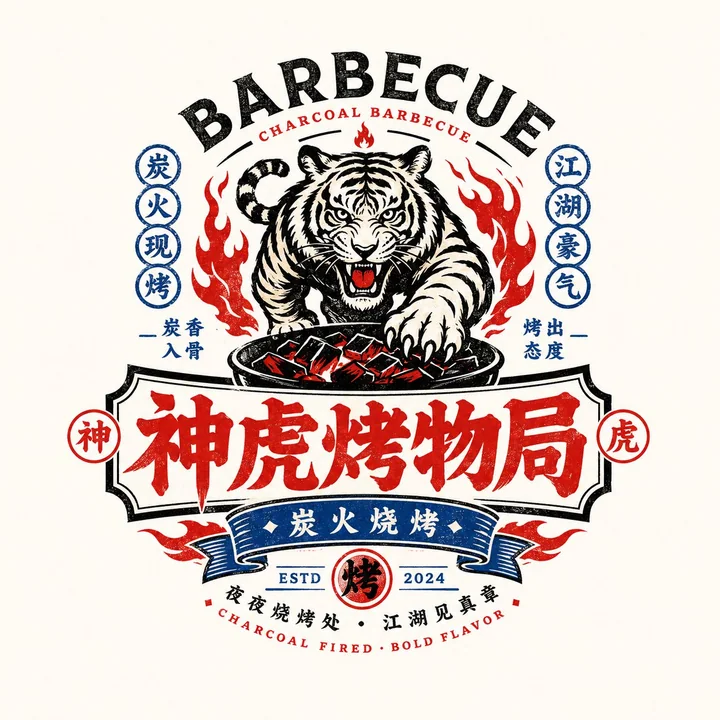
Prompt
Please design a high-quality “Chinese Retro Food Emblem Logo” based on the following user-provided configuration:

[User Input]
- Brand Name / Project Name: [Brand Name / Project Name]
- Subtitle / Product Name: [Subtitle / Product Name]
- Type / Industry: [Type / Industry]
- Regional Flavor: [Hong Kong / Cantonese / Hunan / Sichuan / Charcoal Grill / Night Market / Cha Chaan Teng / Roast / Seafood / Bistro, etc.]
- Brand Positioning: [Brand Positioning]
- Core Keywords: [Retro, Guochao, Storefront Signboard Vibe, Time-Honored Brand Feel, Bustling Street Life, Wuxia/Jianghu vibe, New Consumer Feel, etc.]
- Core Graphic: [Dragon / Phoenix / Crane / Tiger / Ox / Frog / Goose / Fish / Lobster / Utensils / Totems / Auspicious Patterns, etc.]
- Core Food / Category Element: [Roast Goose / BBQ / Tea Drinks / Lobster / Noodles / Beef / Ice Room / Bistro, etc.]
- Emotional Tone: [Lively, Bold, Retro, Classic, Regional, Bustling, Youthful, etc.]
- Main Color: [Main Color]
- Secondary Color: [Secondary Color]
- Aspect Ratio: [Aspect Ratio]

[Core Objective]
Design a truly brand-ready “Chinese Retro Food Emblem Logo” for a dining business. This is not a regular poster, not a simple cartoon illustration, and not just a few words. Center the design around the main Chinese wordmark, integrating a strong recognizable graphic, food-category symbols, retro bilingual typography, and a complete emblem-style structure to create a dining logo with strong storefront presence, packaging presence, brand-system coherence, and communication value.

The final result should immediately communicate:
1. This is a food/dining brand;
2. It has a clear category and personality;
3. It feels like a mature primary brand logo rather than a decorative graphic.

[Design Essence]
The core of this type of logo is not a single graphic or a single font, but the integration of five layers:
1. Main Chinese wordmark: responsible for brand recognition;
2. Graphic symbol: responsible for memorability and category association;
3. Emblem structure: responsible for overall completeness;
4. Chinese-English typography: responsible for hierarchy and retro brand atmosphere;
5. Color system: responsible for reinforcing dining tone and category emotion.

[Most Important Principles]
1. The Chinese brand name must be striking, clear, and have strong storefront signboard presence;
2. The logo must be a complete unified identity, not a collage of scattered elements;
3. The graphic must relate to the brand name or food category, not decoration for decoration’s sake;
4. English is auxiliary and Chinese is primary; English must not overpower the Chinese text;
5. The overall design must clearly belong to a dining brand and be suitable for storefronts, menus, packaging, and social media avatars;
6. The visual must feel retro without looking old-fashioned, dirty, cluttered, or lacking modern brand polish;
7. It must have a true “Guochao retro dining emblem” flavor, not an American cartoon style or Japanese shop-sign style.

[Chinese Wordmark Requirements]
1. The Chinese brand name is the absolute protagonist;
2. The font should evoke retro food signboards, old packaging, or Guochao headline styling;
3. It may be heavy, bold, with a Heiti / Songhei / commercial hand-lettered feel;
4. Moderate custom modification is allowed, but legibility must remain strong;
5. Do not use minimalist thin fonts, weak fonts, or generic system fonts;
6. It must feel suitable for storefront signage and brand identity use.

[Graphic System Requirements]
Please design a main graphic highly related to the [Core Graphic] and [Category Element].
Possible directions include:
- Animals / mythical beasts: dragon, phoenix, tiger, ox, goose, fish, frog, crane, etc.;
- Ingredients / dishes: lobster, roast goose, beef, noodle bowl, flame, teacup, etc.;
- Traditional motifs: seals, patterns, plaques, auspicious symbols;
- Utensils / scene symbols: grill racks, flames, bowls and chopsticks, ice room elements, etc.

Graphic requirements:
1. It must be memorable;
2. It must have a clear relationship with the category and the brand name;
3. It should not be overly complex or hyper-realistic;
4. It must be suitable for integration with the wordmark into an emblem;
5. It may lean toward retro illustration, woodcut style, vintage trademark style, or Guochao line-art style.

[Emblem Structure Requirements]
Please construct the overall design as a complete “dining brand emblem logo,” rather than a simple horizontal layout.
Possible structures:
1. Arched English on top + central graphic + Chinese main wordmark below;
2. Large central graphic + side badges + subtitle below;
3. Circular seal / oval seal / plaque-style composition;
4. Central main graphic + top and bottom text tiers;
5. Symmetrical layout + small stamps + small round badge system;
6. Old signboard / vintage trademark / packaging-master-logo style layout.

[Chinese-English Typography Requirements]
1. Chinese should dominate and English should support;
2. English can be used for an arched title, category name, store type, slogan, year, ESTD, etc.;
3. English should participate in the composition to enhance the retro trademark feel;
4. English does not need to be excessive, but should be refined, clear, and serve the overall structure;
5. Examples include:
   - HOUSE
   - TAVERN
   - BARBECUE
   - ROAST GOOSE
   - TEA RESTAURANT
   - LOBSTER HOUSE
   - ESTD / SINCE / CLASSIC / SPECIALTY
6. Do not let the English overpower the Chinese or turn it into a purely English brand.

[Supporting Elements]
You may add a small number of supporting elements to enhance the brand-system feel, such as:
- ESTD year
- Small circular stamps
- Small icons
- Small labels
- Small seals
- Regional descriptors
- Category descriptors
- Horizontal lines / dotted separators / small borders
- Small slogan text

But these must be restrained and should not make the design look like a complex poster.

[Color Requirements]
Please choose a more suitable Guochao retro dining color system based on the brand category, for example:
1. Black + Red: barbecue, braised foods, roast, bistro;
2. Black + Gold / Bronze: time-honored brands, deli foods, roast goose, Cantonese dining;
3. Green + Red + Cream: Hong Kong-style cafés, Cha Chaan Teng;
4. Blue + Red + White: seafood, lobster, younger night-market dining;
5. Black + Blue: younger, cooler late-night dining or bistro;
6. Red + Cream: old Changsha noodles, traditional snacks, etc.

Requirements:
- The colors should feel like a dining storefront sign;
- Do not use too many colors; 2–4 main colors is the safest range;
- High-saturation accents can improve eye-catching impact, but overall unity must be controlled.

[Visual Presentation Requirements]
1. This is a standalone logo presentation image, not a menu poster;
2. The background should be simple, preferably light gray-white, cream, paper white, or a clean light backdrop;
3. The logo itself should be complete, clear, and centered;
4. The structure should be complete and the information should have hierarchy;
5. The overall result should look like a mature primary logo proposal for a dining brand.

[Style Keywords]
Guochao Retro Dining Emblem Logo, Chinese Retro Food Emblem Logo, dining brand, vintage trademark, old signboard, brand emblem, Chinese-English mixed typography, Guochao wordmark, dining master logo, storefront feel, packaging feel, time-honored brand feel, new-consumption dining.

[Acceptance Criteria]
Please ensure the final result meets the following:
1. It is immediately recognizable as a dining brand;
2. The Chinese main wordmark is bold and easy to recognize;
3. The graphic has a clear relationship with the brand name / category;
4. The emblem structure is complete;
5. The Chinese-English typography has hierarchy;
6. The color palette has the temperament of a food/dining brand;
7. It is suitable for storefronts, menus, packaging, stickers, delivery avatars, and social media hero images;
8. The overall result has the mature commercial feel of a “Guochao retro dining emblem.”

[Output Requirement]
Please ultimately output a high-finish “Chinese Retro Food Emblem Logo.” It must center on the Chinese brand name, combining retro graphic elements, a Chinese-English supporting system, emblem-style composition, and clear category attributes to form a truly brandable, communicable, and production-ready dining brand identity.
More prompts

Case 24308
颐和园联名杜蕾斯荷影微澜情趣用品设计
极简工业设计产品摄影国潮美学
Case 21714
同一人物角色设定图生成指令
Please use the person/character in the attached image as the most important reference to create a character setting sheet that looks like the same person/character. If the attached image is in a photorealistic style, maintain the photoreal