Case 25629
电影感氛围感叙事肖像海报提示词
Prompt
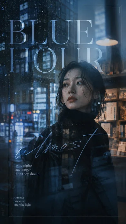
Create a 9:16 cinematic portrait poster built around atmosphere, light, reflection and emotional typography.

Start with a strong film-like portrait rather than a posed fashion photo. The subject should feel caught inside a real moment — looking through glass, standing in reflected city light, separated by shadow, or partially hidden by the environment. Keep natural skin texture, believable hair, expressive eyes and realistic lighting.

Use one main visual interference to shape the mood. This could be rain on glass, an incomplete reflection, a strong light leak, hard leaf shadows, a split moment between two portraits, soft bloom or controlled foreground blur. The effect should change how the portrait is perceived rather than simply decorate it.

Let part of the image remain clear while another part becomes hazy, reflected, overexposed or partially obscured. Controlled imperfection is important — the viewer should not see everything immediately.

Keep the color grading cinematic and distinctive. Cool blue, cyan, moss green, olive, steel grey or other restrained tones can dominate, while skin remains natural. Avoid muddy shadows and overly yellow or orange grading.

Typography should behave like part of the image. Mix an elegant serif or clean sans serif with one expressive handwritten phrase. Let text cross reflections, fade into light, overlap faces, extend beyond the frame or move across two photographic layers. Do not place every line neatly in empty space.

Keep supporting copy minimal — one strong title, one handwritten phrase and one short emotional sentence are enough.

The final image should feel somewhere between a film still, an art-house movie poster and a fashion editorial: atmospheric, intimate, visually layered and emotionally unresolved.

Avoid generic portrait layouts, excessive small text, rigid sidebars, fake movie credits, heavy UI graphics, random effects, image numbering, Vol./Issue labels, four-point sparkle symbols, logos and watermarks.

创建一个 9:16 的电影感人像海报,围绕氛围、光影、反射和情感化排版构建。

首先从一张充满电影感的肖像开始,而不是摆拍的时尚照片。主体应该感觉像是被捕捉在真实的瞬间中——透过玻璃观察、站在反射的城市灯光中、被阴影隔开,或者部分隐藏在环境中。保持自然的皮肤纹理、真实的头发、富有表现力的眼睛和写实的光影。

使用一种主要的视觉干扰来塑造情绪。这可以是玻璃上的雨滴、不完整的反射、强烈的漏光、硬朗的叶影、两张人像之间的瞬间切分、柔和的光晕或受控的前景模糊。这种效果应该改变人像被感知的方式,而不仅仅是装饰它。

让图像的一部分保持清晰,而另一部分变得模糊、反射、过度曝光或部分遮挡。受控的不完美很重要——观众不应该立刻看清一切。

保持电影感且独特的调色。冷蓝色、青色、苔藓绿、橄榄色、钢灰色或其他克制的色调可以占主导地位,而皮肤保持自然。避免浑浊的阴影和过度偏黄或偏橙的调色。

排版应该表现得像图像的一部分。将优雅的衬线体或简洁的无衬线体与一个富有表现力的手写短语结合起来。让文字穿过反射、淡入光影、与面部重叠、延伸到画框之外或跨越两个摄影图层。不要将每一行文字都整齐地放在空白处。

保持辅助文字极简——一个强有力的标题、一个手写短语和一个简短的情感句子就足够了。

最终图像的感觉应该介于电影剧照、艺术电影海报和时尚编辑之间:有氛围感、亲密感、视觉层次丰富且情感上尚未定论。

避免通用的肖像布局、过多的微小文字、生硬的侧边栏、虚假的电影演职员表、厚重的 UI 图形、随机效果、图像编号、Vol./Issue 标签、四角星闪烁符号、标志和水印。
More prompts
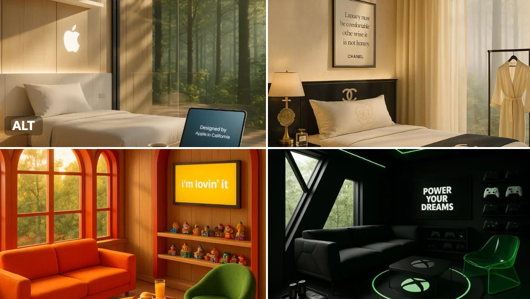
Case 15
Treehouse
A quiet morning in a luxury treehouse retreat created by [BRAND NAME] — golden light pours through windows framed in the brand’s signature colors. A cozy seating area features playful, thematic furniture, and a circular rug inspired by [BRA
natureproductbranding
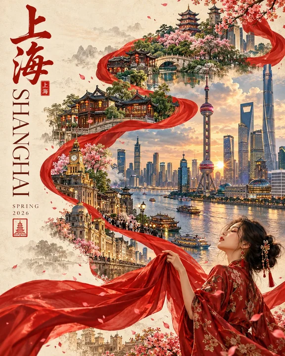
Case 28481
现代丝带流转旅游插画海报
Create a premium 4:5 vertical editorial travel poster for [COUNTRY / CITY / LOCATION], blending contemporary digital illustration, traditional cultural elegance, and refined Asian-inspired design. CORE CONCEPT: A flowing scarlet silk ribbo