Case 24599
CITRUS POP 柑橘软糖商业摄影广告海报
Prompt
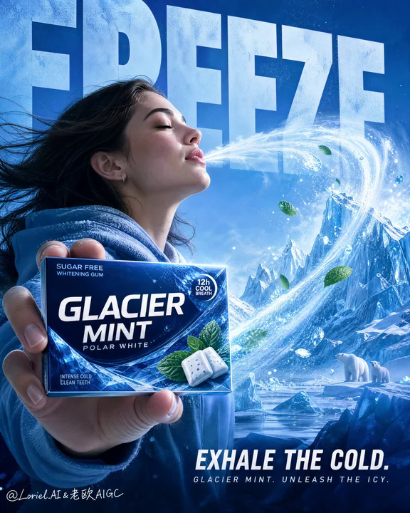
Create a flagship commercial advertising poster for an original chewy fruit-candy brand named "CITRUS POP", combining Orbit energy with Port symbol power. Use ultra-realistic product photography with premium FMCG compositing, not illustration, not 3D cartoon render. Keep the same core structural logic: a vivid orange full-frame poster, one joyful young woman in the left-center immersed in a burst of fruity freshness, one hero candy roll held forward in her hand as the absolute product focus, giant oversized background typography, explosive juice motion around the frame, sliced oranges and glossy candy pieces suspended in motion, and a clean minimal benefit strip along the bottom. The candy roll must remain the absolute product hero at all times.

Style lock: high-energy FMCG candy advertising, ultra-clean commercial realism, crisp pack-shot quality, premium fruit-fresh concept, product-first hierarchy, saturated citrus-orange palette, polished studio portrait integration, globally launch-ready campaign visual.

Core composition: one realistic young woman positioned left-center in three-quarter view, head tilted slightly back, eyes gently closed, expression refreshed and euphoric. Her near hand extends the candy roll toward camera in the lower-left foreground, and the pack must be the sharpest, clearest, and most readable object in the entire image. Behind her, a giant oversized freshness word occupies the upper background as an architectural graphic layer. Around the woman and product, build one strong circular citrus eruption that wraps the scene and visually returns to the candy roll.

Port logic: turn the combination of the candy roll and the orange burst ring into the brand’s super-symbol. The product should feel like the core source of the citrus explosion, while the surrounding circular juice-and-fruit arc becomes its signature energy halo. The viewer should remember the image as "the candy roll inside the orange burst." The symbol must feel ownable, immediate, and iconic.

Orbit logic: shape the splash, fruit slices, floating dragees, droplets, and flowing hair into one coherent circular motion path. The eye should begin at the hero pack, rise through the woman’s face, sweep into the giant headline, circle through the orange burst ring, and resolve back at the product. The motion must feel juicy, explosive, and controlled, never chaotic.

Product concept: redesign the product as "CITRUS POP Orange Chews", a chewy fruity fresh candy roll with bright citrus energy. The pack should be premium, playful, and globally shelf-ready, with a white-and-cobalt master wordmark, glossy orange wrapper ends, fresh citrus cues, and compact claims such as "juicy chew" and "bursting orange". All text must be original.

Female character: one realistic young adult woman with natural anatomy, correct hand structure, five fingers only, realistic skin texture, soft pores, natural lips, believable eyelids, and dynamic flowing hair. She wears a fresh orange-toned jacket or hoodie. Her pose must feel natural and open, with one hand presenting the pack and the body visually connected to the citrus burst.

Lighting: bright warm commercial lighting with a soft frontal key light on the face and product pack, plus glowing citrus backlight through the splash ring. Use crisp highlights on the candy roll, glossy droplets, orange pulp, and wet surfaces. Keep shadows soft and controlled. No muddy oranges, no dead black zones.

Materials and realism: realistic candy roll wrapper print, crisp foil-and-paper texture, believable hand grip, natural skin rendering, semi-translucent juice splash, juicy orange flesh texture, glossy candy dragees, sparkling droplets, and energetic yet physically coherent fluid motion. Every element must obey premium advertising lighting logic.

Typography and layout: use original English text only, never copy any existing wording. Place one giant top background word such as "BURST" or "FRESH" in oversized bold lettering. Add a central slogan such as "CHEW THE SUN." or "UNWRAP THE BURST." Add one compact circular seal with short copy such as "bursting with orange". Along the bottom, place a minimal benefit strip with concise labels such as "fruity fresh", "juicy chew", "long-lasting", and "shareable joy". Typography must be bold, architectural, and secondary to the candy roll.

Color strategy: dominant electric orange, citrus gold, warm tangerine, white highlights, cobalt brand lettering, and tiny green leaf accents. Keep the palette saturated, joyful, premium, and tightly controlled.

Quality and physical rules: extremely sharp hero pack, readable label, correct hand anatomy, believable splash flow, clean edge separation, premium citrus detail, no clutter, no warped pack, no deformed face, no extra fingers, no muddy gradients, no low-resolution fluid effects. The candy roll and its orange burst ring must remain the strongest visual sales trigger at all times.

Negative prompt: copied branding, copied slogan, weak product hierarchy, blurry pack, unreadable label, distorted hand, extra fingers, fused fingers, plastic skin, deformed face, muddy orange background, chaotic splash effects, excessive fantasy clutter, cheap retail flyer aesthetic, cartoon rendering, CGI toy look, low-resolution pack detail, product losing dominance.

为名为“CITRUS POP”的原创嚼劲水果糖品牌创作一张旗舰商业广告海报,结合 Orbit 能量与 Port 符号力量。使用超写实产品摄影与高端快消品(FMCG)合成技术,而非插图,也不是 3D 卡通渲染。保持相同的核心结构逻辑:一张生动的全画幅橙色海报,左中位置有一名沉浸在水果新鲜爆发中的愉悦年轻女性,手中向前握着一卷作为绝对产品核心的主视觉糖果卷,背景有巨大的超大号版式,画框周围有爆发性的果汁动态,悬浮着切开的橙子和光泽的糖果块,底部有一条简洁精干的效益条。糖果卷在任何时候都必须保持为绝对的产品主角。

风格锁定:高能量快消品糖果广告,超洁净商业现实主义,清晰的包装拍摄质量,高端水果新鲜概念,产品优先层级,饱和的柑橘橙色调,精致的摄影棚人像结合,全球发布的活动视觉。

核心构图:一名真实的年轻女性位于左中位置,呈现四分之三侧面观,头微后仰,双眼微闭,表情清新愉悦。她靠近的这只手向镜头伸出糖果卷,位于左下方前景,包装必须是整个图像中最锐利、最清晰、最易读的物体。在她身后,一个巨大的超大号新鲜单词作为建筑图形层占据上方背景。环绕着女性和产品,构建一个强大的圆形柑橘喷发,包裹整个场景并视觉上回归到糖果卷。

Port 逻辑:将糖果卷与橙色喷发环的组合转化为品牌的超级符号。产品应该感觉像是柑橘爆炸的核心源头,而周围的圆形果汁和水果弧线则成为其标志性的能量光环。观众应该将该图像记忆为“橙色喷发中的糖果卷”。该符号必须具有归属感、即时感且具象化。

Orbit 逻辑:将喷溅、水果片、漂浮的糖粒、水滴和飘动的头发塑造成一条连贯的圆周运动路径。视线应从主角包装开始,穿过女性的面部上升,扫入巨大的标题,绕过橙色喷发环,并重新回到产品上。动态必须感觉多汁、爆发且受控,绝不混乱。

产品概念:将产品重新设计为“CITRUS POP Orange Chews”,一种带有明亮柑橘能量的嚼劲水果新鲜糖果卷。包装应该是高端、俏皮且全球上架可用的,带有白蓝相间的主字标、光泽的橙色包装边缘、新鲜的柑橘暗示,以及如“juicy chew”和“bursting orange”等简短声明。所有文字必须是原创的。

女性角色:一名真实的年轻女性,具有自然的解剖结构,正确的手部结构,仅五根手指,真实的皮肤纹理,细腻的毛孔,自然的嘴唇,可信的眼睑,以及动态飘动的头发。她穿着一件新鲜橙色调的外套或连帽衫。她的姿势必须感觉自然大方,一只手展示包装,身体在视觉上与柑橘喷发相连。

灯光:明亮的暖色商业灯光,面部和产品包装上有柔和的前部主灯,加上穿过喷溅环的柔和柑橘背光。在糖果卷、光泽的水滴、橙子果肉和湿润表面上使用清晰的高光。保持阴影柔和受控。没有浑浊的橙色,没有死黑区域。

材质与写实感:真实的糖果卷包装印刷,清晰的箔纸与纸张纹理,可信的手部握持,自然的皮肤渲染,半透明的果汁喷溅,多汁的橙子果肉纹理,光泽的糖果颗粒,晶莹的水滴,以及充满能量但物理连贯的流体运动。每个元素都必须遵循高端广告灯光逻辑。

版式与布局:仅使用原创英文文本,绝不复制任何现有措辞。在上方背景放置一个巨大的单词,如“BURST”或“FRESH”,采用超大号粗体字。添加一个中央口号,如“CHEW THE SUN.”或“UNWRAP THE BURST.”。添加一个紧凑的圆形印章,带有如“bursting with orange”等简短文案。沿底部放置一个极简的效益条,带有如“fruity fresh”、“juicy chew”、“long-lasting”和“shareable joy”等简洁标签。版式必须大胆、具有建筑感,且次于糖果卷。

色彩策略:主导性的电光橙、柑橘金、暖橘红、白色高光、钴蓝色品牌字标和微小的绿叶装饰。保持色调饱和、愉悦、高端且受到严格控制。

质量与物理规则:极其锐利的主角包装,可读的标签,正确的手部解剖,可信的喷溅流向,清晰的边缘分离,高端的柑橘细节,不杂乱,包装不变形,面部不畸形,没有多余手指,没有浑浊渐变,没有低分辨率流体效果。糖果卷及其橙色喷发环在任何时候都必须保持最强的视觉销售触发力。

负面提示:复制的品牌,复制的口号,薄弱的产品层级,模糊的包装,不可读的标签,扭曲的手部,多余的手指,融合的手指,塑料皮肤,畸形的面部,浑浊的橙色背景,混乱的喷溅效果,过度的幻想杂物,廉价的零售传单美学,卡通渲染,CGI 玩具感,低分辨率包装细节,产品失去主导地位。
他のプロンプト

Case 11169
日焼けた金髪の美女がプールサイドでくつろぐ
{ "ar": "9:16", "subject": { "type": "成年女性", "age": "20 多岁", "character_outline": "健美身材(肩部/手臂线条分明,腰肢纤细,臀部曲线优美),肤色白皙,略带健康的暖色晒痕,柔和的女性面部,下颌线清晰,颧骨高耸,胸部非常丰满(胸部饱满,重量和形状真实自然)", "hair": "铂金色长发,自然散落,蓬松柔软,脸颊周围发丝略带风吹效果", "expression": "平静,略显无聊/中性", "g
慵懒辣妹度假泳池缪缪
Case 28078
高级社论排版海报设计指令
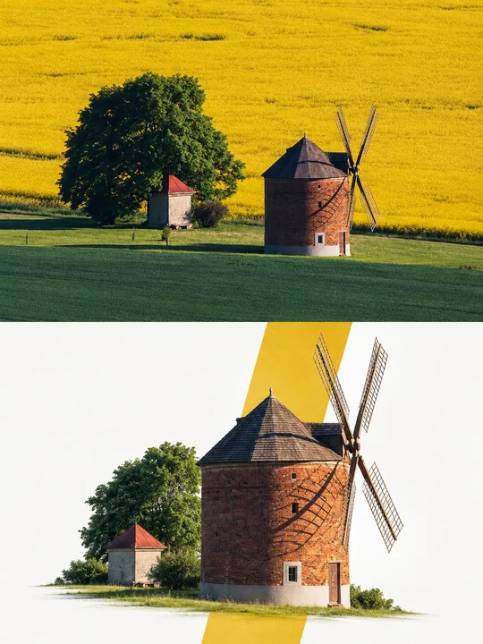
Premium Editorial Poster Instructions Each uploaded photo must be made into a separate, independent, premium editorial poster, and multiple photos must not be combined. Use a strict 3:4 vertical canvas. Split the canvas horizontally in the