Case 20499
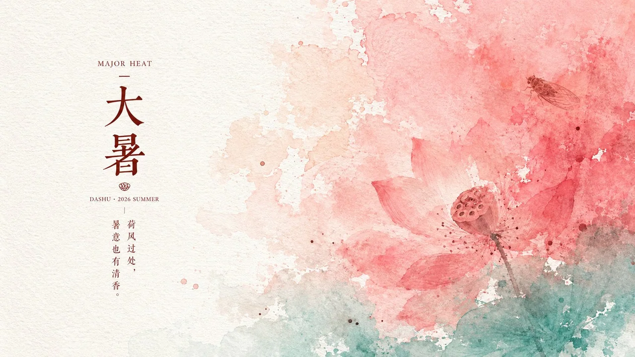
大暑节气清透纸面水彩海报
Prompt
Generate a clear paper-based poster around any theme or subject: let the core emotion of the theme first transform into large areas of wet color washing, naturally flowing in from one side or the top of the frame, covering the main visual weight, with edges showing irregular forms of watercolor infiltration, pigment deposition, translucent layered dyeing, and local white space tearing; the other side retains large blocks of near-white paper surface, allowing the text groups to rest quietly near the junction of white space and color washing, forming an asymmetrical balance between vibrant color blocks and breathing space. Colors are derived from the theme, maintaining a bright and clean high-key tone: a high-saturation warm color or the main theme color occupies the largest area, a low-saturation light color serves as a transition gradient, and the bottom or edges use a cooler auxiliary color to hold the frame; a few dark dot-like symbols derived from symbolic details of the theme are distributed within the color washing area like ink dots dispersed by water, restrained in quantity with soft and blurred edges. The material uses fine fiber paper as the base, the surface has uniform low-relief-like embossing and slight ink-absorbing particles; pigments are not smooth gradients but leave tiny fluctuations like swirls, crumples, and brush marks on the paper texture, while highlights remain clean without added dirt or aged browning. Text is composed of small English serif titles, larger Chinese theme characters, pinyin or date-style auxiliary information, and short phrase descriptions arranged in a narrow column layout, with spacious character spacing; colors are extracted as darker versions from the theme colors, overall looking like seasonal notes printed on paper; text does not compete with the color washing subject, serving only as orderly anchor points within the white space. Maintain minimal visual information, a sense of airiness, and a feeling of flow in the color block boundaries; avoid turning the color wash into hard-edged illustrations, heavy oil paints, complex scenes, or full-screen decorations. Theme: Great Heat Solar Term Poster, Aspect Ratio 16:9

围绕任意主题对象生成清透纸面海报:让主题的核心情绪先化为大面积湿润彩洗,从画面一侧或上方自然漫入,覆盖主要视觉重量,边缘呈水彩浸润、颜料沉积、半透明叠染和局部留白撕开的不规则形态;另一侧保留大块近白纸面,让文字组安静落在留白与彩洗交界附近,形成热烈色块与呼吸空间的非对称平衡。色彩由主题派生,保持明亮洁净的高键基调:一个高饱和暖色或主题主色承担最大面积,一个低饱和浅色作为过渡晕染,底部或边缘用偏清凉的辅助色托住画面,少量深色点状符号来自主题的象征细节,像被水浸散的墨点一样分布在彩洗区域内,数量克制、边缘柔糊。材质以细密纤维纸为底,表面有均匀浅浮雕般的压纹和轻微吸墨颗粒,颜料不是平滑渐变,而是在纸纹上留下旋涡状、揉皱状、刷痕状的微小起伏,亮部仍保持干净,不增加脏污或陈旧褐化。文字采用小型英文衬线标题、较大的中文主题字、拼音或日期式辅助信息、短句说明组成窄列排版,字距疏朗,颜色从主题色中提取较深版本,整体像印在纸上的节令札记;文字不抢占彩洗主体,只作为留白中的秩序锚点。保持画面信息少、空气感足、色块边界有流动感,避免把彩洗做成硬边插画、厚重油彩、复杂场景或满屏装饰。

主题:大暑节气海报
比例16:9
更多提示词
Case 10
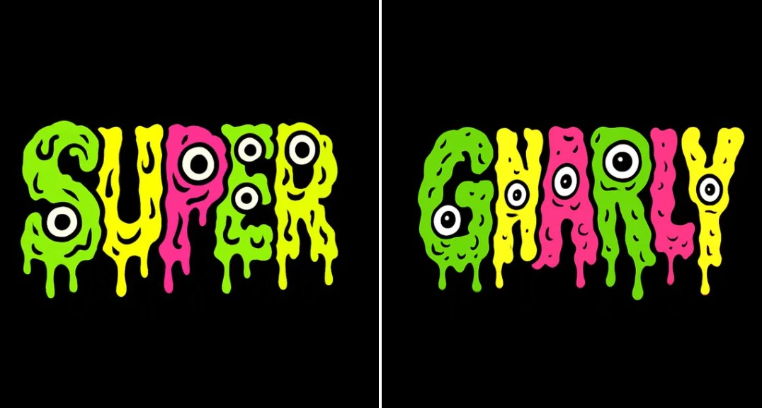
融化变异文本
创建一个迷幻、怪诞的卡通风格文字设计,显示“GNARLY”。将字母排列成一条直线。每个字母应呈现肿胀、融化和渗出的效果,并使用明亮且冲突的纯色,如污泥绿、霓虹黄和热粉色。每个字母必须仅填充一种纯色,不能有渐变或过渡。所有滴落、融化和渗出的部分都必须是纯黑色,没有阴影或渐变。设计需适合矢量图形,具有清晰的纯色填充和粗黑轮廓线。添加额外的黑白眼球,使每个字母看起来像奇怪的突变生物。保持构图混乱但可读,如同周六早晨卡通的突变版本。背景为黑色,采用正方形比例。
cartoonvehicleneonanimal
Case 22
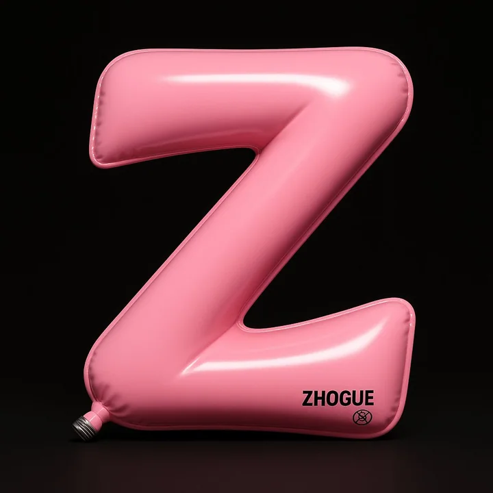
定制气球
一件高度写实的3D装置艺术:字母Z被设计成充气球囊造型,整体形态如同流畅弯曲的“Z”字路径,由两段斜线和一个折角构成,边缘略微卷翘,充满柔软的气压感。 视角为正面稍仰视角(约10°)的正交投影,主体置于画面正中央,占据几乎全部画幅,背景为纯黑色,形成类似剧院聚光灯的聚焦舞台效果。 材质为高弹性亮面PVC,表面涂有高光清漆。主色为柔亮粉色(#FF96AC),阴影部分渐变为淡紫粉色,表面同时具备镜面高光和柔和漫反射,呈现丝滑、饱满、有张力的视觉质感。 左下角可见一个金属螺旋
minimalisttypographytoy3D渲染