Case 24688
当代艺术出版物视觉文化展览海报设计
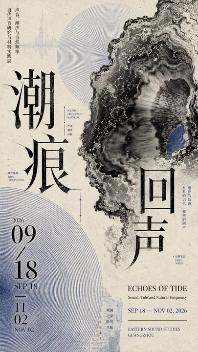
Prompt
Design a 9:16 vertical cultural exhibition poster with an overall contemporary Editorial Graphic Design / art publication visual.

【Theme】: ____
【Chinese Title】: ____
【English Title】: ____
【Key Visual】: ____
【Auxiliary Pattern】: ____
【Primary Color】: ____
【Secondary Color】: ____
【Date / Institution】: ____

Corely use "diagonal potential energy" composition, but do not directly draw obvious diagonal lines.

First determine a hidden diagonal visual axis, letting the visual weight of the key visual, Chinese title, patterns, date information, and white space progress step by step along the same direction.

The key visual bears the main weight; large Chinese titles must participate in the layout, and can be misaligned, vertically arranged, partially cropped, or slightly interspersed with the main subject; English titles, dates, and institution information are scaled down and concentrated in 2–3 areas, forming a clear font size hierarchy.

Each piece uses only one set of auxiliary pattern language and makes it relate to the theme itself, such as sound waves, map folds, artifact rubbings, or plant rubbings. Do not add multiple sets of decorative elements at the same time just for the sake of richness.

The background also needs to participate in the design: use art paper textures, extremely faint pattern afterimages, drawings, specimen information, or material textures, giving the white space layers while remaining clear from a distance.

Overall information volume is medium to high, but there must be a hierarchy:
First glance sees the composition and main subject;
Second glance sees the Chinese title and patterns;
Third glance reads the English, dates, and auxiliary information.

Color is controlled to 3–4 primary colors, creating tension through scale, cropping, overlapping, density, and white space.

Overall effect: cultural exhibition poster, editorial design, mature print publication feel, rich but not messy, diagonal potential energy exists naturally, do not deliberately arrange elements just to be "diagonal."

4 cases for replacement:

1. Echo of Tides
Key Visual: Black and white organic tide / mineral forms
Pattern: Indigo Moiré concentric sound waves

2. Folded Scenes in the City
Key Visual: A folded observation booklet composed of city pen sketches
Pattern: Mustard yellow map folds + extremely faint city road network

3. Oriental Vessel Rhyme
Key Visual: Large bronze vessel
Pattern: Taotie motifs, cloud and thunder patterns, and inscription rubbings extended from the vessel surface

4. Night Flight Among Branches
Key Visual: Old tree branches + black blackbird
Pattern: Light ochre large plant leaf rubbings

设计一张 9:16 竖版文化展览海报,整体为当代 Editorial Graphic Design / 艺术出版物视觉。

【主题】:____
【中文标题】:____
【英文标题】:____
【主视觉】:____
【辅助纹样】:____
【主色】:____
【辅助色】:____
【日期 / 机构】:____

核心使用「斜向势能」构图,但不要直接画明显斜线。

先确定一条隐藏的对角视觉主轴,让主视觉、中文标题、纹样、日期信息和留白的视觉重量沿同一方向逐步递进。

主视觉承担主要重量;大型中文标题必须参与版式,可错位、纵排、局部裁切或与主体轻微穿插;英文标题、日期和机构信息缩小并集中在 2–3 个区域,形成明显字号层级。

每张只使用一套辅助纹样语言,并让它与主题本身产生关系,例如声纹、地图折页、器物拓印、植物拓印。不要为了丰富而同时加入多套装饰元素。

背景也需要参与设计:使用艺术纸纹理、极淡图案残影、图纸、标本信息或材料纹理,让留白有层次,但远看仍保持清楚。

整体信息量中高,但必须有主次:
第一眼看到构图与主体;
第二眼看到中文标题和纹样;
第三眼再阅读英文、日期和辅助信息。

色彩控制在 3–4 个主要颜色,通过尺度、裁切、叠压、疏密和留白制造张力。

整体效果:文化展览海报、编辑设计、成熟印刷出版物感,丰富但不乱,斜向势能自然存在,不要为了“斜”而刻意排列元素。

4 个案例可替换:

1. 潮痕回声
主视觉:黑白有机潮汐 / 矿物形态
纹样:靛蓝 Moiré 同心声纹

2. 城中折景
主视觉:城市钢笔速写组成的折叠观察册
纹样:芥末黄地图折页 + 极淡城市路网

3. 东方器韵
主视觉:大型青铜器
纹样:从器物表面延展出的饕餮纹、云雷纹与铭文拓印

4. 枝间夜航
主视觉:老树枝 + 黑色乌鸫
纹样:淡赭色大型植物叶片拓印
مطالب أخرى
Case 19221
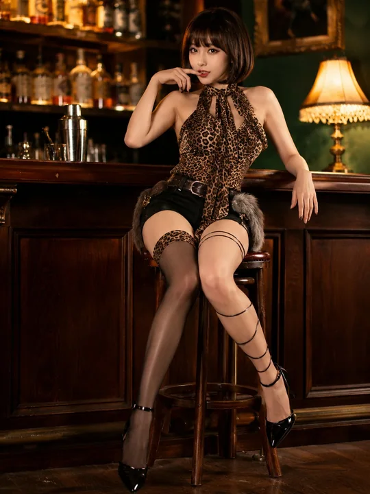
复古酒吧东亚女性写实时尚肖像
Create a photorealistic 3:4 full-body fashion portrait of a beautiful adult East Asian woman sitting on a tall wooden bar stool in an intimate vintage cocktail bar. She has a delicate oval face, fair skin, large almond-shaped eyes with shar
Case 6
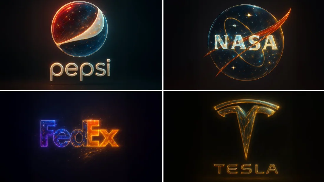
النمط المجرد الشامل الذهبي
{ "base_image": "صورة مُرفوعة", "style_transfer": { "visual_characteristics": { "head_and_face": { "material": "البوليمر الشفاف مع تضمين نجوم ودوائر عصبية مضيئة", "surface_effect":
characterfuturistic