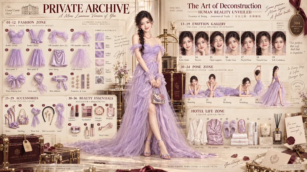
当代空间视错觉透视排版海报
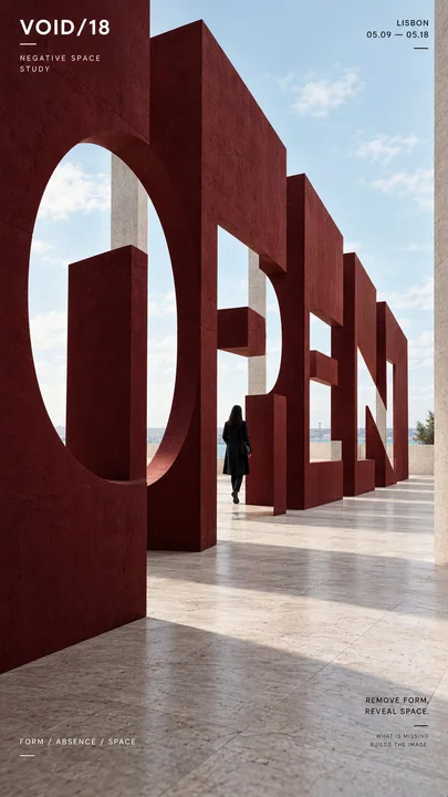
Prompt
标题:[打开 / 对齐 / 相位 / 旋转 / 你的关键词]
项目:[品牌 / 展览 / 活动名称]
空间系统:[负空间 / 阴影 / 旋转面板 / 成角度的鳍片 / 其他]
揭晓机制:[视点 / 光线 / 对齐 / 旋转]
主体:[小型人物形象 / 无]
主色调:[强调色]
格式:9:16 垂直海报

创作一张当代透视排版海报,只有当空间元素、视点或光线正确对齐时,主词才会变得清晰可读。

标题应占据构图的约 35–55%,但绝不能简单地以常规文本形式印刷。将字母形状分解到物理结构中,使它们从其他视点看去呈现碎片化或抽象化,然后从预定的相机位置在视觉上解析为一个清晰的单词。

对于负空间,通过切割多个建筑层的开口来构建字母。
对于阴影,让物理结构投射出独立的形状,并对齐成单词。
对于旋转面板,将排版分散到不同角度的面板上,使它们仅在一个精确的相位重新连接。
对于成角度的鳍片,将单词的窄切片分布在重复的表面上,使完整标题仅从一个观看方向出现。

保持透视、比例、遮挡、照明和几何形状在物理上是可信的。揭晓的过程应该感觉像是一个真实的装置,而不是数字叠加。

使用一种强烈的强调色和克制的建筑色调。当正确对齐时,保持排版大胆、几何化且具有强大的视觉冲击力。

如果包含人物,请保持其体型微小,并将其用作比例参考或自然地与装置互动的观察者。

仅添加少量的次要编辑信息,如项目名称、地点、日期和一行简短的主题。

整体风格:透视排版、变形装置、空间平面设计、当代建筑、编辑海报、清晰的层级和强烈的视觉冲击力。
更多提示词
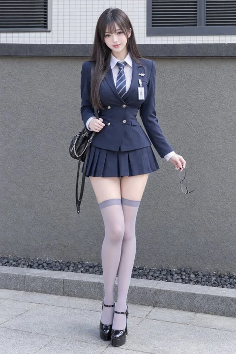
极简海军蓝西装制服都市街拍
## [主体描述] 一张超写实、全身时尚肖像,主角是一位成年东亚女性,皮肤白皙光滑,拥有自然丰满的胸部和修长匀称的双腿。她有着精致的鹅蛋脸,大大的深色眼睛配以淡雅的眼线,眉毛柔和清晰,鼻子小巧,嘴唇呈现自然的珊瑚粉色。她长而直的深褐色头发带有微妙的冷色调光泽,轻薄的空气刘海遮住眼睛,头发自然地垂在肩上。她穿着一件修身的深蓝色定制西装外套,具有结构感肩部、长袖、缺口领,正面有两排装饰性纽扣,内搭一件笔挺的白色尖领衬衫,并系着一条蓝银相间的斜条纹领带。左胸别着一个小型银色装饰别
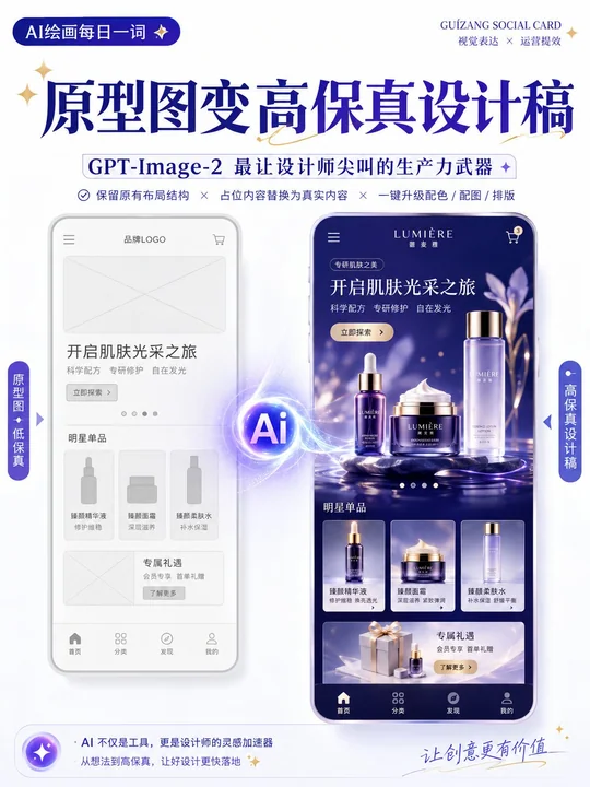
线框图转高保真设计稿的提示词
请以上传的线框图/原型图为参考,生成一张高保真设计稿。 设计类型:【营销活动页 / App界面 / H5页面 / 电商详情页 / 官网页面 / 信息图】 要求: 1. 保留原始页面的布局结构、信息层级和模块划分 2. 将线框图中的占位符替换为真实内容 3. 自动补充配色、图片、图标和排版细节 4. 强化页面的视觉层级、留白、对齐和模块关系 5. 整体输出为高完成度的高保真设计稿 视觉风格:【简约现代 / 科技感 / 轻拟物 / 清新 / 品牌感 / 高级感】 主色调:【
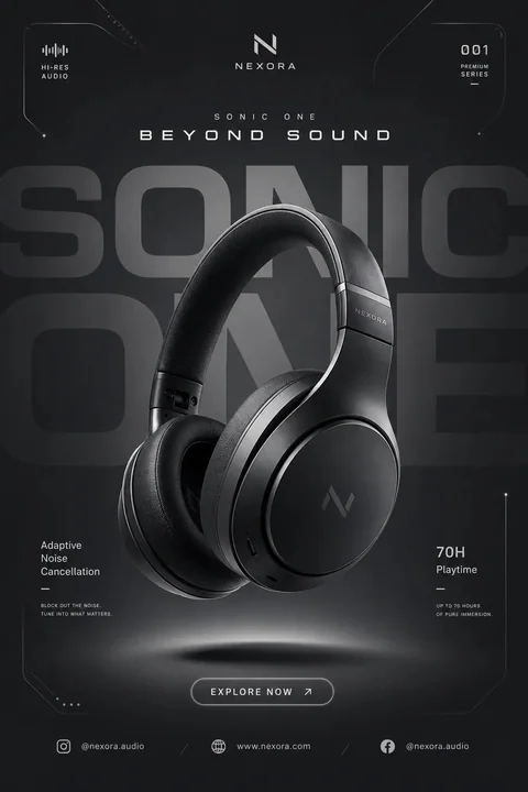
高端现代科技产品促销海报提示词
为 [品牌名称] 创建一个高端现代科技产品促销社交媒体海报。 主题: [产品名称] 风格与艺术指导: 现代未来主义科技广告设计 极简高端商业海报美学 单色色彩品牌化 干净的几何构图 高端电子产品广告 柔和的抽象背景元素 Instagram 和 Behance 品质的科技活动风格 主体: 一个大型写实的 [产品] 3D 渲染图 产品作为核心元素突出显示在中心 高细节的高端材质纹理 柔和的反射表面 产品微微漂浮在背景之上 写实的工作室产品渲染 重点关注曲线、材质和光影 布
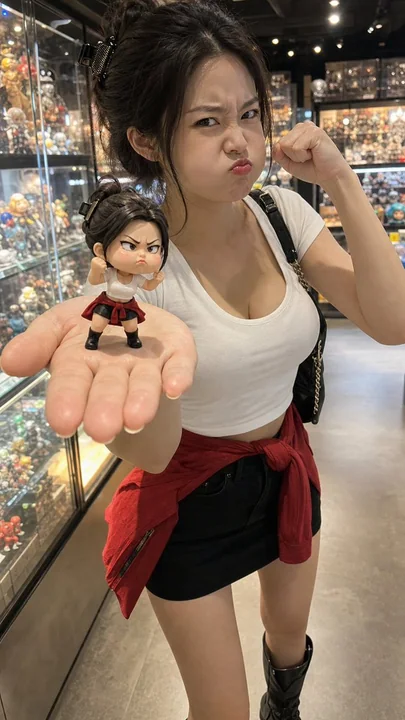
东亚女性模仿手办表情的收藏品店
收藏品商店手机闪光灯照片:一位明显的东亚成年女性手心捧着一个小巧的原型女英雄人偶;人偶做着搞怪愤怒的鼓腮表情并举起一只小拳头,女性也模仿同样的鼓腮愤怒表情和拳头。高级人偶商店,玻璃货架,模糊的盒装玩具且没有可读文字,暖色LED灯,手机闪光灯,压缩/噪点。约28岁的东亚成年女性,美丽成熟的面容,真实的皮肤,写实的手部,修身的白色短款背心,具有安全覆盖范围的黑色迷你裙,腰间系着红色小夹克,短靴,发夹。12-15厘米的二头身人偶,穿着相同的服装。无真实IP/标志/文字/水印,无裸露
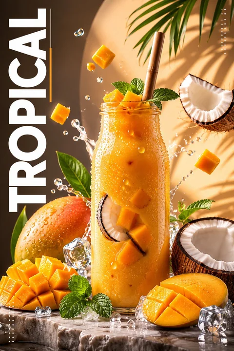
蓝莓柠檬饮品高级写实广告海报
创建一个高级、超写实的饮品广告海报,主角是一个装满鲜艳蓝莓柠檬水的透明大塑料杯。饮料呈现出浓郁的紫蓝色渐变,有闪闪发光的冰块,杯子内部和周围漂浮着新鲜的整颗蓝莓,杯中浸泡着薄薄的柠檬片。杯身上覆盖着真实的冷凝水珠,营造出清爽、冰镇的外观。顶部延伸出一根黑色的吸管。饮料周围环绕着漂浮的新鲜蓝莓、半个柠檬、柠檬片、薄荷叶、水滴和晶莹剔透的冰块,营造出动态的构图。使用带有光泽反射和柔和阴影的戏剧性影棚灯光,营造出奢华的商业外观。背景采用现代分割设计,左侧为深海军蓝,右侧为柔和的薰衣
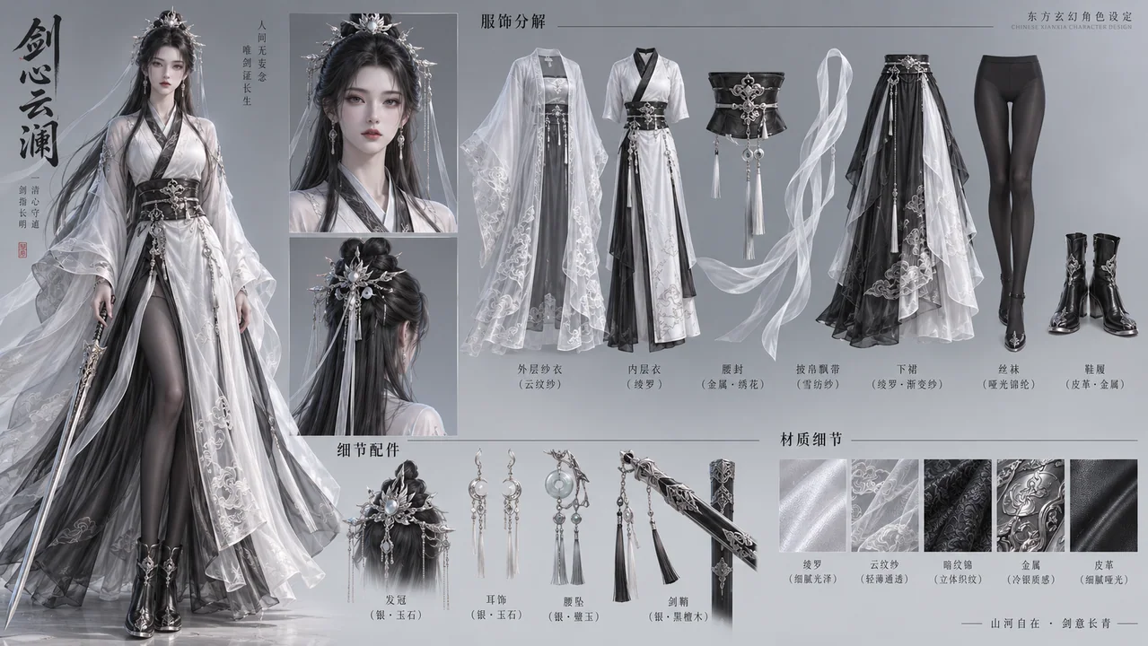
月白墨黑清冷剑仙全方位角色设定图
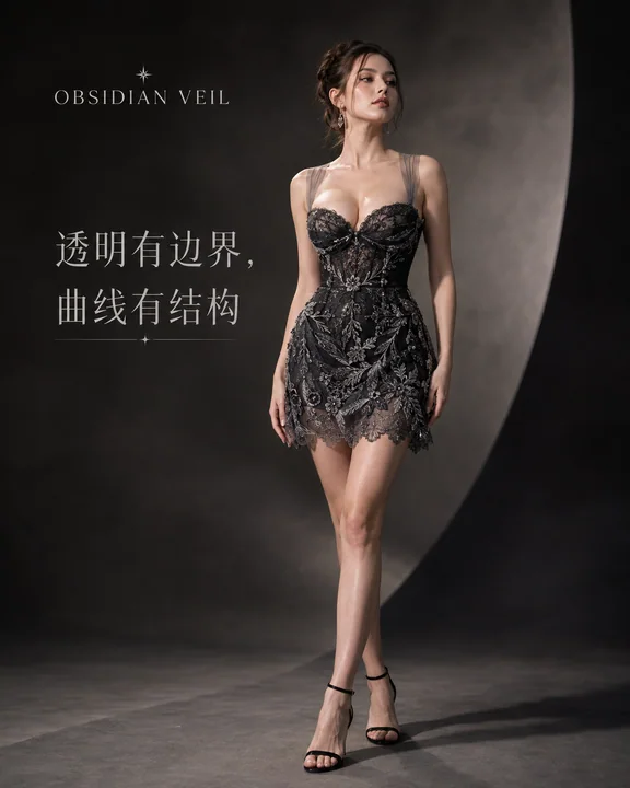
曜石之纱:夏日高级定制女装品牌KV社交媒体封面大片
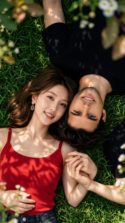
超写实俯视视角下的草地情侣浪漫人像摄影
超写实生活方式情侣肖像,采用完美的垂直俯视构图。一位英俊的年轻男子(人脸见参考图1)和一位美丽的年轻女子(人脸见参考图2)在一个温暖夏日下午的宁静花园里,紧密地躺在郁郁葱葱、充满活力的绿草地上。他们的头轻轻相触,双手自然地十指紧扣,营造出一个亲密而浪漫的时刻。 女子的中长款波浪状栗色发丝自然地散落在草地上,皮肤白皙无瑕,五官精致,双眼温润呈褐色,笑容真挚灿烂,戴着优雅的金质耳坠,身穿一件合身的深红色无袖吊带背心和深色牛仔裤。一只手自然地放在腰间,另一只手握着伴侣的手。 男