Case 25025
压角构图文化展览海报设计
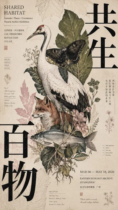
Prompt
[Subject]: ____
[Chinese Main Title]: ____
[English Title]: ____
[Central Subject]: ____
[Corner Pressure Method]: Four-corner text pressure / Dual-corner diagonal pressure / Triple-corner wrap + one corner release / Single-corner heavy pressure + diagonal response
[Corner Elements]: Large Chinese characters / Color blocks / Information area / Patterns
[Auxiliary Pattern]: ____
[Main Color Tone]: ____
[Accent Color]: ____
[Date / Organization]: ____
[Ratio]: 9:16

Generate a poster with a "Corner Pressure Composition" that possesses a mature cultural exhibition and Editorial Graphic Design temperament.

The core is not simply putting text into four corners, but using large Typography, color blocks, information areas, or patterns at the edges of the frame to apply visual pressure inward, naturally "squeezing" out the central subject.

The central subject remains complete, stable, and has clear visual weight; do not intentionally tilt or deform it to fit the composition. The subject carries approximately 40%–60% of the visual weight.

Organize the layout according to the [Corner Pressure Method]:

Four-corner text pressure:
Visual elements in all four corners, but there must be a clear hierarchy; 1–2 corners carry the primary weight, while the others serve as support—do not make all four corners the same size.

Dual-corner diagonal pressure:
Select two diagonal corners as primary pressure points, allowing large titles or color blocks to squeeze the subject from two directions, with the other two corners only holding small information.

Triple-corner wrap + one corner release:
Three corners form a visual enclosure, while the fourth corner is deliberately kept light to allow the image room to breathe.

Single-corner heavy pressure + diagonal response:
One corner uses extra-large text or strong color blocks to carry the main pressure, with the diagonal corner using only smaller elements to respond, while the middle subject remains stable.

Large Chinese titles must truly participate in the composition; they can be partially cropped, aligned to edges, or slightly overlapped with the subject, but must remain clearly legible.

English titles, dates, organizations, and subject descriptions are concentrated in 2–3 areas, creating a clear font size hierarchy through extra-large Chinese, medium-sized titles, and tiny information.

The background cannot be completely blank; very faint patterns related to the theme, archive information, structural diagrams, material textures, or residual shadows of explanations can be added to make the white space "have content" but cannot compete with the subject.

The entire poster uses only one set of main auxiliary patterns, and it must have a real relationship with the theme; colors are controlled to 3–5 main colors, and the same poster must have a clear color stance.

The overall information density is medium-high, but the visual hierarchy is clear:
First look sees the relationship between the subject and the corner pressure;
Second look sees the large Chinese title;
Third look reads the English, dates, and auxiliary information.

Each poster needs a complete theme and authentic content expression; do not use large amounts of meaningless placeholders. Even if the small text is removed, it should still be a valid visual work.

Overall effect: Cultural exhibition poster, magazine editorial design, mature print publication feel, pressure at the edges, focus in the center, rich but not messy.

【主题】:____
【中文主标题】:____
【英文标题】:____
【中心主体】:____
【压角方式】:四角文字压 / 双角对压 / 三角围压+一角释放 / 单角重压+对角回应
【角部元素】:大型中文字 / 色块 / 信息区 / 图案
【辅助纹样】:____
【主色调】:____
【强调色】:____
【日期 / 机构】:____
【比例】:9:16

生成一张具有成熟文化展览与 Editorial Graphic Design 气质的「压角构图」海报。

核心不是简单把文字放进四个角,而是利用画面边缘的大型 Typography、色块、信息区或图案向内部施加视觉压力,把中心主体自然“夹”出来。

中心主体保持完整、稳定、有明确视觉重量,不要为了配合构图故意倾斜或变形。主体约承担 40%–60% 的视觉重量。

根据【压角方式】组织版面:

四角文字压:
四个角都有视觉元素,但必须有明显主次,1–2 个角承担主要重量,其余角只做辅助,不要四角一样大。

双角对压:
选择两个对角作为主要压力点,让大型标题或色块从两个方向夹住主体,另外两角仅安排小型信息。

三角围压 + 一角释放:
三个角形成视觉包围,第四个角刻意保持较轻,让画面有呼吸感。

单角重压 + 对角回应:
一个角使用超大文字或强色块承担主要压力,对角只用较小元素回应,中间主体保持稳定。

大型中文标题必须真正参与构图,可局部裁边、贴边、与主体轻微叠压,但保持清晰可读。

英文标题、日期、机构、主题说明等小型文字集中在 2–3 个区域,通过超大中文、中号标题、极小信息形成明显字号层级。

背景不能完全空白,可加入与主题相关的极淡纹样、档案信息、结构图、材料纹理或说明残影,让留白“有内容”,但不能抢主体。

整张海报只使用一套主要辅助纹样,并且必须与主题产生真实关系,色彩控制在 3–5 个主要颜色,同一张海报必须有明确色彩立场。

整体信息密度中等偏高,但视觉层级清楚:
第一眼看到主体和压角关系;
第二眼看到大型中文标题;
第三眼再阅读英文、日期和辅助信息。

每张海报需要有完整主题和真实内容表达,不要使用大量无意义占位词。即使去掉小字,也应该是一张成立的视觉作品。

整体效果:文化展览海报、杂志编辑设计、成熟印刷出版物感,边缘有压力、中心有聚焦,丰富但不乱。
他のプロンプト

Case 28172
主体身体部位肌肤浅浮雕压痕局部红晕
[Subject] x [Different parts of the body] skin x bas-relief indentation x localized flush x shallow wide concave indentation signature "DeepBlue" 【主体】 × 【身体不同部位】肌肤 × 浅浮雕压痕 × 局部红晕 × 浅宽凹压痕签名“DeepBlue”
Case 26059
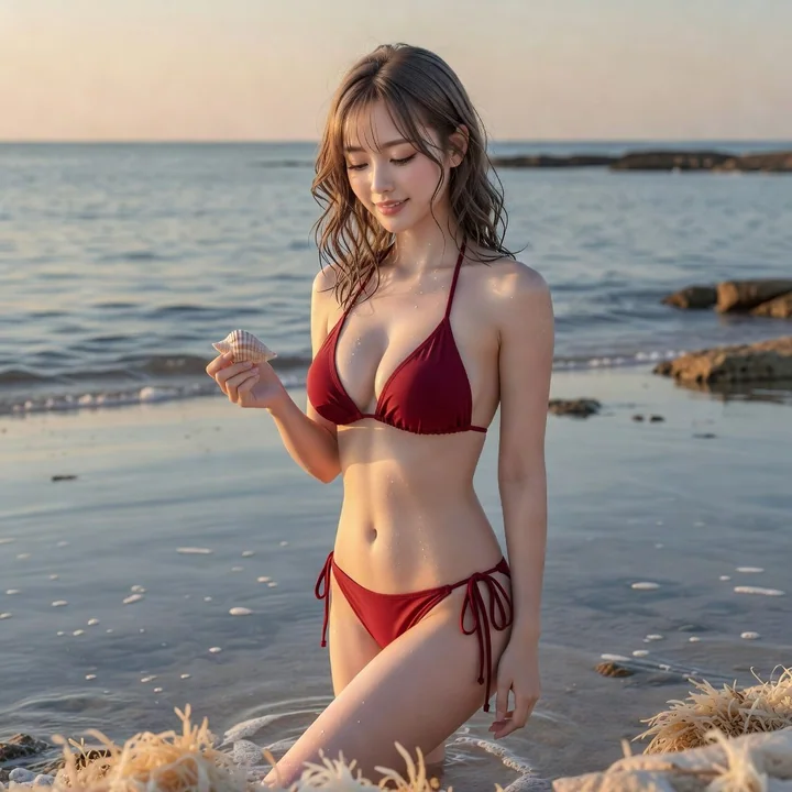
潮汐余温夏日海边人像
Theme: Tidal Afterglow Subject: Vertical 3:4, a quiet bay at dusk in midsummer, a character stands beside light-colored reefs soaked by thin tidal water, turning sideways to look down at a small seashell picked up in the palm, with the sea
Case 26036