Case 14224
Crazy Thursday KFC Embossed Glass Texture Portfolio Cover
Prompt
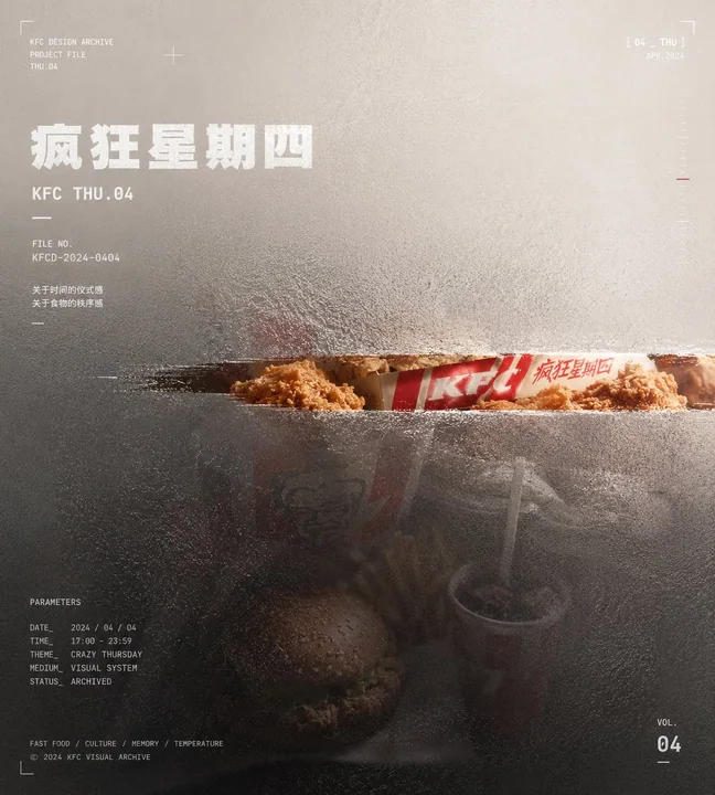
Generate a visual work with the orderly structure of a portfolio cover, centered on a specific theme. The core object should not be displayed in full; instead, it should first be compressed into a main mass deviating from the central axis, submerged between a translucent atomized surface layer and a low-saturation background field. The complete outline, secondary details, and ordinary descriptions of the object should be swallowed by embossed glass particles, tiny refractive displacements, milky atomization, and low-contrast blur. Only at the position that best carries thematic recognition should a clean, clear narrow window be cut out, allowing that part to retain real texture, higher contrast, and necessary color, while the rest becomes a dark mass, softened outlines, broken edges, and transitions consumed by the background.

The clear narrow window should feel like a precise gap wiped open from the material surface—restrained in size but semantically accurate—becoming the only strong entry point for the viewer to enter the theme. The background should be derived from the theme’s spatial relationships, material properties, temporal direction, and emotional temperature, forming a large-area, low-noise color field. The upper or outer area should retain a light, airy feeling, with one side forming a pale breathing zone, while the area where the main body sits is pressed into lower brightness. The background should not carry ordinary scene narration, but instead serve structural functions: swallowing edges, carrying white text, creating distance, and evoking memory.

The color palette should maintain a proportional relationship between large areas of low-saturation structural colors, low-brightness main colors, a small amount of concentrated real color, and white informational color. The hue may shift according to the theme, while brightness hierarchy, saturation restraint, and the value of local color remain stable. The image should use three layers: clear, semi-clear, and out-of-focus. The clear narrow window is responsible for theme recognition; short, thick white titles and numbers remain semi-clear and readable; and most of the subject, background, and bottom micro-information enter atomized defocus.

The typography should use modern sans-serif fonts in white or near-white. The titles should be short, thick, and heavy, as if printed on glass and slightly bitten by the surface layer. Corner logos, edge dates, numbers, and bottom micro-annotations should form a metadata coordinate system, like work numbers, archive records, and production parameters. The text should serve the reading path without covering the clear narrow window.

The overall surface should retain a visible granular embossed-glass texture. The texture density should change according to the brightness and darkness of the underlying layer: denser in dark areas, more milky in bright areas, with fine refraction and slight displacement along the edges. All images, objects, and text should appear unified, as if pressed under the same piece of material.

The final image should present a calm, restrained visual cover with a technical archive sensibility: information is consciously hidden, and only the most critical part is released.

Theme: Crazy Thursday KFC
Aspect ratio: 9:10
More prompts
Case 13623
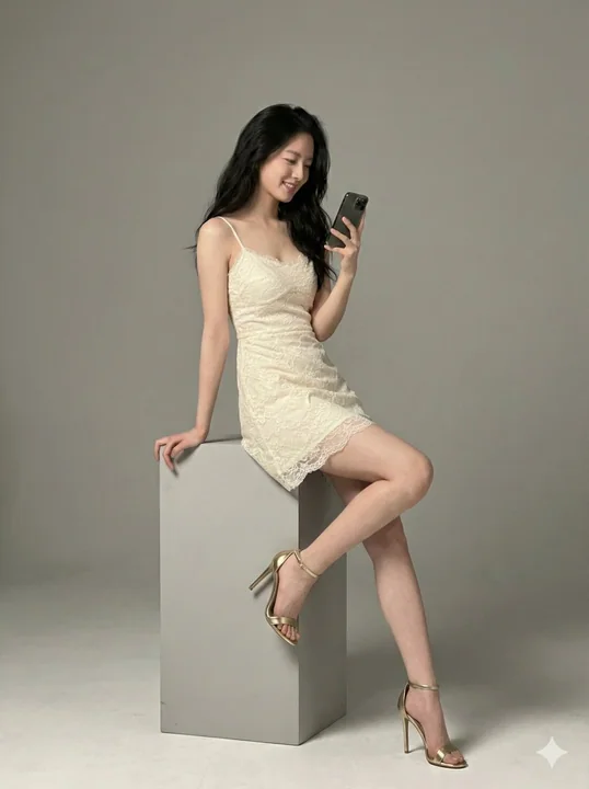
Studio portrait of an ivory-white lace socialite with golden high heels
{ "project_metadata": { "version": "2.0", "target_quality": "Hyper-Realistic / Photogrammetric", "aspect_ratio": "3:4", "reference_parameters": { "identity_preservation": "High (Strictly maintain facial geometry and hairstyle from reference
超写实时尚高跟鞋美腿蕾丝裙
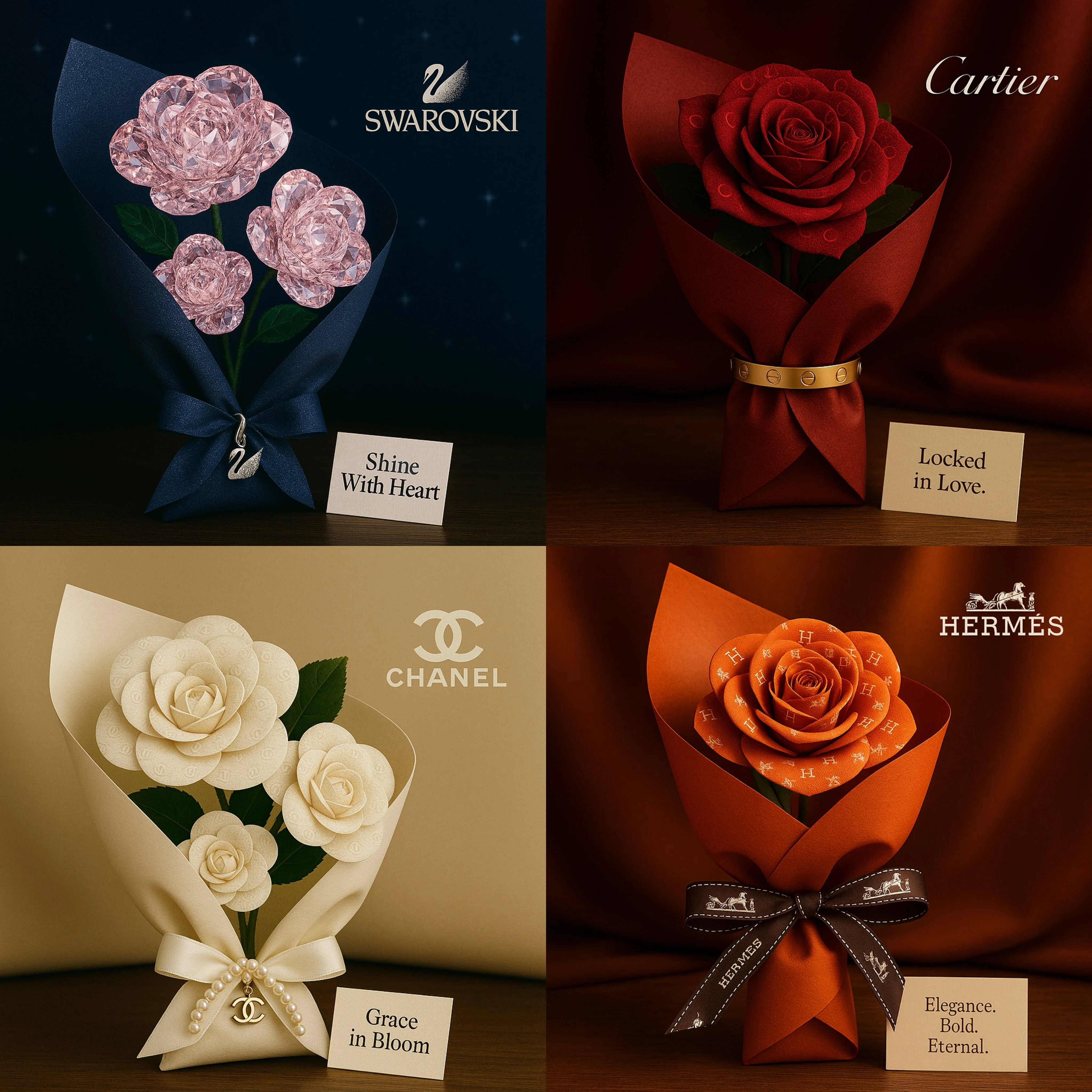
Case 11
Love for the brand script
A romantic square-format bouquet inspired by [Brand Name]. Roses are crafted from visual patterns or textures that reflect the brand's identity. The bouquet is wrapped in luxurious material echoing the brand's signature style (e.g., silk, v
natureproduct