Case 22100
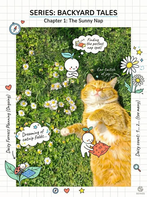
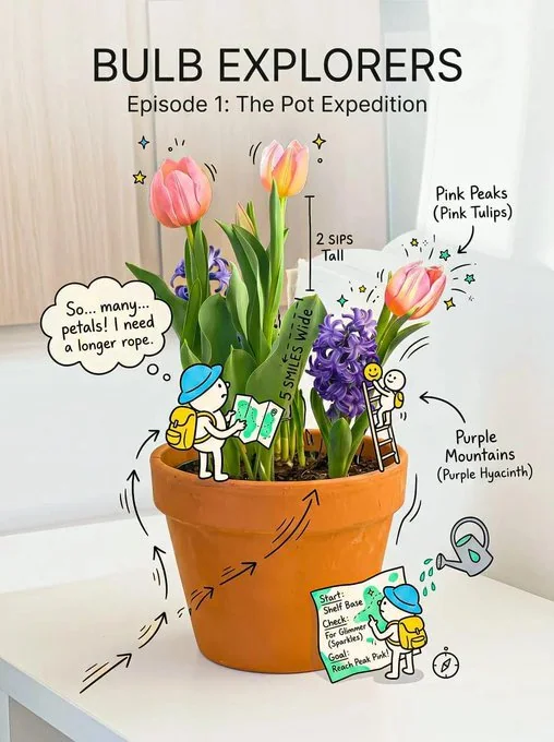
写实主体与趣味手绘涂鸦创意构图
Prompt
Create a cheerful, creative composition that blends a realistic subject with playful hand-drawn doodles and a subtle micro-story.

Subject:
[insert object / person / product — keep simple and recognizable]

Layout:
- Invisible clean grid system underneath
- Balanced, airy spacing (avoid clutter)
- Clear hierarchy: subject first, doodles second, micro details third

Doodles (IMPORTANT):
- Playful, expressive, slightly exaggerated
- Include: smiley faces, stars, sparkles, arrows, motion lines, cute icons
- Doodles must INTERACT with the subject (touching, pulling, lifting, reacting)

Micro Story:
- Add a tiny, fun narrative (e.g., doodle characters using the object, reacting to it)
- Keep it subtle and discoverable on second glance

Typography:
- Friendly sans-serif + handwritten notes
- Casual tone (not serious, not corporate)
- Include small fun labels or thoughts

Color:
- Base: white / soft cream
- Ink: soft black / dark grey
- Accents: 2–3 cheerful colors (yellow, sky blue, soft red, mint, etc.)

Lighting:
- Bright, soft, uplifting
- No harsh shadows

Style:
- Clean + playful + slightly imperfect
- Feels human, warm, and creative

Constraints:
- Do NOT overcrowd
- Every doodle must have purpose or interaction
- Keep subject clearly visible (no obstruction)
- Maintain breathing space

Mood:
[cheerful / curious / lighthearted / imaginative]Add a consistent visual signature:
- same doodle style across all designs
- same color accent system
- recurring tiny character

Introduce a “main doodle character” that appears in every composition interacting with different subjects.

Keep composition consistent across series:
- same framing
- same spacing logic
- same typography style

Goal:
Make the design instantly recognizable as part of a series.

创建一个愉快且富有创意的构图,将逼真的主体与俏皮的手绘涂鸦和微妙的小故事融为一体。

主体:
[插入物体 / 人 / 产品 — 保持简单且易于识别]

布局:
- 下方有看不见的干净网格系统
- 平衡且通透的间距(避免杂乱)
- 清晰的层级结构:主体第一,涂鸦第二,微观细节第三

涂鸦(重要):
- 俏皮、富有表现力、略带夸张
- 包含:笑脸、星星、火花、箭头、运动线条、可爱的图标
- 涂鸦必须与主体互动(触摸、拉动、举起、反应)

微型故事:
- 添加一个微小、有趣的叙事(例如,涂鸦角色使用物体,对其做出反应)
- 保持微妙,在第二次看时才会被发现

排版:
- 友好的无衬线字体 + 手写笔记
- 休闲语调(不严肃,非企业风格)
- 包含有趣的小标签或想法

颜色:
- 底色:白色 / 柔和的奶油色
- 墨水:柔和的黑色 / 深灰色
- 强调色:2–3 种令人愉悦的颜色(黄色、天蓝色、柔和的红色、薄荷绿等)

光影:
- 明亮、柔和、令人振奋
- 无硬阴影

风格:
- 干净 + 俏皮 + 略带不完美感
- 感觉人性化、温暖且富有创意

约束:
- 不要过度拥挤
- 每个涂鸦都必须有目的或互动
- 保持主体清晰可见(无遮挡)
- 保持呼吸空间

情绪:
[愉快 / 好奇 / 轻松 / 富有想象力]添加一致的视觉签名:
- 所有设计中采用相同的涂鸦风格
- 相同的强调色系统
- 重复出现的小角色

引入一个“主要涂鸦角色”,出现在每一个与不同主体互动的构图中。

保持系列构图的一致性:
- 相同的构图框架
- 相同的间距逻辑
- 相同的排版风格

目标:
使设计作为系列的一部分能够被立即识别。
更多提示词

Case 28060
针织毛绒微缩景观建筑旅行海报
Create a premium 4:5 vertical architectural travel artwork for [COUNTRY / CITY / LOCATION / LANDMARK]. TEXT-TO-IMAGE ONLY — generate the entire scene creatively from [COUNTRY / CITY / LOCATION / LANDMARK] alone. No reference image required
Case 18769
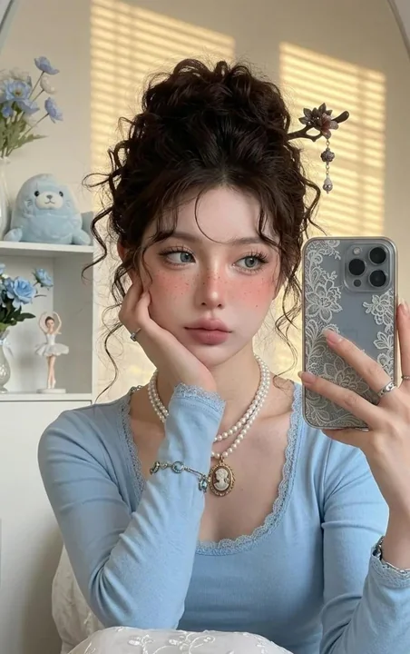
超写实少女宿醉妆蓝色蕾丝镜前自拍
Use the reference photo as the primary source for facial identity. Preserve the face identity 100% without altering the face shape, eyes, nose, lips, jawline, facial proportions, skin tone, or any natural facial characteristics. Do not chan
Case 28077