Case 24589
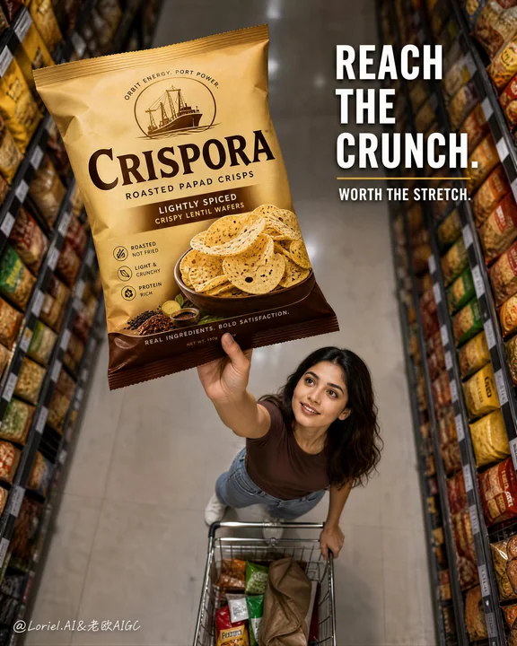
CRISPORA高端帕帕德零食商业海报
Prompt
Create a flagship commercial advertising poster for an original papad snack brand named "CRISPORA", combining Orbit energy with Port symbol power. Use ultra-realistic lifestyle product photography. Keep the same core structural logic: a dramatic top-down supermarket aisle perspective, one young woman reaching upward from a shopping cart to grab a large papad bag from the shelf, long symmetrical grocery shelves on both sides creating a strong tunnel effect, and one clean headline block floating in the upper-right area. The papad package must remain the absolute visual hero, larger, sharper, and more readable than every other element.

Style lock: high-end FMCG retail advertising, premium supermarket realism, product-first hierarchy, clean cinematic lifestyle photography, strong aisle-depth perspective, polished global campaign finish.

Core composition: tall vertical frame, camera looking down from above the aisle. The woman stands in the lower-middle area, body angled slightly forward, one arm fully extended upward holding the hero pack. The shopping cart sits subtly beneath or just behind her. The two shelf walls must form a strong symmetrical corridor that visually funnels attention toward the raised package. The hero bag should sit closest to the viewer in visual importance, reading as the clear destination of the composition.

Port logic: turn the raised papad bag into the brand’s super-symbol. The product should feel like "the one bag worth reaching for" at first glance. The gesture of reaching upward and securing the pack must become the memorable brand code, so the viewer remembers the image as the snack that stands above the shelf.

Orbit logic: use the converging shelf lines, aisle perspective, arm extension, cart placement, and subtle gaze direction to create one clean visual sweep from the far depth of the supermarket tunnel into the woman’s hand and the hero package. The motion must feel focused, desirable, and purchase-driven, never cluttered.

Product concept: redesign the product as an original premium roasted papad brand called "CRISPORA". The pack should feel shelf-ready, modern, and globally marketable, using a warm golden-beige and deep brown identity with subtle spice cues. Add original text only, such as "roasted papad crisps", "lightly spiced", and "crispy lentil wafers". Do not copy any existing branding or wording.

Female character: one realistic young adult woman with natural anatomy, correct shoulders, neck, arms, and hands, five fingers only, realistic skin texture, natural facial proportions, and believable hair strands. Her expression should feel focused and slightly delighted, as if she has found exactly the snack she came for. Clothing should be simple, modern, and secondary to the product.

Lighting: bright supermarket ambient lighting with soft overhead highlights, clean aisle illumination, realistic shelf reflections, and a slightly enhanced commercial key light on the hero pack and the woman’s face. Keep the scene bright, premium, and natural, with no muddy shadows or dead black patches.

Materials and realism: realistic printed snack bag with crisp folds, subtle matte-gloss reflections, believable package inflation, sharp label print, and appetizing papad imagery. Shelf products should be softly blurred and subordinate. The cart, floor tiles, and aisle shelves must obey real-world scale and perspective.

Typography and layout: use original English text only, never copy any existing wording. Place a clean upper-right headline such as "REACH THE CRUNCH." or "TAKE THE TOP PICK." with a short support line like "worth the stretch." Keep typography bold, modern, and clearly secondary to the product.

Color strategy: warm golden-beige hero pack, clean neutral supermarket tones, softened shelf color variety, and restrained warm-brown branding accents. Keep the palette bright, realistic, and premium.

Quality and physical rules: extremely sharp hero pack, readable label, correct hand anatomy, believable supermarket perspective, clean shelf depth, no clutter overload, no warped package, no deformed face, no extra fingers, no muddy lighting. The product bag must remain the strongest visual sales trigger and the clearest symbolic focal point.

Negative prompt: copied branding, copied slogan, weak product hierarchy, blurry pack, unreadable label, distorted hands, extra fingers, fused fingers, plastic skin, deformed face, warped aisle perspective, cluttered shelves, muddy supermarket lighting, cheap retail flyer aesthetic, cartoon rendering, CGI toy look, low-resolution packaging, product losing dominance.

为名为“CRISPORA”的原创帕帕德(papad)零食品牌创建一张旗舰商业广告海报,结合 Orbit 能量与 Port 符号力量。使用超写实的生活方式产品摄影。保持相同的核心结构逻辑:一个戏剧性的自上而下的超市走道透视,一名年轻女性从购物车中向上伸手,从货架上抓取一大袋帕帕德,两侧长长的对称杂货货架营造出强烈的隧道效果,右上角区域漂浮着一个干净的标题块。帕帕德包装必须保持绝对的视觉主角地位,比其他所有元素都更大、更清晰、更具可读性。

风格锁定:高端快速消费品零售广告、优质超市现实主义、产品优先等级、干净的电影化写实生活摄影、强烈的走道深度透视、精湛的全球营销完成度。

核心构图:高大的垂直框架,摄像机从走道上方向下看。女性站在中下方区域,身体略微前倾,一只手臂完全向上伸展,握着主角包装袋。购物车巧妙地位于她下方或紧随其后。两面货架墙必须形成一个强烈的对称走廊,在视觉上将注意力集中在举起的包装上。主角袋在视觉重要性上应离观众最近,被视为构图的明确目标。

Port 逻辑:将举起的帕帕德袋变成品牌的超级符号。产品应该在第一眼就被感觉是“值得伸手去拿的那一袋”。向上伸手并拿稳包装袋的姿势必须成为令人难忘的品牌代码,让观众记住这张图像是矗立在货架之上的零食。

Orbit 逻辑:利用汇聚的货架线条、走道透视、手臂伸展、购物车摆放和微妙的注视方向,创造一个从超市隧道深处汇聚到女性手中和主角包装的干净视觉流向。动作必须感觉专注、令人向往且由购买驱动,绝不凌乱。

产品概念:将产品重新设计为名为“CRISPORA”的原创高端烘焙帕帕德品牌。包装应具有随时可上架感、现代感且具有全球市场竞争力,使用温暖的金米色和深褐色标识,并带有微妙的香料暗示。仅添加原创文本,例如“roasted papad crisps”(烘焙帕帕德脆片)、“lightly spiced”(轻微调味)和“crispy lentil wafers”(酥脆扁豆片)。不要复制任何现有的品牌或措辞。

女性角色:一名写实的成年女性,具有自然的解剖结构、正确的肩膀、颈部、手臂和手部,只有五个手指,真实的皮肤纹理,自然的面部比例和可信的发丝。她的表情应该显得专注并略带喜悦,仿佛她找到了正是她要找的零食。服装应简洁、现代,且从属于产品。

灯光:明亮的超市环境照明,带有柔和的顶置高光,干净的走道照明,真实的货架反射,以及在主角包装和女性面部上稍作增强的商业主光。保持场景明亮、高端且自然,没有浑浊的阴影或死黑斑块。

材料与现实主义:写实的印刷零食袋,带有清晰的褶皱、微妙的哑光-光泽反射、可信的包装膨胀感、清晰的标签印刷和诱人的帕帕德图像。货架产品应软化模糊并处于次要地位。购物车、地板砖和走道货架必须服从现实世界的比例和透视。

排版与布局:仅使用原创英文文本,绝不复制任何现有措辞。在右上角放置一个干净的标题,例如“REACH THE CRUNCH.”(触及嘎吱脆)或“TAKE THE TOP PICK.”(拿走顶级选择),并配有一行简短的辅助文案,如“worth the stretch.”(值得一伸)。保持排版大胆、现代,且明确次于产品。

色彩策略:温暖的金米色主角包装,干净的中性超市色调,柔和的货架颜色多样性,以及克制的暖褐色品牌点缀。保持色调明亮、写实且高端。

质量与物理规则:极度清晰的主角包装,可读的标签,正确的手部解剖结构,可信的超市透视,干净的货架深度,无杂乱过载,无扭曲的包装,无变形的面部,无多余的手指,无浑浊的灯光。产品袋必须保持最强的视觉销售诱因和最清晰的象征性焦点。

负向提示词:复制的品牌、复制的标语、薄弱的产品等级、模糊的包装、不可读的标签、扭曲的手、多余的手指、融合的手指、塑料皮肤、变形的面部、扭曲的走道透视、凌乱的货架、浑浊的超市灯光、廉价零售传单美学、卡通渲染、CGI 玩具感、低分辨率包装、产品失去主导地位。
他のプロンプト
Case 14
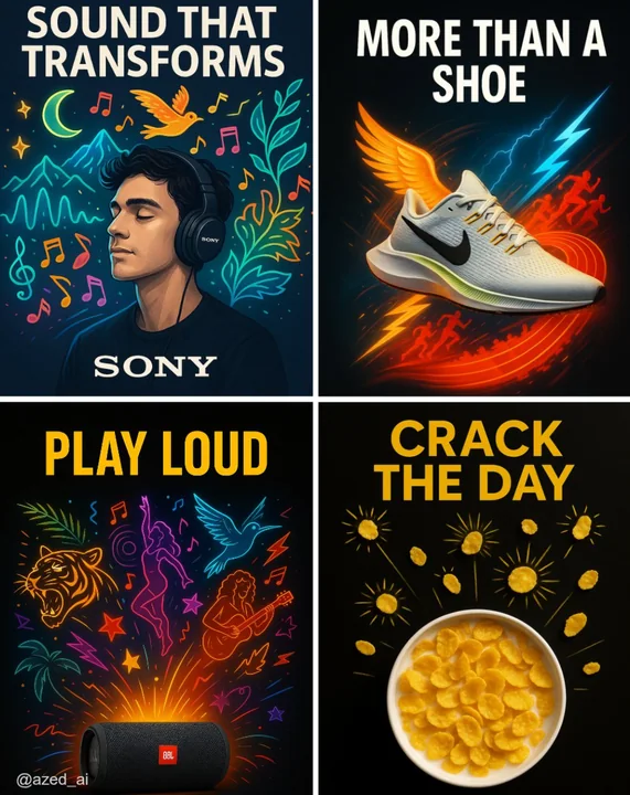
クリエイティブ広告
高衝撃の広告で、清潔なダークまたはハイコントラストの背景に配置されています。[製品]は中央に位置し、シャープに照明され、詳細が際立っています。その周りには、現実離れしたスタイリッシュな視覚的な[要素]のイラストが外に向かって爆発的に広がり(例:ミュージシャン、ランナー、カール、太陽放射)、鮮やかなカラーパレットとネオンが使われています。上部には太字の大文字で「[テキスト]」という広告コピーがあり、下部にはブランドロゴが配置されています。現代的な広告スタイルです。
illustrationproductneonbranding
Case 24582
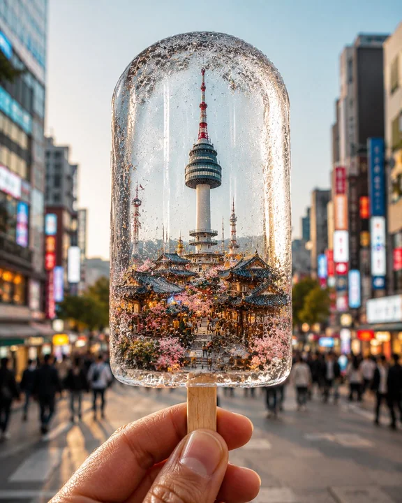
冰棍里的微缩城市景观摄影
Create a hyper-realistic vertical 4:5 conceptual travel photograph of [CITY / COUNTRY], where the entire essence of the destination is magically frozen inside a crystal-clear ice popsicle held in a person’s hand. Inside the transparent pop