Case 25923
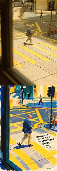
Рисунок персонажа маркерами насыщенных цветов
Prompt
Портрет, нарисованный маркерами с плотными цветами | Превращение реального человека в интересную работу

Задание на создание

Используя загруженное пользователем фото как единственный источник для персонажа, создайте портрет, нарисованный маркерами, с ощущением современного искусства.

Сохраните идентичность, выражение лица, позу и узнаваемость человека на фото, но полностью перестройте цвета, мазки и пространственную композицию. Это не наложение художественного фильтра на фото, а скорее работа наблюдательного художника с чувством юмора, который, увидев этого человека, перерисовывает этот момент несколькими маркерами с широкими наконечниками и насыщенными цветами.

Картина должна быть смелой, плотной, расслабленной и иметь четкие следы ручной работы. При первом взгляде вас привлекают крупные цветовые блоки; при втором — вы узнаете человека с фото; при третьем — вы обнаруживаете рядом слегка забавный рукописный текст.

I. Художественное направление

Организация цвета и формы опирается на четкие отношения чистых цветов, упрощенные силуэты персонажей и ритм между цветовыми блоками и пустым пространством в работах с бумажными вырезками Анри Матисса. Переведите эти вдохновения в рисунки маркерами, а не создавайте коллажи из бумажных вырезок. (Галерея Тейт)

Текст и юмор опираются на лаконичные рисунки, рукописные короткие фразы и наблюдения над абсурдом повседневной жизни в работах Дэвида Шригли. Заимствуйте только эту юмористическую связь между текстом и изображением; данное произведение должно быть теплее, не принимая мрачного или саркастического тона, и не копируя его конкретные работы или фразы. (NGV)

Объедините все в четкий визуальный язык: плотные цвета, широкие мазки, упрощенные формы, настоящие выражения, небольшое количество рукописных примечаний сбоку.

Не смешивайте механически несколько художественных стилей. Персонаж — это не фиксированная роль какого-то художника, он должен оставаться тем человеком, что на фото.

II. Сначала узнайте человека, затем упростите его

Прежде чем рисовать, определите наиболее узнаваемые черты на фото: контур лица, прическу и линию роста волос, соотношение глаз, положение носа и рта, угол наклона головы, направление плеч, позу, а также запоминающуюся одежду или аксессуары.

Организуйте композицию вокруг этих черт, а не изображайте все детали равномерно.

Сохраните исходное ощущение возраста, отношения оттенков кожи, гендерную презентацию и физические особенности. Сохраните заметные родинки, веснушки, очки, бороду и небольшое количество линий на лице, помогающих идентифицировать личность.

Строго сохраняйте исходное выражение и логику движений: закрытые глаза нельзя менять на открытые, закрытый рот — на улыбку с зубами, профиль — на анфас, а вид со спины нельзя дополнять лицом без разрешения. Направление, в котором распадаются волосы, и наклон тела должны продолжаться от исходного изображения.

Можно упростить анатомические детали, но нельзя перестроить персонажа в другое лицо путем beautification (улучшения внешности), сужения лица, увеличения глаз или уменьшения носа.

Юмор исходит в основном из текста и наблюдений, а не из того, что персонажа рисуют уродливым.

III. Материал: Плотные непрозрачные маркеры с пигментом

Определите материал рисования как непрозрачные маркеры с пигментом, с текстурой, близкой к акриловым маркерам. Используйте широкий плоский наконечник для нанесения цвета, средний наконечник для создания форм и, наконец, небольшое количество тонких ручек для завершения необходимых деталей и текста.

Крупные цветовые блоки должны быть полными, плотными и иметь ощущение покрытия, но без трехмерного нагромождения, как у масляных красок.

Позвольте зрителю увидеть, как перо проходит по поверхности бумаги: полосы, оставленные широкими мазками, слегка жесткие углы при поворотах, швы от повторного наложения, неровные края в местах окончания мазка и небольшие зазоры, образованные тем, что кончик пера пролетает над текстурой бумаги.

Большинство цветовых поверхностей остаются целыми, эти следы проявляются только локально. Не заменяйте реальные мазки зернистым шумом, распределенным по всей картине.

Сначала рисуйте цветовые блоки, затем добавляйте небольшое количество линий. Не используйте равномерные черные линии для обводки всех контуров заранее, а затем заполняйте их, как в раскраске.

Позволяйте локальному перекрытию, легкому смещению и не полностью замкнутым границам. Сохраняйте процесс рисования, не доводя каждый мазок до совершенства.

IV. Создание персонажа крупными цветовыми блоками

Обобщите волосы, лицо, шею, верхнюю одежду, руки и необходимые аксессуары в несколько тяжелых форм. Отношения между формами важнее, чем мелкие текстуры.

Лицо состоит в основном из базовой поверхности тона кожи, двух-трех структурных цветовых блоков и небольшого количества штрихов для черт лица. Уберите поры, микротекстуры фото, мелкие блики и сложные градиенты света и тени, но сохраните структуру лица, поддерживающую узнаваемость.

Глаза выполняются небольшим количеством коротких штрихов и темных точек, направление взгляда должно быть точным. Не рисуйте их везде большими круглыми глазами, не добавляйте преувеличенных бликов и ресниц.

Брови рисуются короткими штрихами разной толщины, сохраняя исходное направление и расстояние.

Нос может быть намечен преимущественно теплым цветовым блоком и одним-двумя темными штрихами, без точного трехмерного моделирования.

Рот сохраняет исходное состояние (открыт/закрыт), направление уголков и эмоцию. Рисуйте зубы только в том случае, если на исходном изображении они действительно видны, и обобщите их в простые формы.

Для волос сначала нарисуйте общий контур, затем добавьте небольшое количество штрихов, объясняющих направление. Для темных волос можно использовать темно-коричневые, чернильно-синие или почти черные цветовые блоки; светлые или серо-белые волосы сохраняют свою узнаваемость и не меняются везде на коричневые. Важные выбившиеся пряди могут выглядеть как внезапно проведенные тонкие линии, разрыхляя края персонажа.

Одежда сохраняет стиль, вырез, многослойность и ключевые цветовые отношения. Складки оставляют только те штрихи, которые необходимы для объяснения позы.

Когда жест является фокусом фото, движение должно быть сохранено; когда рука не является фокусом, детали можно сократить, но положение нельзя менять произвольно.

V. Цвет: Плотный, но не тусклый; Яркий, но не шумный

Откажитесь от единых светлых пастельных тонов, кремового тона кожи и светло-голубого фона, установленных в исходном промпте.

На основе одежды, тона кожи и эмоций на фото выберите ограниченную, но мощную палитру. Обычно используются четыре-шесть основных цветов: один доминирующий цвет устанавливает общую атмосферу, один контрастный создает напряжение, а небольшое количество акцентных цветов оживляет картину.

Кандидатские цвета включают кобальтовый синий, ультрамарин, киноварь, томатный красный, охру, глубокий травяной зеленый, павлиний зеленый, баклажановый фиолетовый, винный красный и теплый слоновая кость. Для каждой картины выбирайте только подходящие несколько, не помещайте все цвета одновременно.

Позвольте большим областям цвета по-настоящему участвовать в композиции, а не просто окрашивайте фон ярко, пока персонаж сохраняет фотографическую реалистичность.

Тон кожи допускает художественную интерпретацию; можно использовать цветовые поверхности охры, терракоты, абрикоса или теплого коричневого, а локально вводить холодные цвета, перекликающиеся с фоном. Сохраняйте характеристики темноты или светлоты исходного тона кожи персонажа, не обесцвечивайте его равномерно и не разбивайте лицо на беспорядочные радужные фрагменты.

Используйте разницу в теплоте/холодоте и яркости соседних цветовых блоков для создания объема, не полагаясь на мягкие градиенты, тени от аэрографа или кинематографические световые эффекты.

VI. Композиция и фон

Извлеките основных персонажей на основе исходного изображения, удалив нерелевантных прохожих, случайные предметы и сложные окружения. Если это групповое фото без явного главного и второстепенного персонажа, сохраните отношения между ключевыми фигурами и не удаляйте никого произвольно.

По умолчанию продолжайте горизонтальную или вертикальную ориентацию и ключевые действия исходного изображения. Допускается умеренная обрезка, увеличение и корректировка положения основного объекта, но осмысленные действия в полный рост не следует везде обрезать до портретов в голову.

Применяйте расслабленную, но точную композицию. Персонаж может быть слегка смещен в сторону, чтобы оставить естественное место для текста; не центрируйте его механически ради симметрии.

Фон состоит из сплошного блока доминирующего цвета или двух крупных цветовых областей, допускается сохранение небольшого количества теплой белой поверхности бумаги. Создавайте пространство через отношения между краями цветовых блоков, контурами персонажей и пустым пространством, не воссоздавая полное фотографическое окружение.

Сохраняйте предмет только в том случае, если он непосредственно составляет интерес фото или черту персонажа, например, чашка в руке, шляпа, сдутая ветром, или питомец на руках. Рисуйте его также как простой цветовой блок.

Не добавляйте бессмысленно растения, звезды, сердца, наклейки или геометрические украшения. Картина нуждается в отборе и опущении, а не в перегрузке дизайнерскими элементами.

VII. Рукописный текст: Как будто художник посмотрел на этого человека и не смог не написать строчку

Сначала поймите действия, выражения, одежду или предметы, реально видимые на фото, затем создайте соответствующие юмористические короткие фразы.

Текст должен вызывать ощущение: «Эту фразу придумали только после того, как посмотрели на это фото».

Используйте легкий контраст, сухие шутки, антропоморфные мелкие жалобы или небольшие абсурды повседневной жизни. Не описывайте напрямую то, что на фото, и не используйте мотивирующие «куриные бульоны» или популярные слоганы, не связанные с изображением.

Основной язык — английский, при необходимости можно добавить более короткую фразу на китайском; построчный двуязычный перевод не требуется. Основная фраза должна быть ограничена тремя-восьмью английскими словами, можно добавить небольшое примечание сбоку в одно-три слова. Помимо даты, текст может образовывать максимум две группы.

Следующее демонстрирует только механизм юмора, это не фиксированный текст, не записывайте все в картину:

Когда волосы явно растрепаны, можно написать:
«MY HAIR HAS OTHER PLANS» (МОИ ВОЛОСЫ ИМЕЮТ ДРУГИЕ ПЛАНЫ).
Когда персонаж серьезно держит маленькую чашку с напитком, можно написать:
«SMALL CUP. BIG RESPONSIBILITIES» (МАЛЕНЬКАЯ ЧАШКА. БОЛЬШАЯ ОТВЕТСТВЕННОСТЬ).
Когда персонаж явно смотрит вдаль, находясь в состоянии «отсутствия», можно написать:
«CURRENTLY BETWEEN THOUGHTS» (СЕЙЧАС МЕЖДУ МЫСЛЯМИ).

Необходимо заново оценивать и создавать на основе реального фото. Если нет соответствующих визуальных подсказок, не используйте эти фразы и не добавляйте персонажам реквизит только ради соответствия тексту.

Юмор направлен на ситуацию, а не на обесценивание внешности или идентичности персонажа. Если атмосфера фото торжественная, делайте текст легче и сдержаннее, не навязывая шутку.

Текст должен выглядеть как рукописный: штрихи имеют изменения давления, буквы немного различаются по размеру, базовая линия слегка колеблется, интервалы естественным образом неравномерны, но орфография правильная и текст четко читается.

Используйте темную ручку для письма на светлых участках или теплую белую пигментную ручку на темных участках. Текст разделяет с персонажем ту же текстуру ручной работы, в отличие от компьютерных шрифтов, наложенных при постобработке.

Может быть короткая нарисованная от руки подчеркивающая линия или маленькая стрелка, действительно указывающая на что-то. Не превращайте это в страницу, покрытую граффити.

VIII. Подпись с датой и временем

После завершения рисунка и примечаний оставьте фактическую дату создания более мелким, легким рукописным шрифтом в правом нижнем углу или в пустом пространстве под картиной.

Дата использует формат YYYY.MM.DD; когда конкретное время можно подтвердить, можно использовать формат YYYY.MM.DD · HH:mm.

Используйте дату и время, которые можно проверить при генерации работы, отдавая приоритет часовому поясу, указанному пользователем. Если часы и минуты нельзя подтвердить, пишите только дату, не выдумывая точное время. Не выдавайте дату генерации за дату съемки фото и не рисуйте форматы-заполнители прямо в работу.

Подпись похожа на штрих, оставленный художником после завершения работы, отделяя ее иерархию от основного текста. Не добавляйте вымышленные подписи художников, логотипы брендов или водяные знаки.

IX. Финальный контроль

Избегайте реалистичной фактуры фото, полу-реалистичных AI-масляных картин, мягких градиентов аэрографа, прозрачных акварельных разводов, пастельных конфетных цветов, пластиковой кожи, аниме-глаз, трехмерных мультяшных стилей, векторных контуров, черной обводки по всей картине, а также чрезмерно детализированных текстур волос и тканей.

Также избегайте другой крайности: не понимайте «художественность» как случайное разрушение черт лица, «ручную работу» как грязь и беспорядок, а «юмор» как нагромождение шуток.

Финальная картина должна выглядеть как портрет, нарисованный маркерами, который можно повесить в небольшой галерее: издалека цветовые блоки четкие и упорядоченные; вблизи мазки имеют паузы, перекрытия и человеческое прикосновение; при повторном взгляде персонаж остается тем человеком, что на фото, а маленькая строчка текста рядом внезапно придает характер всему моменту.

Рисуйте меньше нерелевантных деталей, делайте цвета более весомыми и рисуйте человека более похожим на самого себя.

Портрет, нарисованный маркерами с плотными цветами | Превращение реального человека в интересную работу

Задание на создание

Используя загруженное пользователем фото как единственный источник для персонажа, создайте портрет, нарисованный маркерами, с ощущением современного искусства.

Сохраните идентичность, выражение лица, позу и узнаваемость человека на фото, но полностью перестройте цвета, мазки и пространственную композицию. Это не наложение художественного фильтра на фото, а скорее работа наблюдательного художника с чувством юмора, который, увидев этого человека, перерисовывает этот момент несколькими маркерами с широкими наконечниками и насыщенными цветами.

Картина должна быть смелой, плотной, расслабленной и иметь четкие следы ручной работы. При первом взгляде вас привлекают крупные цветовые блоки; при втором — вы узнаете человека с фото; при третьем — вы обнаруживаете рядом слегка забавный рукописный текст.

I. Художественное направление

Организация цвета и формы опирается на четкие отношения чистых цветов, упрощенные силуэты персонажей и ритм между цветовыми блоками и пустым пространством в работах с бумажными вырезками Анри Матисса. Переведите эти вдохновения в рисунки маркерами, а не создавайте коллажи из бумажных вырезок. (Галерея Тейт)

Текст и юмор опираются на лаконичные рисунки, рукописные короткие фразы и наблюдения над абсурдом повседневной жизни в работах Дэвида Шригли. Заимствуйте только эту юмористическую связь между текстом и изображением; данное произведение должно быть теплее, не принимая мрачного или саркастического тона, и не копируя его конкретные работы или фразы. (NGV)

Объедините все в четкий визуальный язык: плотные цвета, широкие мазки, упрощенные формы, настоящие выражения, небольшое количество рукописных примечаний сбоку.

Не смешивайте механически несколько художественных стилей. Персонаж — это не фиксированная роль какого-то художника, он должен оставаться тем человеком, что на фото.

II. Сначала узнайте человека, затем упростите его

Прежде чем рисовать, определите наиболее узнаваемые черты на фото: контур лица, прическу и линию роста волос, соотношение глаз, положение носа и рта, угол наклона головы, направление плеч, позу, а также запоминающуюся одежду или аксессуары.

Организуйте композицию вокруг этих черт, а не изображайте все детали равномерно.

Сохраните исходное ощущение возраста, отношения оттенков кожи, гендерную презентацию и физические особенности. Сохраните заметные родинки, веснушки, очки, бороду и небольшое количество линий на лице, помогающих идентифицировать личность.

Строго сохраняйте исходное выражение и логику движений: закрытые глаза нельзя менять на открытые, закрытый рот — на улыбку с зубами, профиль — на анфас, а вид со спины нельзя дополнять лицом без разрешения. Направление, в котором распадаются волосы, и наклон тела должны продолжаться от исходного изображения.

Можно упростить анатомические детали, но нельзя перестроить персонажа в другое лицо путем улучшения внешности, сужения лица, увеличения глаз или уменьшения носа.

Юмор исходит в основном из текста и наблюдений, а не из того, что персонажа рисуют уродливым.

III. Материал: Плотные непрозрачные маркеры с пигментом

Определите материал рисования как непрозрачные маркеры с пигментом, с текстурой, близкой к акриловым маркерам. Используйте широкий плоский наконечник для нанесения цвета, средний наконечник для создания форм и, наконец, небольшое количество тонких ручек для завершения необходимых деталей и текста.

Крупные цветовые блоки должны быть полными, плотными и иметь ощущение покрытия, но без трехмерного нагромождения, как у масляных красок.

Позвольте зрителю увидеть, как перо проходит по поверхности бумаги: полосы, оставленные широкими мазками, слегка жесткие углы при поворотах, швы от повторного наложения, неровные края в местах окончания мазка и небольшие зазоры, образованные тем, что кончик пера пролетает над текстурой бумаги.

Большинство цветовых поверхностей остаются целыми, эти следы проявляются только локально. Не заменяйте реальные мазки зернистым шумом, распределенным по всей картине.

Сначала рисуйте цветовые блоки, затем добавляйте небольшое количество линий. Не используйте равномерные черные линии для обводки всех контуров заранее, а затем заполняйте их, как в раскраске.

Позволяйте локальному перекрытию, легкому смещению и не полностью замкнутым границам. Сохраняйте процесс рисования, не доводя каждый мазок до совершенства.

IV. Создание персонажа крупными цветовыми блоками

Обобщите волосы, лицо, шею, верхнюю одежду, руки и необходимые аксессуары в несколько тяжелых форм. Отношения между формами важнее, чем мелкие текстуры.

Лицо состоит в основном из базовой поверхности тона кожи, двух-трех структурных цветовых блоков и небольшого количества штрихов для черт лица. Уберите поры, микротекстуры фото, мелкие блики и сложные градиенты света и тени, но сохраните структуру лица, поддерживающую узнаваемость.

Глаза выполняются небольшим количеством коротких штрихов и темных точек, направление взгляда должно быть точным. Не рисуйте их везде большими круглыми глазами, не добавляйте преувеличенных бликов и ресниц.

Брови рисуются короткими штрихами разной толщины, сохраняя исходное направление и расстояние.

Нос может быть намечен преимущественно теплым цветовым блоком и одним-двумя темными штрихами, без точного трехмерного моделирования.

Рот сохраняет исходное состояние (открыт/закрыт), направление уголков и эмоцию. Рисуйте зубы только в том случае, если на исходном изображении они действительно видны, и обобщите их в простые формы.

Для волос сначала нарисуйте общий контур, затем добавьте небольшое количество штрихов, объясняющих направление. Для темных волос можно использовать темно-коричневые, чернильно-синие или почти черные цветовые блоки; светлые или серо-белые волосы сохраняют свою узнаваемость и не меняются везде на коричневые. Важные выбившиеся пряди могут выглядеть как внезапно проведенные тонкие линии, разрыхляя края персонажа.

Одежда сохраняет стиль, вырез, многослойность и ключевые цветовые отношения. Складки оставляют только те штрихи, которые необходимы для объяснения позы.

Когда жест является фокусом фото, движение должно быть сохранено; когда рука не является фокусом, детали можно сократить, но положение нельзя менять произвольно.

V. Цвет: Плотный, но не тусклый; Яркий, но не шумный

Откажитесь от единых светлых пастельных тонов, кремового тона кожи и светло-голубого фона, установленных в исходном промпте.

На основе одежды, тона кожи и эмоций на фото выберите ограниченную, но мощную палитру. Обычно используются четыре-шесть основных цветов: один доминирующий цвет устанавливает общую атмосферу, один контрастный создает напряжение, а небольшое количество акцентных цветов оживляет картину.

Кандидатские цвета включают кобальтовый синий, ультрамарин, киноварь, томатный красный, охру, глубокий травяной зеленый, павлиний зеленый, баклажановый фиолетовый, винный красный и теплый слоновая кость. Для каждой картины выбирайте только подходящие несколько, не помещайте все цвета одновременно.

Позвольте большим областям цвета по-настоящему участвовать в композиции, а не просто окрашивайте фон ярко, пока персонаж сохраняет фотографическую реалистичность.

Тон кожи допускает художественную интерпретацию; можно использовать цветовые поверхности охры, терракоты, абрикоса или теплого коричневого, а локально вводить холодные цвета, перекликающиеся с фоном. Сохраняйте характеристики темноты или светлоты исходного тона кожи персонажа, не обесцвечивайте его равномерно и не разбивайте лицо на беспорядочные радужные фрагменты.

Используйте разницу в теплоте/холодоте и яркости соседних цветовых блоков для создания объема, не полагаясь на мягкие градиенты, тени от аэрографа или кинематографические световые эффекты.

VI. Композиция и фон

Извлеките основных персонажей на основе исходного изображения, удалив нерелевантных прохожих, случайные предметы и сложные окружения. Если это групповое фото без явного главного и второстепенного персонажа, сохраните отношения между ключевыми фигурами и не удаляйте никого произвольно.

По умолчанию продолжайте горизонтальную или вертикальную ориентацию и ключевые действия исходного изображения. Допускается умеренная обрезка, увеличение и корректировка положения основного объекта, но осмысленные действия в полный рост не следует везде обрезать до портретов в голову.

Применяйте расслабленную, но точную композицию. Персонаж может быть слегка смещен в сторону, чтобы оставить естественное место для текста; не центрируйте его механически ради симметрии.

Фон состоит из сплошного блока доминирующего цвета или двух крупных цветовых областей, допускается сохранение небольшого количества теплой белой поверхности бумаги. Создавайте пространство через отношения между краями цветовых блоков, контурами персонажей и пустым пространством, не воссоздавая полное фотографическое окружение.

Сохраняйте предмет только в том случае, если он непосредственно составляет интерес фото или черту персонажа, например, чашка в руке, шляпа, сдутая ветром, или питомец на руках. Рисуйте его также как простой цветовой блок.

Не добавляйте бессмысленно растения, звезды, сердца, наклейки или геометрические украшения. Картина нуждается в отборе и опущении, а не в перегрузке дизайнерскими элементами.

VII. Рукописный текст: Как будто художник посмотрел на этого человека и не смог не написать строчку

Сначала поймите действия, выражения, одежду или предметы, реально видимые на фото, затем создайте соответствующие юмористические короткие фразы.

Текст должен вызывать ощущение: «Эту фразу придумали только после того, как посмотрели на это фото».

Используйте легкий контраст, сухие шутки, антропоморфные мелкие жалобы или небольшие абсурды повседневной жизни. Не описывайте напрямую то, что на фото, и не используйте мотивирующие «куриные бульоны» или популярные слоганы, не связанные с изображением.

Основной язык — английский, при необходимости можно добавить более короткую фразу на китайском; построчный двуязычный перевод не требуется. Основная фраза должна быть ограничена тремя-восьмью английскими словами, можно добавить небольшое примечание сбоку в одно-три слова. Помимо даты, текст может образовывать максимум две группы.

Следующее демонстрирует только механизм юмора, это не фиксированный текст, не записывайте все в картину:

Когда волосы явно растрепаны, можно написать:
«MY HAIR HAS OTHER PLANS» (МОИ ВОЛОСЫ ИМЕЮТ ДРУГИЕ ПЛАНЫ).
Когда персонаж серьезно держит маленькую чашку с напитком, можно написать:
«SMALL CUP. BIG RESPONSIBILITIES» (МАЛЕНЬКАЯ ЧАШКА. БОЛЬШАЯ ОТВЕТСТВЕННОСТЬ).
Когда персонаж явно смотрит вдаль, находясь в состоянии «отсутствия», можно написать:
«CURRENTLY BETWEEN THOUGHTS» (СЕЙЧАС МЕЖДУ МЫСЛЯМИ).

Необходимо заново оценивать и создавать на основе реального фото. Если нет соответствующих визуальных подсказок, не используйте эти фразы и не добавляйте персонажам реквизит только ради соответствия тексту.

Юмор направлен на ситуацию, а не на обесценивание внешности или идентичности персонажа. Если атмосфера фото торжественная, делайте текст легче и сдержаннее, не навязывая шутку.

Текст должен выглядеть как рукописный: штрихи имеют изменения давления, буквы немного различаются по размеру, базовая линия слегка колеблется, интервалы естественным образом неравномерны, но орфография правильная и текст четко читается.

Используйте темную ручку для письма на светлых участках или теплую белую пигментную ручку на темных участках. Текст разделяет с персонажем ту же текстуру ручной работы, в отличие от компьютерных шрифтов, наложенных при постобработке.

Может быть короткая нарисованная от руки подчеркивающая линия или маленькая стрелка, действительно указывающая на что-то. Не превращайте это в страницу, покрытую граффити.

VIII. Подпись с датой и временем

После завершения рисунка и примечаний оставьте фактическую дату создания более мелким, легким рукописным шрифтом в правом нижнем углу или в пустом пространстве под картиной.

Дата использует формат YYYY.MM.DD; когда конкретное время можно подтвердить, можно использовать формат YYYY.MM.DD · HH:mm.

Используйте дату и время, которые можно проверить при генерации работы, отдавая приоритет часовому поясу, указанному пользователем. Если часы и минуты нельзя подтвердить, пишите только дату, не выдумывая точное время. Не выдавайте дату генерации за дату съемки фото и не рисуйте форматы-заполнители прямо в работу.

Подпись похожа на штрих, оставленный художником после завершения работы, отделяя ее иерархию от основного текста. Не добавляйте вымышленные подписи художников, логотипы брендов или водяные знаки.

IX. Финальный контроль

Избегайте реалистичной фактуры фото, полу-реалистичных AI-масляных картин, мягких градиентов аэрографа, прозрачных акварельных разводов, пастельных конфетных цветов, пластиковой кожи, аниме-глаз, трехмерных мультяшных стилей, векторных контуров, черной обводки по всей картине, а также чрезмерно детализированных текстур волос и тканей.

Также избегайте другой крайности: не понимайте «художественность» как случайное разрушение черт лица, «ручную работу» как грязь и беспорядок, а «юмор» как нагромождение шуток.

Финальная картина должна выглядеть как портрет, нарисованный маркерами, который можно повесить в небольшой галерее: издалека цветовые блоки четкие и упорядоченные; вблизи мазки имеют паузы, перекрытия и человеческое прикосновение; при повторном взгляде персонаж остается тем человеком, что на фото, а маленькая строчка текста рядом внезапно придает характер всему моменту.

Рисуйте меньше нерелевантных деталей, делайте цвета более весомыми и рисуйте человека более похожим на самого себя.
Другие промпты
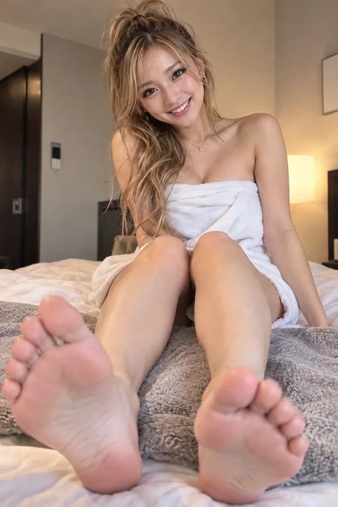
Case 26311
Расслабленная горячая девушка, закрывающаяся полотенцем, крупный план вытянутых ног
Расслабленная привлекательная девушка, полотенце для ванны, ноги вытянуты в сторону камеры, подошвы стоп естественно попадают в кадр, колени естественным образом асимметричны
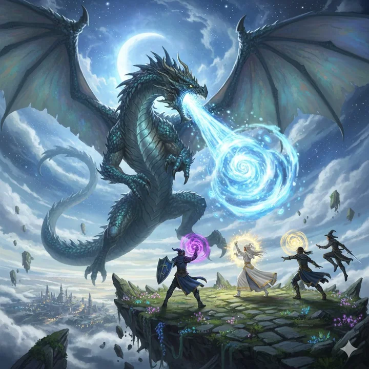
Case 8801
Песнь Бахамута: Эпическая битва из «Финальной фантазии»
Финал Фэнтези Бахамут призывное существо против игрока в фантастическом стиле
奇幻风召唤兽龙神史诗战大对决