Case 27066
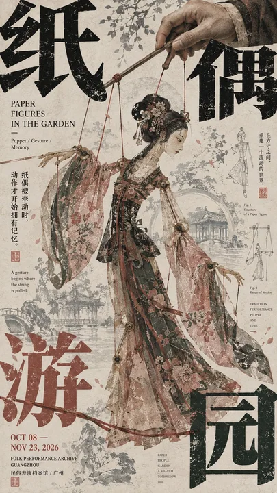
东亚文化展览海报压角构图设计
Prompt
[Subject]:
[Four-character Chinese Title]:
[English Title]:
[Core Subject]:
[Subject Action / Pose]:
[Auxiliary Visual Elements]:
[Main Color Palette]:
[Accent Color]:
[Exhibition Date / Institution]:
[Aspect Ratio]: 9:16

Generate a high-aesthetic East Asian cultural exhibition poster, adopting "corner-pressure composition" and a mature Editorial Graphic Design visual language. The overall effect is not a simple subject plus a title, but a layout where a strong visual subject, giant Chinese characters, peripheral information, auxiliary patterns, and negative space truly interlock to form a rich but orderly relationship.

The subject occupies about 45%–60% of the frame, remains complete, clear, with distinct outlines and visual weight, potentially featuring figures, animals, natural landscapes, artifacts, or folk imagery. The subject must possess a sense of craftsmanship and narrativity, without being deliberately distorted, fragmented, or made too small for the sake of the layout.

Split the [Four-character Chinese Title] and distribute the characters across the four edges and corners of the frame, but ensure they are not equal in size, equidistant, or perfectly symmetrical. Select 1–2 characters to serve as the primary corner-pressure elements, significantly enlarged and partially cropped out of the frame, with the remaining characters acting as secondary responses. These large Chinese characters are not merely titles but part of the layout's structure, interacting with the subject through authentic front-and-back interleaving—for example, figures, animals, wings, horns, ropes, branches, sleeves, mountains, or other subject outlines passing through the character shapes, creating a sense that "the characters are behind the subject, and the subject grows out of the characters."

English titles, dates, institutions, and explanatory text should be concentrated in 2–3 peripheral areas, mixing horizontal and vertical alignments, tiny font sizes, and various orientations. Create distinct scale jumps through oversized Chinese characters, medium-sized English text, and minute information; do not arrange all information into a neat modern grid or scatter it evenly across the frame.

Use only one set of auxiliary visual languages directly related to the theme for the entire poster. For example, animals could use horn shapes, footprints, or silhouettes; figures could use ropes, action trajectories, or clothing structures; landscapes could use ridgelines or water ripples; folk themes could use puppet strings, mask patterns, or craft structures. Auxiliary elements can be repeated, enlarged, cropped, or faded, but do not include multiple unrelated decorative sets.

For the background, use art paper with a cultural publication texture, incorporating delicate paper fibers, slight print grain, faint line work, subject silhouettes, small handwritten notes, or an old print texture. The background must be layered without becoming a secondary subject; it should remain clean from a distance, with details revealing themselves only upon closer inspection.

Restrict the color palette to 3–5 core colors to establish a clear color identity. There should be a distinct relationship between the large-area background color, the subject color, and the giant character color, with a minimal amount of accent color used for dates, seals, or key details. Avoid multiple high-saturation colors competing for attention.

The visual reading order must be clear: first, the strong subject and giant corner-pressure characters; second, the occlusion, interleaving, and scale relationships between the subject and characters; third, the English text, dates, and peripheral information; and finally, the paper texture and auxiliary line work.

The overall effect should resemble a mature East Asian museum exhibition poster, art publication, or cultural catalog: a large subject, strong typography, pressure at the edges, and focus at the center—rich in information but not cluttered, possessing a visual tension of "order within chaos." Even if all small text were removed, the image itself should stand as a complete and valid work of art.

【主题】:
【四字中文标题】:
【英文标题】:
【核心主体】:
【主体动作 / 姿态】:
【辅助视觉元素】:
【主色调】:
【点缀色】:
【展览日期 / 机构】:
【画面比例】:9:16

生成一张高审美东亚文化展览海报,采用「压角构图」与成熟 Editorial Graphic Design 视觉语言。整体不是普通主体加标题,而是让一个强主视觉、巨型中文字、边缘信息、辅助纹样和留白真正互相咬合,形成丰富但有秩序的版式关系。

主体占画面约45%–60%,保持完整、清晰、有明显轮廓和视觉重量,可使用人物、动物、自然景观、器物或民俗形象。主体必须具有作品感和叙事性,不要为了版式故意扭曲、切碎或缩得过小。

将【四字中文标题】拆开分布在画面四边与角落,但不要四字等大、等距或完全对称。选择1–2个字作为主要压角,明显放大并部分裁出画面,其余文字作为次级回应。大型中文字不是普通标题,而是版面结构的一部分,要与主体发生真实前后穿插,例如人物、动物、翅膀、角、绳索、枝条、衣袖、山体或其他主体轮廓从字形前后穿过,让“字在主体后方、主体又从字中长出来”。

英文标题、日期、机构、说明文字集中在2–3个边缘区域,可以混合横排、竖排、极小字号和不同方向排版。通过超大中文、中号英文、极小信息形成明显的尺度跳跃,不要把全部信息整齐排成现代网格,也不要平均撒满整个画面。

整张海报只使用一套与主题直接相关的辅助视觉语言。例如动物可以使用角形、足迹或轮廓线;人物可以使用绳索、动作轨迹或服装结构;山水可以使用山脊线、水纹;民俗可以使用操偶线、面具纹或工艺结构。辅助元素可以重复、放大、裁切或淡化,但不要同时堆入多套无关装饰。

背景使用具有文化出版物质感的艺术纸,可加入细腻纸张纤维、轻微印刷颗粒、极淡线稿、题材残影、少量手写注记或旧版画质感。背景必须有层次,但不能成为第二主体;远看保持清楚,近看才发现细节。

色彩控制在3–5个核心颜色,建立明确色彩立场。大面积背景色、主体色、巨字色之间要有明显关系,再用极少量强调色点缀日期、印章或关键细节。避免多个高饱和颜色同时竞争。

画面阅读顺序必须明确:第一眼看到强主体和巨大压角文字;第二眼发现主体与文字之间的遮挡、穿插和尺度关系;第三眼阅读英文、日期和边缘信息;最后才注意纸张纹理与辅助线稿。

整体效果要像真正成熟的东亚美术馆展览海报、艺术出版物或文化图录:大主体、强Typography、边缘有压力、中心有聚焦,信息丰富但不乱,具有“乱中有序”的视觉张力。即使去掉所有小字,画面本身也应该是一件完整成立的作品。
更多提示词
Case 22231
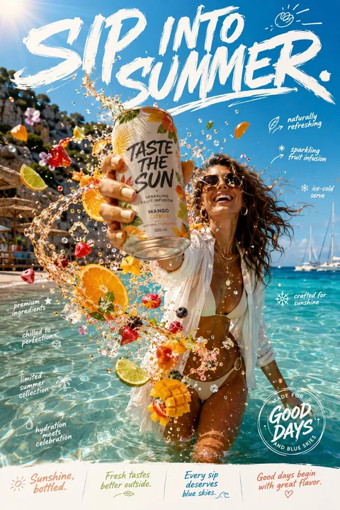
奢华果味气泡水夏日广告大片
Create an ultra-premium lifestyle beverage campaign titled: TASTE THE SUN. This is not a conventional canned drink advertisement. It should feel like the visual embodiment of endless summer—carefree, vibrant, stylish, and effortlessly as
Case 27068
现代室内走廊时尚年轻女性全身照
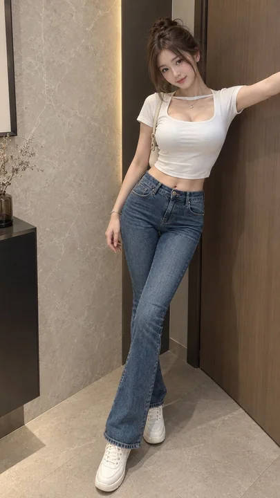
A photorealistic cinematic vertical full-body fashion portrait of a clearly adult young woman in her early twenties, around 20 years old, posing casually in a refined modern interior hallway. Her specific ethnicity or race is not stated bec
Case 2216