Case 26674
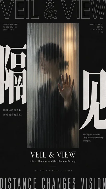
东亚现代主义空间包围海报提示词
Prompt
[Subject]
[Main Visual Subject]
[Core Chinese Character]
[Chinese Title]
[English Title]
[Enclosure Method] Dark edge framing / Circular surround / Time boundary / Real door frame / Others
[Spatial Relationship] Perspective / Blur / Refraction / Rotation / Motion blur / Layers of depth / Others
[Accent Color]
[Aspect Ratio] 9:16

Generate a modern exhibition poster with the temperament of East Asian Modernist Exhibition Poster, Japanese Contemporary Graphic Design, and Editorial Photography. The core adopts "spatial enclosure composition": do not rely solely on text or borders to surround the subject, but use real space, dark edges, circular orbits, photographic cropping, architectural door frames, glass media, motion direction, or perspective structures to build visual pressure and depth from the periphery toward the center, making the center naturally become the focal point of vision. The enclosure relationship must have clear foreground and background layers, avoiding just flat text pasting; methods such as "dark edges clamping a bright window," "circular subject and ring-shaped text forming an orbit," "temporal Typography pressing in from the edges of photography," or "consecutive door frames pointing layer by layer into the distance" can be used to let the enclosure itself generate a sense of space.

First, select the most suitable visual mechanism based on [Subject] and [Spatial Relationship]. Character or photographic themes can use frosted glass, blur, occlusion, and light-dark boundaries to form "dark outside and bright inside"; circular objects can let text run along the circumference, and then use needles, rods, hands, or other real objects to break the closed orbit; dynamic photography can let time, direction, and large characters enter from the edges, then use motion blur to connect multiple areas; architectural themes can directly use door holes, walls, window frames, or corridors to form a real Frame within Frame. Keep only one main mechanism per image; do not mix circular, door frame, glass, and motion blur all together.

Typography must have a real relationship with the space rather than floating on the surface of the image. Use a striking [Core Chinese Character], allowing it to cling to edges, be partially cropped, inverted, refracted by glass, swallowed by dark areas, deformed along a circumference, or occluded by photographic edges; English titles can use Grotesk, Condensed Sans, Outline Sans, or restrained Serif, and be arranged horizontally, vertically, rotated 90°, or along paths according to the spatial structure. Large characters are responsible for establishing boundaries, medium characters for the theme, and small characters retain only the date, location, and minimal information. Do not rely on a large amount of explanatory text to create a sense of complexity.

The image should strengthen real foreground and background layers and spatial direction. Through light and dark, occlusion, scale difference, perspective, blur gradients, reflections, circular motion, or continuous door holes, let the audience clearly feel the visual progression from "periphery → middle layer → center / distance." Retain at least one "frame-breaking" relationship, such as a stylus cutting through circular text, a person's hand being clearer near the glass, a red line stepping out of the photographic boundary, or a distant color block passing through continuous door holes to become the final focus. Keep only 1–2 frame-breaking instances to avoid the image going out of control.

Overall keep the look modern, restrained, and high-contrast. Use neutral colors like cold white, charcoal black, and light gray preferentially for the background, and add only one [Accent Color] according to the theme; the accent color can be used for distant exits, circular centers, time nodes, thin lines, or local light sources, with the total area controlled at about 5%–10%. If photography is used, the photography itself should also maintain a unified grayscale, low saturation, or monochromatic system, and not let commercial color grading, neon, or movie special effects take away the layout logic.

Information density mainly comes from "spatial hierarchy + Typography + subject structure," not from knowledge modules. The central or distant focus must be simpler than the periphery, retaining at least about 25%–35% effective negative space. The periphery can be heavier, denser, and blacker, while the center can be brighter, quieter, and emptier, forming an obvious "dense outside × sparse inside" or "dark outside × bright inside" relationship. Do not add flowcharts, material cards, small image collages, complex parameters, or meaningless descriptions, unless they themselves are an indispensable part of the theme.

The final reading order should be: first eye sees the strong peripheral structure and central spatial focus, second eye understands how the enclosure relationship creates depth or focus, third eye discovers real spatial mechanisms like blur, orbits, motion, door frames, or occlusion, and finally reads the title, date, and minimal information. The entire work should be like a real contemporary photography exhibition, sound art exhibition, architectural exhibition, or independent cultural visual, rather than a regular photo with text, commercial poster, or info sheet.

Avoid: regular full-bleed photography, movie poster feel, cyberpunk, neon effects, tech HUD, complex spectrums, subway maps, mechanical circular frames, average four-sided borders, PPT layout, too much explanatory text, random English, Design Study, Vol., numbering, Logo, QR codes, and copyright marks.

【主题】
【主视觉主体】
【中文核心字】
【中文标题】
【英文标题】
【包围方式】暗边夹景 / 圆周环绕 / 时间边界 / 真实门框 / 其他
【空间关系】透视 / 模糊 / 折射 / 旋转 / 运动拖影 / 层层深入 / 其他
【强调色】
【画面比例】9:16

生成一张具有 East Asian Modernist Exhibition Poster、Japanese Contemporary Graphic Design、Editorial Photography 气质的现代展览海报。核心采用“空间型包围式构图”:不要只依靠文字或边框围住主体,而是利用真实空间、暗部边缘、圆周轨道、摄影裁切、建筑门框、玻璃介质、运动方向或透视结构,从外围向中央建立视觉压力和纵深,让中心自然成为视线落点。包围关系必须有明确前后层次,避免只是平面贴字;可以采用“暗边夹住亮窗口”“圆形主体与环形文字形成轨道”“时间 Typography 从边缘压入摄影”“连续门框一层层指向远处”等方式,让包围本身产生空间感。

先根据【主题】和【空间关系】选择一种最适合的视觉机制。人物或摄影题材可以利用磨砂玻璃、模糊、遮挡和明暗边界形成“外暗内亮”;圆形对象可以让文字沿圆周运行,再用针、杆、手或其他真实物件打破闭合轨道;动态摄影可以让时间、方向和大字从边缘进入,再利用运动拖影把多个区域连接起来;建筑题材可以直接用门洞、墙体、窗框或走廊形成真实的 Frame within Frame。每张只保留一种主机制,不要把圆周、门框、玻璃、拖影全部混在一起。

Typography 必须与空间发生真实关系,而不是浮在图片表面。使用一个醒目的【中文核心字】,允许贴边、局部裁切、反白、被玻璃折射、被暗部吞没、沿圆周变形或与摄影边缘发生遮挡;英文标题可使用 Grotesk、Condensed Sans、Outline Sans 或克制 Serif,并根据空间结构进行横排、竖排、90° 旋转或沿路径排列。大字负责建立边界,中字负责主题,小字只保留日期、地点和极少信息。不要靠大量说明文字制造复杂感。

画面要强化真实的前后层次和空间方向。可以通过明暗、遮挡、尺度差、透视、模糊梯度、反射、圆周运动或连续门洞,让观众明确感受到“外围 → 中层 → 中心 / 远处”的视觉推进。至少保留一处“破框”关系,例如唱针切断圆周文字、人物手部靠近玻璃而更清楚、红线跨出摄影边界、远处色块穿过连续门洞成为最终焦点。破框只保留 1–2 处,避免画面失控。

整体保持现代、克制和高对比。背景优先使用冷白、炭黑、浅灰等中性色,根据主题只加入一个【强调色】;强调色可以用于远处出口、圆形中心、时间节点、细线或局部光源,总面积控制在约 5%–10%。如果使用摄影,摄影本身也应保持统一的灰阶、低饱和或单色体系,不要被商业调色、霓虹或电影特效抢走版式逻辑。

信息密度主要来自“空间层级 + Typography + 主体结构”,不是来自知识模块。中央或远端焦点必须比外围更简洁,至少保留约 25%–35% 的有效负空间。外围可以更重、更密、更黑,中心可以更亮、更静、更空,形成明显的“外密 × 内疏”或“外暗 × 内亮”关系。不要加入流程图、材料卡、小图拼贴、复杂参数或无意义说明,除非它们本身就是主题不可缺少的一部分。

最终阅读顺序应为:第一眼先看到强烈的外围结构与中央空间焦点,第二眼理解包围关系如何制造纵深或聚焦,第三眼发现模糊、轨道、运动、门框或遮挡等真实空间机制,最后才阅读标题、日期和少量信息。整张作品要像真实的当代摄影展、声音艺术展、建筑展或独立文化视觉,而不是普通照片加字、商业海报或信息说明页。

避免:普通满版摄影、电影海报感、赛博朋克、霓虹特效、科技 HUD、复杂频谱、地铁线路图、机械圆框、平均四边框、PPT 排版、过多说明文字、随机英文、Design Study、Vol.、编号、Logo、二维码和版权标识。
他のプロンプト
Case 26673
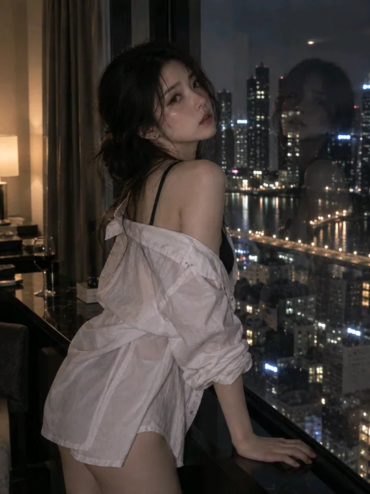
城市公寓落地窗前的年轻亚洲女性
A young Asian woman standing by a floor-to-ceiling window in a high-rise city apartment at night. She wears a loose white shirt with the collar naturally loosened, one shoulder slightly exposed, and a simple black camisole underneath. The p
Case 14878
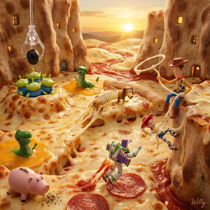
トイ・ストーリーのファンタジーピザ・ミニチュア大冒険
ミクロジオラマのフードフォトグラフィー:『トイ・ストーリー』のキャラクターたちがピザの世界の中で暮らしている。ウッディは、伸びるモッツァレラチーズをカウボーイのロープのように投げ縄で捕らえ、ピザクラストの崖から落ちそうなジェシーを救出している。バズ・ライトイヤーはペパロニのスライスをロケットのブーストパッドとして使い、トマトソースの「ジェット噴流の跡」を残している。リトル・グリーン・メンは泡立つチーズポケットの中から現れ、オリーブを「クレーン」として崇めている。レックスは伸び
电影感超写实微缩摄影美食世界创意脑洞