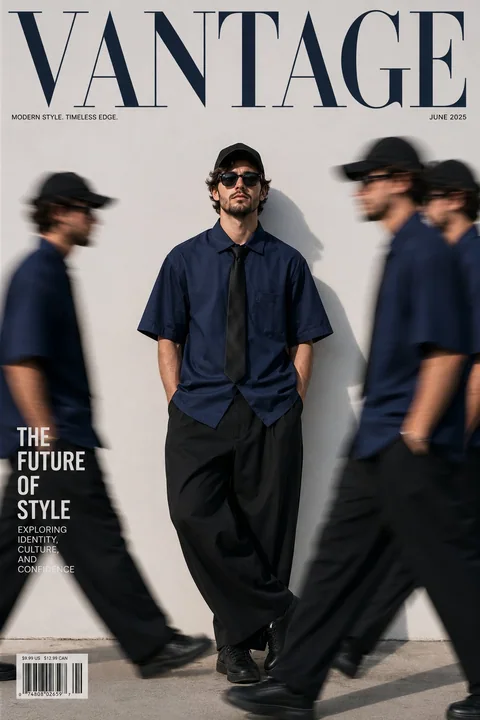
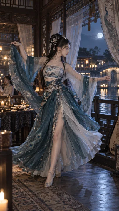
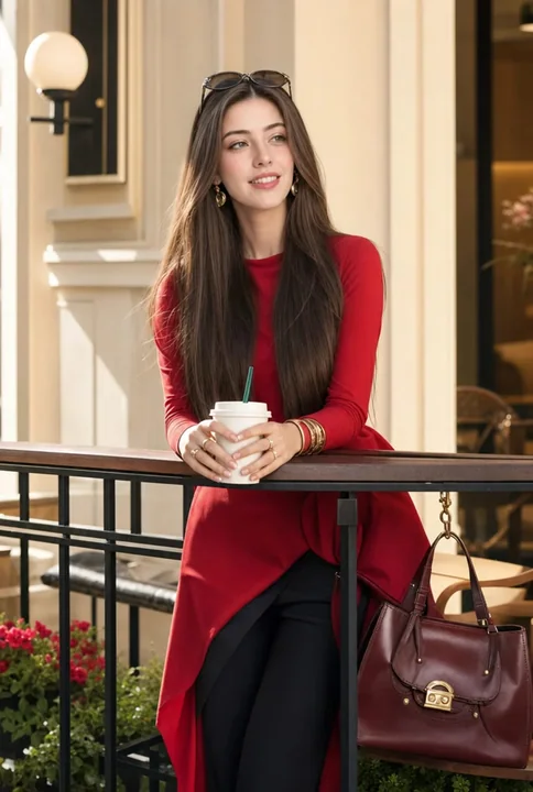
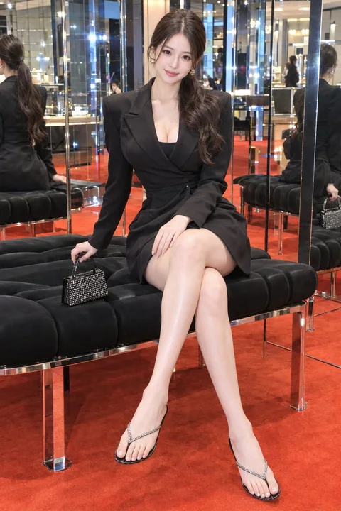
Case 25481
超大排版物理材质交互商业海报
Prompt
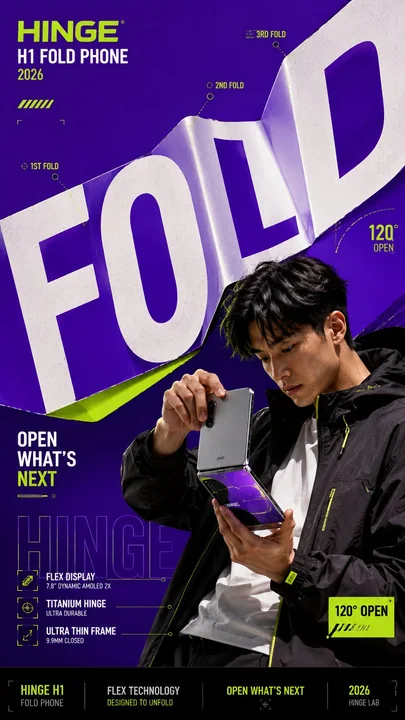
Create a bold editorial campaign poster where oversized typography behaves like a physical material instead of remaining flat and static.

Brand: [BRAND NAME]
Product / Campaign: [PRODUCT OR CAMPAIGN]
Main Word: [SHORT WORD]
Subject: [PERSON / PRODUCT / BOTH]
Material Behavior: [FOLD / PEEL / SPLIT / REFLECT / OTHER]
Main Color: [COLOR]
Accent Color: [COLOR]
Campaign Details: [SLOGAN / SPECS / DATE]
Aspect Ratio: [9:16]

Use realistic commercial photography, oversized typography, strong high-contrast colors, and contemporary editorial design.

Make the main word extremely large, filling roughly 50–75% of the composition. Let the typography physically react according to the selected material behavior:

 FOLD: create clean creases and folded planes that follow the product or subject’s structural direction.
 PEEL: build several clean color layers and let the top layer lift away to reveal what is underneath.
 SPLIT: divide the typography into several large strips and shift them in alternating directions while keeping the subject visually intact.
 REFLECT: turn the letterforms into flat mirrored surfaces that realistically reflect the subject, product, and surrounding colors.

Create strong foreground–subject–background interaction so the person or product feels physically connected to the typography.

Use one dominant color with black, white, and one contrasting accent color. Add only a few meaningful campaign details such as the brand name, product name, slogan, specifications, or small editorial labels.

Keep people, products, materials, lighting, and reflections realistic and polished.

The final image should feel like a finished campaign key visual — bold, colorful, layered, and conceptually clear.

Avoid generic subject + big text layouts, random deformation, heavy 3D lettering, meaningless filler text, excessive UI graphics, clutter, and disconnected visual effects.

创建一张大胆的社论活动海报,其中超大排版像物理材质一样表现,而不是保持扁平且静止。

品牌:[品牌名称]
产品 / 活动:[产品或活动]
主要文字:[短词]
主体:[人物 / 产品 / 两者]
材质行为:[折叠 / 剥离 / 拆分 / 反射 / 其他]
主色调:[颜色]
强调色:[颜色]
活动详情:[口号 / 规格 / 日期]
纵横比:[9:16]

使用真实的商业摄影、超大排版、强烈的高对比色彩和当代社论设计。

让主要文字非常大,占据构图的大约 50–75%。让排版根据所选的材质行为产生物理反应:

 折叠:创建整洁的褶皱和折叠平面,遵循产品或主体的结构方向。
 剥离:构建几个干净的颜色层,让顶层掀开以露出下方的内容。
 拆分:将排版分成几个大的条带,并以交替方向移动,同时保持主体视觉上的完整性。
 反射:将字母形状转变为扁平的镜像表面,真实地反射主体、产品和周围的颜色。

创建强烈的前景–主体–背景互动,使人物或产品在物理上与排版相连。

使用一种主导色搭配黑色、白色和一种对比鲜明的强调色。仅添加少量有意义的活动细节,如品牌名称、产品名称、口号、规格或小型社论标签。

保持人物、产品、材质、灯光和反射的真实感与精致感。

最终图像应该感觉像是一个完成的活动主视觉 —— 大胆、多彩、分层且概念清晰。

避免通用的主体 + 大文字布局、随机变形、沉重的 3D 字体、无意义的填充文本、过多的 UI 图形、杂乱和断开的视觉效果。