Case 27416
时尚编辑风格人像海报设计提示词
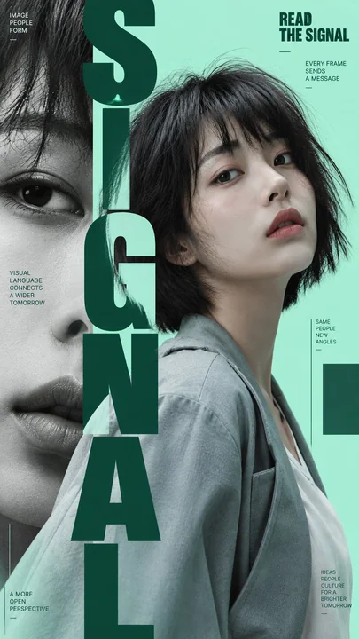
Prompt
Create four independent portrait poster variations from the uploaded photo, all belonging to the same visual system.

Portrait: [use uploaded portrait]
Main color: [mint green / red / blue / yellow / custom]
Typography theme: [SIGNAL / MOTION / ECHO / MINT, or custom words]
Aspect ratio: 9:16

Keep the same person, facial identity, hairstyle, outfit, photographic realism, color palette, typography family, and editorial art direction across all four posters.

The four posters must feel like one cohesive fashion editorial series, but each must use a clearly different layout concept:

1. Vertical Type Layering
   Use oversized condensed typography as a strong vertical spine. Let letters move in front of and behind the portrait, creating clear depth and layered interaction.

2. Sliced Portrait
   Split the portrait into several clean horizontal sections and slightly offset each slice. Keep the face recognizable and beautiful. Avoid RGB glitch, noise, or digital distortion.

3. Echo Portrait
   Show the same subject twice using contrasting scale or orientation, such as one normal portrait and one enlarged flipped portrait. Use repeated typography or outline type to create a visual “echo.”

4. Portrait Inside Oversized Type
   Use huge bold typography as the main composition. Let parts of the face, eyes, lips, hair, or shoulders appear through and between the letterforms, so the portrait becomes integrated into the typography.

Use a modern fashion-editorial aesthetic with oversized condensed sans-serif type, strong portrait photography, clean geometric structure, generous negative space, fine rules, small meaningful editorial text, and subtle graphic blocks.

Keep the information hierarchy clear: large typography first, portrait second, small editorial text third.

Use meaningful supporting copy related to the visual concept rather than random placeholder text.

Keep skin realistic with natural texture, realistic hair strands, natural fabric folds, and photographic lighting. Avoid plastic skin, CGI appearance, excessive retouching, random symbols, meaningless text, heavy UI graphics, sparkles, numbering, NO., VOL., and decorative clutter.

Generate all four as separate standalone 9:16 posters, not combined into a single collage.

根据上传的照片创建四张独立的肖像海报变体,它们都属于同一个视觉系统。

肖像:[使用上传的肖像]
主色调:[薄荷绿 / 红色 / 蓝色 / 黄色 / 自定义]
排版主题:[SIGNAL / MOTION / ECHO / MINT,或自定义单词]
纵横比:9:16

在所有四张海报中保持同一个人、面部身份、发型、服装、摄影写实感、色调、字体系列和编辑艺术指导。

这四张海报必须感觉像是一个统一的时尚编辑系列,但每张必须使用明显不同的布局概念:

1. 垂直文字层叠
使用超大压缩字体作为强有力的垂直脊柱。让字母在肖像前后移动,创造出清晰的深度和层级交互。

2. 切片肖像
将肖像分成几个干净的水平切片,并略微偏移每一块。保持面部可识别且美观。避免 RGB 故障、噪点或数字扭曲。

3. 回声肖像
使用对比鲜明的比例或朝向两次展示同一个主体,例如一个正常肖像和一个放大的翻转肖像。使用重复的排版或轮廓字体来创造视觉上的“回声”。

4. 超大文字中的肖像
使用巨大的粗体排版作为主要构图。让面部、眼睛、嘴唇、头发或肩膀的一部分出现在字母形状之间,使肖像与排版融为一体。

采用现代时尚编辑审美,使用超大压缩无衬线字体、强有力的人像摄影、干净的几何结构、大量的负空间、细线、有意义的编辑小字和微妙的图形块。

保持清晰的信息层级:大排版第一,肖像第二,编辑小字第三。

使用与视觉概念相关的有意义的辅助文案,而不是随机的占位符文本。

保持皮肤真实,具有自然纹理、真实的头发丝、自然的织物褶皱和摄影照明。避免塑料感皮肤、CGI 外观、过度修图、随机符号、无意义的文字、沉重的 UI 图形、闪光、编号、NO.、VOL. 和装饰性杂乱。

将所有四张作为独立的 9:16 海报生成,而不是组合成一张拼贴图。
More prompts
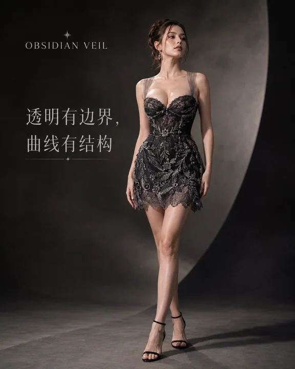
Case 27458
曜石之纱:夏日高定女装品牌KV社交媒体封面大片
沙漏身材真实肤质品牌视觉高定女装暗场摄影

Case 16132
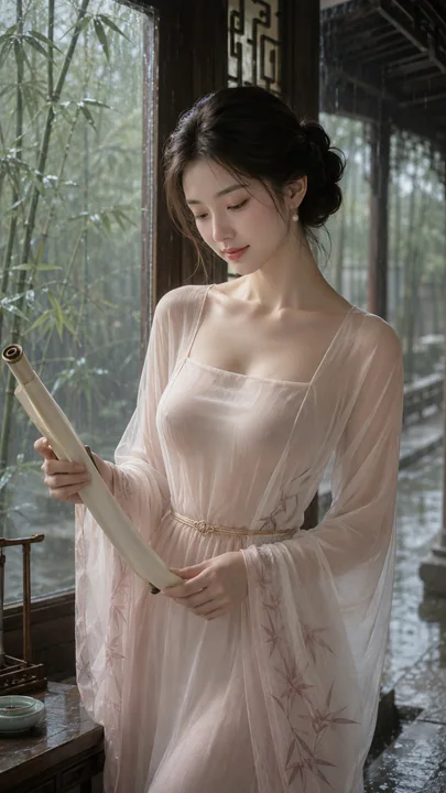
古风韩系写实人像摄影私房写真
3:4 vertical aspect ratio, ancient style realistic portrait photography, a clearly adult Korean woman, in her 20s, exquisite Korean-style light makeup face, soft oval face, clear and natural makeup, real and delicate skin texture, deep brow