Case 25099
左右构图展览视觉海报设计
Prompt
【Subject / Work Name】: ____
【Left Content】: ____
【Right Content】: ____
【Left-Right Relationship】: Whole and Part / Original and Result / Instant and Extension / Dense and Blank Space / Other
【Cross-region Connection Method】: Subject crossing boundaries / Material translation / Color extension / Cloud and mist transition / Action trajectory / Other
【Chinese Title】: ____
【English Title】: ____
【Main Color】: ____
【Secondary Color】: ____
【Aspect Ratio】: 9:16

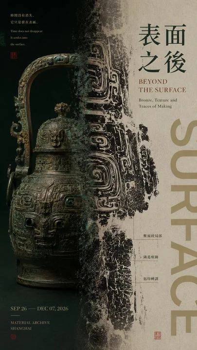
Generate an editorial graphic design poster with a left-right composition, featuring mature visual texture for an exhibition.

The core is not to mechanically divide the screen into two equal halves, but to establish two visual areas with different functions and visual weights that have a clear relationship with each other.

Do not fix the left-right ratio at 50:50. Use unequal ratios such as 35:65, 40:60, 45:55, 60:40 according to the content. Complete visual weight balance through subject size, color depth, information density, and white space.

The left and right sides should undertake different visual tasks, for example: one side shows the complete subject, the other side enlarges local textures; one side presents raw materials, the other side shows its transformed visual result; one side freezes a person or object, the other side extends action, trajectory, or energy; one side maintains high-density images, the other side achieves balance with large areas of white space and Typography.

The most important thing is the "middle boundary." Do not use hard vertical lines to divide columns directly; instead, let at least one core element cross the left and right areas to truly connect the two sides:

Subject parts naturally cross the boundary; materials gradually change from solid objects to flat images; colors, ink marks, or textures extend across regions; action trajectories extend from the subject side to the other; clouds, light and shadow, or spatial structures naturally dissipate at the boundary. Let the central axis be "the place where the relationship happens" rather than a simple dividing line.

Typography is organized according to the content of the work. Main titles, short sentences of the work, and auxiliary information must all be related to the subject itself. Do not use templated placeholder text such as "Left-right composition," "Design case," or "Visual research."

Text can participate in left-right weighting: reduce text on the side with heavier images, and increase titles or information on the side with more white space; or let the title cross the boundary and intersperse with the subject.

Control colors within 2–4 main color systems. There can be obvious contrast in cold and warm, light and dark, or material between left and right, but at least one color, texture, or typography system is needed as a visual connection to avoid looking like two pictures forced together.

Maintain sufficient breathing space through: unequal proportions, visual weighting, subject crossing boundaries, material translation, density changes, and Typography interspersion to establish a designed left-right relationship.

The final reading order should be clear: first glance feels the visual contrast between the left and right sides; second glance finds the connections or changes at the central axis; third glance understands the content relationship between the two areas; finally, read the title and work information.

Overall requirements: The left-right relationship is clear but not rigid; the two areas each have a function and belong to the same work; there is visual hierarchy, content logic, and a mature Editorial Poster texture.

【主题 / 作品名】:____
【左侧内容】:____
【右侧内容】:____
【左右关系】:整体与局部 / 原始与结果 / 瞬间与延展 / 密集与留白 / 其他
【跨区连接方式】:主体越界 / 材质转译 / 色彩延展 / 云雾过渡 / 动作轨迹 / 其他
【中文标题】:____
【英文标题】:____
【主色调】:____
【辅助色】:____
【画面比例】:9:16

生成一张具有成熟 Editorial Graphic Design 与展览视觉质感的左右构图海报。

核心不是把画面机械地平均分成左右两半,而是建立两个功能不同、视觉重量不同,但彼此存在明确关系的视觉区域。

左右比例不要固定 50:50,可根据内容采用 35:65、40:60、45:55、60:40 等不等比例关系,通过主体大小、色彩深浅、信息密度和留白完成视觉配重。

左、右两侧应承担不同视觉任务,例如:一侧展示完整主体,另一侧放大局部纹理;一侧呈现原始材料,另一侧展示其转化后的视觉结果;一侧定格人物或物体,另一侧延展动作、轨迹或能量;一侧保持高密度图像,另一侧用大面积留白和 Typography 完成平衡。

最重要的是“中间边界”。不要使用生硬竖线直接分栏,而要让至少一种核心元素跨越左右区域,使两侧真正连接起来:

主体局部自然越界;材质由实体逐渐变成平面图像;颜色、墨迹或纹理跨区延展;动作轨迹从主体一侧延伸到另一侧;云雾、光影或空间结构在边界处自然消散。让中轴成为“关系发生的位置”,而不是简单的分隔线。

Typography 根据作品内容组织。主标题、作品短句和辅助信息都必须与主题本身有关,不使用“左右构图”“设计案例”“视觉研究”等模板化占位文字。

文字可以参与左右配重:图像较重的一侧减少文字,留白较多的一侧增加标题或信息;也可以让标题跨越边界,与主体产生穿插。

色彩控制在 2–4 个主要色系。左右可以存在明显冷暖、明暗或材质反差,但需要有至少一种颜色、纹理或文字系统作为视觉连接,避免看起来像两张图片硬拼在一起。

保留足够呼吸空间,通过:不等比例、视觉配重、主体越界、材质转译、疏密变化、Typography 穿插建立有设计感的左右关系。

最终阅读顺序应清晰:第一眼感受到左右两侧的视觉反差;第二眼发现中轴处的连接或变化;第三眼理解两个区域之间的内容关系;最后阅读标题与作品信息。

整体要求:左右关系明确但不生硬,两个区域各有作用又属于同一件作品,有视觉层次、有内容逻辑、有成熟 Editorial Poster 质感。
Autres prompts
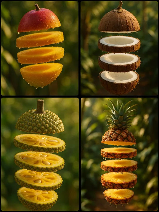
Case 129
Créer des tranches flottantes de fruits
Une photographie hyper-réalistique d'une [FRUIT] coupée en cinq couches brillantes, chaque tranche flottant verticalement dans l'air avec des gouttelettes de jus scintillantes aux bords. Les tranches projettent des ombres douces et naturell
landscapenaturephotographyinterior
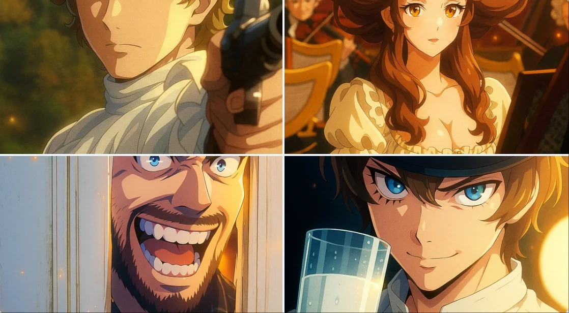
Case 140
Style numérique moderne de dessin animé
Transformez cette image en style moderne de dessin animé numérique pour télévision. Utilisez des contours nets et précis, des couleurs vives et à forte contraste, ainsi qu'un ombrage numérique avec des gradients subtils. Ajoutez des effets
charactercartoon