Case 25046
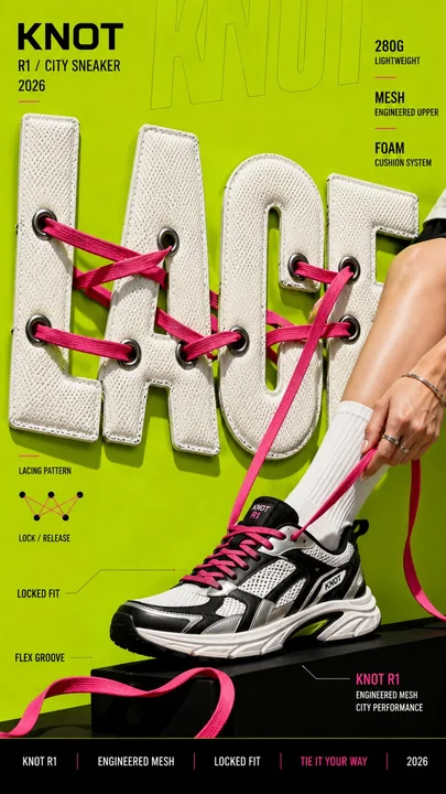
创意材质化超大字体时尚海报
Prompt
Create a bold editorial campaign poster where oversized typography is made from a real physical material and behaves like that material.

Brand: [BRAND NAME]
Product / Campaign: [PRODUCT OR CAMPAIGN]
Main Word: [SHORT WORD]
Material: [PUFFER FABRIC / DENIM / MESH / CREAM / OTHER]
Material Behavior: [COMPRESS / TEAR / WEAVE / MELT / OTHER]
Subject / Product: [PERSON / PRODUCT / BOTH]
Main Color: [COLOR]
Accent Color: [COLOR]
Campaign Details: [SLOGAN / SPECS / DATE]
Aspect Ratio: [9:16]

Use realistic commercial photography, oversized typography, bold high-contrast colors, and contemporary editorial design.

Make the main word extremely large, filling roughly 50–75% of the frame. Construct the letters from the chosen material with believable texture, thickness, seams, fibers, surface details, and lighting.

Most importantly, make the typography behave physically like the material. Fabric can compress and wrinkle, denim can tear and expose fibers, mesh can be threaded through eyelets, and frozen cream can soften and melt.

Let the subject or product interact directly with the material typography. Use realistic contact, pressure, tension, shadows, folds, tearing, or other material reactions so the effect feels physically connected rather than decorative.

Keep the main word readable even after the material transformation. Distort only the areas affected by the chosen behavior.

Use one dominant color system with a few contrasting accents. Add a small amount of meaningful campaign information such as the brand name, product name, slogan, specifications, labels, or callouts.

The final image should feel like a finished commercial campaign key visual — bold, tactile, colorful, concept-driven, and visually complete.

Avoid generic “subject + big text” layouts, plastic-looking materials, random distortion, meaningless filler text, excessive UI graphics, heavy CGI styling, clutter, and effects that do not match the chosen material.

创建一张大胆的社论风格活动海报,其中超大字体由真实的物理材料制成,且其表现行为与该材料一致。

品牌:[品牌名称]
产品 / 活动:[产品或活动]
主词:[短词]
材质:[羽绒面料 / 丹宁 / 网眼 / 奶油 / 其他]
材质行为:[压缩 / 撕裂 / 编织 / 融化 / 其他]
主体 / 产品:[人 / 产品 / 两者皆有]
主色:[颜色]
点缀色:[颜色]
活动详情:[口号 / 规格 / 日期]
宽高比:[9:16]

使用真实的商业摄影、超大字体、大胆的高对比度色彩以及现代社论设计。

让主词变得极大,占据画面约 50–75% 的比例。用选定的材质构建字母,具备可信的纹理、厚度、接缝、纤维、表面细节和光影。

最重要的是,让字体的物理行为与材质一致。织物可以压缩和起皱,丹宁可以撕裂并露出纤维,网眼可以穿过孔眼,冷冻奶油可以变软和融化。

让主体或产品与材质化字体直接互动。使用真实的接触、压力、拉力、阴影、褶皱、撕裂或其他材质反应,使效果在物理上感觉相互连接,而非仅仅是装饰性的。

即使在材质转变后,也要保持主词的可读性。仅扭曲受所选行为影响的区域。

使用一种主导色系并搭配少量对比色点缀。添加少量有意义的活动信息,如品牌名称、产品名称、口号、规格、标签或标注。

最终图像应感觉像是一张完成的商业活动主视觉图——大胆、有触感、色彩丰富、概念驱动且视觉完整。

避免平庸的“主体 + 大文字”布局、塑料感的材质、随机的扭曲、无意义的占位文本、过多的 UI 图形、沉重的 CGI 风格、杂乱以及与所选材质不符的效果。
مطالب أخرى
Case 28204
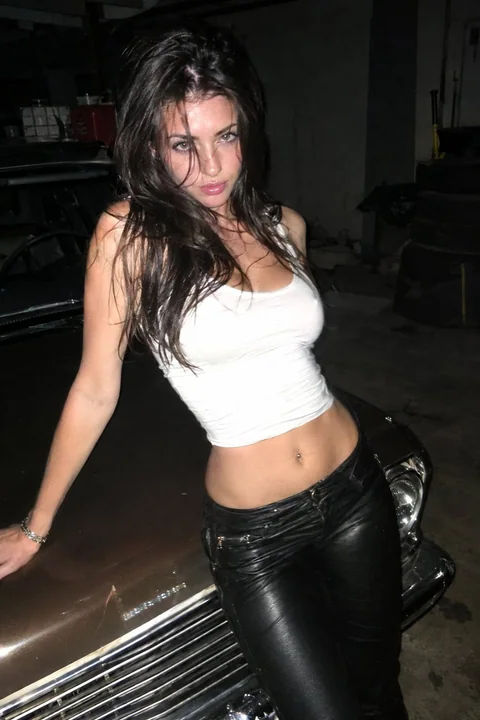
直闪手机摄影复古肌肉车与叛逆少女
Direct flash phone photo: stunning 21yo girl, messy hair, rebellious gaze, tight white crop top, low-rise leather pants, leaning on vintage muscle car in dim garage, harsh contrast, skin reflections, slight motion blur, raw smartphone reali
Case 28195
高级多角色排版社论海报
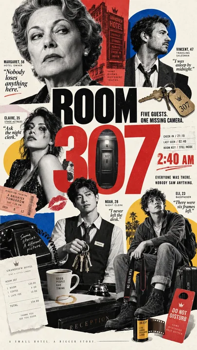
Create a 9:16 high-end multi-character editorial poster about [THEME]. Include 4–7 clearly different characters with distinct ages, roles, personalities, poses, and relationships. Build a believable story around why they belong in the same
Case 12092