Case 27664
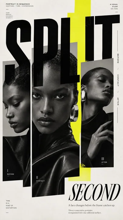
实验性时尚编辑海报设计
Prompt
TITLE: [your title]
SUBJECT: [model, styling, expression]
EDITORIAL MECHANISM: [type mask / unequal portrait panels / repeated crops / edge tension]
ACCENT COLOR: [cobalt / acid yellow / burnt amber / vermilion / another single accent]
FORMAT: 9:16 vertical poster

Create a premium experimental fashion editorial poster where portrait photography becomes part of the layout itself rather than simply sitting behind typography.

Begin with a strong, realistic fashion portrait with natural skin texture, distinctive styling, clear facial emotion and a confident editorial silhouette. Use black-and-white or restrained neutral photography as the base, then introduce only one controlled accent color.

Deconstruct and reorganize the portrait through one dominant editorial mechanism. The image may appear inside oversized letterforms, split into unequal photographic columns, repeat through differently scaled facial crops, break beyond its frame, or be pushed toward the page edge so the entire layout reacts to the subject.

Treat cropping as a design tool. Use close facial fragments, eyes, hands, shoulders or full-body silhouettes at different scales. Allow selected elements to cross image boundaries, typography or color fields so the composition never feels like a rigid grid.

Typography should actively construct the page. Combine one monumental display word with refined serif or condensed sans-serif supporting type. Let large letters overlap portraits, disappear behind subjects, extend beyond the canvas or behave like masks and architectural forms. Pair them with concentrated micro editorial copy, vertical edge text and a few precise alignment rules.

Use color as structure rather than decoration. Introduce one bold cobalt, acid yellow, burnt amber, vermilion or similar accent as a large block, narrow spine, transparent window or irregular field that changes the relationship between photography and typography.

Maintain deliberate information density: a visually dense central or edge zone balanced by quieter negative space. Small text should be grouped into a few clear editorial information islands instead of being scattered everywhere.

Use asymmetry, extreme scale contrast, controlled misalignment, partial cropping and layered foreground/background relationships. The final poster should feel like a sophisticated independent fashion magazine, experimental editorial spread and contemporary art-direction piece combined.

At thumbnail size, the image should still have one immediate visual hook: a large face, monumental word, bold color field, unusual crop or striking fashion silhouette. On closer inspection, reveal secondary layers of typography, repeated photography, micro copy and frame-breaking details.

Avoid generic centered magazine covers, simple photo-plus-text layouts, perfectly even grids, decorative color blocks, excessive empty minimalism, random symbols, fake UI graphics, meaningless dense text, logos, watermarks, barcodes, issue numbers, plastic skin and multiple competing accent colors.

标题:[您的标题]
主体:[模特、造型、表情]
编辑机制:[文字遮罩 / 不等比人像面板 / 重复裁剪 / 边缘张力]
强调色:[钴蓝色 / 酸黄色 / 焦琥珀色 / 朱红色 / 其他单一强调色]
格式:9:16 垂直海报

创建一个高端的实验性时尚编辑海报,其中人像摄影成为布局本身的一部分,而不是简单地位于排版之后。

从一个具有自然皮肤纹理、独特造型、清晰面部情感和自信编辑轮廓的强烈、写实的时尚人像开始。使用黑白或克制的中心色摄影作为基础,然后仅引入一种受控的强调色。

通过一种主导的编辑机制解构并重组人像。图像可能出现在超大字母形状内,分割成不等比的摄影栏,通过不同比例的面部裁剪进行重复,突破框架,或被推向页面边缘,使整个布局对主体产生反应。

将裁剪视为设计工具。使用近景的面部片段、眼睛、手部、肩膀或不同比例的全景剪影。允许选定元素跨越图像边界、排版或颜色场,使构图永远不会感到像僵硬的网格。

排版应积极构建页面。将一个巨大的展示性单词与精致的衬线体或紧凑的无衬线支撑字体相结合。让大写字母与人像重叠,消失在主体后面,延伸到画布之外,或者像遮罩和建筑形式一样表现。将它们与集中的微型编辑文案、垂直边缘文本和一些精确的对齐规则配对。

将颜色作为结构而非装饰。引入一种大胆的钴蓝色、酸黄色、焦琥珀色、朱红色或类似的强调色,作为大色块、狭窄的书脊、透明窗口或改变摄影与排版关系的排版区域。

保持刻意的信息密度:视觉密集的中心或边缘区域与更安静的负空间相平衡。小文本应分组为几个清晰的编辑信息岛,而不是到处散布。

使用不对称、极端比例对比、受控的错位、局部裁剪和分层的构景/背景关系。最终的海报应该感觉像是精致的独立时尚杂志、实验性编辑跨页和当代艺术指导作品的结合。

在缩略图尺寸下,图像仍应具有一个直观的视觉钩子:一张大脸、一个巨大的单词、大胆的颜色场、不寻常的裁剪或引人注目的时尚轮廓。仔细观察时,展现排版、重复摄影、微型文案和突破框架细节的次要层级。

避免通用的居中杂志封面、简单的照片加文字布局、完全均匀的网格、装饰性色块、过度空洞的极简主义、随机符号、虚假的UI图形、毫无意义的密集文本、标志、水印、条形码、期号、塑料感皮肤和多种竞争的强调色。
他のプロンプト
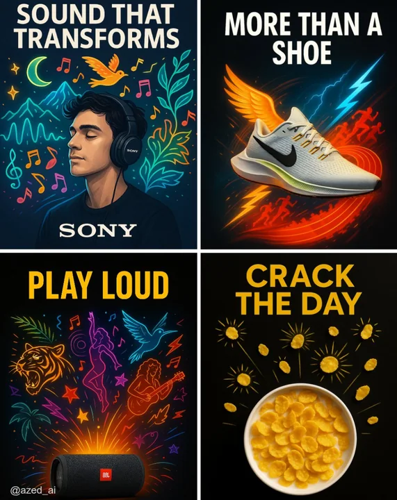
Case 14
クリエイティブ広告
高衝撃の広告で、清潔なダークまたはハイコントラストの背景に配置されています。[製品]は中央に位置し、シャープに照明され、詳細が際立っています。その周りには、現実離れしたスタイリッシュな視覚的な[要素]のイラストが外に向かって爆発的に広がり(例:ミュージシャン、ランナー、カール、太陽放射)、鮮やかなカラーパレットとネオンが使われています。上部には太字の大文字で「[テキスト]」という広告コピーがあり、下部にはブランドロゴが配置されています。現代的な広告スタイルです。
illustrationproductneonbranding
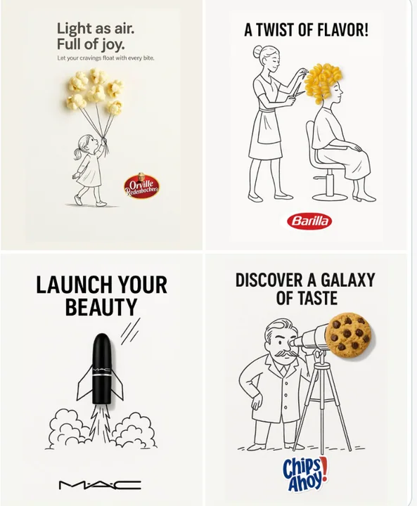
Case 12
クリエイティブ広告
シンプルでクリエイティブな広告。清潔な白い背景上に配置されています。 現実の[現物]は、ゆるく遊び心のある黒インクのスケッチに統合されており、手描きの自由な線が使われています。[スケッチコンセプト]は、オブジェクトとユニークで想像力豊かな方法で相互作用しています。トップまたは中央に太い黒い[広告コピー]テキストを配置し、下部には明確に[ブランドロゴ]を配置してください。視覚的には、清潔で楽しい、高コントラストで、概念的にスマートなデザインとします。
minimalist品牌Logobranding