Case 27700
实验性日系平面设计对角构图海报
Prompt
【Subject】
【Main Visual Subject】
【Chinese Core Character】
【Chinese Title】
【English Title】
【Diagonal Mechanism】 Crossover Transformation / Photography to Print / Transparent Layering / Repetitive Perspective / Other
【Visual State Change】 Photography -> Graphic / Color -> Monochrome / Entity -> Refraction / Near Large -> Far Small / Other
【Main Color】
【Emphasis Color】
【Aspect Ratio】 9:16

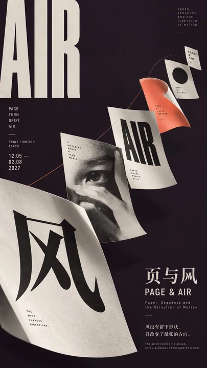
Generate an experimental vertical poster with the temperament of Experimental Japanese Graphic Design, East Asian Contemporary Poster, Editorial Art Direction, and Photo Graphic Design. Continue to use "diagonal composition" as the core, but do not rely solely on a single diagonal line to cut the frame; instead, let the subject, color fields, transparent layers, repetitive elements, or spatial sequences change along an invisible diagonal axis, making the diagonal relationship itself a visual experiment.

First, choose the most suitable diagonal mechanism based on the [Subject]. A single object can span two color fields and transform from real photography into a flat graphic after crossing the boundary; organic subjects like plants or figures can traverse diagonal color blocks, changing color, dots, or printing states in different areas; transparent materials can be layered along the diagonal axis from near to far, establishing space through refraction, occlusion, and scale changes; multiple repetitive elements can advance along the diagonal axis through "near-large-far-small, front-back occlusion, and posture changes," allowing the audience to clearly feel the direction even without an actual diagonal line.

The most important thing for this type of poster is "what happens after the crossover." Design at least one obvious but reasonable visual state change, such as real photography becoming a screen-printed silhouette after entering a color field, a single object appearing refracted and misaligned after passing through a transparent layer, pages gradually shrinking from near to far along a diagonal direction, or the subject changing from color to black and white after passing the boundary. Changes must have a causal relationship with the composition; do not use random glitch, RGB separation, or meaningless special effects.

Diagonal color fields should rely on large shapes rather than small decorations. You can use the collision of two high-purity color fields, one large color field plus narrow negative space, front-to-back layering of transparent plates, or a large area of dark background to set off repetitive objects. It is suggested that the subject or main visual area occupies about 50%–70% of the frame, with colors controlled within 2–4 primary levels, establishing only one strongest color relationship per image. Boldly use modern printing colors such as ultramarine, acid yellow, vermillion, deep purple, and cold white, but do not distribute colors evenly.

Typography must continue to follow "subject moves, text remains steady." Chinese core characters, work titles, and English titles should remain horizontal or vertical, and can be boldly enlarged, edge-aligned, cropped, and cross-regional, but do not rotate them all along the diagonal. English can use modern fonts like Condensed Sans, Neo-Grotesk, Bold Serif, etc., with small information using Neutral Grotesk. Allow Typography to have one instance of real occlusion, intersection, or front-back relationship with the subject, but it must be ensured that the title remains clearly legible.

Appropriately add printing textures such as halftone, screenprint, offset grain, slight overprint errors, and coarse dot photography to make the image look more like an art book, independent publication, or design festival poster, rather than an ordinary digital poster. But do not make it into punk collage, torn paper, dirty old newspapers, or excessive grunge. The image should be bold, young, and experimental, while maintaining clear large shapes and high-level typographic control.

Maintain medium information density. Visual complexity mainly comes from changes in subject state, diagonal direction, color field relationships, transparent layers, or repetitive perspective, rather than a large number of text modules. Retain at least about 20%–30% effective white space to create a rhythm between high-density visual areas and quiet areas. Auxiliary text should only include the title, subtitle, short sentences, date, location, and 3–4 subject keywords.

The final reading order should be: first, see the strong large color field or diagonal subject; second, discover the visual state change of the subject after crossing the boundary; third, understand the relationship between transparent layers, repetitive perspective, or photography and graphics; and finally, read the title and a small amount of information. The overall effect should be like a Tokyo experimental design exhibition, an independent art book, an international Graphic Design yearbook, or high-end Editorial Art Direction, rather than a common product advertisement or diagonal template.

Avoid: simply placing the subject at an angle, standard 45° splits, all text being tilted, dual-color template skins, digital glitch, RGB dispersion, tech HUD, PPT timelines, too much explanatory text, meaningless English, Design Study, Vol., numbering, logos, QR codes, and copyright marks.

【主题】
【主视觉主体】
【中文核心字】
【中文标题】
【英文标题】
【对角机制】跨界变形 / 摄影转印刷 / 透明叠层 / 重复透视 / 其他
【视觉状态变化】摄影→图形 / 彩色→单色 / 实体→折射 / 近大→远小 / 其他
【主色】
【强调色】
【画面比例】9:16

生成一张具有 **Experimental Japanese Graphic Design、East Asian Contemporary Poster、Editorial Art Direction、Photo Graphic Design** 气质的实验性竖版海报。核心继续使用“对角构图”,但不要只依靠一条斜线切画面,而是让主体、色域、透明层、重复元素或空间序列沿隐形对角轴发生变化,使对角关系本身成为视觉实验。

先根据【主题】选择一种最适合的对角机制。单一物件可以跨越两个色域,并在越过边界后从真实摄影转化为平面图形;植物、人物等有机主体可以穿越斜向色块,在不同区域改变颜色、网点或印刷状态;透明材质可以从近到远沿对角轴叠加,通过折射、遮挡和尺度变化建立空间;多个重复元素可以通过“近大远小、前后遮挡、姿态变化”沿斜轴推进,让观众在没有真实斜线的情况下仍然清楚感受到方向。

这类海报最重要的是“跨界以后发生什么”。至少设计一个明显但合理的视觉状态变化,例如真实摄影进入色域后变成丝网印刷剪影、同一物体经过透明层后出现折射错位、纸页沿对角方向由近到远逐渐缩小,或主体经过边界以后从彩色变成黑白。变化必须与构图产生因果关系,不要使用随机 glitch、RGB 分离或无意义特效。

对角色域要依赖大形而不是小装饰。可以使用两块高纯色域碰撞、一块大色域加窄负空间、透明板前后叠层,或大面积深色背景衬托重复对象。主体或主要视觉区域建议占画面约 50%–70%,颜色控制在 2–4 个主要层级,同一张只建立一个最强色彩关系。大胆使用群青、酸黄、朱红、深紫、冷白等现代印刷色,但不要平均分散颜色。

Typography 必须继续遵守“主体动,文字稳”。中文核心字、作品标题、英文标题保持水平或垂直,可大胆放大、贴边、裁切和跨区,但不要全部跟着对角线旋转。英文可以使用 Condensed Sans、Neo-Grotesk、Bold Serif 等现代字体,小信息使用 Neutral Grotesk。允许 Typography 与主体发生一处真实遮挡、穿插或前后关系,但必须保证标题仍然清晰可读。

可以适度加入 **halftone、screenprint、offset grain、轻微套印误差、粗网点摄影** 等印刷质感,使画面更像艺术书、独立出版、设计节海报,而不是普通数字海报。但不要做成朋克拼贴、撕纸、脏旧报纸或过度 grunge。画面要大胆、年轻、实验,同时保持清楚的大形和高级的版式控制。

信息密度保持中等。视觉复杂度主要来自主体状态变化、对角方向、色域关系、透明层或重复透视,而不是大量文字模块。至少保留约 20%–30% 有效留白,让高密视觉区域与安静区域形成节奏。辅助文字只保留标题、副标题、短句、日期、地点和 3–4 个主题关键词即可。

最终阅读顺序应为:第一眼先看到强烈的大色域或对角主体,第二眼发现主体跨界后的视觉状态变化,第三眼理解透明层、重复透视或摄影与图形之间的关系,最后才阅读标题和少量信息。整体效果应像东京实验设计展、独立艺术书、国际 Graphic Design 年鉴或高级 Editorial Art Direction,而不是普通产品广告或对角模板。

避免:只把主体斜着摆、标准 45° 分割、所有文字都倾斜、双色模板换皮、数字 glitch、RGB 色散、科技 HUD、PPT 时间轴、过多说明文字、无意义英文、Design Study、Vol.、编号、Logo、二维码和版权标识。
他のプロンプト
Case 9
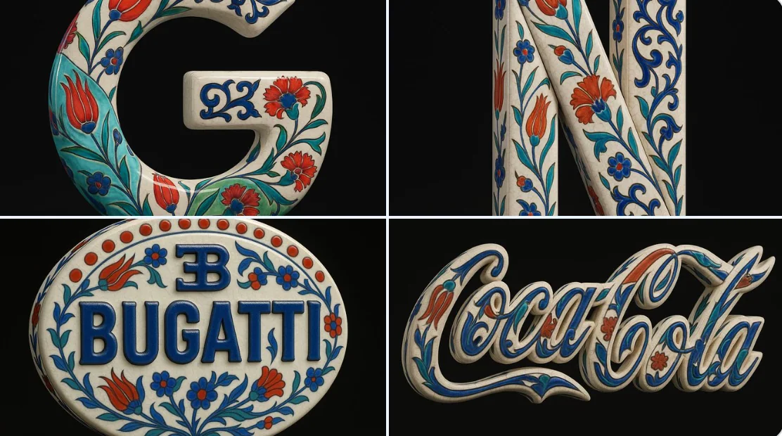
青花磁器様式
アップロードされた画像を正確な視覚的な基盤として使用し、その形状と比例のみを保持したハイパーリアリスティックな3Dオブジェクトに変換してください。伝統的なオスマン・イズニクのセラミックテクスチャを適用してください—温かみのあるホワイトグレーズドベースに繊細なクラックルラインがあり、鮮やかなコバルトブルー、ターコイズ、そして力強い赤色のフラワーモチーフ(チューリップ、カーネーション、アラベスクのつる)が重ねられています。ロゴ全体は、背景プレートやタイル構造を持たず、独立したセラ
natureproductvehiclesculpturebranding
Case 11994
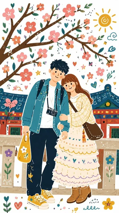
グラフィティ要素を含む民俗風のイラスト
ご全体の画像を、ドゥードル要素を組み込んだ単一の装飾的な民間風フラットイラストに変換してください。元の画像とはまったく異なる、大胆で遊び心のあるカラーパレットを使用してください。 すべての詳細を、白紙の上に描かれたように、手作業風で若干不完全な感覚を持った、シンプルでフラットな形状に簡略化してください。全体のスタイルはかわいらしく、子供っぽく、ファンタジックでなければなりません。