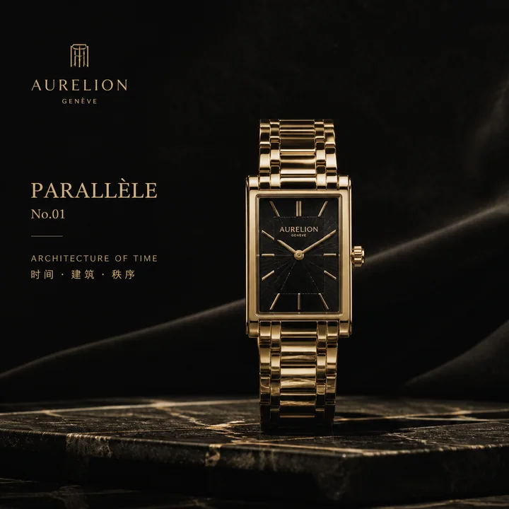
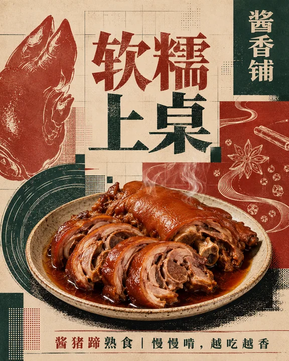
Case 15148
Affiche de culture urbaine au style collage de papier déchiré à la main fluorescent

Prompt
At first glance, a group of irregularly layered fluorescent hand-torn paper title blocks forms a strong visual anchor: the main title is huge, centered, and staggered in lines, with a typeface formed by thick brushes and paper-cutting, heavy strokes, rough and broken edges, exaggerated corners, varying internal white spaces, and slight local misalignments, making the text look like hand-printed graphics rather than neat typography. A circular, loose but clear reading path activity information system is established around the title, with several hand-drawn sticker badges with blue and white outlines distributed around it; each badge is connected to a theme-related small illustration, location marker, or symbol with a white label, varying in size and direction, as if casually pasted on the paper surface; the main body and labels share a striking blue outer contour and yellow fill, forming a unified brushstroke across elements. The background uses warm fibrous paper and old poster textures, with a large area of umber base color, retaining paper grains, indentations, slight color differences, and printing bleeds; organize the blank space with dark brown hand-drawn dashed lines, arcs, arrows, and a small amount of English geometric lettering, without being overbearing. The primary colors are locked to ochre brown, bright yellow, vivid blue, and off-white, using flat coating and limited overlapping colors, without using modern gradients, glass textures, or excessively smooth digital shadows. All graphics, text, stickers, and backgrounds share slightly unstable hand-drawn outlines, overprint offsets, thickness variations, and local wear, retaining imperfect production marks; the information hierarchy is clear, the central title is the heaviest, and the surrounding modules create rhythm and breathing space, and the overall piece looks like an urban cultural event poster completed by collage, hand-drawing, screen printing, and old paper.

第一眼以一组不规则叠压的荧光色手撕纸标题块形成强烈视觉锚点:主标题巨大、居中、分行错落,字形像粗笔刷与剪纸共同构成,笔画厚重,边缘毛糙断续,转角夸张,内白大小不一,局部轻微错位,让文字像手工印刷的图形而非整齐排版。围绕标题建立环形、松散但有明确阅读路径的活动信息系统,四周分布数个蓝白描边的手绘贴纸徽章,每枚由主题相关的小插画、定位标记或符号与白色标签连接,大小有别、方向略有变化,像随手贴在纸面上;主体与标签共享醒目的蓝色外轮廓和黄色填色,形成跨元素的统一笔触。背景使用温暖的纤维纸与旧海报质感,棕褐色大面积底色,保留纸张颗粒、压痕、轻微色差和印刷渗边;以深棕手绘虚线、弧线、箭头和少量英文几何字样组织空白,但不喧宾夺主。主色锁定赭棕、亮黄、鲜蓝、米白,采用平涂和有限叠色,不使用现代渐变、玻璃质感或过度光洁的数字阴影。所有图形、文字、贴纸和背景共享略微不稳定的手工描边、套印偏移、粗细变化与局部磨损,保留不完美的制作痕迹;信息层级清晰,中心标题最重,周边模块形成节奏和呼吸,整体像一张由剪贴、手绘、丝网印刷和旧纸共同完成的城市文化活动海报。

```

英文版:
```
Create an immediate visual anchor from a group of irregularly layered fluorescent torn-paper title blocks: the main title is huge, centered, split into staggered lines, and built from a combination of rough brush lettering and paper-cut forms, with heavy strokes, ragged broken edges, exaggerated corners, uneven counters, and slight local misregistration so the words feel like hand-printed graphic shapes rather than orderly typesetting. Build a circular, loose yet clearly guided event-information system around the title, with several blue-and-white outlined hand-drawn sticker badges distributed around it; each badge connects a theme-related small illustration, location marker, or symbol to a white label, varies in size and direction, and feels casually pasted onto the paper. The subject and labels share a vivid blue outer contour and yellow fill, creating a unified cross-element stroke. Use warm fibrous paper and aged-poster texture in the background, with a large brown umber field retaining paper grain, impressions, slight color variation, and bleeding print edges; organize the open space with dark-brown hand-drawn dotted lines, arcs, arrows, and a few English geometric letterforms without letting them compete with the main message. Lock the main colors to ochre brown, bright yellow, vivid blue, and warm off-white, using flat fills and limited color overlap, with no modern gradients, glass effects, or excessively polished digital shadows. Give every graphic, word, sticker, and background the same slightly unstable handmade outlines, screen-print misregistration, varied stroke weights, and localized wear, preserving imperfect making traces; keep the information hierarchy clear, with the central title carrying the greatest weight and the surrounding modules creating rhythm and breathing room, so the whole piece feels like an urban cultural event poster assembled from collage, hand drawing, screen printing, and aged paper.
Autres prompts
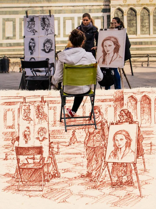
Case 28062
竖版上下对比红线手绘写实锚点海报
Turn the input photo into a vertical 3:4 top-bottom comparison transformation poster without watermarks. The upper half, approximately 45%, retains the original photo's complete composition, subject, action, perspective, and real light; the
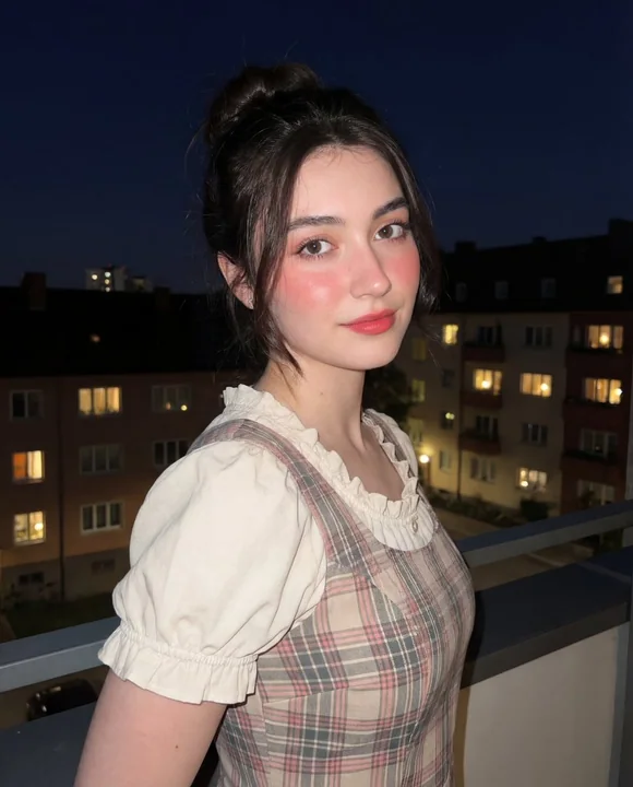
Case 21781
夜幕闪光灯下的复古田园少女
{ "composition": { "framing": "vertical portrait orientation", "shot_type": "medium shot from waist to head", "camera_angle": "eye-level with slight rightward angle", "subject_position": "center-right of frame", "pose": "three-quarter profi
少女夜景写真复古闪光灯