Case 26568
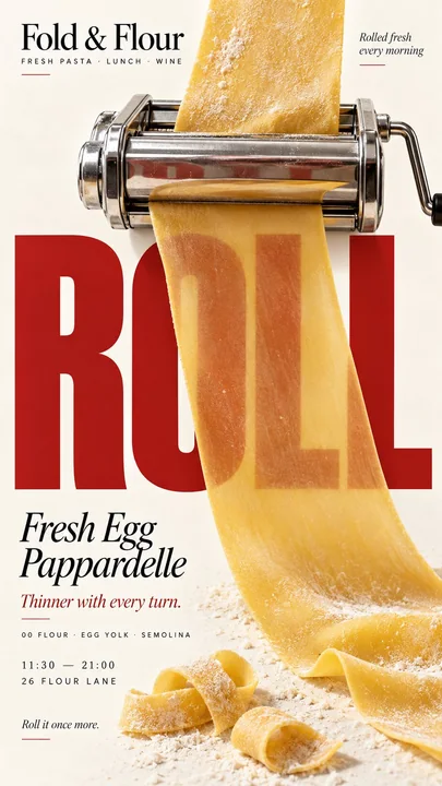
食品社论海报物理交互排版设计
Prompt
[BRAND]: {brand name}
[PRODUCT]: {food / drink}
[HEADLINE]: {short bold word}
[INTERACTION]: {thickness transition / absorption reveal / thermal refraction / diffusion field}
[ACCENT COLOR]: {main typography color}
[DETAILS]: {ingredients / short copy / hours / address}

Create a 9:16 vertical food editorial poster combining highly realistic food photography with bold, professionally designed typography.

Use a warm cream or ivory background, subtle paper texture, realistic materials, natural lighting and a clean editorial layout.

Keep [HEADLINE] completely intact, sharp and normally designed. The food must remain a separate real object and physically change only how the typography is seen according to [INTERACTION].

For “thickness transition,” let food become physically thinner through a real process such as rolling, revealing more of the typography behind it as thickness decreases.

For “absorption reveal,” let oil or another food liquid soak into a real material such as paper, increasing its transparency and gradually revealing the hidden typography underneath.

For “thermal refraction,” use real heat rising from hot food to bend and slightly shift only the typography seen through the hot-air zone while keeping the rest perfectly sharp.

For “diffusion field,” let a real ingredient spread naturally through liquid, creating changing color, density and visibility across the typography behind it.

Make [HEADLINE] large, simple and readable at thumbnail size. The physical interaction should be understandable within the first second.

Use [ACCENT COLOR] with cream, natural food colors and dark neutrals. Add only a few meaningful details such as [BRAND], product name, ingredients, one short line of copy, opening hours or address.

Keep props minimal. Avoid food-shaped letters, digital masks, fake blur, CGI materials, generic 3D type, random distortion, numbered labels, 01/02, Vol. or sparkles.

The final poster should work as a stop-scroll image: one bold headline, one clear physical food process, and one surprising but believable change in how the typography is seen.

Keep the typography professionally designed and untouched — let the real food process change the view.

[品牌]: {品牌名称}
[产品]: {食物 / 饮料}
[标题]: {简短粗体词}
[交互]: {厚度过渡 / 吸收揭示 / 热折射 / 扩散场}
[强调颜色]: {主要排版颜色}
[细节]: {成分 / 简短文案 / 营业时间 / 地址}

创建一个 9:16 垂直食品社论海报,将高度写实的食品摄影与大胆、专业的排版设计相结合。

使用温暖的奶油色或象牙色背景、细微的纸张纹理、真实的材料、自然的照明和整洁的社论布局。

保持 [标题] 完全完整、清晰且正常设计。食物必须保持为一个独立的真实物体,并仅根据 [交互] 物理性地改变排版的呈现方式。

对于“厚度过渡”,让食物通过擀开等真实过程物理性地变薄,随着厚度的减少,揭示其背后更多的排版。

对于“吸收揭示”,让油脂或其他食物液体浸入纸张等真实材料中,增加其透明度并逐渐揭示下方隐藏的排版。

对于“热折射”,利用热食冒出的真实热气来弯曲并略微偏移仅在热气区域看到的排版,同时保持其余部分完美清晰。

对于“扩散场”,让真实的成分在液体中自然扩散,在背后的排版上产生不断变化的颜色、密度和可见度。

使 [标题] 大而简单,在缩略图大小下清晰易读。物理交互应在第一秒内即可理解。

将 [强调颜色] 与奶油色、天然食物颜色和深色中性色结合使用。仅添加少量有意义的细节,如 [品牌]、产品名称、成分、一行简短文案、营业时间或地址。

保持道具极简。避免食物形状的字母、数字遮罩、虚假模糊、CGI 材料、通用的 3D 字体、随机扭曲、带编号的标签、01/02、Vol. 或火花。

最终的海报应具备停止滚动的吸引力:一个大胆的标题,一个清晰的物理食物过程,以及一个令人惊讶但可信的排版观察变化。

保持排版设计专业且不被改动 —— 让真实的食物过程改变视觉效果。More prompts
Case 20403
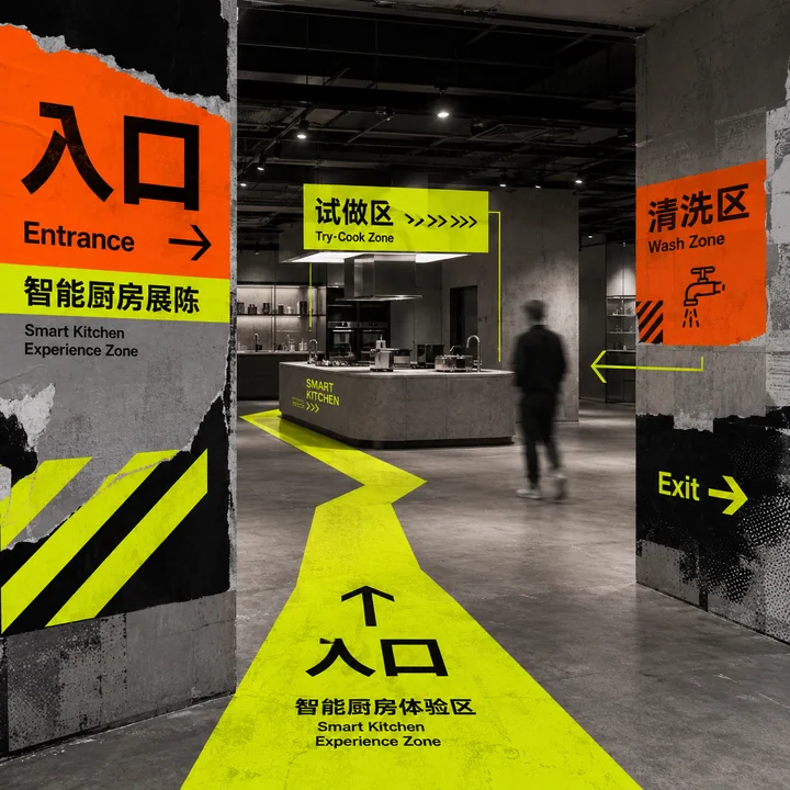
荧光动线指引的智能厨房展陈空间导视设计
极简风工业风荧光色空间导视展陈设计
Case 24026
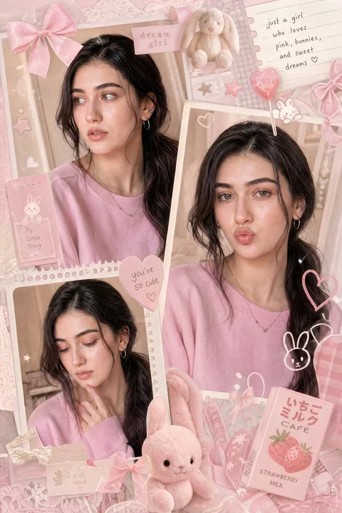
梦幻粉色少女感多帧拼贴画
A dreamy multi-frame pastel pink aesthetic collage featuring a cute young girl with long silky black hair tied in a low ponytail. She wears natural soft-glam makeup, dewy skin, glossy pink lips, and a sweet youthful expression. The composit