Case 25957
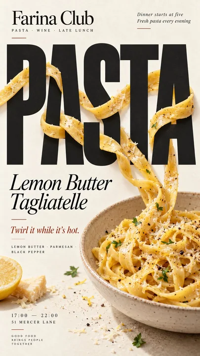
Промпт для дизайна макета креативного постера с едой
Prompt
[Бренд]: {название бренда}
[Еда / Напиток]: {основной продукт}
[ЗАГОЛОВОК]: {основное слово или короткий заголовок}
[ВЗАИМОДЕЙСТВИЕ]: {переплетение с типографикой / преломление типографики / создание негативного пространства / замена буквы}
[ЦВЕТ АКЦЕНТА]: {основной цвет типографики}
[ДЕТАЛИ]: {ингредиенты / короткий текст / часы работы / адрес}

Создайте вертикальный постер в формате 9:16 в стиле гастрономического редакционного дизайна, сочетающий высоко реалистичную фуд-фотографию с смелой, выразительной типографикой.

Используйте тёплый кремовый или слоновой кости фон из бумаги с тонкой естественной текстурой. Еда или напиток должны выглядеть реалистично, аппетитно и материально достоверно, с естественными бликами, тенями, текстурой и пропорциями. Избегайте CGI, пластиковых поверхностей, парящих вырезок или чрезмерно отполированной коммерческой рендеризации.

Ключевая концепция состоит в том, что еда должна физически взаимодействовать с типографикой согласно пункту [ВЗАИМОДЕЙСТВИЕ], а не просто находиться рядом с текстом.

Для «переплетения с типографикой» позвольте нескольким непрерывным элементам еды естественно перемещаться перед и за крупными буквами, создавая чёткую и правдоподобную глубину.

Для «преломления типографики» поместите прозрачное стекло или жидкость перед заголовком так, чтобы только буквы, видимые сквозь неё, естественно смещались, увеличивались или искажались за счёт реального оптического преломления.

Для «создания негативного пространства» позвольте форме еды или её отсутствующей части создать чистую пустую область, в которую заголовок органично вписывается.

Для «замены буквы» используйте саму еду в качестве одной узнаваемой буквы внутри заголовка, сохраняя при этом полную читаемость всего слова.

Сделайте [ЗАГОЛОВОК] одним из самых сильных визуальных элементов, используя смелую редакционную типографику. Интегрируйте типографику и еду в единую композицию с чёткой иерархией, сильным негативным пространством и намеренным кадрированием.

Добавьте лишь несколько полезных деталей бренда, таких как [Бренд], ингредиенты, вкусовые ноты, часы работы или адрес. Держите весь текст кратким и содержательным.

Используйте [ЦВЕТ АКЦЕНТА] как основной типографский акцент наряду с кремовым цветом, естественными оттенками еды и тёмными нейтральными тонами. Держите палитру под контролем.

Избегайте нумерованных меток, 01/02, Vol., блёсток, стандартного заполняющего текста, ненужного декора, карточек в стиле UI или шаблонных макетов.

Финальный постер должен ощущаться как настоящая кампания кофейни, пекарни или ресторана: визуально эффектным в размере миниатюры, детализированным при близком рассмотрении и построенным вокруг одной чёткой идеи, где еда и типографика действительно влияют друг на друга.Другие промпты
Case 28640
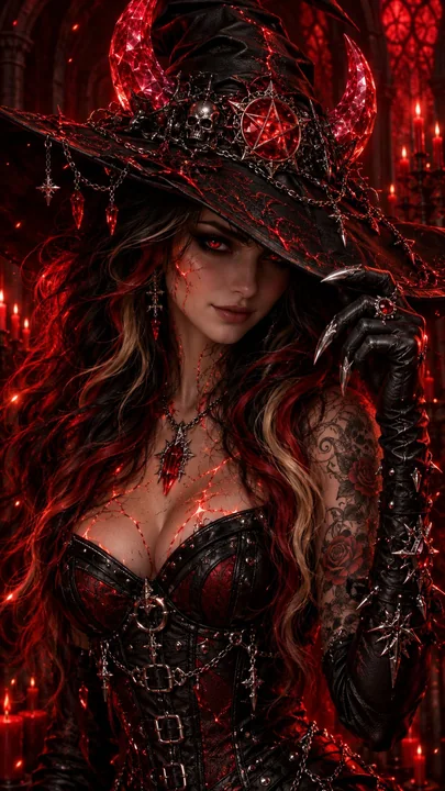
Тёмный фэнтезийный портрет ведьмы с алой кровью
Ультрадетальный портрет в стиле тёмного фэнтези: багровая Кровь-ведьма, изображённая по пояс, с слегка наклонённой головой и хитрой, осведомлённой ухмылкой. Одна когтистая рука в перчатке приподнимает поля её шляпы, отбрасывая на лицо полут
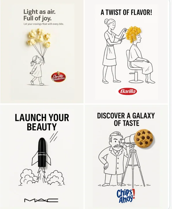
Case 12
Креативная реклама
Минималистичная и креативная реклама на чистом белом фоне. В ручной черно-чернильной зарисовке интегрирован настоящий [Real Object], выполненный с помощью свободных, игривых линий. Концепция [Doodle Concept] взаимодействует с объектом умным
minimalist品牌Logobranding