创意美食海报排版设计提示词
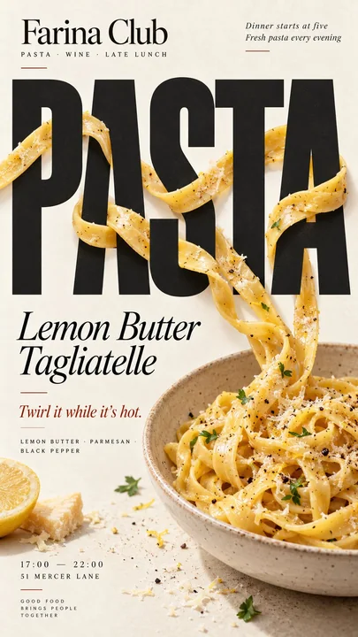
Prompt
[品牌]:{品牌名称}
[食物 / 饮料]:{主要产品}
[标题]:{主要单词或短标题}
[互动方式]:{穿插排版 / 折射排版 / 创造负空间 / 替换字母}
[强调色]:{主要排版颜色}
[详情]:{成分 / 短文案 / 营业时间 / 地址}

创建一个 9:16 的垂直美食社论海报,将高度写实的美食摄影与大胆、富有表现力的排版相结合。

使用带有微妙自然纹理的温暖奶油色或象牙色纸张背景。保持食物或饮料写实、诱人且材质可信,具有自然的亮部、阴影、纹理和比例。避免 CGI、塑料表面、漂浮的剪切图或过于平滑的商业渲染。

核心概念是,食物必须根据 [互动方式] 与排版产生物理互动,而不仅仅是停留在文字旁边。

对于“穿插排版”,让一些连续的食物元素自然地在大字母前后穿行,具有清晰、可信的深度感。

对于“折射排版”,将透明玻璃或液体置于标题前,使仅通过它看到的字母因真实的光学折射而自然地产生移位、放大或扭曲。

对于“创造负空间”,让食物的形状或缺失部分创造出一个干净的空白区域,使标题自然地嵌入其中。

对于“替换字母”,使用食物本身作为标题中一个可识别的字母,同时保持整个单词立即可读。

使用大胆的社论排版使 [标题] 成为最强的视觉元素之一。将文字和食物整合到同一个构图中,具有清晰的层级、强大的负空间和有意的裁剪。

仅添加少量有用的品牌细节,如 [品牌]、成分、风味说明、营业时间或地址。保持所有文案简短且有意义。

使用 [强调色] 作为主要的排版点缀,并搭配奶油色、自然食物颜色和深色中性色。保持色调受控。

避免数字标签、01/02、Vol.、闪烁、通用的填充文案、不必要的装饰、UI 风格的卡片或模板化的布局。

最终的海报应该感觉像是一个真实的咖啡馆、面包店或餐厅的宣传活动:在缩略图大小下视觉冲击力强,近看细节丰富,并围绕一个食物与排版真正相互影响的清晰创意而构建。更多提示词
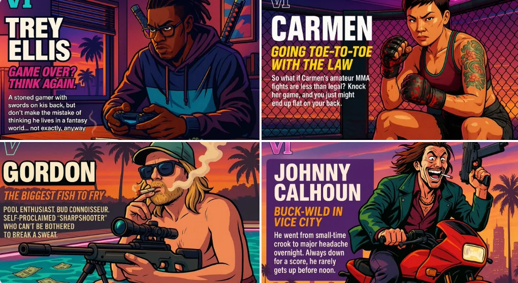
创建你自己的GTA角色
VI **LUCIAN "SUNSET" VARGAS** *“Where the sun sets… the deals begin.”* Lucian “Sunset” Vargas is a smooth-talking, sunset-obsessed drug kingpin who runs the most exclusive beachfront meth lab in Vice City. He’s got more charm than a
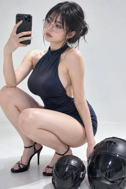
韩国美女工作室人像与科幻头盔
一张超写实的8K工作室照片,画面是一位美丽的韩国女性,蹲在无缝的白色地板上。深色头发梳成松散的发髻,留着齐刘海,戴着圆形细框眼镜。白皙真实的皮肤,可见毛孔并带有柔和的光泽,棕色眼睛,轮廓分明的眉毛,涂着光泽感柔和玫瑰色唇膏。左侧肋骨处有一个红色的小印记。 姿势:双膝弯曲并张开,重心落在前脚掌上,右手举起拿着手机自拍,左手撑在地板上以保持平衡。穿着黑色露趾高跟鞋,配有蕾丝系带。 服装:一件合身的深蓝色高领无袖迷你连衣裙,侧面开叉,面料在胸部和臀部处紧绷,形成微小的张力褶皱。
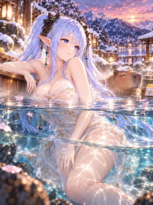
温泉沐浴插图:半身露出水面,半身浸在水中
纵向3:4,干净高画质的2.5D动画插图,明亮清澈的色彩。温泉入浴场景,一半水上·一半水中的构图视角,OC披着薄披肩,半身在汤中,半身在水面上,自然地倚靠在浴池边缘,静静地眺望周围的景色。清澈的水面,水影,折射,波光的闪耀,柔和飘散的温泉蒸汽。
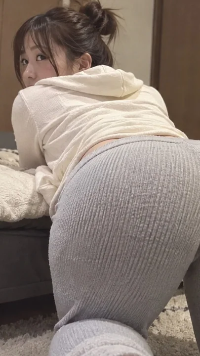
卧室床边,女性身着居家服回眸的写实摄影
主题: 一张从后方近距离拍摄的照片,描绘了一位虚构的成年女性,她上半身倚靠在卧室的低矮床沿,双膝跪在地板上。身穿接近白色的浅米色连帽衫,以及带有浅灰色粗竖条纹的宽松长裤。女性从肩后转头,双眼望向镜头。画面着重表现从近处腰部经背部延伸至远处脸部的对角线透视感,以及家居服的柔软质感。 地点/时间/背景: 远处是一扇棕色木质储物门,带有垂直接缝和小金属配件。画面左侧是白色羊毛毯,其下方是深灰色的床侧。脚下隐约可见浅米色长毛地毯。在最终的竖幅构图中,不包含右侧远处的植物或家具,背景
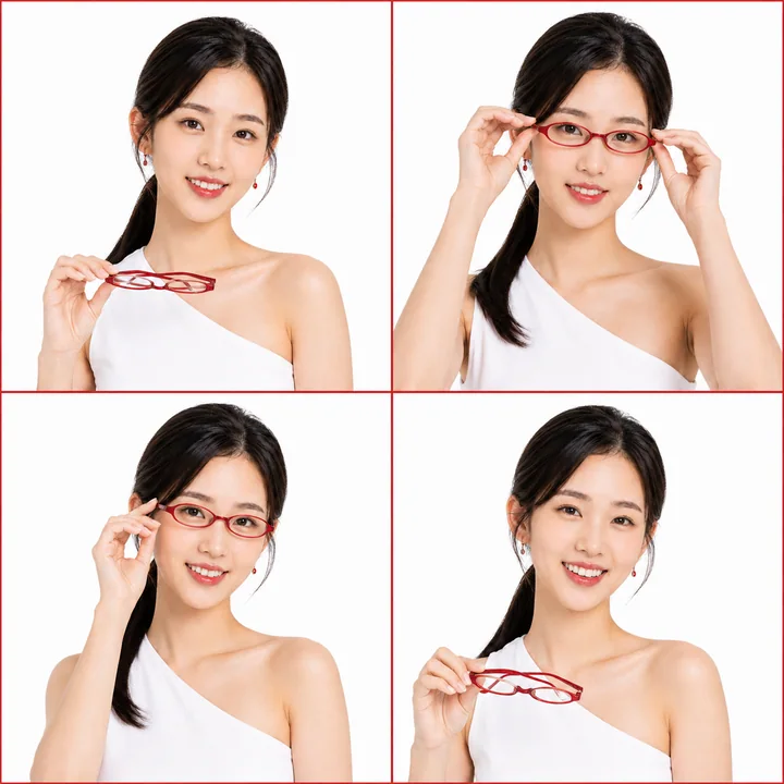
红色镜框时尚四格:优雅女性的动感瞬间
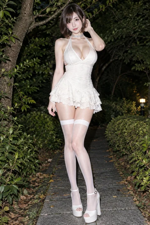
花园夜色中的东亚女性时尚全身照
## [主体描述] 一张超写实的全身时尚摄影作品,主角是一位成年东亚女性,拥有白皙光滑的皮肤、自然丰满的胸部、纤细的腰肢以及修长健美的双腿。她长着精致的鹅蛋脸,深邃的大眼睛,画着淡淡的眼线,脸颊透着柔和的腮红,嘴唇呈现自然的玫瑰粉色。她留着一头深棕色、光泽感强的短发,造型为凌乱的波波头,长长的斜刘海部分遮住了一只眼睛。她直视镜头,神情平静且略带一丝魅惑。 她身穿一件优雅的象牙白色挂脖迷你裙,具有深V领口、修身褶皱的上衣、精致的纹理面料,以及带有扇形边缘的分层荷叶边裙摆。脖
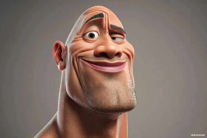
真人转3D漫画
这是一幅高度风格化的[名人]3D漫画肖像,头部硕大,面部特征富有表现力,并带有诙谐夸张的风格。画面采用流畅、精致的渲染方式,材质干净,环境光柔和。背景极简,突出了人物的魅力和存在感。
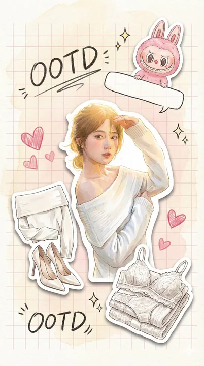
奶油水彩手账
一张9:16竖屏的高级时尚插画情绪板,模拟平板扫描效果。背景是纯手绘的奶油色水彩晕染纸张,带有淡淡的粉色网格。视觉核心是数张具有明显白色模切宽边和柔和投影的亮面乙烯基贴纸。中央贴纸是用户穿着甜美约会装的照片,光线明亮。左侧是对这套穿搭的解构贴纸,整齐折叠的外套和精致的高跟鞋。右下角是关键的隐藏层贴纸:一套折叠整齐的高级白色蕾丝内衣,展现细腻纹理。一只穿着粉色系、与用户服装呼应的Labubu艺术公仔贴纸正趴在一个手绘对话框上。周围装饰着蜡笔质感的手绘爱心、闪光符号和潦草的中文书
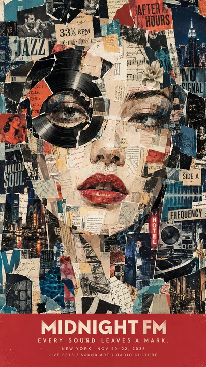
复古社论风格撕纸拼贴人像海报
[自定义] 品牌:[品牌名称] 主题:[音乐 / 时尚 / 美容 / 旅行 / 书籍 / 等] 人像:[年龄,性别,外貌,表情] 拼贴元素:[照片,杂志,地图,花卉,书页,票据,等] 视觉反转:[一个创意性地融入面部特征的物体] 颜色:[主色,辅助色,以及强调色] 标语:[品牌口号] 详情:[产品 / 活动 / 地点信息] 风格与构图 创作一张令人惊叹的 9:16 复古社论拼贴海报,特色是一个完全由撕裂的杂志、档案照片、印刷文本、插图和分层纸张碎片组成的巨大人物肖像。