Case 26113
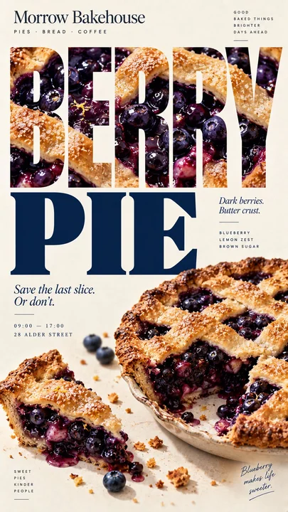
ملصق طعام بأسلوب تحريري يتكون من قوامات الطعام
Prompt
[العلامة التجارية]: {اسم العلامة التجارية}
[الطعام / الطبق]: {المنتج الرئيسي}
[العنوان الرئيسي]: {الكلمة الرئيسية أو العنوان القصير}
[البنية]: {نوع حشوة الصور / طبقات الطعام كشبكة / شبكة تحريرية معيارية / حجاب البخار}
[اللون المميز]: {اللون الرئيسي للنص}
[التفاصيل]: {المكونات / نص قصير / ساعات العمل / العنوان}

أنشئ ملصقًا تحريريًا عموديًا للطعام بنسبة 9:16 يستخدم الطعام نفسه لبناء البنية البصرية للصفحة.

استخدم خلفية كريمية دافئة أو عاجية ذات ملمس ورقي خفيف، وصورًا فوتوغرافية واقعية للغاية للطعام، وخطوطًا تحريرية معبّرة، ولوحة ألوان مضبوطة. يجب أن يبدو الناتج وكأنه حملة حقيقية لمقهى أو مخبز أو مطعم، وليس قالبًا قابلًا لإعادة الاستخدام.

الفكرة الأساسية هي أن [البنية] يجب أن تحدد التكوين.

بالنسبة لـ "حشوة الصور"، استخدم صورة طعام واحدة متصلة داخل حروف العنوان الكبيرة مع الحفاظ على وضوح الكلمة فورًا. يجب أن تتدفق الصورة بشكل طبيعي عبر جميع الحروف بدلاً من استخدام خامات منفصلة لكل حرف.

بالنسبة لـ "طبقات الطعام كشبكة"، استخدم الطبقات الأفقية الطبيعية للطعام — المعجنات، الكريمة، الفواكه، الحشوات أو الأقسام المرئية الأخرى — كنظام محاذاة للنص والملاحظات الصغيرة. دع الطعام ينشئ الشبكة بدلاً من رسم شبكة اصطناعية فوقه.

بالنسبة لـ "الشبكة التحريرية المعيارية"، قسّم الصفحة إلى عدة وحدات غير متساوية للتصوير الفوتوغرافي والنص. استخدم قصّات ومقاييس ونقاط نظر مختلفة، مع جعل عنصر أو عنصرين يتجاوزان حدود الوحدات بشكل خفيف حتى يبدو التخطيط تحريريًا وليس مجرد كولاج بسيط.

بالنسبة لـ "حجاب البخار"، ضع النص العريض خلف طعام ساخن حقيقي، ودع المناطق المغطاة بالبخار الصاعد الطبيعي فقط تصبح أكثر نعومة أو فاتحة أو محجوبة جزئيًا. حافظ على وضوح جميع النصوص خارج البخار تمامًا. لا تستخدم تأثيرات الضباب الرقمي أو الدخان.

اجعل [العنوان الرئيسي] والطعام هما أقوى نقطتي ارتكاز بصريين. استخدم خط عرض عريض للعنوان الرئيسي، وخط مقيّد ذو حواف أو خط بدون حواف محايد للمعلومات الثانوية.

أضف فقط بضع تفاصيل ذات معنى مثل [العلامة التجارية]، المكونات، ملاحظات النكهة، ساعات العمل، العنوان أو سطر واحد قصير للعلامة التجارية. تجنب نصوص التعبئة العامة.

استخدم [اللون المميز] إلى جانب اللون الكريمي، ألوان الطعام الطبيعية، والألوان المحايدة الداكنة. حافظ على لوحة الألوان نظيفة ومتناسقة.

يجب أن يكون الملصق النهائي قويًا بصريًا عند حجم الصورة المصغرة، ومفصّلًا عند النظر عن قرب، ومبنيًا حول مبدأ واضح واحد: الطعام لا يجلس ببساطة داخل التخطيط — بل إن ملمسه، وطبقاته، وقصّاته، أو أجواءه هي التي تخلق التخطيط نفسه.مطالب أخرى
Case 28732
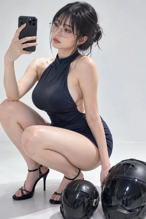
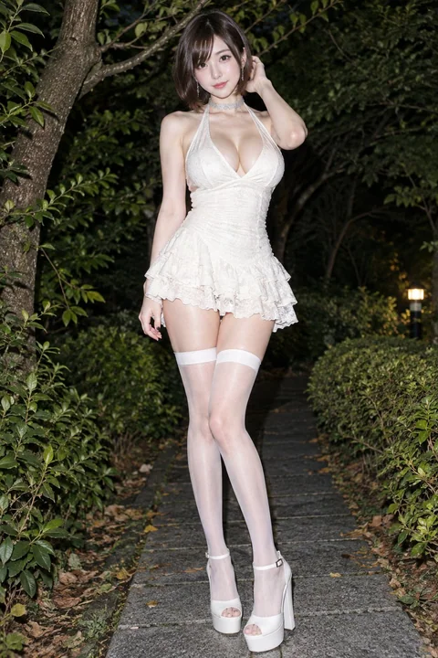
صورة كاملة لامرأة آسيوية شرقية أنيقة في ليل الحديقة
## [وصف الموضوع] صورة أزياء واقعية بالكامل لجسم امرأة آسيوية شرقية بالغة، بشرة فاتحة وناعمة، صدر طبيعي ممتلئ، خصر نحيف، وساقين طويلتين وممشوقتين. لديها وجه بيضاوي دقيق، عيون كبيرة داكنة، خط عيون خفيف، خدود مرسومة بلمسة خفيفة من الورد، وشفت
Case 18156
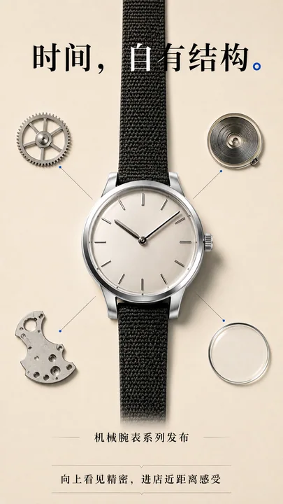
جماليات الآلية: تفكيك دقيق يكشف عن البنية الذاتية للزمن
机械美学极简风格腕表发布精密结构竖屏海报