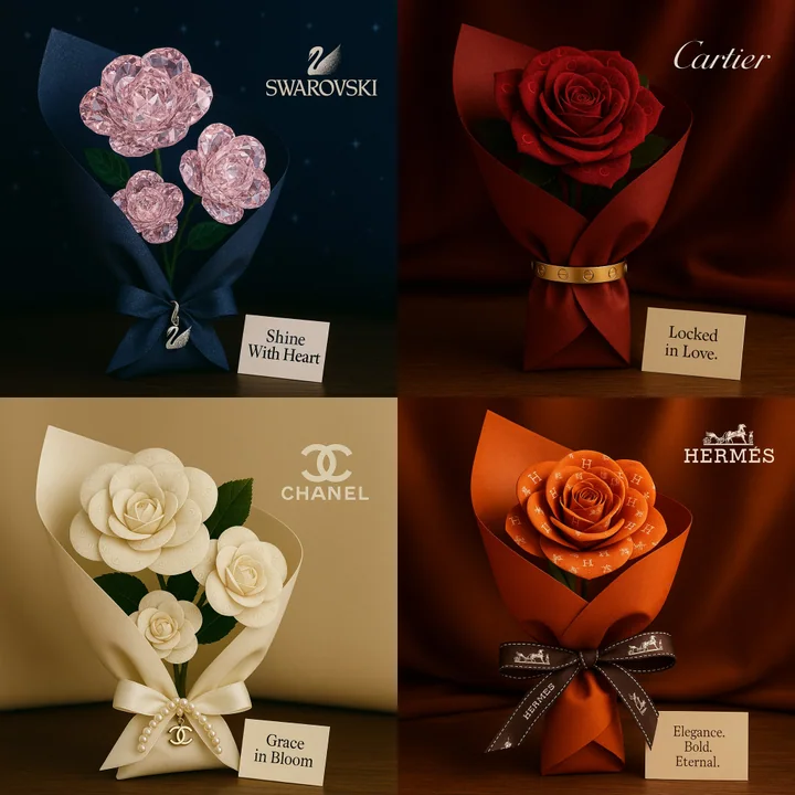
Case 26147
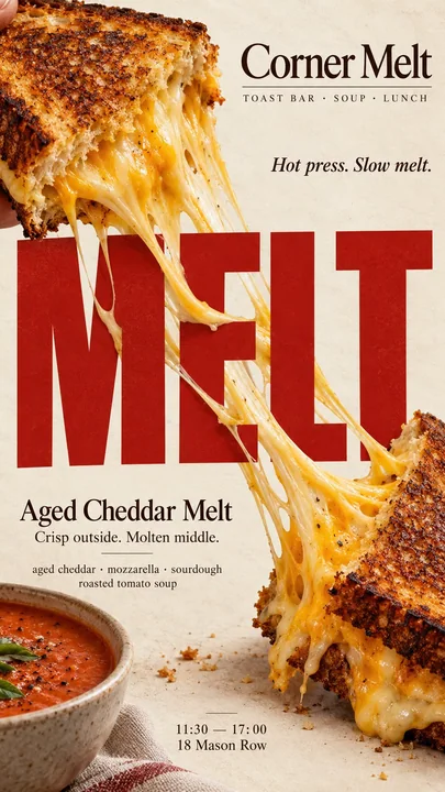
Промпт для креативного постера с минималистичной едой, текстом и физическим взаимодействием
Prompt
[Бренд]: {название бренда}
[Продукт]: {еда / блюдо / десерт}
[Заголовок]: {короткое жирное слово}
[Взаимодействие]: {растяжение через текст / трансформация текста под воздействием тепла / оттиск текста на еде / трещина в еде проходит через текст}
[Акцентный цвет]: {основной акцентный цвет}
[Детали]: {ингредиенты / короткий текст / часы работы / адрес}

Создайте вертикальный редакционный постер формата 9:16, объединяющий высоко реалистичную фуд-фотографию и жирную типографику через одно четкое физическое взаимодействие.

Используйте теплый кремовый или слоновой кости фон, тонкую бумажную текстуру, натуральные пищевые материалы, естественный свет и чистую редакционную композицию. Результат должен напоминать настоящую рекламную кампанию кофейни, пекарни или ресторана.

Еда и типографика должны физически влиять друг на друга в соответствии с [Взаимодействием], а не просто располагаться рядом.

Для «растяжения через текст» непрерывный съедобный материал, такой как расплавленный сыр, должен перекрывать крупные буквы с правдоподобным натяжением, гравитацией и глубиной.

Для «трансформации текста под воздействием тепла» создайте заголовок из съедобного материала, такого как меренга, и позвольте реальному теплу создать непрерывный градиент запекания как на буквах, так и на еде.

Для «оттиска текста на еде» вдавите заголовок непосредственно в поверхность еды, чтобы исходная текстура физически деформировалась вокруг букв.

Для «трещины в еде, проходящей через текст» реальная трещина или разлом в еде должна задавать одно четкое направление, и этот же разлом должен продолжаться через заголовок, сохраняя его читаемость.

Сделайте [Заголовок] крупным, простым и мгновенно читаемым в размере миниатюры. Физическое взаимодействие должно быть понятным в первую секунду.

Используйте [Акцентный цвет] дозированно в сочетании с кремовым, натуральными пищевыми цветами и темными нейтральными оттенками. Добавьте лишь несколько полезных деталей, таких как [Бренд], название продукта, ингредиенты, одну короткую строку текста, часы работы или адрес.

Держите реквизит минимальным. Избегайте CGI-еды, пластиковых текстур, универсального 3D-шрифта, цифровых глитчей, искусственных эффектов обугливания, случайных трещин, чрезмерного декора, нумерованных меток, 01/02, Vol. или блеска.

Финальный постер должен работать как изображение, останавливающее скроллинг: один смелый заголовок, одно четкое действие с едой и одно удивительное, но физически правдоподобное взаимодействие «Еда × Типографика».

Не украшайте текст едой — позвольте еде физически перестроить текст.Другие промпты
Case 23003
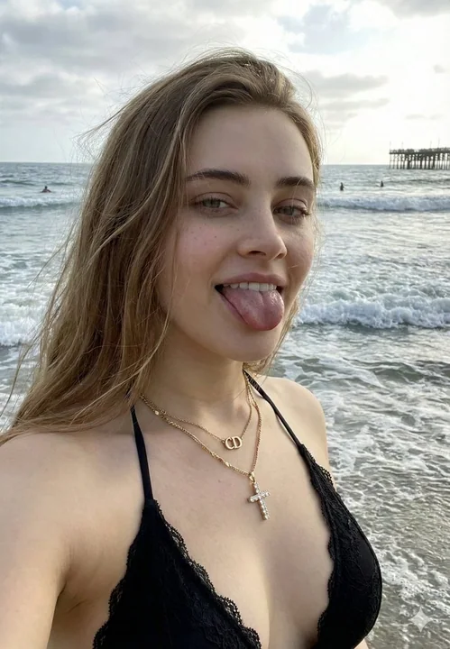
Пикантная девушка в бикини на пляже летом: игривый селфи с высунутым языком
{ "image_prompt": { "subject": { "description": "Молодая женщина, светлый тон кожи, длинные прямые светло-каштановые волосы, некоторые пряди развеваются на ветру.", "pose": "Угол селфи, голова слегка наклонена, игриво высунут язык, взгляд н
自拍写实比基尼海滩俏皮
Case 22997
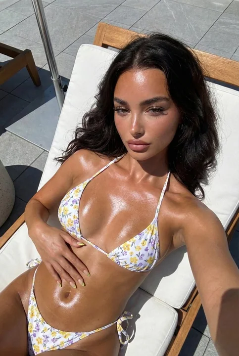
Цветочный бикини на ярком солнце и блестящая бронзовая кожа
{ "subject": { "description": "Молодая женщина с глубоким загаром и длинными тёмными волнистыми каштановыми волосами, лежащая на шезлонге.", "body_details": { "skin_texture": "Высокодетализированная текстура кожи с выраженным блеском от мас