Case 24753
书籍拼贴微缩插画风格
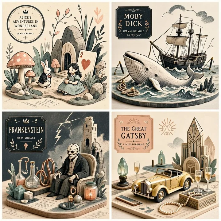
Prompt
2x2 grid, 1:1 do this for 4 famous books<transformation> - Preserve the subject’s recognizable structure, but reinterpret it as a stylized editorial composition where drawing and miniature object-world logic coexist. - Convert some forms into sparse grainy line illustration while converting other forms into soft pastel miniatures or still-life objects. - Reinterpret texture-rich or detailed areas as small clusters of plants, props, vessels, terrain fragments, or decorative micro-world motifs. - Convert smooth surfaces into matte pastel color fields, while using graphic linework to describe edges, volume, and texture selectively. - Reduce complexity into a limited color system with one dominant graphic ink tone and a few quiet pastel support colors. - Replace deep realism with poster-like clarity, paper-print tactility, and curated tabletop arrangement. - Allow the subject to feel partially drawn and partially physically staged, creating a deliberate ambiguity between illustration and object. - Use negative space and sparse composition to keep the image clean, modern, and highly readable. </transformation> <shape_language> - Favor simple containers, rounded objects, leaves, stems, pebbles, tabletop silhouettes, miniature clusters, and clean abstract forms. - Use a mix of flat contour areas and soft low-relief sculptural accents. - Keep repetition rhythmic and decorative. - Let small details feel intentional and editorial rather than busy. </shape_language> <rendering_rules> - Use visibly grainy printed or crayon-like marks for lines and texture accents. - Keep volumetric forms soft, simplified, and pastel. - Limit the palette aggressively for a designed, print-friendly look. - Use shallow spatial depth with subtle diorama hints. - Make the final result feel like an art print, a magazine illustration, and a miniature set all at once. </rendering_rules> <finish> - Graphic limited-palette editorial hybrid. - Printmaking texture fused with soft pastel mini-world staging. - Smart, modern, collectible, and quietly distinctive. </finish> <avoid> - Avoid photoreal rendering. - Avoid deep cinematic perspective or strong realism. - Avoid overstuffing with too many tiny details. - Avoid using too many colors; keep it controlled and designed. </avoid>

2x2 网格,1:1 比例,为 4 本名著创作 <transformation> - 保留主体的可辨识结构,但将其重新诠释为一种风格化的编辑构图,使绘画与微型物体世界的逻辑并存。 - 将某些形式转换为稀疏的颗粒感线条插画,同时将其他形式转换为柔和的柔和色调微缩模型或静物对象。 - 将纹理丰富或细节较多的区域重新诠释为小型的植物群、道具、容器、地形碎片或装饰性的微型世界图案。 - 将平滑表面转换为哑光柔和色块,同时有选择地使用图形线条来描绘边缘、体积和纹理。 - 将复杂性简化为有限的色彩系统,包含一种主导性的图形墨色和几种沉静的柔和辅助色。 - 以海报般的清晰度、纸张印刷的触感和精心策划的桌面布置取代深度现实主义。 - 让主体感觉像是部分绘制的,部分是实体布置的,在插画和物体之间创造一种刻意的模糊感。 - 使用负空间和稀疏的构图,使图像保持干净、现代且高度易读。 </transformation> <shape_language> - 偏好简单的容器、圆润的物体、叶子、茎、鹅卵石、桌面剪影、微缩集群和干净的抽象形式。 - 结合平面的轮廓区域和柔和的低浮雕雕塑感点缀。 - 保持重复具有韵律感和装饰性。 - 让微小的细节显得具有意图感和编辑感,而不是杂乱。 </shape_language> <rendering_rules> - 使用明显的颗粒状印刷或蜡笔般的痕迹作为线条和纹理重点。 - 保持体积形式柔和、简化且呈柔和色调。 - 极力限制调色板,以获得一种经过设计的、适合印刷的外观。 - 使用浅空间深度并带有细微的西洋镜暗示。 - 让最终结果同时具有艺术印刷品、杂志插画和微缩场景的感觉。 </rendering_rules> <finish> - 图形化有限色调的编辑混合体。 - 版画纹理与柔和色调微型世界布置相结合。 - 灵动、现代、具有收藏价值且低调独特。 </finish> <avoid> - 避免写实渲染。 - 避免深邃的电影透视或强烈的现实主义。 - 避免塞入过多的微小细节。 - 避免使用过多颜色;保持受控且经过设计。 </avoid>