Case 25644
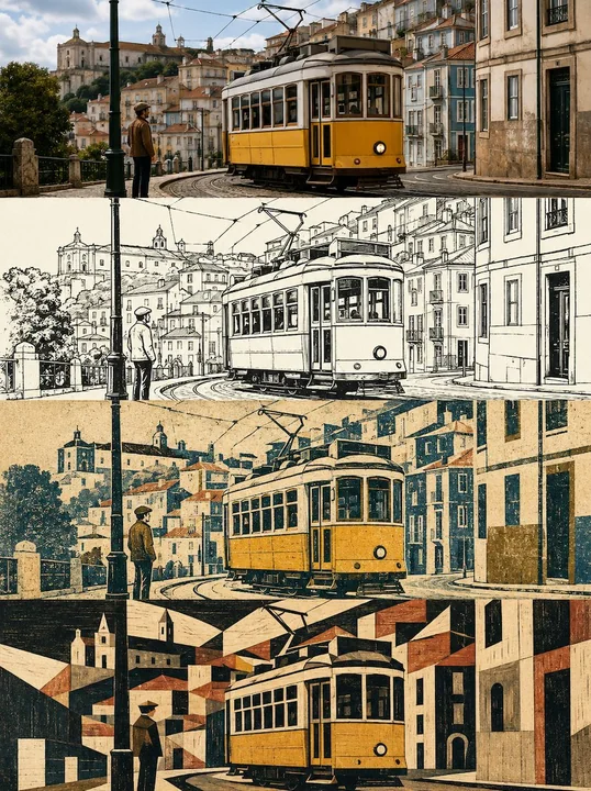
Affiche de conception de scénarios multidimensionnels en quatre niveaux progressifs
Prompt
Veuillez créer une affiche de design haut de gamme représentant la même scène que la photo téléversée dans la couche actuelle, sans collage multi-photos, en sortant chaque photo individuellement. « Sans collage multi-photos » signifie ici : ne pas mélanger différentes photos téléversées dans le même produit fini ; chaque photo téléversée doit générer indépendamment une affiche complète au style quatre couches.

【Ratio global et structure en quatre couches】
La mise en page globale utilise une composition verticale de 3:4. L'image est strictement divisée en quatre zones horizontales égales de haut en bas, et la hauteur de chaque zone doit précisément représenter 25 % de la hauteur totale de l'image. Le ratio des quatre couches est strictement de 1:1:1:1, et aucun écart de ratio n'est autorisé. Les quatre couches sont connectées de manière ininterrompue, sans lignes de séparation, sans espaces blancs et sans bordures.

Étant donné que chaque couche est en réalité une bannière extrêmement plate d'environ 3:1, le sujet doit être adapté horizontalement au sein de chaque couche : maintenir la stabilité de la position principale et du point focal visuel du sujet, privilégier l'expansion horizontale et éviter que le sujet ne soit étiré verticalement, aplati, poussé contre le bord ou que ses parties clés ne soient rognées. Le ciel, les murs, le sol, la surface de l'eau, le papier ou l'espace négatif environnemental cohérent avec l'image d'origine peuvent être étendus vers la gauche et la droite, mais la duplication d'un arrière-plan flou ne doit pas être utilisée pour le remplissage.

【Cohérence entre les quatre couches】
Les quatre couches doivent provenir de la même photo téléversée et du même instant. Maintenir strictement la cohérence de l'identité du sujet, du nombre de sujets, des traits du visage des personnes ou des animaux, de la posture, de la direction du mouvement, du regard, des caractéristiques essentielles de la coiffure et des vêtements, de la structure architecturale, de l'identité du point de repère, des relations entre les objets principaux, de l'angle d'observation, de la direction de la perspective, de la position gauche-droite, de la hiérarchie avant-arrière et de la relation narrative.
Les couches de style sont autorisées à supprimer les arrière-plans secondaires, à réduire les textures et à modifier les matériaux et la densité des détails selon leurs médias respectifs, mais le sujet ne peut pas être remplacé par une autre personne, un autre bâtiment, une autre voiture, un autre animal ou une autre scène.

【Couche 1 | Photographie originale】
La première couche conserve fidèlement la texture photographique réelle de la photo téléversée. Conserver l'identité du sujet, la quantité, la relation de composition, la posture, le mouvement, les matériaux réels, l'éclairage et les ombres naturels, la température de couleur globale et l'atmosphère de la scène. Seule une coloration photographique de haut de gamme mesurée, un ajustement fin de l'exposition et du contraste, ainsi qu'une optimisation extrêmement légère et délicate du grain sont autorisés.
Pour s'adapter à la bannière actuelle d'environ 3:1, un rognage naturel ou une extension des bords environnementaux cohérents avec la scène d'origine peuvent être effectués, mais le sujet ne doit pas être étiré, déformé, mis en miroir, copié, les objets clés déplacés, la structure architecturale modifiée ou les personnages redessinés.
La première couche n'ajoute aucun texte supplémentaire, logo de marque, bordure, filigrane ou élément décoratif.

【Couche 2 | Dessin à l'encre noir et blanc style animation des années 1970 | Règles d'adaptation de la couche actuelle】
Cette couche ne représente que 25 % de la hauteur de l'affiche totale en quatre parties de 3:4, ce qui est en réalité une zone horizontale extrêmement plate d'environ 3:1. Les instructions de style suivantes sont toutes exécutées « dans la couche actuelle ».
Toute expression apparaissant dans le prompt source, telle qu'affiche indépendante, image entière, ratio vertical, sortie séparée, etc., ne doit pas modifier la structure globale en quatre parties ; le ratio horizontal plat d'environ 3:1 de la couche actuelle est la priorité absolue.
Ne pas générer de zone de comparaison avec l'image originale, de deuxième photo, d'écran divisé haut-bas ou de grilles multiples supplémentaires au sein de la couche actuelle. S'il y a des exigences de recomposition dans le prompt source, seule la refinement des informations d'arrière-plan, des matériaux, de l'espace négatif et des éléments secondaires est autorisée ; l'identité du sujet, la quantité, la posture clé, la direction du mouvement, la perspective d'observation, la perspective principale, la position gauche-droite et la relation spatiale centrale ne doivent pas être modifiées.
Si le texte est un composant important du style source, il est conservé, mais il doit être réduit au nombre minimal nécessaire pour être clairement lisible dans la couche actuelle ; si le prompt source exige explicitement l'absence de texte, maintenir l'absence de texte.

【Description complète de la traduction du style source】
Créer un dessin à l'encre noir et blanc du [sujet]. Mettre en valeur les caractéristiques expressives, en utilisant l'esthétique de l'animation 2D des années 1970, des contours rugueux à fort contraste, un art linéaire net et clair, des largeurs de ligne minimalistes mais hiérarchisées, et un style de nettoyage d'animation. L'image utilise une composition en clair et un fond blanc pur, n'utilisant que les couleurs noir et blanc, sans ajouter d'ombres, de couleurs ou de nuances de gris.

【Couche 3 | Estampe en relief de voyage à couleurs limitées et grain grossier | Règles d'adaptation de la couche actuelle】
Cette couche ne représente que 25 % de la hauteur de l'affiche totale en quatre parties de 3:4, ce qui est en réalité une zone horizontale extrêmement plate d'environ 3:1. Les instructions de style suivantes sont toutes exécutées « dans la couche actuelle ».
Toute expression apparaissant dans le prompt source, telle qu'affiche indépendante, image entière, ratio vertical, sortie séparée, etc., ne doit pas modifier la structure globale en quatre parties ; le ratio horizontal plat d'environ 3:1 de la couche actuelle est la priorité absolue.
Ne pas générer de zone de comparaison avec l'image originale, de deuxième photo, d'écran divisé haut-bas ou de grilles multiples supplémentaires au sein de la couche actuelle. S'il y a des exigences de recomposition dans le prompt source, seule la refinement des informations d'arrière-plan, des matériaux, de l'espace négatif et des éléments secondaires est autorisée ; l'identité du sujet, la quantité, la posture clé, la direction du mouvement, la perspective d'observation, la perspective principale, la position gauche-droite et la relation spatiale centrale ne doivent pas être modifiées.
Si le texte est un composant important du style source, il est conservé, mais il doit être réduit au nombre minimal nécessaire pour être clairement lisible dans la couche actuelle ; si le prompt source exige explicitement l'absence de texte, maintenir l'absence de texte.

【Description complète de la traduction du style source】
Veuillez utiliser la photo actuellement téléversée comme seule référence et la transformer en une affiche d'estampe en relief de voyage à couleurs limitées de haut de gamme dans la couche actuelle. Utiliser une composition horizontale plate d'environ 3:1 pour la couche actuelle ; la couche actuelle ne présente que cette traduction de style et ne définit pas de zone de comparaison avec la photo originale supplémentaire.

Estampe en relief de voyage

L'image utilise un fond de papier d'imprimerie naturel de couleur crème ou ivoire chaud.
Le papier doit avoir : un grain de papier visible, des fibres de papier subtiles, une surface mate légèrement rugueuse, un papier d'archivage chaud, une absorption naturelle des pigments.

Sélectionner le sujet le plus reconnaissable de la photo originale téléversée, ou une scène dans son ensemble qui peut représenter le sens de la photo, et le refaire en un « marque d'estampe de voyage » indépendant flottant sur le papier.

Conserver ce qui détermine la reconnaissabilité de la photo originale :
- Contour extérieur du sujet
- Posture ou direction du mouvement
- Divisions principales de lumière et d'ombre
- Direction de la perspective
- Structures clés
- Rythme de la texture des matériaux
- Couleurs signature
- Relations spatiales les plus importantes

Supprimer activement :
- Arrière-plans complexes
- Structures architecturales répétitives
- Grand nombre de fenêtres
- Foules denses
- Véhicules non pertinents
- Petites enseignes
- Clutter
- Textures fines
- Objets secondaires
- Textes qui ne peuvent pas être générés avec précision

La couche actuelle ne consiste pas à réduire la saturation de toute la photo, à ajouter du grain ou à appliquer un filtre d'imprimerie. Il faut d'abord comprendre les informations visuelles les plus importantes de la photo, puis la réplater, la comprimer, la colorer et l'imprimer.

IV. Médias et texture d'imprimerie
Utiliser le langage d'imprimerie mixte suivant : Estampe en relief de voyage, sérigraphie à palette de couleurs limitée, lithographie grossière, texture de gravure sur bois, texture de linogravure, impression par pochoir, texture photographique compressée, impression artisanale, pigments usés, trames brisées, couverture d'encre irrégulière, bords de pinceau sec rugueux, transparence du papier, léger décalage d'enregistrement des couleurs, ombres granuleuses, limites de masquage manuel, manque d'encre naturel.
L'estampe doit avoir la texture du grain grossier, de la superimpression artisanale et des anciennes estampes de voyage. Les pigments sont des encres d'impression opaques et mates, pas des aquarelles transparentes.

Autorisé :
- Couverture d'encre inégale
- Manque d'encre local
- Trames brisées
- Bords de pinceau sec rugueux
- Transparence du papier
- Léger décalage d'enregistrement des couleurs
- Ombres granuleuses
- Limites irrégulières du masquage manuel
- Usure partielle
- Une petite quantité de texture de la photo originale après compression

Les différentes couches de couleur doivent sembler avoir été superimprimées séparément sur le papier, plutôt que fusionnées de manière lisse par des dégradés numériques. Ne pas utiliser de traits de vecteur précis. Ne pas laisser le sujet devenir un logo de marque d'entreprise, une icône propre ou une illustration plate courante.

V. Composition de la couche actuelle
Le sujet de l'estampe est placé au centre ou légèrement dans la partie supérieure de l'image. Le sujet représente environ 38 % à 52 % de la hauteur de la couche actuelle, ajusté naturellement selon le contenu de la photo. Le sujet de l'estampe ne peut pas remplir tout le cadre ; une grande quantité d'espace négatif du papier ivoire chaud doit être réservée autour de lui. Les bords du sujet ne peuvent pas former un cadre de photo rectangulaire complet. Utiliser les méthodes suivantes pour faire disparaître naturellement les bords : impression au pinceau irrégulière, bords d'encre déchirés, trames brisées, zones de manque d'encre, grain diminuant progressivement, transparence naturelle du papier, interruptions structurelles partielles. La sensation globale est celle d'« un souvenir de voyage imprimé sur le papier ».
Les photos de paysage peuvent conserver une petite quantité de terrain, de ligne d'horizon, de surface d'eau ou de rythme architectural, mais ne peuvent pas reconstruire complètement tous les arrière-plans. Les photos de personnes ou de véhicules doivent privilégier la mise en valeur du contour, de la posture et de la direction du mouvement du sujet. Les photos architecturales doivent conserver les volumes les plus reconnaissables, les toits, les ratios de fenêtres aux murs ou les rythmes structurels.

VI. Palette de couleurs limitée
Extraire 3 à 5 couleurs principales de la photo originale téléversée et les comprimer en une palette d'encre limitée, mate et à fort contraste. Elle comprend généralement : une couleur d'encre de contour la plus sombre, une couleur de base du papier chaude, une à deux couleurs de sujet, une couleur de surbrillance ou de signature sur une petite zone.
Les photos aux tons chauds peuvent utiliser : orange ocre, rouge brique, jaune brûlé, vert olive, gris charbon, beige chaud.
Les photos aux tons froids peuvent utiliser : bleu gris, bleu-vert marin, vert foncé, gris graphite, gris brumeux et ivoire chaud.
Les scènes nocturnes peuvent utiliser : vert foncé sombre, noir charbon, bleu délavé, rouge sombre et une petite quantité de lumière jaune chaude.
Conserver une couleur vive de la photo originale la plus reconnaissable comme point de mémoire visuelle, mais ne pas utiliser de nombreuses couleurs vives simultanément. Toutes les couleurs doivent sembler être des couches d'encre physique superimprimées. Les dégradés numériques lisses, les lueurs néon, les correspondances de couleurs commerciales à haute saturation et les taches d'aquarelle transparente sont interdits.

VII. Système de texte
Placer une quantité minimale de texte sous le sujet de l'estampe. Le titre principal utilise le texte exact suivant : « [Titre principal en anglais] ». Le titre principal est limité à 1 à 3 mots en anglais, utilisant une police de machine à écrire mesurée, une police serif monospace ou une police d'archives ancienne, centrée horizontalement. Sous le titre principal, placer les mots-clés de voyage précis suivants : « [Mot-clé 1 / Mot-clé 2 / Mot-clé 3] ». Les mots-clés utilisent 3 à 5 mots courts en anglais, séparés par des barres obliques, plus petits que le titre principal, avec un espacement naturel des lettres, comme des descriptions dactylographiées au dos de vieilles photos de voyage. Tout le texte doit être exact mot pour mot ; aucune modification, addition, suppression, faute d'orthographe ou caractère supplémentaire ne doit être généré. À l'exception des deux lignes ci-dessus, n'ajouter pas de numéros, d'années, de marques, de logos de marque, de codes QR, d'URL, de slogans, de longs paragraphes ou de texte sans sens. Si aucun texte n'est fourni, maintenir un design sans texte et ne pas inventer de titres.

VIII. Tempérament global
L'ensemble doit ressembler à une petite estampe en édition limitée faite à partir de photographies de voyage : direct, simple, nostalgique, chaud, calme, grossier, avec une légère sensation d'aventure et de mémoire de voyage personnelle. La qualité haut de gamme provient de : palette de couleurs limitée précise, compression des informations du sujet, texture d'impression à grain grossier, bords d'estampe incomplets, espace négatif du papier, texte mesuré et correspondance visuelle avec la photo originale en termes de sujet, de couleur et de narration. Ce n'est pas une peinture réaliste traditionnelle, ni un filtre photo ordinaire. C'est une marque de mémoire de voyage refaite à partir de la photo originale.

IX. Évitements obligatoires
Éviter : collages multi-photos, mises en page en grille, maquettes d'affiche, cadres photo, scènes murales, affiches tenues en main, illustration de la zone de la photo originale, redessin de photos, changement d'identité du sujet, changement de traits du visage, changement de posture, changement de structure architecturale, copie d'objets, extension en miroir, étirement de photos, remplissage latéral de photos floues, application d'un filtre d'imprimerie à toute l'affiche, traits de vecteur propres, dégradés numériques lisses, illustrations plates lisses, silhouettes de logos de marque génériques, rognages rectangulaires complets de photos, reconstruction détaillée de l'arrière-plan, taches d'aquarelle, aquarelle transparente, collage de stickers, icônes de voyage, icônes d'avion, graphiques de passeport, épingles de carte, lignes de plan architectural, cercles aléatoires, grilles décoratives, effets 3D lisses, anime, cartoons, couleurs néon, remplissage plein cadre, cadres photo rectangulaires durs, typographie excessive, marques fictives, texte illisible, filigranes, modèles de souvenirs bon marché.

Règle la plus importante : L'estampe doit correspondre précisément au sujet ou à la scène la plus importante de la photo originale actuelle. L'image doit refaire le sujet ou la scène la plus importante de la photo originale en une marque d'estampe de voyage à couleurs limitées, à grain grossier et aux bords incomplets, flottant dans une grande zone d'espace négatif du papier ivoire. L'affiche entière doit être terminée en une seule génération ; ne pas générer les matériaux séparément, ne pas utiliser de code pour l'assemblage et ne pas sortir plusieurs images.

【Couche 4 | Affiche de composition géométrique gravée de point de repère | Règles d'adaptation de la couche actuelle】
Cette couche ne représente que 25 % de la hauteur de l'affiche totale en quatre parties de 3:4, ce qui est en réalité une zone horizontale extrêmement plate d'environ 3:1. Les instructions de style suivantes sont toutes exécutées « dans la couche actuelle ».
Toute expression apparaissant dans le prompt source, telle qu'affiche indépendante, image entière, ratio vertical, sortie séparée, etc., ne doit pas modifier la structure globale en quatre parties ; le ratio horizontal plat d'environ 3:1 de la couche actuelle est la priorité absolue.
Ne pas générer de zone de comparaison avec l'image originale, de deuxième photo, d'écran divisé haut-bas ou de grilles multiples supplémentaires au sein de la couche actuelle. S'il y a des exigences de recomposition dans le prompt source, seule la refinement des informations d'arrière-plan, des matériaux, de l'espace négatif et des éléments secondaires est autorisée ; l'identité du sujet, la quantité, la posture clé, la direction du mouvement, la perspective d'observation, la perspective principale, la position gauche-droite et la relation spatiale centrale ne doivent pas être modifiées.
Si le texte est un composant important du style source, il est conservé, mais il doit être réduit au nombre minimal nécessaire pour être clairement lisible dans la couche actuelle ; si le prompt source exige explicitement l'absence de texte, maintenir l'absence de texte.

【Description complète de la traduction du style source】
Veuillez traduire chaque photo de voyage que je téléverse en une affiche d'art de point de repère haut de gamme indépendante. Utiliser par défaut la composition horizontale plate d'environ 3:1 de la couche actuelle ; ne pas conserver d'écrans divisés haut-bas et ne pas afficher de zone de photo originale, de cadres photo, de murs ou de maquettes de présentation tenues en main.

D'abord, comprendre la structure visuelle qui détermine réellement la reconnaissance du lieu, et sélectionner un ensemble des relations de sujet les plus importantes parmi les bâtiments, les monuments, les ponts, les tours, les gares, les navires, les sommets, les îles, les côtes ou les lignes d'horizon urbaines.

Conserver précisément dans la photo originale :
- Identité du point de repère et nombre de sujets
- Angle d'observation et direction spatiale
- Contour extérieur architectural et relation hiérarchique
- Rythme des toits, ratio des tours, portées des ponts, ouvertures en arche ou ouvertures principales
- Crêtes, lignes de rivage, lignes de base de l'eau et formes négatives clés
- Structures emblématiques permettant de reconnaître le lieu d'origine d'un coup d'œil

Supprimer activement : touristes, véhicules, végétation dense, publicités, vitres, petits textes, composants décoratifs et bruit photographique. Ne pas ajouter de bâtiments, de véhicules, de symboles culturels ou de deuxième point de repère qui n'existent pas dans la photo pour renforcer le « sentiment de localité ».

Refaire le sujet comme une gravure architecturale noire grossière. Intégrer les langages de la gravure sur bois, de la pointe sèche, de l'estampe sur cuivre et de la sérigraphie ancienne, exprimant la forme par des hachures denses mais inégales, des hachures croisées, des surfaces d'encre brisées, des marques de gravure, des lacunes de pinceau sec, des fuites d'encre locales, des bords rugueux et la transparence du papier.

Le sujet ne peut pas être une silhouette noire lisse, ni ressembler à un contour automatique de photo. Les murs architecturaux blancs, la neige, les ouvertures du ciel et les reflets de l'eau peuvent être exprimés directement en utilisant des formes négatives du papier, laissant l'espace négatif participer réellement à la structure du sujet.

Placer 2 à 3 grands blocs géométriques modernistes derrière le sujet. Toutes les formes géométriques doivent être extraites de la structure, du contour ou des formes négatives de la photo actuelle elle-même, par exemple :
- Extraire des cercles, des demi-cercles ou des ellipses basses du soleil, du dôme, de la montagne ou du centre visuel ;
- Extraire des arches verticales et des surfaces courbes des arches, des portes, des corps de tour, des voiles, des vallées ou des toits courbes ;
- Extraire des blocs inclinés ou angulaires des toits triangulaires, des pentes, des portées de pont et des polylignes architecturales ;
- Extraire des croissants étroits, des tranches noires ou des structures verticales du côté du sujet, de l'épaisseur structurelle, des montagnes lointaines et des ombres spatiales.

Les différentes photos doivent produire différentes combinaisons géométriques basées sur leurs sujets respectifs. Ne pas ajouter mécaniquement le même cercle, la même arche ou le même soleil à toutes les œuvres. Les blocs géométriques sont responsables de l'organisation de l'espace et du rythme et ne doivent pas devenir des logos de marque, des badges ou des motifs purement décoratifs.

Les planches de couleur géométrique doivent avoir une texture de fabrication réelle, y compris des déviations légères de superimpression, des bords usés, des couleurs d'encre inégales, du grain, des rayures, des ébréchures et la transparence locale du papier. Éviter les graphiques de vecteur propres, les dégradés numériques et les bords de logiciel lisses.

L'image entière utilise du papier d'imprimerie ivoire chaud, beige de page de livre ancien ou taupe clair. Le papier a de fines fibres, de légères indentations, des taches d'encre et une usure naturelle, mais le vieillissement doit être mesuré ; ne pas avoir de bords brûlés, d'effet de carte au trésor ou de taches sur toute la page.

Compresser le sujet et les planches de couleur géométrique en une île visuelle compacte, représentant environ 32 % à 52 % de l'image, placée en bas au centre, en bas à gauche ou en bas à droite selon le centre de gravité de la photo originale. En haut, au moins environ 30 % à 40 % d'espace négatif continu est réservé, et un espace de respiration suffisant doit également être maintenu à gauche et à droite.

Ne pas remplir la toile avec le paysage selon la photo originale. Le ciel, l'air, la distance et l'arrière-plan complexe de la photo peuvent être représentés directement par le papier vierge.

Le bas du sujet n'utilise que quelques traits horizontaux intermittents noirs et de couleur spot pour suggérer la surface de l'eau, la route, la terrasse, l'horizon, le reflet ou la ligne de rivage. Les traits doivent se briser, s'user et disparaître progressivement dans le papier vers les côtés et le bas, ne formant pas un arrière-plan complet, une base régulière ou un paysage fermé.

Les couleurs globales n'utilisent que :
- Couleur de base du papier chaud
- Encre de gravure noire carbone
- Une couleur spot mate extraite et résumée de la photo originale

La couleur spot peut être rouge brique, jaune ocre, orange foncé, bleu gris, vert mousse, olive ou d'autres couleurs les plus représentatives selon la photo, mais chaque œuvre n'utilise qu'une seule couleur spot principale. Si nécessaire, une version très claire de la même couleur spot est autorisée ; ne pas utiliser de collages multicolores.

Par défaut, ne générer aucun texte. Seulement lorsque l'utilisateur le demande explicitement, ajouter un petit titre de 1 à 3 mots en anglais ou un numéro sur le bord de l'espace négatif éloigné du sujet. Interdire les noms d'auteurs, les noms de photographes, les signatures, les sceaux, la pseudo-calligraphie, les comptes, les logos de marque et les filigranes.

L'ensemble doit avoir le tempérament du design éditorial moderniste, de l'imprimerie architecturale, de la sérigraphie grossière et des publications indépendantes de niveau collection : mesuré, calme, rugueux, clairement structuré, avec une sensation réelle de fabrication artisanale et de grandes zones d'espace négatif.

Éviter : couverture complète de l'arrière-plan, traçage précis de la photo, deuxième point de repère fictif, modèles de points de repère génériques, compositions d'arches fixes, cercles aléatoires, compositions de style logo de marque, géométrie de vecteur propre, dégradés numériques lisses, silhouettes noires plates, filtres photo, aquarelles, effets 3D lisses, reconstruction complète du paysage, collages encombrants, palettes multicolores, couleurs néon, bords de parchemin brûlés, vieillissement de style carte au trésor, pseudo-calligraphie, noms d'auteurs, signatures, sceaux, logos de marque, filigranes.

【Vérification finale unifiée】
1. La hauteur des quatre couches doit strictement représenter 25 % chacune, et l'ordre ne doit pas être modifié.
2. Aucune bordure, ligne de séparation, espace blanc ou espacement de type carte ne doit apparaître entre les quatre couches.
3. La première couche maintient la photographie réelle ; les couches 2 à 4 exécutent strictement leurs styles sources respectifs et ne mélangent pas les médias.
4. L'identité du sujet, la quantité, la posture, la direction du mouvement, la perspective, la perspective clé, la position gauche-droite et les relations spatiales centrales doivent être continues et cohérentes.
5. Ne pas mélanger différentes photos téléversées dans la même affiche.
6. Ne pas ajouter de sujets, de points de repère, de personnes, de véhicules ou d'objets narratifs clés qui n'existent pas dans la photo en raison de la stylisation.
7. À moins qu'un style source n'exige clairement du texte, ne pas ajouter de texte supplémentaire ; tout le texte doit être orthographié correctement, clairement lisible, et aucun texte illisible, pseudo-texte, logo de marque, code QR ou filigrane n'est autorisé.
8. Chaque couche doit pouvoir lire indépendamment ses caractéristiques de média, mais après la combinaison des quatre couches, cela ressemble toujours à la même scène traduite progressivement de la réalité vers différents médias artistiques.
Autres prompts
Case 13
Publicité créative
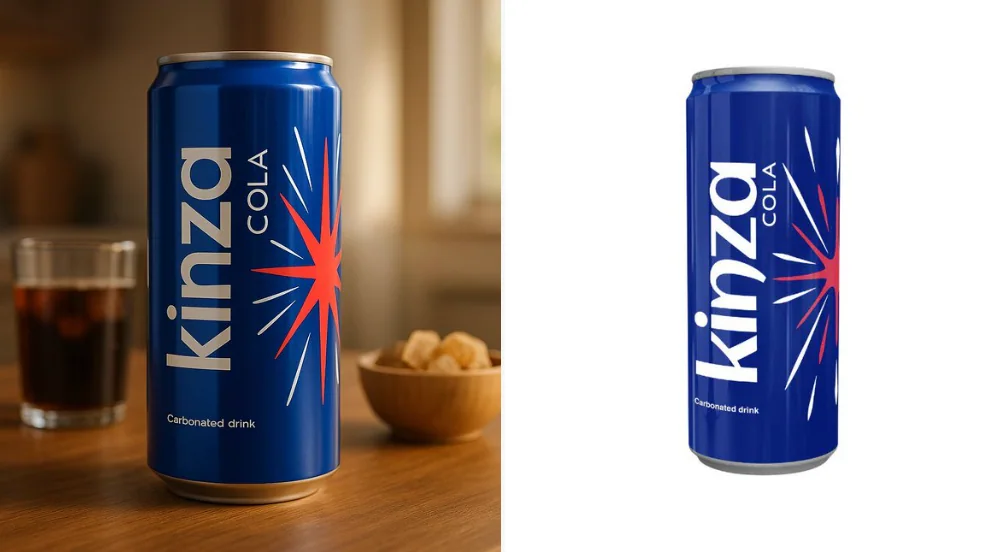
Utilisez exactement l'image du produit téléchargée — ne la modifiez pas, ne la redessinez pas ou ne la réinterprétiez pas en partie. Suivez les directives ci-dessous pour créer une présentation de produit de haute qualité et cinématique :
minimalistphotographyproductvehicleinteriorfood
Case 18441
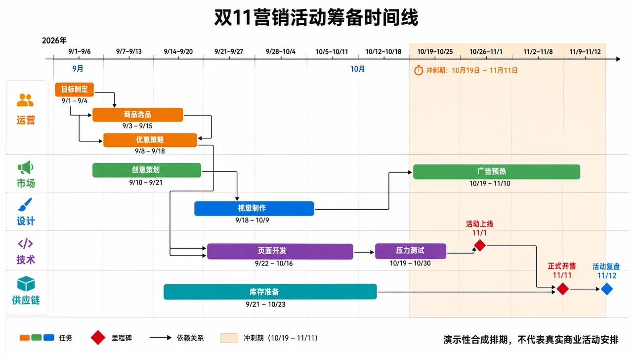
Chronologie horizontale du planning de projet pour la grande promotion e-commerce du Double 11
扁平风格时间线项目管理