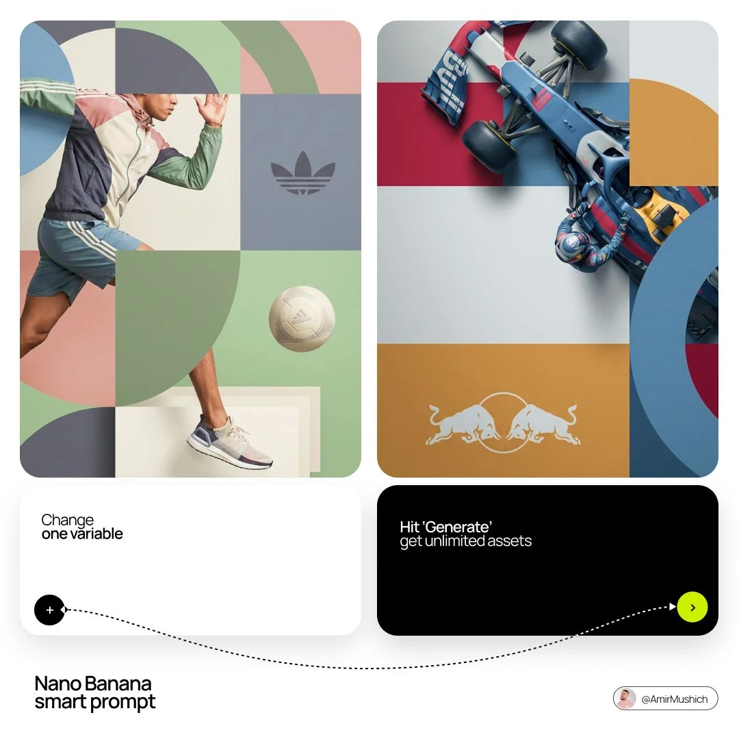
几何蒙太奇风格时尚杂志商业大片
Prompt
[品牌名称]。化身为世界级编辑设计师。第一阶段:动态主体逻辑——主体甄选:自主剖析[品牌名称];分层(三明治效应):让主体与背景图形巧妙交织,车辆或人物的部分区域需隐于几何块之后,而另一些部分(如车轮、肢体、道具)则须覆盖其上,以此营造三维纵深感。第二阶段:网格与几何——布局:采用清爽明快的2×2 网格构图;叠加:在网格之上覆以巨型粗犷的几何弧线及圆形;视觉平衡:于独立象限置入一款标志性产品道具(例如,汽车的悬浮钥匙扣或运动用球),以平衡主体视觉。第三阶段:精致柔和色调——色彩导向:严禁使用侵略性霓虹色或过度饱和色调;调色板:提炼[品牌名称]核心色并转译至“精致柔和”色系——以灰玫瑰替代亮粉、鼠尾草绿取代鲜薄荷、板岩蓝替换皇家蓝,呈现去饱和、大地或“尘土感”的质感;表面处理:哑光平面色块,零渐变。第四阶段:摄影与灯光——主体风格:高端商业影棚摄影;灯光:柔和漫射式布光,辅以温润高光,杜绝生硬阴影;融合:确保主体仿佛物理嵌入图形网格之中。第五阶段:极简品牌呈现——标志:将一款纯净单色的[品牌名称]徽标置于任一背景区块正中央,仅呈显标识符号,不附加标语。
更多提示词
创意广告
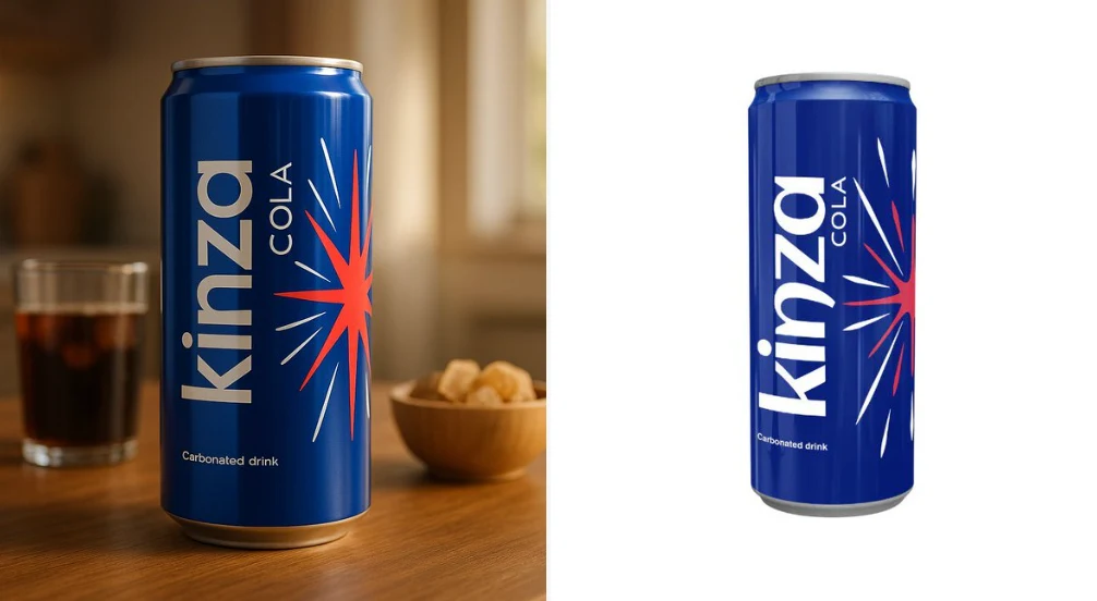
请严格按照上传的产品图片进行使用——不要对任何部分进行修改、重绘或重新诠释。按照以下指南创建高质量的电影感产品展示: • 保持产品的完整性——所有文字、标签、比例、包装和颜色必须完全保持原样。 • 使用自然光或电影灯光来增强产品的吸引力。 • 将产品放置在与其类别相符的真实表面上(例如面包放在木质厨房桌,护肤品放在浴室架子上,科技小工具放在书桌上)。 • 如适当可添加互补的道具(如面包旁边放吐司和咖啡,护肤品旁放树叶和水滴)——但不要让它们接触或遮盖产品。 • 使用柔和模糊
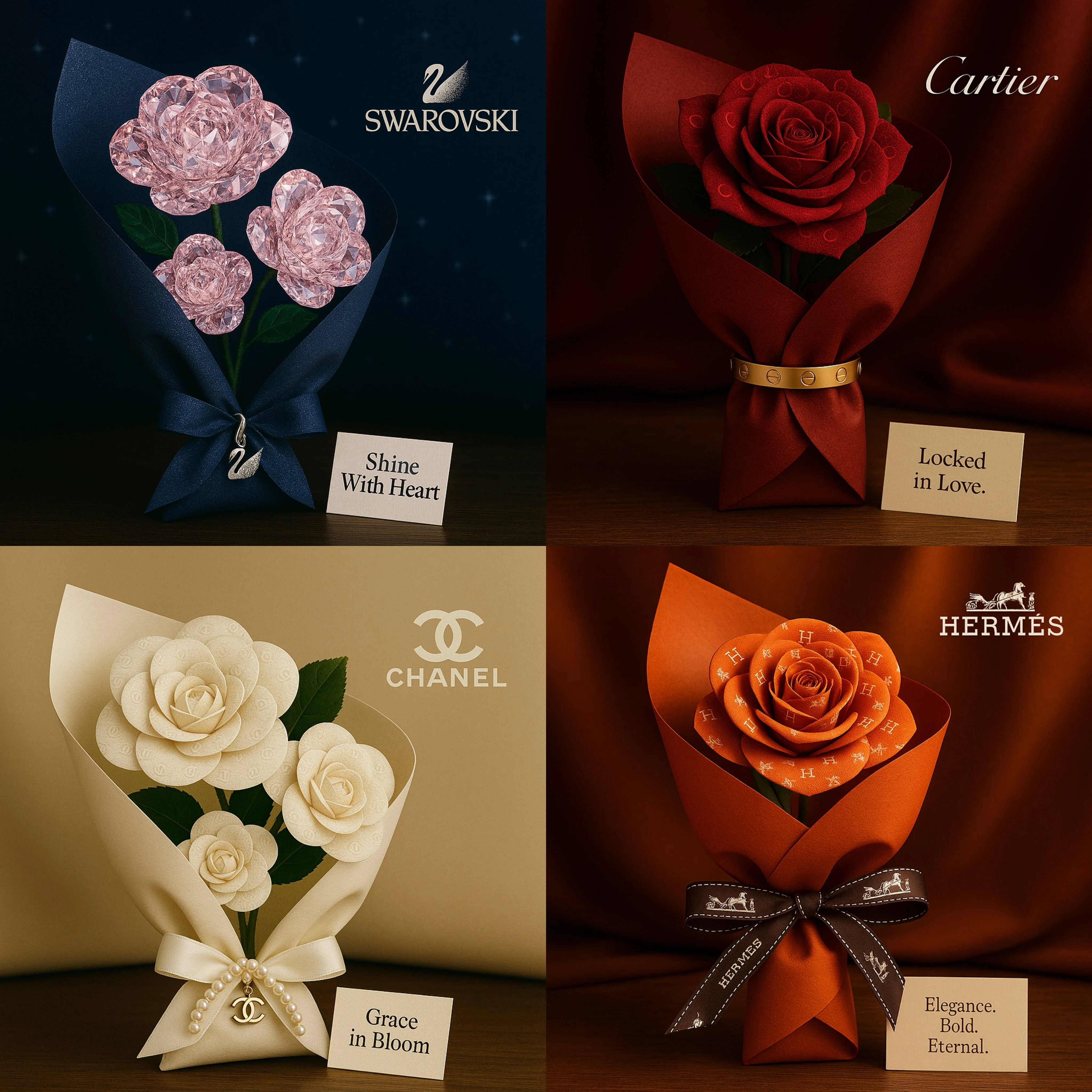
品牌之爱的话术
灵感来自[品牌名称]的浪漫方形花束。玫瑰由视觉图案或纹理制成,反映出品牌的形象。花束用奢华材质包裹,呼应品牌的标志性风格(如丝绸、天鹅绒、皮革),并以品牌的一款标志性产品优雅地系住,取代传统的丝带。将其放置在与品牌形象相匹配的表面上。在花束旁边放一张信息卡,上面印有代表品牌精神的简短情感三字标语。在场景中微妙地加入[品牌名称]的标志。电影般的照明效果,超精细细节,优雅的景深,高端编辑品质。
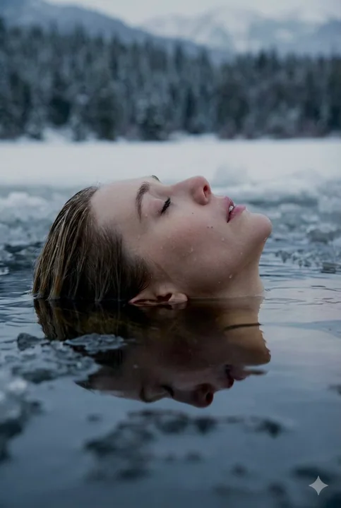
冰湖沉浮的金发少女与极致写实光影
{ "prompt": { "subject": { "type": "人类", "gender": "女性", "appearance": { "hair": { "color": "金色", "texture": "湿润,略带波浪", "length": "短至中等", "style": "向后梳,浸润于水中" }, "skin": { "tone": "苍白,冷色调底色", "texture": "超写实,湿润,脸上可见水珠", "features": "闭眼,表情放松

慵懒男模在苔藓石阶上
{ "prompt": "一张超逼真的户外生活方式抓拍照片,主体是我(使用我的面部参考,身份必须完全匹配)。拍摄角度略微抬高,相机位于视线水平上方,向下俯视。我静止地站立在郁郁葱葱的绿色森林中长满苔藓的崎岖石阶上。我的身体与相机呈 20-30 度角,肩膀放松,姿势自然挺拔。我的头部略微向上倾斜,眼睛看向相机。表情平静、自信、放松、中性——没有笑容,没有紧张。 外貌:头发与上传的参考照片完全一致——浓密、健康,具有自然的波浪和卷曲纹理,顶部中等长度,修剪整齐,两侧微妙渐变但未褪
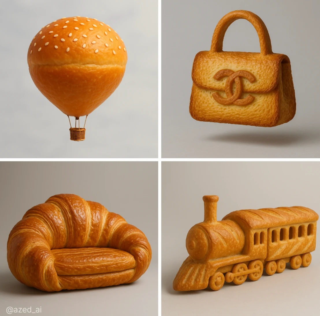
面包的形状
一个高度逼真的[物体]雕塑,完全由[面包类型]制成,具有超精细的纹理和颜色。表面展示了面包的天然特性,呈金黄色、有光泽、酥脆或有裂纹,在适当的位置可见层次或种子,工作室灯光,柔和
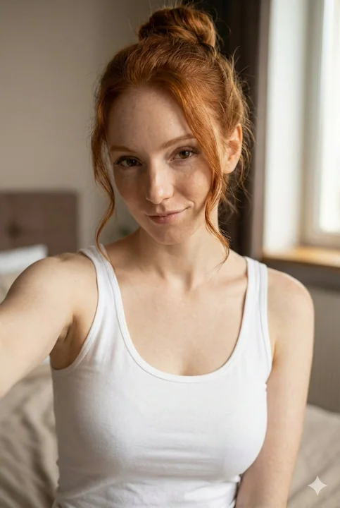
晨光下居家慵懒俏皮少女自拍
{ "scene": "室内一位年轻女士的半身自拍肖像", "composition": "手持智能手机自拍,摄像头略高于胸部,裁剪至腰部,构图亲密,主体居中但放松", "outfit": "简约的 {argument name=\"top color\" default=\"白色\"} 背心,柔软的棉质纹理,休闲居家服美学", "hair": "凌乱的发髻,几缕发丝自然地垂落在脸庞周围", "expression": "对着镜头俏皮地凝视,柔和的半微笑,自信中带着 play
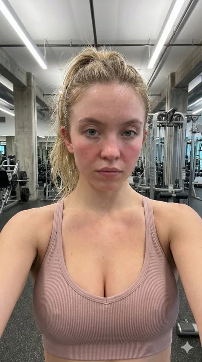
Sineswini健身房汗水自拍
{ "subject": { "name": "Sydney Sweeney", "facial_features": { "eyes": "Light blue/grey, direct and neutral gaze", "skin": "Fair complexion, heavily flushed and red from exertion", "details": "Visible sweat droplets on forehead, nose, and ch
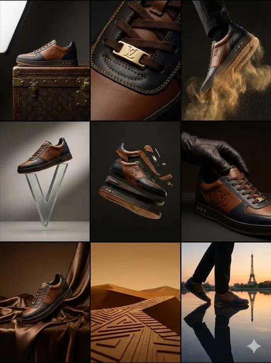
踏碎金尘的路易威登前卫运动鞋
{ "campaign_metadata": { "brand_identity": "Louis Vuitton Malletier", "product_focus": "奢华皮革运动鞋 / 训练鞋", "aspect_ratio": "3:4", "aesthetic": "高端时尚杂志风格 | 前卫奢华" }, "visual_dna": { "materials": ["全粒面小牛皮", "Monogram 压纹帆布", "抛光金色五金件"], "color_sch
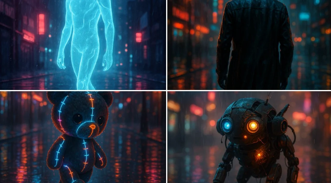
未来的一瞥
[主体]在雨夜中穿过被雨水浸湿的街道,画面充满电影感,阴郁的霓虹灯照亮了场景,水面上倒映着舞动的光影,背景是朦胧的城市天际线。主体显得栩栩如生,仿佛置身于孤独与电流交织之间。