Case 11643
2×2 Grid Brand Mood Board Design
Prompt
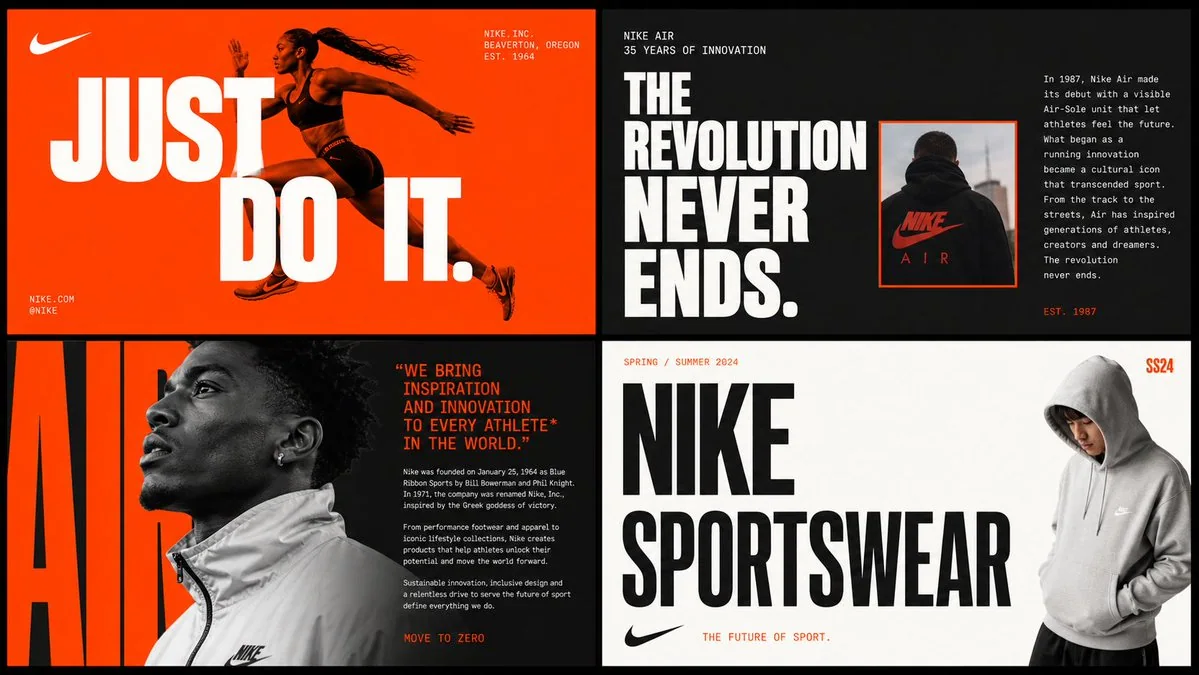
[BRAND NAME] Act as a Senior Brand Art Director and Editorial Designer creating a 2×2 grid brand moodboard — four distinct editorial cards unified by [BRAND NAME]'s visual identity system. References: Ivy Park campaign editorial, Supreme lookbook layouts, Palace Skateboards zine design, Off-White editorial grids, Highsnobiety brand feature spreads. --- PHASE 0: BRAND INTELLIGENCE — AUTONOMOUS RESEARCH Before generating any visual, perform a complete brand decode of [BRAND NAME] from training data. Extract and apply all of the following autonomously: Color system: identify the exact primary and secondary brand colors — their specific hex values, how they are used in hierarchy (dominant background color, accent color, text color). These colors drive every card in the grid. Typography DNA: identify the exact typeface or typeface category [BRAND NAME] uses — serif, sans-serif, condensed, extended, grotesque, slab. Identify the weight hierarchy: what weight is used for headlines, what for body text, what for labels. Apply this typography system throughout all four cards. Brand language: identify the tone of voice, key phrases, campaign slogans, product categories, founding year, key collaborators, cultural positioning. Extract real factual information about [BRAND NAME] that can be used as text content across the four cards — real product names, real campaign titles, real dates, real locations, real brand statements. Visual symbols: identify the photographic style associated with [BRAND NAME] — fashion editorial, sports, street, luxury, industrial. Identify the composition patterns used by the brand — full-bleed photography, text-driven layouts, pure graphic compositions, collages. All text content on the four cards must be real information about [BRAND NAME] — not placeholder text or generic copy. Must be real brand slogans, real product lines, real campaign names, real brand founding information. --- PHASE 1: GRID SYSTEM The final output is an image composed of four equally sized rectangular cards arranged in a 2×2 grid. The overall image dimensions are square or slightly horizontal — aspect ratios of 1:1 or 4:3. Each card is the same size — exactly one quarter of the total image area. There is a fine gap of 4 to 6 pixels between the cards — the gap color can be a neutral dark or light color depending on the brand palette. These four cards form a unified editorial system — they share the same color palette and typography, but each card has its own unique layout style. Together, they tell the brand's story. --- PHASE 2: CARD 1 — HERO EDITORIAL (TOP LEFT) Layout style: bold large typography, overlaid or integrated into the photo. Main background color: [BRAND NAME]'s primary brand color, with maximum saturation, covering the entire card. Photo: a fashion or lifestyle image associated with [BRAND NAME]'s visual identity — a model, product, or environment. The photo can be full-bleed displayed beneath the text or cropped to a specific area of the card, with the text occupying the remaining space. Photo processing: slightly merged with the background color, making the photo and background seamlessly integrated. Typography: [BRAND NAME]'s most recognizable headline or slogan, using the largest font size on the card — bold, condensed, uppercase, white, or brand secondary color. The text is large enough to partially cover the photo. Auxiliary small text: brand name, location, date — using small caps or narrow small text, placed in the corner. Overall style: magazine cover or promotional poster. --- PHASE 3: CARD 2 — EDITORIAL TEXT LAYOUT (TOP RIGHT) Layout style: text-driven editorial layout with a small image inset. Background: [BRAND NAME]'s secondary brand color or a neutral dark color consistent with the brand palette. Headline: a real campaign title or brand statement from [BRAND NAME], displayed across multiple lines — each line with different font sizes or weights, creating a stepped visual effect. The largest line is very large, the smallest line is medium-sized, left-aligned, forming an uneven right edge. Small body text column: a real brand information passage — such as brand story, product description, or campaign background — using regular small font, located in the top-right or bottom-right corner of the card. Image inset: a small rectangular photo — occupying 20% to 30% of the card area — placed above or below the headline text, creating contrast or overlapping with the headline text, generating visual tension. The photo has a colored border in the brand's primary color. --- PHASE 4: CARD 3 — FASHION EDITORIAL (BOTTOM LEFT) Layout style: photo-driven with text as a structural background element. Photography: a striking fashion or product image — a model wearing [BRAND NAME] product, or a product close-up. The photo is located on the left side of the card, 50% to 60% of the card width, with tight cropping. Photo processing: slightly reduced saturation or increased contrast — using editorial-grade black and white or brand-specific tones. Background text: a super large single word or letter from [BRAND NAME]'s brand identity — 200% to 300% of the card height, using the brand's primary or secondary color, as a background behind the photo. This background text is partially obscured by the photo. Body text: a column of [BRAND NAME]'s brand editorial — 3 to 5 short paragraphs, using thin regular weight font, located to the right of the photo. Quotation: a sentence extracted from the body text, larger font, using the brand's emphasis color, located between the photo and the body text. --- PHASE 5: CARD 4 — CLEAN BRAND STATEMENT (BOTTOM RIGHT) Layout type: minimalist, graphical, brand identity statement. Background: white, off-white, or the lightest tone in [BRAND NAME]'s color palette — creating maximum contrast with the other three cards. Primary element: [BRAND NAME]'s logotype or brand name, using a prominent font — ultra-bold, condensed, or widened font, depending on the brand's typography. The logotype is divided into 2 to 3 lines, each line left-aligned, occupying 70% to 80% of the card width. Font color: black or the brand's darkest color — creating maximum contrast on a light background. Secondary element: a model or product image located on the right edge of the card, slightly cropped — human-centric, making the graphical layout more stable. The model/product is not the focus — the focus is on the typography. Emphasis element: year, number, series identifier, or brand slogan, using the brand's primary color, displayed in small font — as a superscript or footnote near the main logotype, adding a handwritten or seal-like texture. --- PHASE 6: UNIFIED VISUAL SYSTEM The typography style on the four cards is consistent: all text uses fonts consistent with [BRAND NAME]'s brand identity. Headline font: one font, one weight — choose the most eye-catching option that best represents the brand. Body font: one font, regular weight — clear and readable even at small font sizes. Do not use any decorative or unrelated fonts. Color consistency: the four cards use only the colors determined in Phase 0 — primary brand color, secondary brand color, neutral color (white or black), and one emphasis color. Do not use any colors outside this color palette. No gradients. No shadows. No textures on text. Information consistency: all text is real information about [BRAND NAME]. Do not use lorem ipsum text. Do not use generic placeholder text. Each word on each card is either the brand name, a real product name, a real campaign title, a real date, a real location, or a real brand statement. Grid alignment: elements on the cards share implicit alignment axes — the headline on Card 1 aligned with the element on Card 3 at the same x-coordinate. In this way, as a whole, the 2×2 grid has visual coherence. --- PHASE 7: TECHNICAL SPECIFICATIONS Output: a single flat image containing the complete 2×2 grid. No separate files are provided. Aspect ratio: 1:1 square or 4:3 horizontal. Overall resolution: high enough to ensure all body text is clearly readable. Font rendering: all text is anti-aliased, sharp, and clear with no blurriness. Photography: editorial-grade quality, not stock photo style. Color accuracy: brand colors are exactly the same as determined in Phase 0, not approximate values. Film grain is not added unless it is a brand-specific texture. No vignettes. No lens flares. Clean, precise, and editorial-standard. Output effect: this moodboard can be published on Hypebeast, Highsnobiety, or used as a slide in internal brand presentations.
More prompts
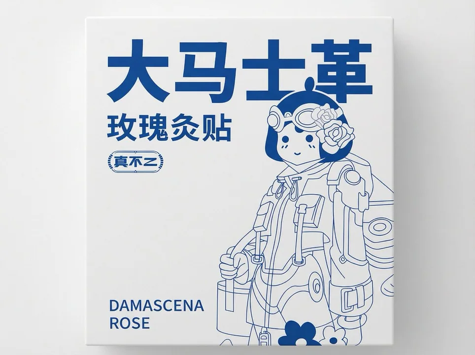
Case 8338
Minimalist all-white front packaging design
"Give me this front packaging on a 2D flat white background"
极简风包装平面图纯白底正面图
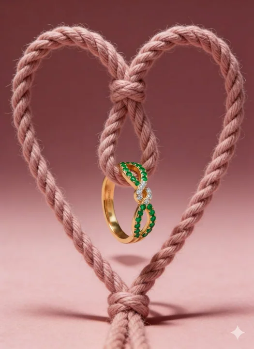
Case 8326
Luxurious jewelry with a romantic, floating heart-shaped knot design
Ultra-premium conceptual jewelry product photography with romantic symbolism. A soft dusty-rose twisted cotton rope tied into a symmetrical heart-shaped knot, vertically suspended in the center of the frame. The rope texture is highly detai
奢华悬浮