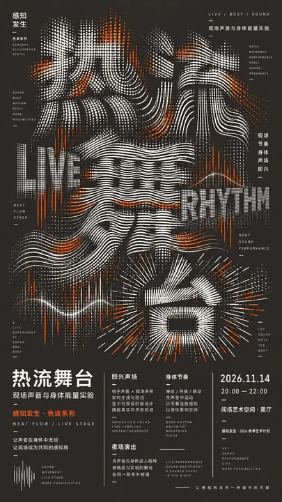
高密度実験的タイポグラフィカルチャーポスターデザイン
Prompt
【メインタイトル】:
【テーマ】:
【シリーズ名】:
【背景色】:
【アクセントカラー】:
【点線メカニズム】:
【セカンダリーテキスト】:
【イベント情報】:
【アスペクト比】:デフォルト 9:16

高密度な実験的タイポグラフィ文化ポスターをデザインしてください。

通常のフォントに単にエフェクトを追加するのではなく、ドットマトリックス、アーク、波紋、放射線、グリッド、またはスキャンラインを用いて【メインタイトル】を直接再構築してください。異なる文字には異なるが関連性のある点線メカニズムを使用し、連続的な変化を形成してください。例えば、ドットマトリックス → アーク → 波紋 → 放射線 / グリッドなどです。

メインタイトルは画面の約65%〜70%を占めます。密度、行間、曲率、圧縮、伸縮、および部分的な消失を通じて字形を形成し、より強いデザイン感のためにわずかな可読性の犠牲を許容してください。

明確な多層タイポグラフィを取り入れてください:巨大な中国語メインタイトル + 大きな中国語および英語キーワード + 微細な編集テキスト + 完全なイベント情報。異なるスケールのテキストは、単なる説明ではなく、構成に真に参画する必要があります。

暗い背景、明るいメイングラフィック、そして1つの【アクセントカラー】を使用してください。アクセントカラーは局所的なノードとキーワードにのみ使用し、抑制的に保ってください。

下部には完全な編集スタイルの情報エリアを維持し、異なる列幅、わずかなズレ、局所的な縦書き、および長さの異なる区切り線を用いて、均等な4カラム、PPT、またはUIカードのような雰囲気を避けてください。

全体的な要件は、密でありながら秩序があり、点線が連続的で、テキストの階層が豊富で、遠くから見るとインパクトがあり、近くで見ると詳細があることです。

写真、人物、3D、ネオン、ランダムな文字列、QRコード、ウォーターマーク、四角星、またはフレーム番号を追加しないでください。完全な9:16のポスターを1枚だけ出力してください。
他のプロンプト
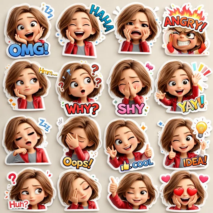
ピクス風3Dかわいい妹の顔文字ステッカーデザイン
かわいい3Dカートゥンの女の子ステッカーのパック、ピクサー風、短い茶色の髪、大きな表現力のある目、赤いジャケットとグレーのシャツ、16種類の異なる反応、絵文字風の表情(笑っている、怒っている、恥ずかしい、混乱している、愛している、眠たい、考えている、驚いている)、さまざまな遊的なフォントのカラフルなテキスト(OMG、ハハ、なぜ、やった、アイデア)、白いステッカーの輪郭、鮮やかな色、4x4のコラージュレイアウト、高精細、柔らかい照明。
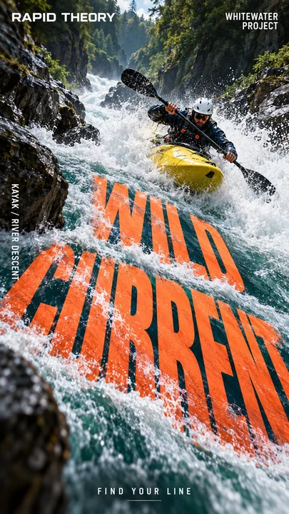
スポーツ競技の視点でレイアウトしたダイナミックなポスター
[スポーツ / アクション]: {ホワイトウォーターカヤック、ドリフト、サッカー、ハードル…} [環境]: {川の流れ、山岳サーキット、スタジアム、陸上トラック…} [メインヘッドライン]: {あなたの太字の英語タイトル} [モーションインタラクション]: {水流、カーブした道路、弾性ネット、トラックの透視…} [カラーパレット]: {高コントラストのスポーツキャンペーンカラー} [ブランド / タグライン]: {カスタムブランドアイデンティティとスローガン} 高
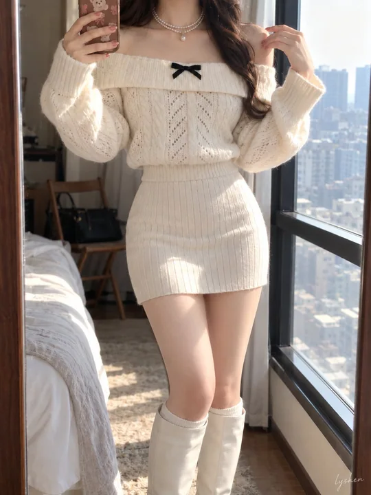
ミラーセルフィー、東アジアの清純な女大学生、クリームホワイトのニット
被写体と構図:大人の東アジア人、清楚な雰囲気の女子大学生。3:4の縦長ミラーセルフィー。人物は中央に配置され、フレーム内の占有率が高い。上端は首元でカットされ、下端は白いロングブーツの下部でカットされており、頭部・顔面および靴底はフレーム外にある。 ポーズと動作:体はわずかに横を向いており、腰と骨盤はフレームの右側へわずかにずれている。フレーム左側の腕は肘を曲げて上に持ち上げ、茶色のカートゥーン柄のスマートフォンを左上端の近くに保持している。もう片方の肘はわずかに外側に向き
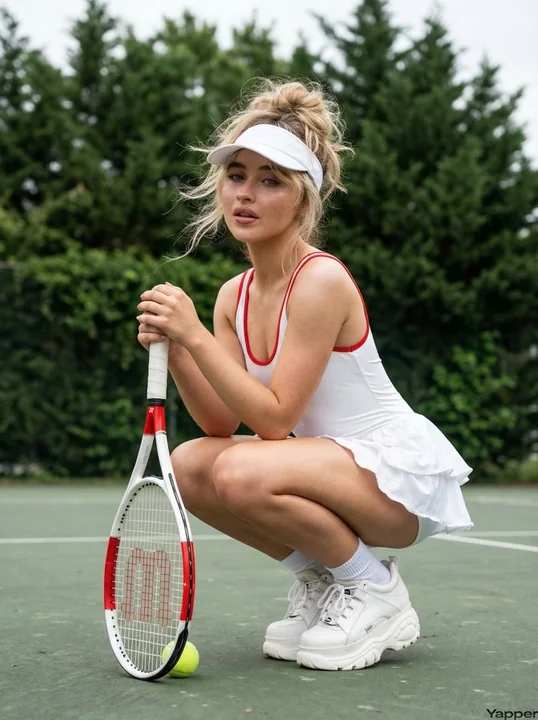
サブリナに酷似した魅力的なテニス女神のシャドウアート写真
{ "image_generation_prompt": { "subject": { "description": "若い女性で、サブリナ・カーペンターに強い似顔をしている。", "hair": "ボリュームのある乱れたポニーテール、顔の周りを縁取るほつれた髪の毛、風に吹かれたような質感、そしてヘルメットの下からわずかにはみ出る柔らかく、ささやかなフリンジ。", "face": "セクシーな表情、わずかに開いた唇、自然光の下で
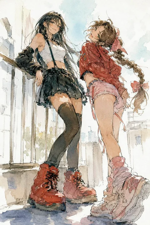
陽光のテラスの少女の水彩漫画スケッチ
陽光が差し込むバルコニーで、二人の少女がじゃれ合うようなひとときを描いた、表現力豊かな水彩マンガスケッチ。ラフなインクのアタリ線と、やわらかなパステル調のウォッシュで仕上げられている。 一人の少女は長い黒髪で、白のクロップドタンクトップ、黒のアームスリーブ、短いサスペンダースカート、サイハイストッキング、そしてオーバーサイズの赤いブーツを身に着け、気負いのない笑みを浮かべながら手すりにもたれかかっている。 その隣には、誇張されたリボンを結んだ三つ編みの茶髪の少女。赤いクロ
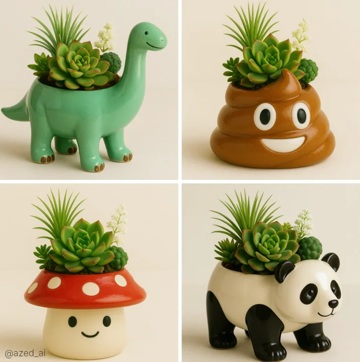
絵文字が鉢に変わる
かわいらしいセラミック製の[オブジェクト/動物]型プランターの高品質な写真。艶やかな仕上げで、ヒアリーナ(Haworthia)のような棘のある植物、ロゼット状のエチェベリア(Echeveria)、そして繊細な白い花が植えられており、さまざまな明るい色合いのサクセラントとグリーンを楽しむことができます。プランターにはフレンドリーな顔があり、柔らかく中性の背景に置かれ、拡散された自然光によって、繊細な質感と色彩のコントラストがクリーンでミニマルな構図の中で際立っています。
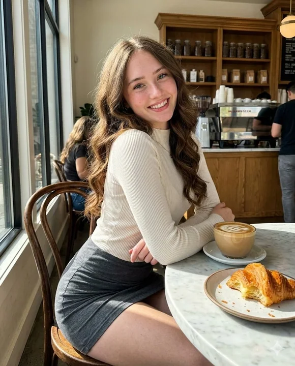
原始ハイビジョン実写:陽光が差し込む高級カフェで自信に満ちた美女
(比例 4:5)。iPhone 17 Pro で撮影された、生の高コントラストのカジュアルな写真。中距離から第三者によって、高級なカフェで撮影された。人工的なボケは一切なし。被写体の肌から背景にあるエスプレッソマシンに至るまで、すべてがシャープでピントが合っている。 主体とアイデンティティのロック: •アイデンティティ:画像1(セルフィー)の女性の正確な顔と特徴的な特徴を厳密に保持する。 •バイオ・フィデリティ:高精細な皮膚の物理特性を再現:微細な毛穴が見え、自然
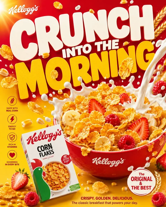
高級消費財ブランドの朝食シリアル向け商業ポスターデザイン
**GOLDEN MORN バイラル FMCG ポスターキャンペーンシステム** **「黄金の朝を始めよう。ずっと力強く。」** **役割:** 世界的なFMCGのシニアクリエイティブディレクター、ラグジュアリーな朝食フードスタイリスト、プレミアム商業製品フォトグラファー、タイポグラフィデザイナー、そしてモダンなブランド広告制作者として、世界クラスのシリアルブランドのために、バイラル性の高い Golden Morn の朝食キャンペーンポスターを制作する。 **デザインの融
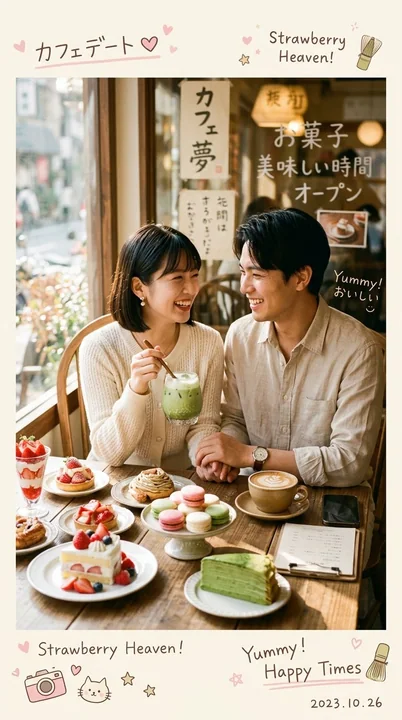
日韓風の雰囲気感のあるスイーツ店でのカップル撮影
超リアルで居心地のよい日韓風カフェ写真。トレンディで美しい雰囲気のカフェに、可愛い若い[日本人/韓国人]カップルが自然に寄り添って座っている様子を捉える。若いカップルはおしゃれで若々しく見え、[ファッションスタイル/服の色]を身にまとい、やさしく微笑みながら一緒にデザートを楽しんでいる。 テーブルの上には、[デザート/フード]が美しく並べられている。たとえば、パンケーキ、いちごケーキ、マカロン、クロワッサン、ペストリー、アイスコーヒー、抹茶ラテ、フルーツデザート、美しいドリ