Case 13211
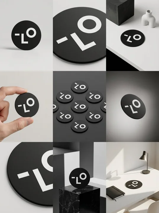
High-end brand visual nine-grid design mockup
极简风格九宫格产品摄影品牌设计样机展示
Prompt
Place 9 panels of [ratio] size in a clean 3x3 [ratio] storyboard grid with a [4:5] aspect ratio. Use the reference image as the base image for the product. The product, packaging design, branding, materials, colors, proportions, and overall identity must be exactly the same as in the reference image. The product must be clearly recognizable in all frames. Labels, logos, and proportions must be exactly the same.

This storyboard is a high-end designer mock-up presentation for a branding portfolio. It focuses on shape, composition, material, and visual rhythm rather than realism or lifestyle narratives. The overall look should convey a curated, refined, and design-driven impression.

Frame 1: A front-facing hero shot of the product in a clean studio setup. Neutral background, balanced composition, calm and confident product presentation.

Frame 2: A close-up shot focused on the center of the product. Emphasize surface texture, material, and printing details.

Frame 3: Place the reference product in an environment that naturally blends with the brand and product category. A studio setting inspired by the product’s design elements and colors.

Frame 4: A scene showing the product being used or interacted with against a neutral studio background. Keep hands and interaction elements to a minimum, with an appearance consistent with the packaging style.

Frame 5: An isometric composition with multiple products viewed from above, arranged in precise geometric order. All products are shown from the same top isometric perspective, evenly spaced, clean, and graphic.

Frame 6: The product is slightly tilted and floating against a neutral background that matches the reference image’s color palette. The intentional angled tilt should make the product appear to float naturally in space.

Frame 7: An extreme close-up focusing on specific details such as labels, edges, textures, or material behavior.

Frame 8: Place the product in an unexpected yet aesthetically powerful setting, creating a bold, editorial, and visually striking impression. An unexpected yet highly stylized scene. Studio-based, designer-led production. Bold composition that enhances the brand image.

Frame 9: A wide composition showing the product in use within a sophisticated designer setting. Minimal props, controlled styling, and consistency with the rest of the series.

Camera and Style: Ultra-high-quality studio photography with a realistic camera look. Different camera angles and framing for each frame. Depth of field, accurate lighting, precise materials, and reflections. The lighting logic, color palette, mood, and visual language must remain consistent across all nine panels, unifying them as a single series.

Output: A clean 3x3 grid without borders, text, captions, or watermarks.
More prompts
Case 21386
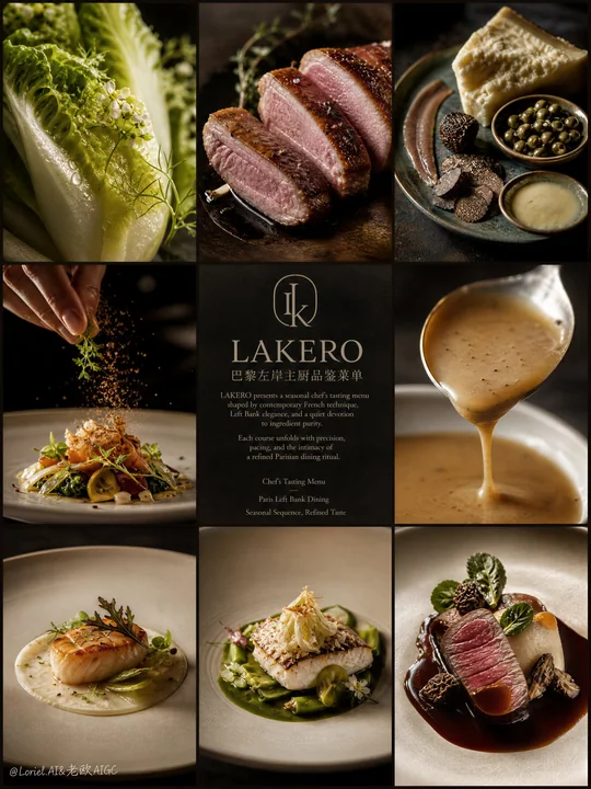
巴黎左岸主厨品鉴菜单九宫格海报
Create an ultra-premium 3x3 editorial poster for LAKERO, reimagined as a Paris Left Bank chef’s tasting menu campaign. The image should feel like a Michelin-level French dining identity piece rooted in Left Bank sophistication: intellectual
Case 28046
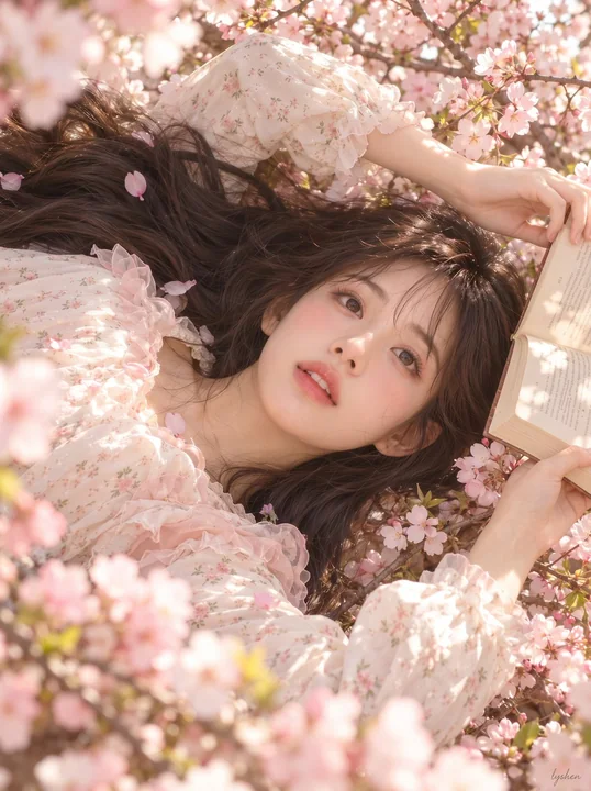
竖幅春日繁花横置构图人像写真
Vertical spring portrait photo, maintaining a composition where the person is positioned horizontally in the frame: the woman's head is located in the middle of the right side, her shoulders and body extend to the left, and thick dark long
Case 21392