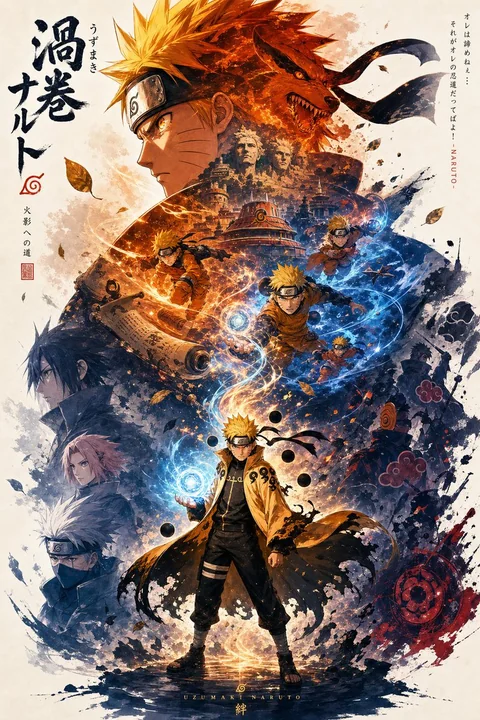
鸣人主题高端宣传海报
Prompt
超高端宣传海报,A4 尺寸,纵向构图,以漩涡鸣人为主题,采用独特的忍者风格视觉语言。

海报结构:
顶部区域(主导的上半部分):一个大型、标志性的鸣人头部和上半身的剪影,略微侧脸,眼神坚定而炽热,额护清晰可见。他的头发和头带布料向外流动,形成主要的视觉主体。

在这个大型剪影内部:应用双重曝光叙事拼贴,使用从暖到冷的查克拉渐变(橙色、红色、深蓝色)。整合分层元素,例如:
– 九尾狐九喇玛(Kurama)在剪影后方或内部隐约浮现
– 木叶隐村天际线(木叶屋顶、火影岩)
– 旋转的查克拉能量图案和风迹
– 小型动作场景(鸣人奔跑、螺旋丸成型、影分身中途动作)
– 象征性元素,如卷轴、苦无和被风卷起的树叶

中部到底部区域:全身鸣人作为次要主体,稳稳站立,姿势略微前倾,一手结成螺旋丸,外袍(六道仙人或火影外袍变体)微微飘动。这个形象锚定整个构图。

构图流动:
创建一个垂直能量流(查克拉流动线),连接:
全身鸣人 → 上升的查克拉粒子 → 内部拼贴 → 上方的大型剪影
这条线应给人以上升能量或命运的感觉。

左侧和右侧:
引入不对称的辅助元素以制造叙事张力:
– 左侧:盟友的模糊剪影(佐助、小樱、卡卡西)柔和融合
– 右侧:抽象的敌人存在(晓组织云雾、阴影身影、破碎碎片)
所有元素应感觉嵌入雾气、查克拉薄雾和分层空间中。

视觉风格:
东方水墨画 + 现代动漫融合。
使用:
– 墨水扩散边缘
– 柔和模糊过渡
– 碎片化纹理
– 分层云雾和烟雾般的查克拉
– 控制的白负空间

颜色设计:
比传统更鲜艳夺目——发光的橙色、电光蓝、深邃黑,辅以微妙的金色高光。面部和螺旋丸处的高对比焦点照明。

美学基调:
史诗般的、情感化的,象征成长、奋斗和传承。

整体:
高度精炼的、电影般的、分层叙事海报,具有强烈的层级结构、干净的构图,以及强大的中心身份感。
更多提示词
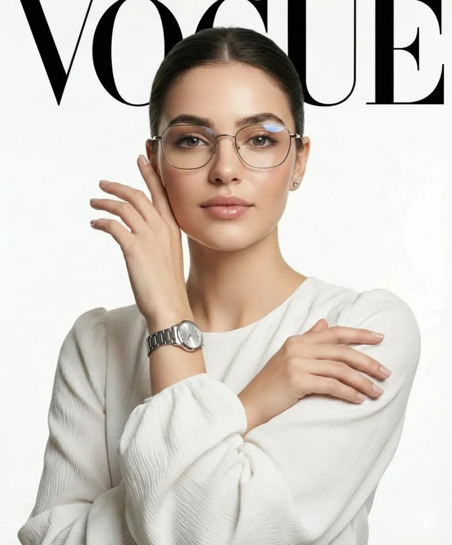
极简银镜白绸女郎VOGUE
一张高清、专业的时尚大片,拍摄一位精致女性,她梳着光滑的中分发髻,佩戴优雅的细框银边眼镜,身穿极简白色长袖丝绸衬衫。她姿态优雅,双手靠近脸部与胸前,展示一块奢华银色腕表。背景为干净明亮的白色,顶部以醒目、高对比度的黑色衬线字体写着“VOGUE”。采用影棚灯光,皮肤质感柔和,眼部焦点锐利,8K分辨率,85mm镜头拍摄,以获得柔美人像压缩效果。 自定义结果小贴士: 模特:若想改变造型,可将“精致女性”替换为具体特征,如“雀斑”、“深色卷发”或“极简妆容”。 品牌:可将“VO
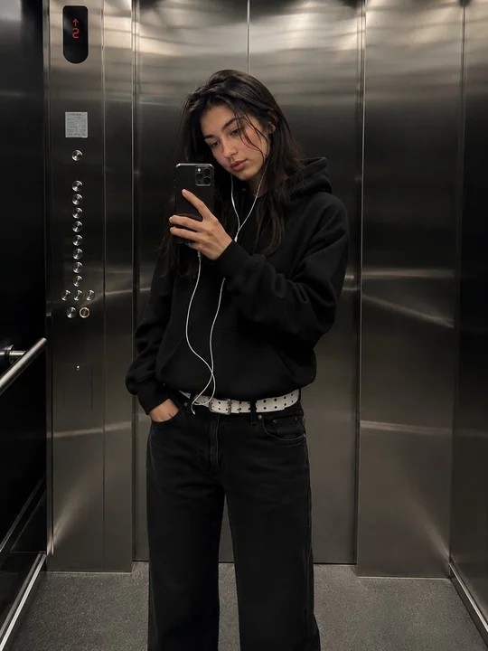
电梯镜面自拍写实时尚少女
现代不锈钢电梯内,一位时尚年轻女性的超写实电影感镜面自拍。她身穿宽大的黑色连帽衫(帽子放下)、宽松黑色水洗牛仔裤、白色腰带和干净的休闲运动鞋。一只手拿着连接有线耳机的智能手机,另一只手自然地插在口袋里。 她以侧身轮廓的镜面姿势入镜,身体微微朝电梯镜子倾斜,展现出冷静、自信、神秘的表情。纤细的身形,轻松随性的都市街头穿搭美学。深色长发自然垂落在肩周。柔和自然妆容,真实皮肤质感,微微光泽感的双唇。 现代拉丝金属电梯内部,反光不锈钢墙面,柔和顶部照明,真实反射,极简奢华氛围
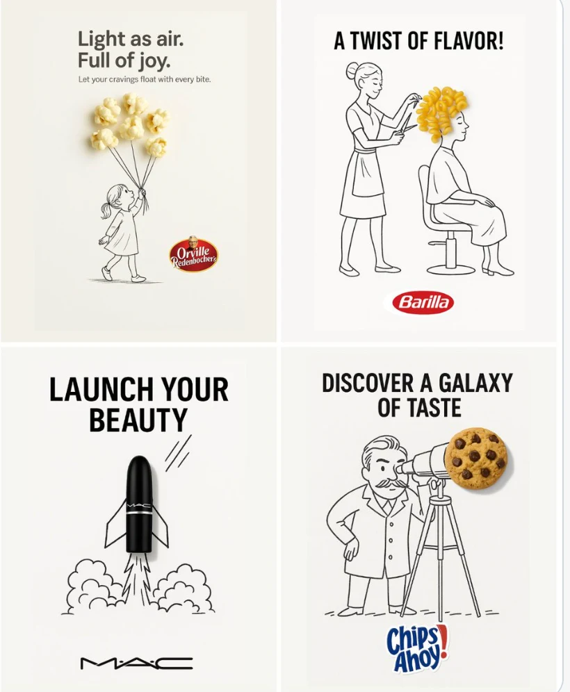
创意广告
一个极简而富有创意的广告,背景为干净的白色。 一个真实的[实物]被融入到一幅手绘的黑色墨水涂鸦中,使用松散、活泼的线条。[涂鸦概念]以聪明且富有想象力的方式与物体互动。在顶部或中央放置大胆的黑色[广告语]文字。将[品牌标志]清晰地置于底部。整体视觉效果应简洁、有趣、高对比度,并具有概念上的智慧。
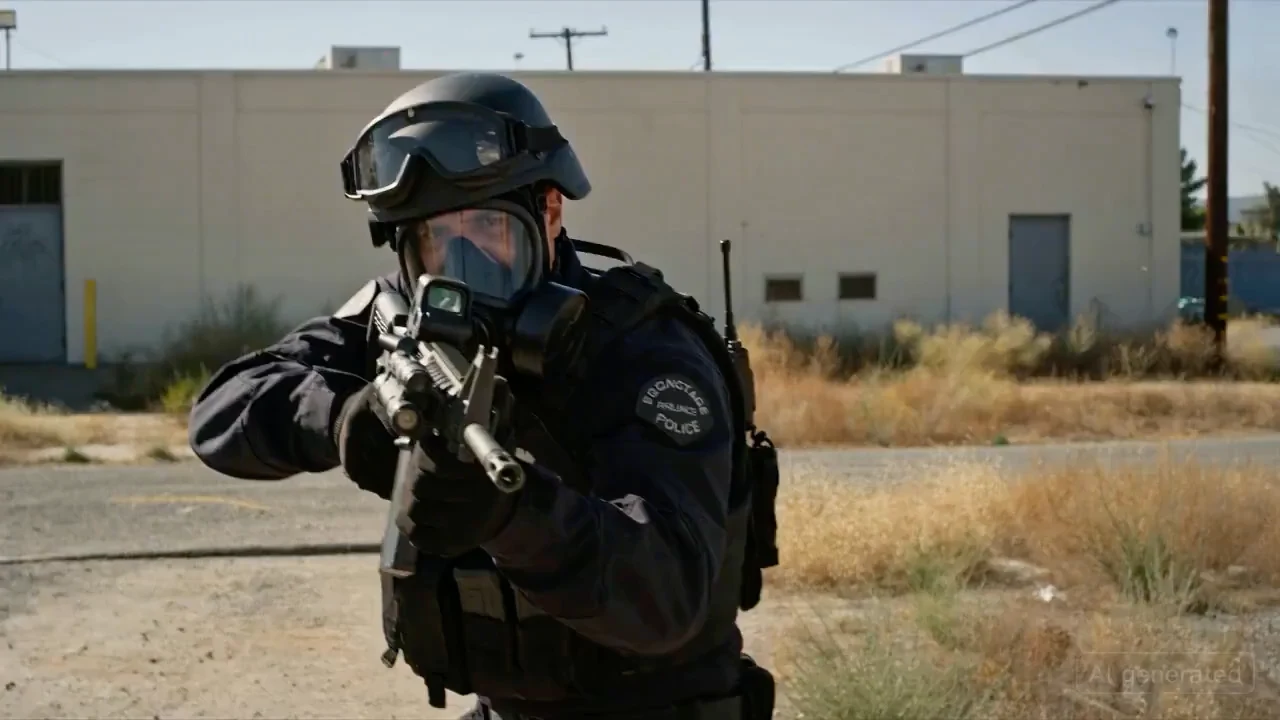
特警人质解救战
[ 镜头1:正面威胁镜头 ] 一名身着全套战术装备的特警队员的中景镜头, 戴着防毒面具, 和头盔。他直接将突击步枪对准镜头(打破第四面墙)。他正在激烈地喊话:"释放人质!放下武器!" [ 镜头2:威胁者 ] 切换到穿着脏背心的歹徒的中景镜头, 用锁喉姿势控制着一名女性。他将一把手枪抵在她的太阳穴上。他汗流浃背,情绪激动, 对着屏幕外的警官喊叫:"后退!我会杀了她!我发誓我会这么做!" [ 镜头3:过肩解决镜头 ] 镜头直接位于特警队员的右肩后方。我们能看到他头盔的
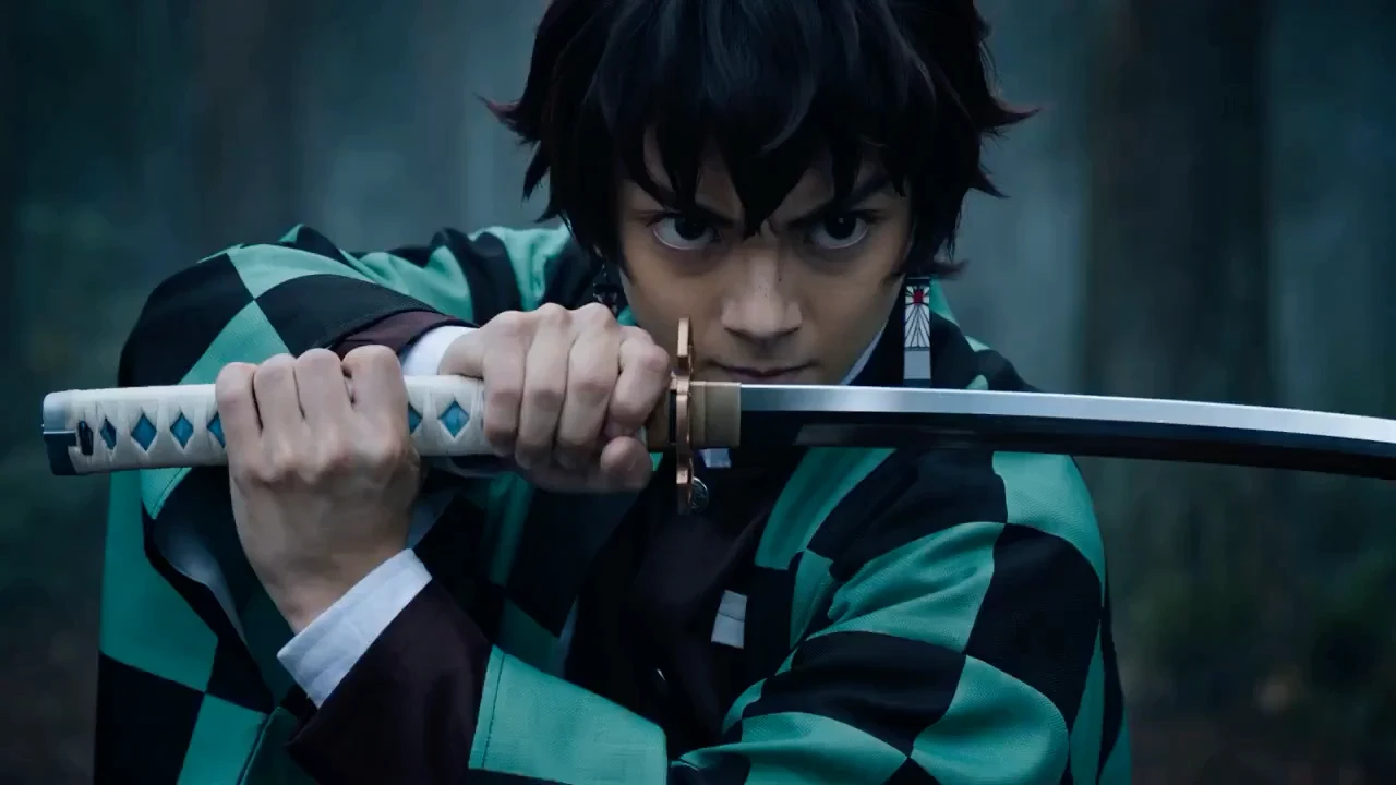
暗月剑客对决
【风格】好莱坞真人特效大片(Hollywood Live-Action Blockbuster),IMAX电影画质,8K超清,真实摄影(Photorealistic),暗黑奇幻(Dark Fantasy),虚幻引擎5写实渲染,无动漫感。 【时长】15秒 【场景】月光下真实的迷雾森林,地面是湿润的泥土和真实的落叶。 [00:00-00:05] 镜头1:真人演绎·水之呼吸(Realistic Water FX)。 【特写】一名亚洲少年剑客(真实演员脸部毛孔可见),身穿绿黑格纹的
烦恼旅人
真人电影风格序列。另一位年轻女子,穿着奢华的黑色两件式泳衣,从左侧(房子内部)进入场景,并在微风中飘动时关闭窗帘。女子行走,摄像机从后方跟踪她,她进入房间,床上有一个打开的行李箱。女子很烦恼。我们切换到她的中近景镜头。她对自己咕哝道:"该死的意大利人...我讨厌这个地方!"
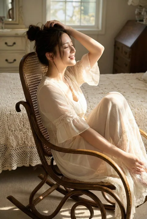
Vintage lace dream girl in the afternoon sunlight
一幅高度逼真的写实摄影风格年轻女性肖像(面部必须与参考图像 100% 完全一致)。她二十多岁,留着浓密蓬松的深棕色长发,发型为柔软、略显凌乱的高发髻,许多松散飘逸的发丝环绕脸庞,并垂落在背部和肩头。她拥有白皙且带有阳光亲吻感的肌肤,散发温暖的金色光泽,妆容自然细腻,眉形清晰,睫毛纤长,双唇为柔和带光泽的裸粉色。她身穿一件极致浪漫的半透明米白色/象牙色雪纺长裙,通体饰有精致的镂空蕾丝,细吊带设计,贴身上身带有柔和褶皱,蓬松荷叶边短袖带有扇形蕾丝滚边,飘逸的分层裙摆由多层蕾丝与雪
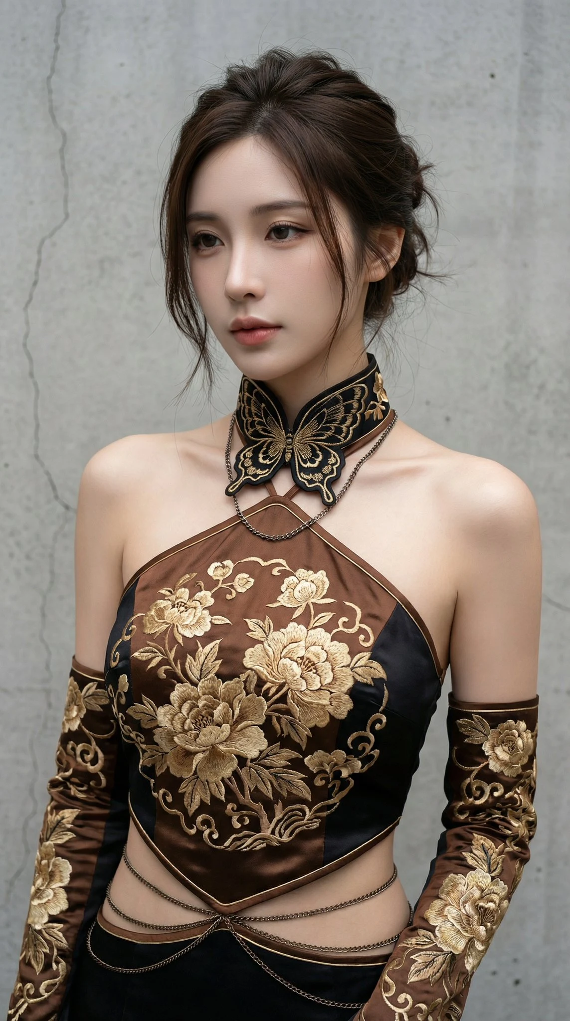
金绣牡丹黑棕时尚大片
一位极具气质的年轻东亚女性人像,精致清冷的五官,柔顺的深棕色盘发随性散落几缕发丝。她穿着一件极具设计感的改良新中式挂脖上衣,结合了深棕色与黑色的丝绸质感,布料上绣有极其繁复精美的金色牡丹和传统花卉纹样。颈部佩戴着宽大的黑色刺绣蝴蝶形立领,搭配细长的金属项链。双臂佩戴着同色系的刺绣长款袖套,腰间装饰有纤细的金属链条,展现出一种“新中式”与“赛博朋克”碰撞的时尚感。 构图采用中景半身视角,人物神情疏离且优雅。光影呈现出细腻的自然散射光,柔和地勾勒出人物的面部轮廓和精致的锁骨线条
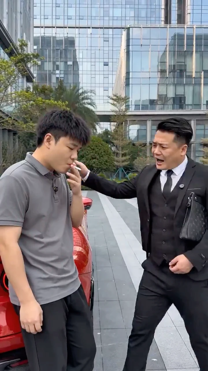
豪车旁的尴尬职场反转
【风格】抖音搞笑段子(Viral Sketch Comedy),竖屏(Portrait),生活化运镜,演员表情夸张,音效卡点清晰。 【时长】15秒 【角色】 老板(穿西装,夹公文包,一脸优越感)。 员工小王(穿休闲装,一脸老实憨厚)。 【道具】一辆顶级豪车(法拉利/劳斯莱斯),水桶和抹布。 [00:00-00:05] 镜头1:嘲讽(The Mockery)。 场景:公司楼下。小王正靠在一辆崭新的千万级豪车旁抽烟(或喝水)。 动作:老板路过,停下来拍拍小王的肩膀,一脸说教。