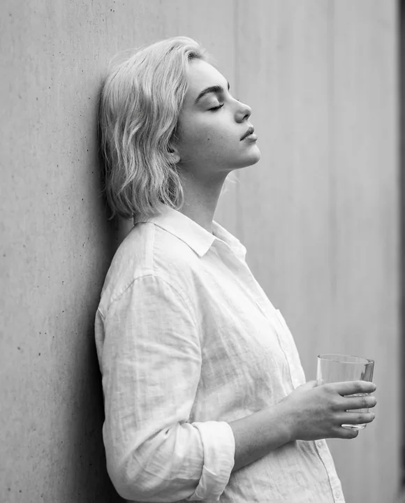
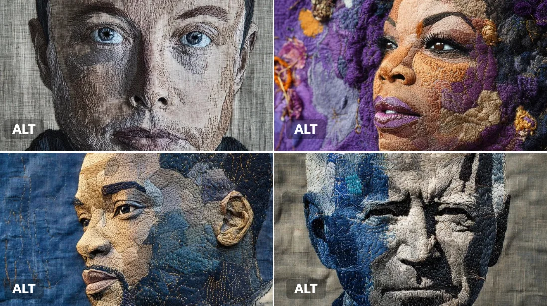
Case 25994
كلمات مفتاحية لبوستر أرشيف بصري لألبومات سفر فاخرة
Prompt
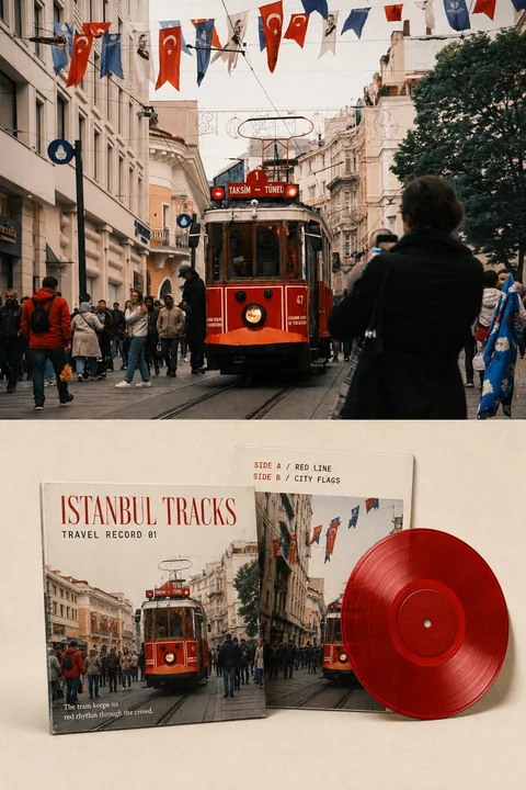
Please turn each of the travel photos I upload into an independent high-end travel record visual archive poster, no multi-photo stitching, output each photo individually.

The overall layout uses a 3:4 vertical composition, forming a clearly visible comparison between the original photo and the reinterpretation. The upper part occupies about 45%–50% of the screen, faithfully preserving the original photo, accurately maintaining the identity and number of subjects, the poses of people or vehicles, architectural and topographical structures, observation angles, spatial relationships, real textures, natural light and shadow, and the original color atmosphere. Only apply slight high-end photographic color grading and extremely thin film grain processing to give the photo the texture of travel magazines, independent music publications, and photography exhibitions. To adapt to the layout, the sky, ground, or surrounding environment can be naturally extended, but the subject must not be stretched, distorted, mirrored, moved, replaced, or redrawn.

The lower part, on a warm white or light ivory uncoated paper surface, reconstructs the same scene into an exquisite travel record visual system. Physically display one colored vinyl record, one front cover, and one back cover; the three items form a restrained asymmetrical balance. The record shows clear and fine real grooves, a center hole, a center label, and a slight smoky translucent texture; the covers show paper thickness, cut edges, subtle wear, paper fibers, and natural shadows. Do not copy multiple records, and do not make it into a desktop e-commerce Mockup.

The front cover extracts the most recognizable architecture, terrain, vehicles, plants, sky, or water surface from the photo, reorganizing them with bold but restrained effective cropping; do not copy the complete composition of the original photo. The back cover uses another local crop, color block relationship, or minimalist outline of the same scene, forming a different information density from the front. Removal of photographic noise and minor details is allowed, but the subject outline, orientation, iconic colors, and location temperament that allow one to trace back to the original photo at a glance must be preserved.

The record color is entirely extracted from the original photo: choose one most representative main color from the photo as the base color of the record, and then complete the cover with shades of the same color, analogous colors, and a small amount of accent colors. Summarize, purify, and soften complex colors into a limited color palette, preserving the warm or cool character of the original scene, without applying fixed vinyl templates or adding irrelevant clashing colors out of thin air.

Add a small amount of clearly readable English text on the cover and the record center label. Refine 1–3 English words as the main title based on the real location, subject, weather, or emotion of the photo, and add “TRAVEL RECORD 01”, “SIDE A”, “SIDE B”, and a short sentence of 5–12 English words. All text must be determined word for word according to the photo; use fine serifs paired with restrained narrow-body sans-serifs, making the text look as if it is truly printed on the paper sleeve and center label, allowing for slight ink bleeding and printing deviations.

The objects in the lower part occupy about 55%–70% of the area, leaving at least 30% continuous warm white blank space between the periphery and the objects. Use a clear, horizontal, and restrained boundary between the original image and the reinterpretation, with no fogging, no feathering, and no mutual penetration.

The overall reference is high-end record covers, independent music publications, travel photography archives, and collectible editorial design, presenting a visual temperament that is rhythmic, quiet, enduring, restrained, and memorable.

Avoid full-image filters, changing textures with the same composition, missing photos, shrinking original images into decorative thumbnails, fictional artists or record labels, duplicate records, plastic 3D, e-commerce displays, excessive text, fake text, logos, QR codes, watermarks, and a cheap template feel.
مطالب أخرى
Case 8
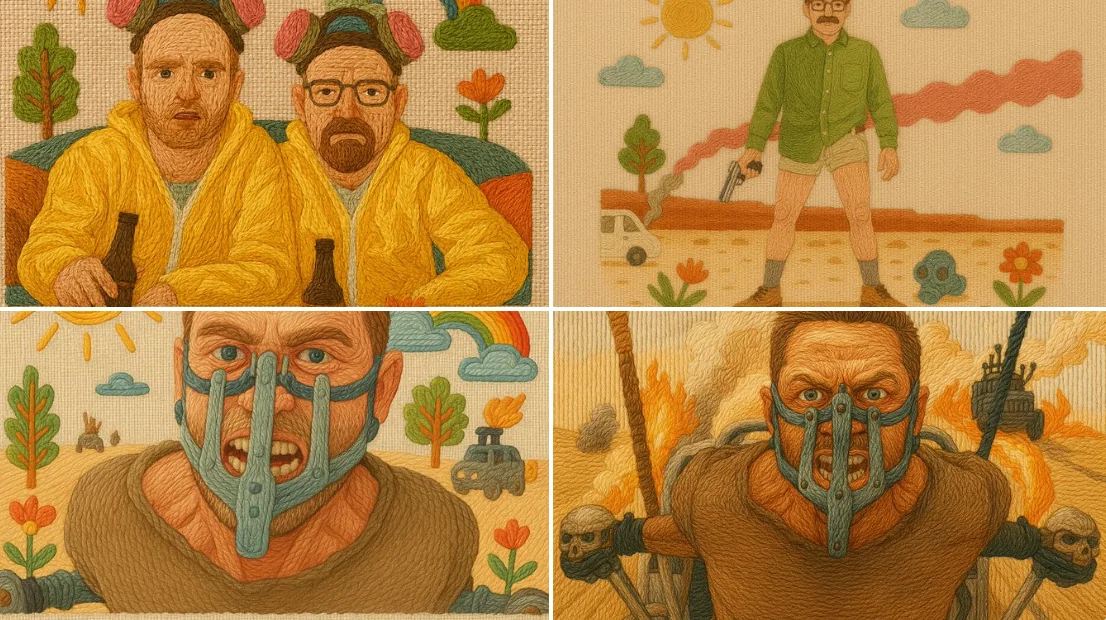
أسلوب تزيين بالخياطة
رسمة مصنوعة يدويًا تُحاكي الخياطة التقليدية باستخدام خيوط لونية على قماش القطن. جميع العناصر "مُخيطَة" مع ظلال خيوط مرئية، باستخدام تقنيات مثل الخياطة المنسوجة، والخياطة العكسية، وعقد الفرنسية. الحواف المرتفعة ومجرى الخيوط المتوجه يخلقان مظ
illustration

Case 28724
بورتريه واقعي للغاية لامرأة تلتقط صورة سيلفي بهاتفها في غرفة نوم
تصوير سيلفي فائق الواقعية داخل غرفة نوم باستخدام الهاتف، بتكوين عمودي بنسبة 3:4. امرأة شرق آسيوية شابة في سن الرشد الواضح، تبلغ من العمر تقريباً 23-28 عاماً، بشرة فاتحة، شكل وجه صغير ودقيق، وجه بيضاوي ناعم، عيون لامعة، أنف مستقيم، شفتان ممت