Case 26471
HM新制服高能动感时尚海报设计提示词
Prompt
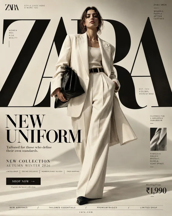
H&M — “NEW UNIFORM” I researched H&M’s current brand/visual system first. The strongest identifiable elements are H&M red + black/white, a bold fashion-led typographic system, dramatic in-the-moment photography, and H&M’s own type family. H&M’s published style guide specifically emphasizes dramatic contrast, captivating in-the-moment/action photography, while its typography system uses IBM Plex Sans for supporting copy and a condensed headline face for impact. H&M also maintains proprietary fonts including HMSans, HMSerif, HM Amperserif and HMMove. So unlike the MANGO direction, this should be more energetic, graphic, youthful and high-contrast rather than Mediterranean/minimal. ⸻ PROMPT — H&M “NEW UNIFORM” FORMAT Ultra-Premium H&M Fashion SMM Promotional Poster Vertical 4:5 Instagram Hero Creative Global Fashion Retail Campaign Contemporary Fashion Advertising Commercial Fashion Graphic Design Agency-Level Art Direction Behance Front Page Quality 8K UHD Hyper-Realistic Fashion × Graphic Design × Street Culture Fusion High-Impact Visual Communication Zero AI Slop Zero Generic Fast-Fashion Advertising Zero Catalogue Aesthetic Zero Luxury-Copycat Aesthetic ⸻ CORE STRATEGY This is not simply a clothing advertisement. This is H&M turned into a visual statement. The campaign should communicate: fashion moves fast. culture moves faster. H&M should feel: accessible + expressive + contemporary + youthful + global + confident. The visual language should combine: H&M fashion campaign × editorial magazine × street-culture poster × high-fashion graphic design × digital-first social advertising The result should feel unmistakably H&M, not Zara, Mango, COS or a generic luxury fashion brand. H&M’s own published style direction emphasizes dramatic contrast and in-the-moment photography, so the photography should feel alive rather than static. ⸻ CAMPAIGN IDEA “NEW UNIFORM” Forget traditional uniforms. This is: THE UNIFORM OF NOW. The clothes represent the constantly changing identity of a new generation. One day: minimal. Next day: street. Next: tailored. Next: experimental. H&M becomes the wardrobe that keeps up. The campaign message: THE UNIFORM CHANGES. YOU DON’T HAVE TO. ⸻ MASTER VISUAL Create an enormous typographic structure reading: H&M The typography should occupy approximately 60–70% of the entire composition. But unlike the MANGO concept, the H&M typography should feel: bold compressed graphic energetic slightly disruptive The giant H&M lettering can be: partially cropped, stacked, repeated, layered, hidden behind the model, intersected by red graphic blocks, cut by diagonal photographic frames, and pushed beyond the canvas. The typography should feel like a physical poster installation, not simple text. ⸻ HERO SUBJECT Young female fashion model. Contemporary global fashion appearance. Natural skin texture. Strong expressive face. Minimal but polished makeup. Confident expression. No artificial influencer smile. No exaggerated luxury pose. The model should feel like someone who actually belongs in the city. Youthful. Self-assured. Energetic. Culturally aware. ⸻ WARDROBE Create a contemporary H&M fashion look. HERO LOOK Oversized black leather-effect bomber jacket. Crisp white fitted tank. Relaxed wide-leg grey trousers. Chunky black footwear. Small silver jewelry. Structured mini shoulder bag. Subtle red accessory detail. Layered styling. The clothing should feel: accessible fashion elevated through styling. Not couture. Not runway costume. Not quiet luxury. Not excessive branding. The clothes should look genuinely wearable. ⸻ POSE / MOVEMENT The model is captured mid-stride. One foot forward. Jacket moving naturally. Hair slightly moving. Body turned approximately 15 degrees. Direct eye contact. One hand adjusting the jacket. Other hand relaxed. The image should feel like a moment captured rather than a pose performed. This directly aligns with H&M’s published preference for dramatic, in-the-moment/action-oriented imagery. ⸻ COMPOSITION TYPOGRAPHY 60–70% MODEL 20–25% GRAPHIC / PROMOTIONAL INFORMATION 10–15% Visual hierarchy: H&M ↓ NEW UNIFORM ↓ MODEL ↓ COLLECTION INFORMATION ↓ CTA Create strong visual tension between the model and typography. The model should partially cover the giant letters. ⸻ H&M COLOR SYSTEM PRIMARY H&M RED Strong saturated red. Use approximately: #E50010 as the primary visual reference. BLACK #000000 Used for: typography, fashion, graphic blocks, borders, micro typography. WHITE #FFFFFF Used for: negative space, copy, graphic panels, background areas. The recognizable H&M visual palette is strongly associated with red, black and white. ⸻ COLOR RATIO 60% White / light neutral 20% Black 15% H&M Red 5% photographic natural tones The red should be strategic, not flooding the entire poster. Use red as a visual trigger. Red graphic rectangle. Red typography. Red edge strip. Red accessory. Red CTA. The eye should naturally travel toward the red elements. ⸻ BACKGROUND Create a contemporary urban studio environment. White architectural walls. Concrete floor. Large geometric panels. Sharp sunlight. Hard shadows. One massive H&M red architectural block. Black graphic planes. Subtle paper/poster texture. The environment should feel halfway between: fashion studio and urban billboard installation. No recognizable city. No distracting scenery. No luxury hotel. No generic streetwear alley. The graphic environment itself should create the H&M world. ⸻ GRAPHIC DESIGN SYSTEM Create an aggressive but controlled editorial grid. Use: bold horizontal rules, vertical lines, red rectangles, black blocks, oversized numerals, micro typography, cropped type, collection codes, thin borders, small directional arrows, photographic crop windows. Introduce a subtle poster-within-poster system. For example: a small secondary campaign image appears inside a red frame. Beside it: 01 / 04 NEW SEASON H&M WOMEN This gives the composition the feeling of a sophisticated global fashion campaign rather than a basic Instagram advertisement. ⸻ TYPOGRAPHY SYSTEM Use H&M’s established typographic character rather than generic fashion fonts. PRIMARY HEADLINE Condensed, uppercase, bold display typography inspired by H&M’s headline system. Extremely large scale. Tight leading. Minimal tracking. Hard geometric presence. H&M’s published style guide identifies a condensed caps-only headline typeface for high-impact headlines, while IBM Plex Sans is used for longer supporting copy. SUPPORTING COPY Clean grotesk / sans-serif. IBM Plex Sans-style characteristics. Highly readable. Neutral. Modern. ⸻ TOP LEFT Small official-style H&M logo placement. Below: FASHION FOR EVERYONE Very small. Do not compete with the hero typography. Preserve generous clear space around the logo. H&M’s published logo guidance stresses maintaining clear space and avoiding distortion or unsuitable treatment. ⸻ GIANT CENTER TYPOGRAPHY Massive: H&M Then layered behind it: NEW UNIFORM The giant H&M lettering should extend outside the frame. Crop: left side, top, right side. The typography should physically interact with the model. ⸻ CAMPAIGN TITLE Lower-left: NEW UNIFORM Use extremely bold condensed uppercase typography. Make UNIFORM substantially larger than NEW. Add a small red underline. ⸻ SUPPORTING COPY THE UNIFORM OF NOW. Secondary line: Designed for whatever comes next. Keep it short. No paragraph. No unnecessary marketing copy. ⸻ COLLECTION INFORMATION Small structured block: H&M WOMEN AUTUMN / WINTER 2026 COLLECTION 01 NEW SEASON FASHION / ESSENTIALS / STREET Use micro typography. ⸻ PROMOTIONAL STRIP Create a thin H&M red horizontal block containing: NEW ARRIVALS TRENDING NOW ONLINE EXCLUSIVE MEMBERS FIRST ACCESS White uppercase typography. The strip should feel integrated into the grid. Not like a sale banner. ⸻ CTA Bottom-right: SHOP NOW → Black rectangular button. White typography. Underneath: Explore the new collection Keep the button compact. ⸻ PRICE Bottom-right corner: FROM ₹999 Large enough to be commercially readable. But secondary to the fashion statement. Do not make the poster look like a discount advertisement. ⸻ BOTTOM FEATURE STRIP Thin black rule. Then: WOMEN / MEN / KIDS / DENIM / TRENDING / NEW ARRIVALS Centered beneath: ⸻ VERTICAL EDGE TEXT Right edge: H&M / AW26 Rotated vertically. Small. Precise. ⸻ RED GRAPHIC DEVICE Create one enormous H&M-red rectangle behind the model. Inside the rectangle: 02 Large black number. Underneath: THE NEW EVERYDAY This becomes the campaign’s visual signature. The red block should feel almost like a piece of Swiss graphic design translated into contemporary fashion advertising. ⸻ PHOTOGRAPHIC STYLE High-energy fashion photography. Dramatic contrast. Sharp moment. Natural movement. Hard directional light. Deep shadows. Bright whites. Saturated H&M red. Natural skin. Realistic fabric. Subtle motion in clothing. H&M’s published style guide specifically calls for dramatic contrast and captivating in-the-moment imagery, with action shots as the primary photographic direction. ⸻ LIGHTING Large directional studio source. Strong side lighting. Controlled hard shadows. Bright white highlights. Deep black clothing separation. Red surfaces receiving rich saturated light. Natural skin exposure. No beauty-dish glamour. No soft luxury haze. No excessive bloom. No artificial neon. ⸻ CAMERA ARRI Alexa Mini LF 50mm fashion/editorial lens Slightly low camera angle. Full-body composition. Fast-fashion campaign energy. Moderate depth of field. Extremely sharp clothing texture. Natural movement. High dynamic range. Premium commercial fashion photography. ⸻ POST-PRODUCTION Contemporary global fashion campaign grading. Clean whites. Deep blacks. Highly saturated controlled red. Natural skin tones. Subtle film grain. Visible textile texture. Crisp typography. Sharp graphic edges. Controlled contrast. No excessive retouching. No plastic skin. No artificial HDR. No fake luxury glow. No cinematic teal-orange grade. No excessive grain. ⸻ BRAND SAFETY / CONSISTENCY The final visual must immediately read as: H&M without relying solely on the logo. Brand recognition should come from: red / black / white bold condensed typography dramatic in-motion photography accessible contemporary styling graphic campaign language youthful global fashion energy strong commercial communication Do not make it resemble: ZARA’s restrained editorial minimalism. MANGO’s Mediterranean warmth. COS’s architectural minimalism. Prada’s intellectual luxury. Louis Vuitton’s heritage luxury. The visual identity must remain H&M. ⸻ FINAL FEEL If: H&M × a global fashion magazine × a contemporary graphic design studio × street culture × a giant urban billboard created one campaign together. Not a catalogue. Not a generic fast-fashion ad. Not a luxury fashion imitation. Not a simple red-and-white poster. A high-impact H&M campaign where typography, movement, fashion and graphic design become one visual system. Vertical 4:5 — 8K UHD — hyper-realistic — dramatic in-the-moment fashion photography — H&M red/black/white palette — oversized condensed typography — precise editorial grid — realistic human anatomy — natural skin — detailed fabrics — accurate H&M branding treatment — crisp readable typography — premium commercial photography — agency-level art direction — Instagram hero creative — Behance front-page quality — print-ready.

H&M — “NEW UNIFORM” 我首先研究了 H&M 目前的品牌/视觉系统。最容易识别的元素是 H&M 红 + 黑/白,大胆的时尚主导排版系统,富有戏剧性的即时摄影,以及 H&M 自有的字体族。H&M 发布的风格指南特别强调了强烈的对比、迷人的即时/动作摄影,而其排版系统则使用 IBM Plex Sans 作为辅助文本,并使用紧凑的标题字体以增强冲击力。H&M 还拥有专利字体,包括 HMSans、HMSerif、HM Amperserif 和 HMMove。所以与 MANGO 的方向不同,这应该是更有活力、更具平面感、更年轻且高对比度的,而不是地中海/极简风格。 ⸻ 提示词 — H&M “NEW UNIFORM” 格式 超优质 H&M 时尚社交媒体营销(SMM)促销海报 纵向 4:5 Instagram 核心创意 全球时尚零售活动 当代时尚广告 商业时尚平面设计 机构级艺术指导 Behance 首页质量 8K 超高清 超现实主义 时尚 × 平面设计 × 街头文化融合 高冲击力视觉传达 零 AI 废话 零平庸快时尚广告 零目录美学 零奢侈品模仿美学 ⸻ 核心策略 这不仅仅是一个服装广告。这是将 H&M 转化为一种视觉宣言。该活动应传达:时尚瞬息万变,文化更迭更快。H&M 应该感觉:平易近人 + 富有表现力 + 当代 + 年轻 + 全球化 + 自信。视觉语言应结合:H&M 时尚活动 × 编辑杂志 × 街头文化海报 × 高级时尚平面设计 × 数字优先的社交广告。结果应该让人一眼就能看出是 H&M,而不是 Zara、Mango、COS 或普通的奢侈时尚品牌。H&M 自家发布的风格方向强调戏剧性的对比和即时摄影,因此摄影应该感觉是鲜活的,而不是静态的。 ⸻ 活动创意 “NEW UNIFORM” 忘记传统制服。这是:当下的制服。这些服装代表了新一代不断变化的身份。某天:极简。第二天:街头。再下一天:剪裁考究。再下一天:实验性。H&M 成为紧跟脚步的衣橱。活动信息:制服在变,你无需改变。 ⸻ 主视觉 创建一个巨大的排版结构,文字为:H&M 排版应占据整个构图的约 60–70%。但与 MANGO 的概念不同,H&M 的排版应该感觉:大胆、紧凑、平面化、充满活力、略带破坏性。巨大的 H&M 字样可以:部分裁剪、堆叠、重复、分层、隐藏在模特身后、被红色图形块交叉、被对角摄影框切割,并超出画布。排版应该感觉像是一个实体海报装置,而不仅仅是简单的文本。 ⸻ 英雄主体 年轻女性时尚模特。当代全球化时尚外貌。自然皮肤纹理。强烈的表现力面部。极简但精致的妆容。自信的表情。没有典型网红的假笑。没有夸张的奢侈品姿势。模特应该感觉像是真正属于这座城市的人。年轻。自信。精力充沛。具有文化意识。 ⸻ 衣橱 打造当代 H&M 时尚造型。核心造型 廓形黑色皮质质感飞行员夹克。清爽白色贴身背心。宽松阔腿灰色长裤。厚底黑色鞋履。小型银饰。结构化迷你单肩包。微妙的红色配饰细节。层叠搭配。服装应该感觉:通过搭配提升的平价时尚。不是高级定制。不是 T 台秀服。不是老钱风。没有过度的品牌标识。衣服看起来应该确实具有实穿性。 ⸻ 姿势 / 动作 捕捉模特大跨步的瞬间。一只脚在前。夹克自然摆动。头发轻微飘动。身体扭转约 15 度。直接眼神交流。一只手调整夹克。另一只手放松。图像应该感觉像捕捉到的瞬间,而不是表演出来的姿势。这直接符合 H&M 发布的对戏剧性、即时/动作导向影像的偏好。 ⸻ 构图 排版 60–70% 模特 20–25% 图形 / 促销信息 10–15% 视觉层级:H&M ↓ NEW UNIFORM ↓ 模特 ↓ 系列信息 ↓ CTA 在模特和排版之间创造强烈的视觉张力。模特应部分遮挡巨型字母。 ⸻ H&M 色彩系统 主色 H&M 红 强烈饱和的红色。使用约:#E50010 作为主要视觉参考。黑色 #000000 用于:排版、时尚、图形块、边框、微型排版。白色 #FFFFFF 用于:负空间、文案、图形面板、背景区域。辨识度极高的 H&M 视觉调色板与红、黑、白紧密相关。 ⸻ 色彩比例 60% 白色 / 浅色中性色 20% 黑色 15% H&M 红 5% 摄影自然色调 红色应是策略性的,而不是淹没整个海报。将红色作为视觉触发点。红色图形长方形。红色排版。红色边缘条。红色配饰。红色 CTA。眼睛应自然地移向红色元素。 ⸻ 背景 打造一个当代城市摄影棚环境。白色建筑墙面。水泥地板。大型几何面板。强烈的阳光。硬阴影。一个巨大的 H&M 红色建筑块。黑色平面图形。微妙的纸张/海报质感。环境应该感觉介于:时尚摄影棚和城市广告牌装置之间。没有可辨认的城市。没有分散注意力的风景。没有豪华酒店。没有普通的街头巷尾。图形环境本身应创造出 H&M 的世界。 ⸻ 平面设计系统 打造一个激进但受控的编辑网格。使用:粗横线、垂直线、红色矩形、黑色块、超大数字、微型排版、裁剪字体、系列代码、细边框、小型方向箭头、摄影裁剪窗口。引入一种微妙的“海报中的海报”系统。例如:一个小型的次要活动图像出现在红色框内。旁边:01 / 04 NEW SEASON H&M WOMEN 这赋予了构图一种精致的全球时尚活动感,而不是基本的 Instagram 广告。 ⸻ 排版系统 使用 H&M 既定的排版特征,而不是普通的时尚字体。主要标题 紧凑、大写、粗体展示排版,灵感来自 H&M 的标题系统。极大的比例。紧凑的行距。极小的字间距。硬朗的几何存在感。H&M 发布的风格指南确定了一种仅限大写的紧凑标题字体用于高冲击力标题,而 IBM Plex Sans 用于较长的辅助文案。辅助文案 干净的 Grotesk / 无衬线体。具有 IBM Plex Sans 风格特征。高度易读。中性。现代。 ⸻ 左上角 小型官方风格 H&M Logo 放置。下方:FASHION FOR EVERYONE 非常小。不要与核心排版竞争。在 Logo 周围保留充足的留白空间。H&M 发布的 Logo 指南强调保持留白空间,避免扭曲或不当处理。 ⸻ 居中巨型排版 巨大的:H&M 然后分层在其后方:NEW UNIFORM 巨大的 H&M 字样应延伸到框架外。裁剪:左侧、顶部、右侧。排版应在物理上与模特互动。 ⸻ 活动标题 左下角:NEW UNIFORM 使用极其粗体、紧凑的大写排版。使 UNIFORM 显著大于 NEW。添加一个小红下划线。 ⸻ 辅助文案 THE UNIFORM OF NOW. 副标题:Designed for whatever comes next. 保持简短。不要段落。不要不必要的营销文案。 ⸻ 系列信息 小型结构化块:H&M WOMEN AUTUMN / WINTER 2026 COLLECTION 01 NEW SEASON FASHION / ESSENTIALS / STREET 使用微型排版。 ⸻ 促销条 打造一个细长的 H&M 红色水平块,包含:NEW ARRIVALS TRENDING NOW ONLINE EXCLUSIVE MEMBERS FIRST ACCESS 白色大写排版。该条应感觉融入网格中。不要像促销横幅。 ⸻ CTA 右下角:SHOP NOW → 黑色矩形按钮。白色排版。下方:Explore the new collection 保持按钮紧凑。 ⸻ 价格 右下角:FROM ₹999 足够大以在商业上易读。但次于时尚宣言。不要让海报看起来像折扣广告。 ⸻ 底部特征条 细黑线。然后:WOMEN / MEN / KIDS / DENIM / TRENDING / NEW ARRIVALS 居中在其下方:⸻ ⸻ 垂直边缘文本 右侧边缘:H&M / AW26 垂直旋转。小型。精准。 ⸻ 红色图形装置 在模特身后创建一个巨大的 H&M 红色矩形。矩形内部:02 大型黑色数字。下方:THE NEW EVERYDAY 这成为活动的视觉签名。红色块应该感觉几乎像是一件转化为当代时尚广告的瑞士平面设计作品。 ⸻ 摄影风格 高能量时尚摄影。戏剧性对比。敏锐瞬间。自然动作。强烈的定向光。深阴影。明亮的白色。饱和的 H&M 红。自然皮肤。真实的织物。服装中的微妙动感。H&M 发布的风格指南特别要求戏剧性的对比和迷人的即时影像,以动作拍摄作为主要的摄影方向。 ⸻ 光照 大型定向影棚光源。强烈的侧光。受控的硬阴影。明亮的白色高光。深黑色服装分离。红色表面接收丰富的饱和光线。自然皮肤曝光。没有柔光箱的美妆感。没有柔软的奢华薄雾。没有过度的光晕。没有人造霓虹灯。 ⸻ 相机 ARRI Alexa Mini LF 50mm 时尚/编辑镜头 稍低的相机角度。全身构图。快时尚活动能量。中等景深。极其锐利的服装纹理。自然动作。高动态范围。优质商业时尚摄影。 ⸻ 后期制作 当代全球时尚活动调色。干净的白色。深邃的黑色。高度饱和且受控的红色。自然肤色。微妙的胶片颗粒。可见的纺织品纹理。清晰的排版。锐利的图形边缘。受控的对比度。没有过度的修图。没有塑料感的皮肤。没有虚假的高动态范围(HDR)。没有虚假的光泽。没有电影感的青橙调色。没有过多的颗粒。 ⸻ 品牌安全 / 一致性 最终视觉效果必须立即读出是:H&M,而不仅仅依靠 Logo。品牌认可度应来自:红 / 黑 / 白 调色,大胆的紧凑排版,富有戏剧性的动态摄影,平易近人的当代造型,平面化的活动语言,年轻的全球时尚能量,强烈的商业传达。不要使其看起来像:ZARA 的内敛编辑极简主义。MANGO 的地中海温暖。COS 的建筑极简主义。Prada 的知识分子奢侈感。Louis Vuitton 的传统奢侈感。视觉身份必须保持为 H&M。 ⸻ 最终感觉 如果:H&M × 全球时尚杂志 × 当代平面设计工作室 × 街头文化 × 巨型城市广告牌共同创建了一个活动。不是产品目录。不是普通的快时尚广告。不是奢侈时尚的仿制品。不是简单的红白海报。一个高冲击力的 H&M 活动,排版、动作、时尚和平面设计合而为一。垂直 4:5 — 8K 超高清 — 极其写实 — 戏剧性的即时时尚摄影 — H&M 红/黑/白调色板 — 超大紧凑排版 — 精确的编辑网格 — 真实的人体解剖结构 — 自然皮肤 — 细节丰富的面料 — 准确的 H&M 品牌处理 — 清晰易读的排版 — 优质商业摄影 — 代理商级别的艺术指导 — Instagram 核心创意 — Behance 首页质量 — 印刷就绪。