Case 27051
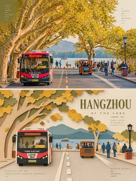
独立杂志感拼接纸艺海报
Prompt
Create one independent editorial-style poster for each uploaded photo. Do not make a collage. Process and output each photo separately.

Use a strict 3:4 vertical composition, divided horizontally into two exactly equal sections, each occupying 50% of the canvas.

TOP HALF — ORIGINAL PHOTOGRAPH
Preserve the original photo. Keep the main subject unchanged while retaining its realistic texture, natural lighting, and original color atmosphere. Apply only subtle editorial-grade color correction to create the refined feel of an art magazine, independent publication, or exhibition photography.

To fit the composition, you may gently extend the sky, ground, or surrounding environmental background, but do not stretch, distort, or alter the main subject.

BOTTOM HALF — LAYERED PAPER CUT / PAPER ART REINTERPRETATION
Reinterpret the most recognizable subject, silhouette, pose, and spatial relationships from the photo as a minimalist layered paper-cut / paper-art composition.

Use one primary subject as the visual anchor. Do not mechanically reproduce every detail. Instead, reconstruct the key silhouette, proportions, and structure through folding, cutting, layering, and overlapping.

Transform only a few supporting environmental elements into foreground, midground, and background paper layers. Use scale contrast, negative space, clean alignment, and front-to-back layering to make the subject immediately recognizable while maintaining a restrained editorial composition.

COLOR & MATERIAL
Extract the most distinctive and recognizable colors from the original photo, then reduce them into a limited and harmonious paper-art palette.

Use warm ivory or light-colored paper as the base, supported by a small amount of stronger accent colors, darker structural tones, soft transitional layer colors, and very limited highlights.

The material should resemble high-quality matte cardstock, with subtle visible paper fibers, clean cut edges, and soft contact shadows under natural diffused lighting. Emphasize the tactile quality of real handcrafted paper art.

Avoid glossy plastic-like 3D effects, cheap craft-paper aesthetics, neon colors, and overly saturated or complex gradients.

EDITORIAL TYPOGRAPHY SYSTEM
Add a refined editorial typography system. Based on the identity, location, action, material, emotion, or symbolic meaning of the subject, create one short main title.

Add 2–4 groups of smaller supporting text. These may include object names, location information, numbers, sequence markers, coordinate-like numbers, direction words, status words, material descriptions, classification labels, or a very short poetic phrase.

Do not use any year or date.

The main title should convey emotion and identity, while the smaller text should add rhythm, structure, and refinement.

TYPOGRAPHY INTEGRATION
Integrate the typography naturally into the composition so that it interacts with the paper-cut forms. Arrange text along paper-layer edges, subject contours, geometric axes, or areas of negative space.

Use horizontal or vertical typesetting, rotated text, generous letter spacing, edge alignment, corner placement, cross-section layouts, embedded typography, or partially overlapped text.

The main title may have a subtle paper-cut or folded-paper quality, while the supporting text should remain thin, modern, restrained, and precise.

The final result should feel elegant, tactile, balanced, art-directed, and distinctly editorial.

为每张上传的照片制作一张独立的社论风格海报。不要制作拼贴画。分别处理并输出每张照片。

使用严格的 3:4 垂直构图,在水平方向上分成两个完全相等的部分,各占画布的 50%。

上半部分 — 原始照片
保留原始照片。保持主体不变,同时保留其真实的纹理、自然的光线和原始的色彩氛围。仅应用细微的社论级色彩校正,以营造艺术杂志、独立出版物或展览摄影的精致感。

为了适应构图,你可以轻轻延伸天空、地面或周围的环境背景,但不要拉伸、扭曲或改变主体。

下半部分 — 分层剪纸 / 纸艺重新诠释
将照片中最具辨识度的主体、轮廓、姿势和空间关系重新诠释为极简的分层剪纸 / 纸艺构图。

使用一个主要主体作为视觉锚点。不要机械地复制每一个细节。相反,通过折叠、裁剪、分层和重叠来重构关键的轮廓、比例和结构。

仅将少数辅助环境元素转化为前景、中景和背景纸层。利用比例对比、负空间、整洁的对齐和前后分层,使主体立即辨识,同时保持克制的社论构图。

色彩与材质
从原始照片中提取最具特色和辨识度的色彩,然后将其简化为有限且和谐的纸艺调色板。

使用暖象牙色或浅色纸张作为基底,辅以少量较强的强调色、较深的结构色调、柔和的过渡层颜色以及极其有限的高光。

材质应类似于高质量的磨砂卡纸,具有细微可见的纸张纤维、整洁的切割边缘,以及在自然漫反射光线下的柔和接触阴影。强调真实手工纸艺的触感质量。

避免产生像塑料一样的光泽 3D 效果、廉价的工艺纸美感、霓虹色以及过度饱和或复杂的渐变。

社论排版系统
添加精致的社论排版系统。根据主体的身份、位置、动作、材质、情感或象征意义,创建一个简短的主标题。

添加 2–4 组较小的辅助文字。这些可能包括物体名称、位置信息、数字、序列标记、类似坐标的数字、方向词、状态词、材质描述、分类标签或非常短的诗意短语。

不要使用任何年份或日期。

主标题应传达情感和身份,而较小的文字应增加节奏感、结构感和精致度。

排版整合
将排版自然地融入构图,使其与剪纸形式互动。沿着纸层边缘、主体轮廓、几何轴线或负空间区域排列文字。

使用水平或垂直排版、旋转文字、宽松的字间距、边缘对齐、角落放置、横截面布局、嵌入式排版或部分重叠的文字。

主标题可能带有细微的剪纸或折纸质感,而辅助文字应保持纤细、现代、克制且精确。

最终结果应感觉优雅、具有触感、平衡、经过艺术指导且具有鲜明的社论风格。
更多提示词
Case 7
刺绣肖像
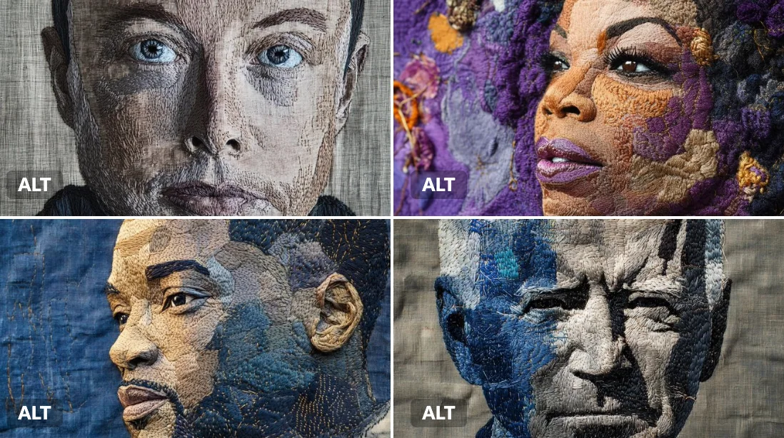
一幅刺绣肖像,以[颜色]线在深色亚麻布上缝制。可见的针脚、层次分明的纹理和手工图案赋予其一种质朴而神圣的感觉。 一幅埃隆·马斯克的刺绣肖像,用丰富的钢灰色和电光蓝色线在深色亚麻布上缝制。可见的针脚、层次分明的纹理和手工图案赋予其一种质朴而神圣的感觉。
portrait
Case 9388
午夜巴黎的高级慵懒美学
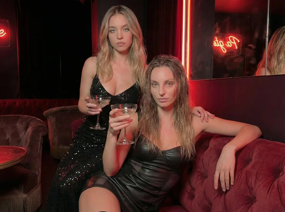
{ "subject": { "demographics": "两位引人注目的白人女性,二十五六岁,展现出高级时装夜生活美学。", "hair": "站立人物:蓬松的金色头发,带有自然的松散波浪。坐姿人物:蜂蜜金色头发,略带湿润、缕状质感和法式刘海。", "face": "淡化妆容,自然皮肤光泽,中性表情,上眼睑略显下垂(类似上睑下垂),T 区可见细微纹理。", "anatomy": "站立人物:胸部有明显的软组织,呈现自然重力作用下的泪滴状形态;胸部展现出未受挤压的丰满度,
写实霓虹微醺高定夜生活