Case 19243
国际主义平面设计风格蜈蚣的妙用
Prompt
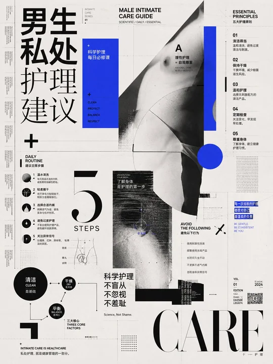
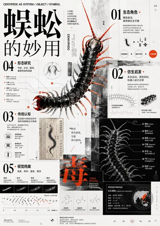
Design using the theoretical systems of International Typographic Style, Bauhaus, Constructivism, Dada collage, postmodern deconstruction, editorial design, information visualization, Gestalt psychology, and visual semiotics; integrating the grid order of Josef Müller-Brockmann, the typographic discipline of Jan Tschichold, the experimental typography of Wolfgang Weingart, the deconstructive tension of David Carson, the multi-layered information organization of Kohei Sugiura, and the white space consciousness of Kenya Hara; the color scheme adopts an extremely restrained achromatic base, a single high-brightness and high-purity emphasis area, area proportion control, brightness collision, figure-ground reversal, local visual explosion, and a limited color system, forming a color logic where calm order and intense stimulation coexist; composition uses asymmetrical balance, modular grids, scale mutation, local transgression, density gradients, layered collage, diagonal momentum, visual anchors, golden ratio, white space cutting, rhythmic repetition, and center shift, allowing the image to present free growth within a rational framework; typography adopts a strong contrast combination of serif and sans-serif fonts, juxtaposition of oversized display characters and miniature explanatory text, coordination of Chinese and Western font skeletons, modular font size gradients, font weight contrast, width contrast, mixed horizontal and vertical layout, italic emphasis, alternating tight letter spacing and loose line spacing, establishing a magazine-style multi-layered reading path; the overall temperament is rational, avant-garde, academic, experimental, sharp, restrained, unfamiliar, retro-futuristic, knowledge-intensive, ideologically radical, cold yet full of vitality, bringing a sense of exploration, enlightenment, discovery, intellectual excitement, visual impact, the pleasure of order, and a continuous desire to read.

Theme: The Uses of Centipedes

用国际主义平面设计、包豪斯、构成主义、达达拼贴、后现代解构、编辑设计、信息可视化、格式塔心理学与视觉符号学的理论体系进行设计,融合约瑟夫·穆勒-布罗克曼的网格秩序、扬·奇肖尔德的字体纪律、沃尔夫冈·魏因加特的实验排版、大卫·卡森的解构张力、杉浦康平的多层信息组织与原研哉的留白意识;配色采用极度克制的无彩基底、单一高明度高纯度强调区、面积比例控制、明度对撞、图底反转、局部视觉爆破与有限色系统,形成冷静秩序与强烈刺激并存的配色逻辑;构图使用非对称平衡、模块化网格、尺度突变、局部越界、密度梯度、层叠拼贴、斜向动势、视觉锚点、黄金分割、留白切割、节奏重复与中心偏移,使画面呈现理性框架下的自由生长;字体采用衬线体与无衬线体的强对比搭配、超大展示字与微型说明字并置、中西文字体骨架协调、模块化字号级差、字重反差、宽窄反差、横竖混排、倾斜强调、紧密字距与疏朗行距交替,建立杂志编辑式多层阅读路径;整体气质理性、前卫、学术、实验、锐利、克制、陌生、复古未来、知识密集、思想激进、冷峻又充满生命力,带来探索感、启蒙感、发现感、智性兴奋、视觉冲击、秩序快感与持续阅读欲。

主题:蜈蚣的妙用
更多提示词
Case 12551
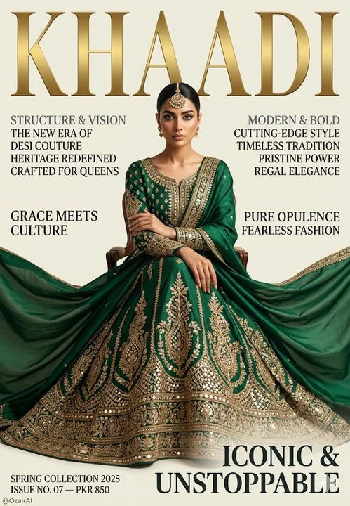
高端南亚时尚杂志封面上的翡翠绿刺绣礼服
奢华高端时尚杂志封面。干净的象牙白/奶油色背景。一位极其美丽的南亚女性,五官锐利优雅,肌肤无瑕,眼神自信而凌厉——优雅地端坐在画面中央,双臂自然交叉于身前。 她身穿深祖母绿色、重工刺绣的巴基斯坦传统 lehenga 长裙,饰有繁复的金色 zari 刺绣、镜面点缀,以及一条丝质 dupatta 披肩,戏剧性地向外飘展开来,如皇家礼服般铺满画面下半部分。 发型为光滑的低发髻,佩戴 maang tikka 额饰。金饰简约。 关键文字排版规则: - 所有文字都必须仅直接印在背景

Case 5
创建你自己的GTA角色
VI **LUCIAN "SUNSET" VARGAS** *“Where the sun sets… the deals begin.”* Lucian “Sunset” Vargas is a smooth-talking, sunset-obsessed drug kingpin who runs the most exclusive beachfront meth lab in Vice City. He’s got more charm than a
characterlandscapeneongaming