Case 28093
日系艺术展览海报排版设计指南
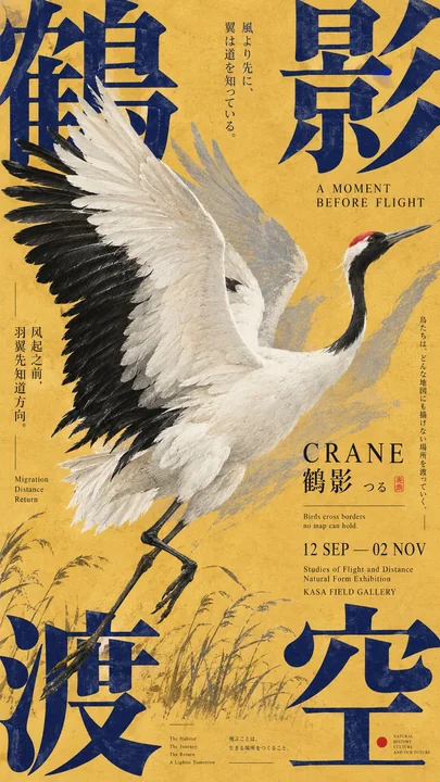
Prompt
Create a premium 9:16 Japanese-inspired editorial poster using the following creative direction.

Theme: [Your exhibition, cultural event, or artistic concept]
Main Typography: [Large English, Chinese, or Japanese headline]
Visual Subject: [Wildlife, natural elements, printed materials, objects, or abstract forms]
Color Palette: [Choose 2–4 harmonious or contrasting colors]
Supporting Text: [Subtitle, dates, venue, and meaningful multilingual details]

Visual Style & Typography

Draw inspiration from Japanese cultural exhibition posters, experimental typography, independent publishing, and contemporary editorial graphic design. Make typography the main visual structure, using oversized letterforms, expressive Kanji, bold cropping, unconventional spacing, and a sophisticated mix of Chinese, Japanese, and English.

Explore dynamic relationships between text and imagery through overlapping, masking, fragmented layouts, negative space, and layered compositions. Depending on the theme, use calligraphic collage, large characters framing illustrations, typography interacting with natural objects, or dense editorial arrangements.

Composition & Information Hierarchy

Build a visually striking yet carefully organized composition. Combine dominant headlines with smaller vertical text columns, exhibition details, dates, poetic phrases, fine rules, and compact information blocks.

Maintain the rich visual density of authentic Japanese art posters. Every element should contribute to the concept, with clear hierarchy, intentional asymmetry, balanced negative space, and strong readability even at thumbnail size.

Imagery & Print Texture

Integrate illustrations, photography, archival fragments, or physical materials naturally into the typography. Objects should interact with letters through meaningful overlap and spatial relationships rather than appearing as separate decorations.

Use subtle paper fibers, offset printing textures, ink grain, restrained registration imperfections, and tactile printed surfaces. Keep colors rich and controlled, with authentic material details and refined editorial craftsmanship.

Final Art Direction

The result should feel like an original poster commissioned by a Japanese art museum, independent publisher, cultural gallery, or design exhibition. Each composition should have its own distinctive visual concept while maintaining a cohesive Japanese editorial aesthetic.

Avoid generic AI poster templates, excessive minimalism, meaningless filler text, random decorations, glossy 3D effects, artificial gradients, numbering, sparkles, and watermarks.

使用以下创意方向创作一张高级的 9:16 日系风格编辑海报。

主题:[你的展览、文化活动或艺术概念]
主要排版:[大型英文、中文或日文标题]
视觉主体:[野生动物、自然元素、印刷材料、物体或抽象形式]
配色方案:[选择 2–4 种和谐或对比的颜色]
辅助文字:[副标题、日期、地点以及有意义的多语言细节]

视觉风格与排版

从日本文化展览海报、实验性排版、独立出版和当代编辑平面设计中汲取灵感。将排版作为主要的视觉结构,使用超大字母、表现力强的汉字、大胆的裁剪、非常规的间距,以及中文、日文和英文的精致混合。

通过重叠、遮罩、碎片化布局、负空间和分层构图,探索文字与图像之间的动态关系。根据主题,使用书法拼贴、构勒插图的大型字符、与自然物体互动的排版或密集的编辑安排。

构图与信息层级

构建一个具有视觉冲击力但又精心组织的构图。将主导标题与较小的垂直文本栏、展览详情、日期、诗意短句、细线和紧凑的信息块相结合。

保持正宗日本艺术海报丰富的视觉密度。每个元素都应为概念做出贡献,具有清晰的层级、刻意的非对称、平衡的负空间,即使在缩略图尺寸下也具有很强的可读性。

图像与印刷纹理

将插图、摄影、档案片段或物理材料自然地融入排版中。物体应通过有意义的重叠和空间关系与字母互动,而不是作为单独的装饰出现。

使用微妙的纸张纤维、胶印纹理、油墨颗粒、克制的套印缺陷以及有触感的印刷表面。保持色彩丰富且受控,具有真实的材质细节和精致的编辑工艺。

最终艺术指导

其结果应该感觉像是由日本美术馆、独立出版社、文化画廊或设计展览委托制作的原创海报。每种构图都应具有其独特的视觉概念,同时保持一致的日式编辑美学。

避免通用的 AI 海报模板、过度的极简主义、无意义的填充文本、随机装饰、光泽的 3D 效果、人造渐变、编号、闪光和水印。
More prompts
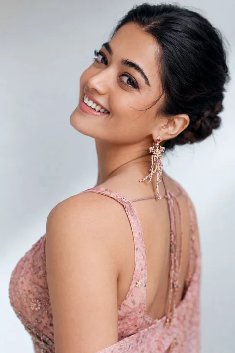
Case 9602
淡粉纱丽刺绣柔美全身肖像
{ "image_type": "studio portrait", "resolution_target": "8K", "aspect_ratio": "approximately 3:4 (vertical)", "camera_framing": { "shot_type": "full-length portrait", "orientation": "vertical", "subject_position": "centered, slightly angled
印度风影棚照纱丽花刺绣柔美人
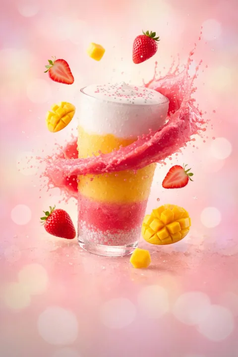
Case 9622
Summer Cool Storm in a Glass Cup
Summer in a glass: strawberries, mango, and pure refreshment exploding in one sip.
饮品夏日清爽